Branding (v1.8.0+)
Depictio ships in a neutral Mantine look. A deployment can replace it with its own logo, name, colours, chrome surfaces, typography and figure palette, and a single dashboard can override any of it. All of that is one object, the brand theme, so every place you can set it takes the same fields.
Where it can be set
| Layer | Set from | Needs a redeploy |
|---|---|---|
| Deployment defaults | DEPICTIO_BRANDING_* environment variables. See Environment Reference |
Yes |
| Instance overrides | Administration → Branding at /admin, saved server-side |
No |
| Dashboard override | The dashboard's Settings, or brand_theme: in its YAML |
No |
Each layer states only what differs and inherits the rest. That is what makes a dashboard's inherit the instance real rather than a copy: change the instance logo and every dashboard that never uploaded its own follows.
Availability
The layered engine landed in v1.8.0 (#1003). Dashboards carrying the older logo_url or plot_theme fields fold into brand_theme on read and keep working.
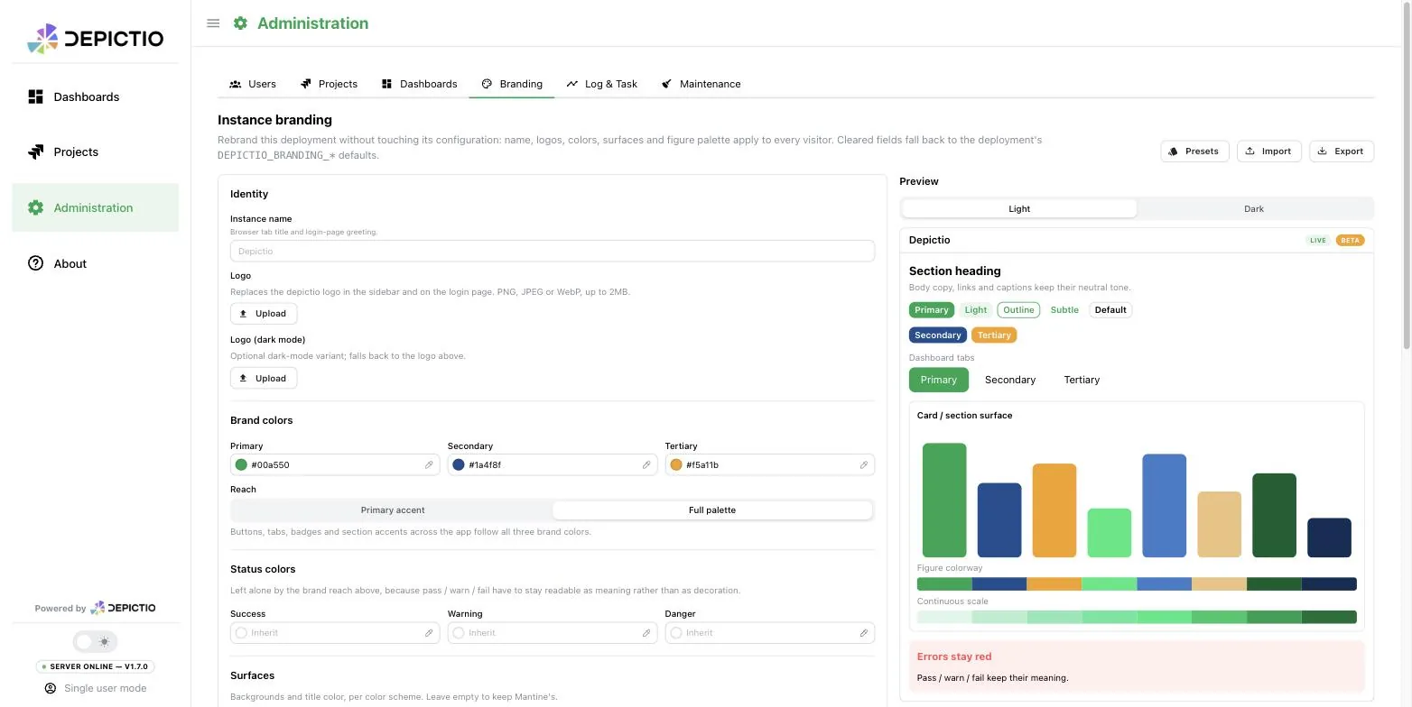
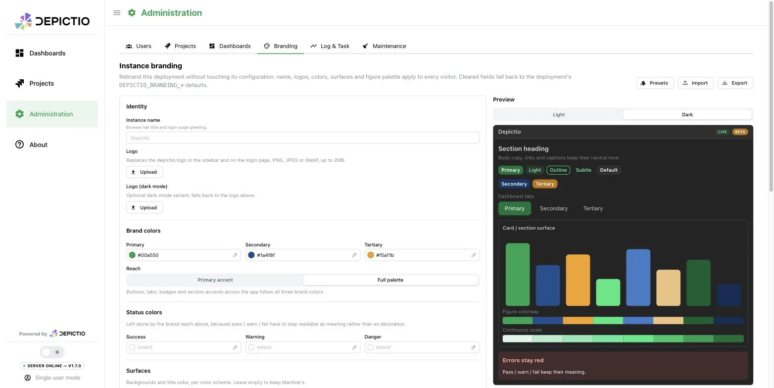
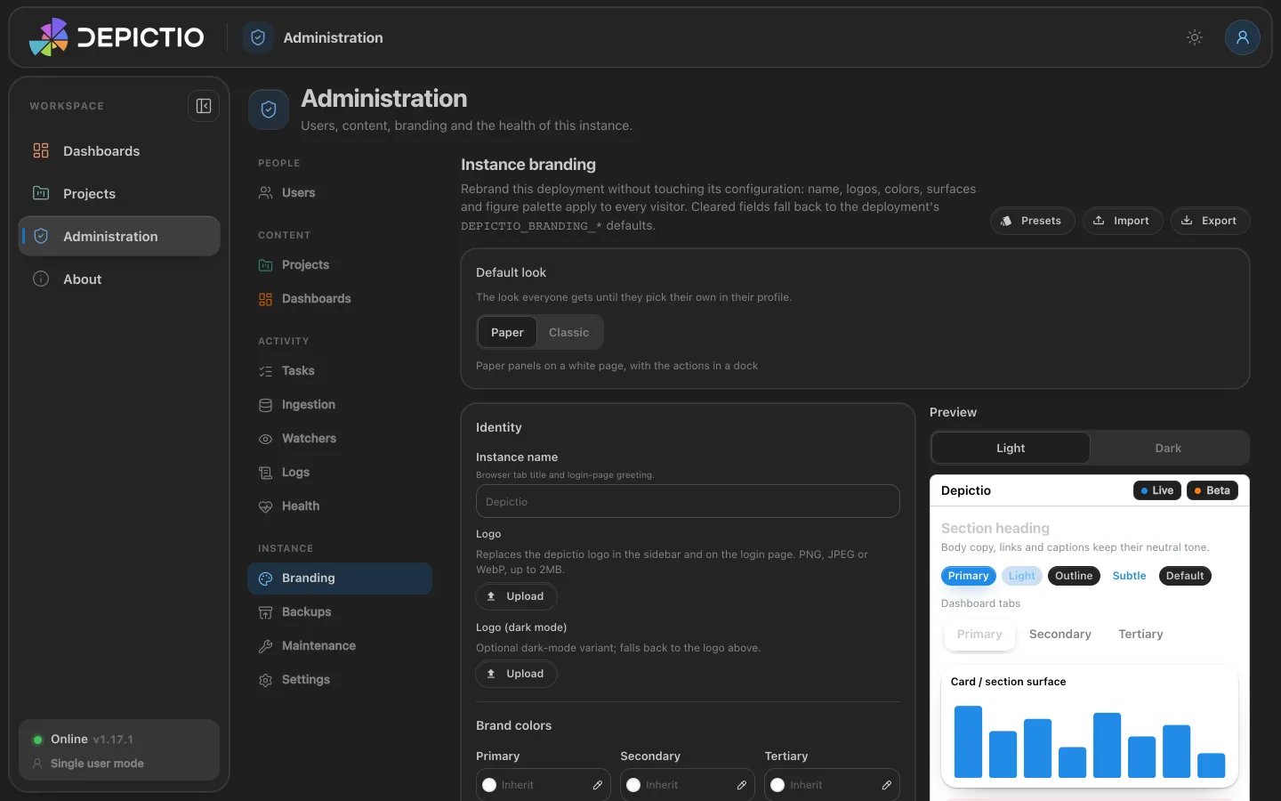
Administration → Branding puts the whole theme on one page, with a live preview that renders real components under the draft, in either colour scheme:
The fields
The admin form groups them as below, and a dashboard override offers the same set.
| Group | Fields |
|---|---|
| Identity | app_name (browser tab title and login greeting), logo_url, logo_url_dark, and logo_mode: inherit (the default), custom or none |
| Brand palette | primary, secondary, tertiary, each a hex colour or a Mantine palette name (blue, teal, grape, and so on) |
| Status colours | success, warning, danger, held outside the brand reach so pass, warn and fail keep reading as meaning rather than as decoration |
| Reach | tint_mode: accent (the default) re-tints the primary accent only, full carries all three brand colours into buttons, tabs, badges and section accents. gray, red, green and yellow are never remapped in either mode |
| Surfaces | surfaces_light and surfaces_dark, each holding app_bg (page), section_bg (cards and panels), nav_bg (header and sidebar) and heading (title text). Hex only, since these become raw CSS values |
| Typography and shape | font_family, headings_font_family, default_radius (a Mantine token, xs to xl) |
| Figures | plots.template for figures whose component picks none, unset meaning follow the UI colour scheme; plots.colorway and plots.sequential for the categorical and continuous palettes |
Fonts are not fetched for you
A named font has to be installed on the viewer's machine or served by the deployment. An unavailable font fails silently, so the admin form renders a live sample of what you typed.
Derived values
colorway, sequential and the Mantine shade tuples are derived from the brand palette whenever you leave them unset, so figures follow the brand without a second list to keep in step. The derivation runs server-side, once, and the resolved theme is what /utils/public-config serves, so a dashboard's figures and the chrome around them cannot drift apart. State colorway or sequential yourself and the derivation steps aside for that field alone.
A hex brand colour is expanded into a 10-shade tuple with your colour on shade 6, the shade a filled control actually paints in light mode (8 in dark). Generic generators place the input by its lightness instead, which for a dark brand leaves every button a washed-out cousin of it. The colorway walks the brand hues before rotating hue, so a figure's first series are recognisably the brand.
palettes is output, not input
The resolved theme carries a palettes object holding the derived tuples, keyed by role. The server fills it in and authors never set it, in the environment, in the admin panel or in YAML.
Presets, import and export
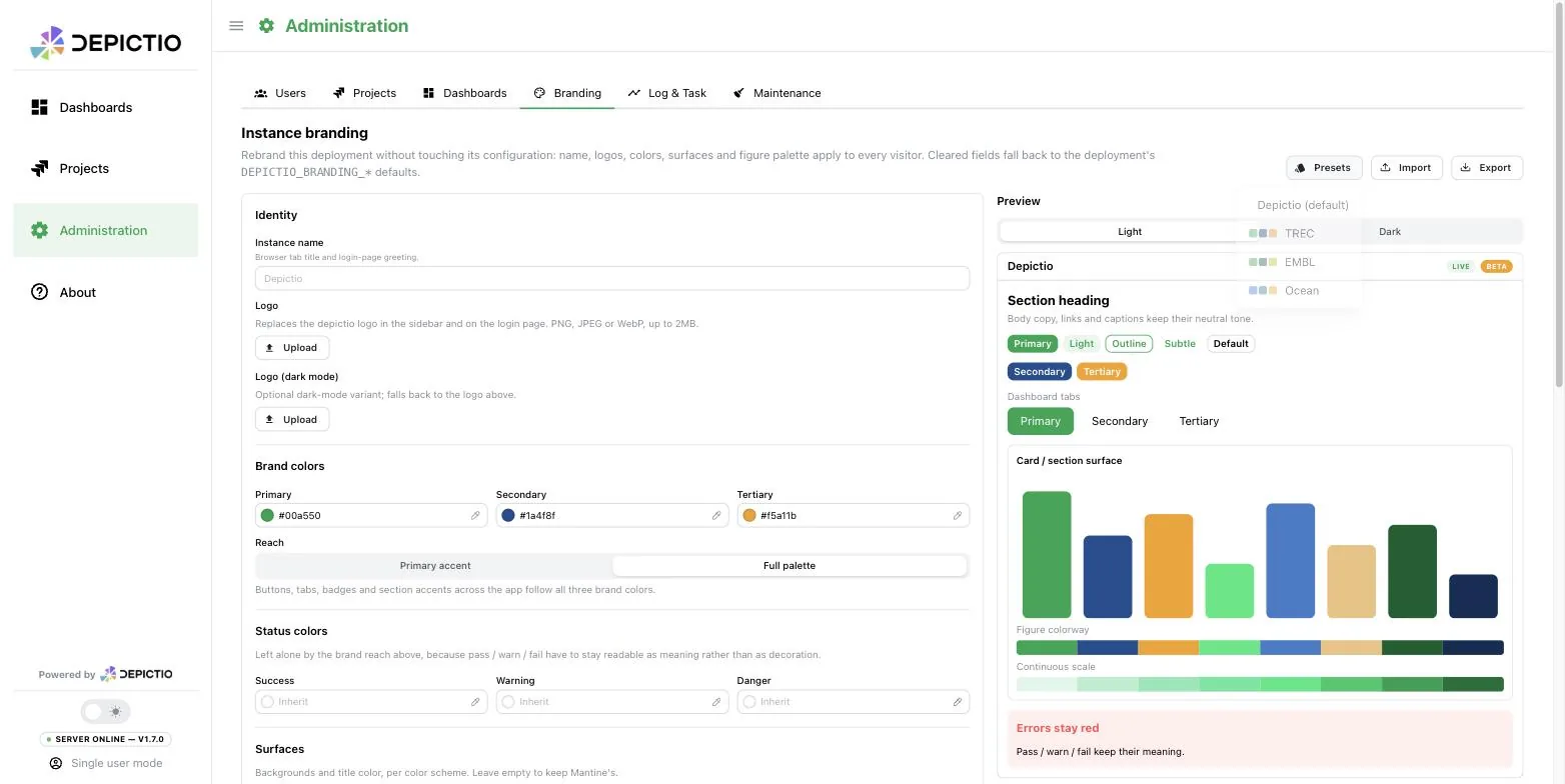
Presets seeds the form from a starting point, namely the stock Depictio look, TREC, EMBL or Ocean, also settable at deploy time with DEPICTIO_BRANDING_PRESET. Everything a preset fills in stays editable, and the flat environment variables override it field by field. Export writes the current theme as JSON and Import reads one back, so a brand can be version-controlled and moved between deployments. An imported file keeps the instance's uploaded logos unless it names logos of its own, on the same reasoning as a preset: a theme file is a palette, not an identity.
Default look (v1.17.0+)
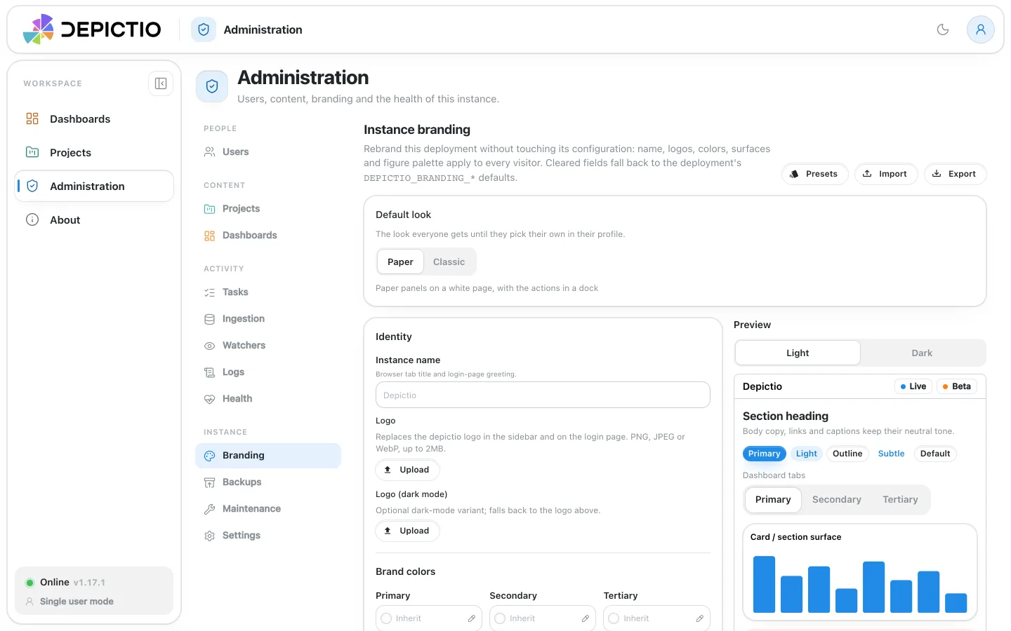
The first card of Administration → Branding sets the look of the app for every user who has not picked one: Paper, the default, or Classic. A user's own pick in Account settings → Preferences wins over it, in their browser.
Where the logos live (v1.8.2+)
Uploaded logos are stored in a branding_assets collection and served from the API, at /utils/branding/logo/{variant} for the instance and /dashboards/logo/{id} for a dashboard. Nothing is written to the container filesystem, so a rebuild or a pod redeploy cannot leave a theme pointing at an image that no longer exists, and no volume or PVC has to be provisioned. Each is capped at 2 MB, as PNG, JPEG or WebP; SVG is refused because it can carry scripts and would be served same-origin.
branding_assets and the overrides document in instance_settings are both part of the backup set, so a restore brings back the instance identity that every dashboard theme inherits from. A deployment branded before v1.8.2 keeps working: logos still on disk are imported into the database at startup, once, and their stored URLs rewritten.
The "Powered by Depictio" attribution (v1.8.2+)
The badge renders exactly when the Depictio wordmark does not, meaning when the logo in scope resolves to custom or none. A stock deployment already carries the wordmark in the app rail and on the login card, so a badge there would only repeat it; a branded one is where it is the only thing saying what the app is built on. It appears once per surface: under the logo on the login card, in the app rail outside dashboards, and in a dashboard header.
A dashboard override
From a dashboard in edit mode: Settings → Branding → Customise. The same fields appear, with the instance's values shown as placeholders. The override applies to that dashboard's page only, so it can wear its own identity inside a differently branded instance. See Using the dashboard for the rest of the Appearance controls.
Since v1.14.0 a child tab with no brand of its own draws in its main tab's, figures included, and its Source reads Inherit main tab. Before, it fell back to the instance's.
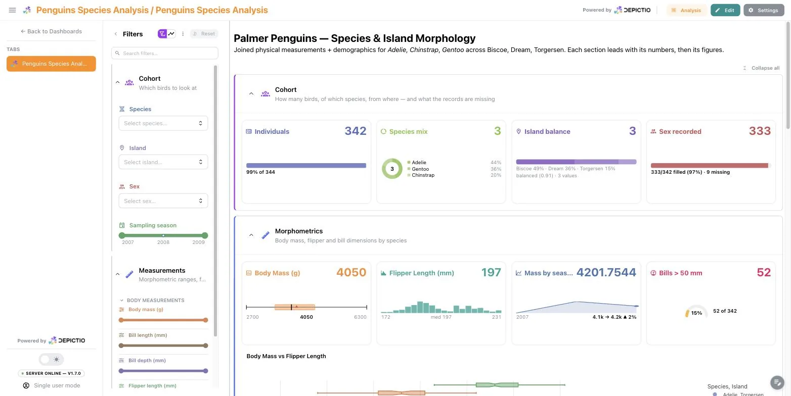
In YAML it is a top-level brand_theme: block. The bundled penguins demo carries one as a worked example:
brand_theme:
  primary: "#159090"    # Gentoo
  secondary: "#a034f0"  # Chinstrap
  tertiary: "#ff8c00"   # Adelie
  tint_mode: "full"
Uploaded logos do not travel
Logos uploaded through the UI are stripped on export: the image lives in the instance's own database, so a reference to it would resolve to nothing elsewhere. Use logo_url with an absolute address for a logo that should survive a move.
See Also
- Environment Reference for every
DEPICTIO_BRANDING_*variable - Using the dashboard for the per-dashboard Appearance controls
- Components for the per-figure theme and font scale