Dashboard Features
Depictio dashboards provide flexible, interactive data visualization with multiple modes, customizable layouts, and tabbed organization.
Dashboard Modes
Depictio provides two distinct modes for working with dashboards:
Viewer Mode
URL: /dashboard/{id}
Read-only mode for exploring data:
- View and interact with visualizations
- Use filter components to explore data
- Export data from tables (v0.6.0+)
- Share dashboards with collaborators
- Discuss and annotate components (project editors and owners), see Comments and Annotations
- Export one component to another website, when the server allows it, see Component export and embedding (v1.17.0+)
- No accidental modifications
Editor Mode
URL: /dashboard-edit/{id}
Full editing capabilities:
- Add, remove, and configure components
- Drag-and-drop component positioning
- Resize components
- Create and manage tabs
- Access the component builder stepper
Three-Panel Layout
The dashboard interface uses a three-panel layout with a collapsible sidebar:
Paper look (v1.17.0+)
The diagram below is the Classic look. In Paper, the default since v1.17.0, the header bar becomes a top bar with the dashboard title, the tab sidebar folds to an icon rail, and Search, Analysis, Comments and Edit move to a floating dock. The panels are the same. See Paper and Classic.
┌──────────────────────────────────────────────────────────────────────────┐
│                                Header Bar                                │
├────────┬──────────────────┬──────────────────────────────────────────────┤
│        │   LEFT PANEL     │            RIGHT PANEL                       │
│ Side-  │   (Filters)      │          (Visualizations)                    │
│  bar   │ ┌──────────────┐ │                                              │
│        │ │ 2 active   ▾ │ │                                              │
│ Tab 1  │ └──────────────┘ │  ▾ Cohort                                    │
│ Tab 2  │ ▾ Sample      📌 │  ┌─────────────┐  ┌─────────────┐            │
│ Tab 3  │ ┌──────────────┐ │  │    Card     │  │    Card     │            │
│        │ │ MultiSelect  │ │  └─────────────┘  └─────────────┘            │
│ [+]    │ └──────────────┘ │                                              │
│        │ ▸ Time  (folded) │  ▸ Quality control                  (folded) │
│ [=]    ├──────────────────┤                                              │
│        │ Map dock     (3) │  ▾ Detail                                    │
│        │ ┌──────────────┐ │  ┌─────────────┐  ┌─────────────┐            │
│        │ │  (map here)  │ │  │   Figure    │  │    Table    │            │
│        │ └──────────────┘ │  └─────────────┘  └─────────────┘            │
│        │                  │  ▾ Raw Data                              📌 │
│        │                  │  ┌────────────────────────────────────────┐ │
│        │                  │  │        (shared table, read-only)       │ │
│        │                  │  └────────────────────────────────────────┘ │
└────────┴──────────────────┴──────────────────────────────────────────────┘
Both panels can be organised into foldable sections (v1.4.0+), and the
left panel collapses to a narrow rail. 2 active is the active-filter summary; (3) on
the map dock is how many values that map is filtering on. A map can be lifted out of the
grid into that dock, or float above the canvas.
📌 marks a section shown on every tab (v1.6.0+). Here Sample filters every tab and keeps its values across a switch, and Raw Data is pinned to the bottom of each one. This tab declares neither: both arrive from the tab that does.
Sidebar (Tab Navigation)
The collapsible sidebar on the far left provides:
- Dashboard tabs - Navigate between different views within the same dashboard
- Tab management - Add (+), rename, or delete tabs
- Burger menu (☰) - Collapse/expand the sidebar
- Navigation controls - Quick access to project settings
- Logo (v1.8.0+) - Centred at the bottom: the dashboard's own upload, the instance logo it inherits, or nothing. See Appearance
Long tab names truncate rather than overflow, with the full name in a tooltip when it is actually cut off.
Left Panel (Filters)
The left panel contains interactive filter components:
- Filter controls that affect visualizations in the right panel
- Automatic assignment - Interactive components go here by default
- Independent grid - Drag and resize filters within this panel
Since v1.4.0 the editor and the viewer draw the same panel, so the order you drag filters into while editing is the order a viewer sees:
- Collapses to a rail - 44px wide rather than nothing, so the active-filter count stays on screen. A dashboard showing filtered numbers must never look like it is showing everything.
- Resizable - drag the panel's edge; the width is remembered and the grid re-lays out to match.
- Active-filter summary - applied filters are listed above the controls as an aligned label/value list, each row carrying its own control's icon and accent, with a per-row clear. The list folds to a single line.
- Remembered per tab family (v1.8.3+) - the collapse, the width and the section folds are keyed on the dashboard family, the same convention as the map panel and cross-tab sections, so they survive a tab switch instead of resetting on it.
- Drawer on narrow screens - the panel becomes an overlay rather than stealing canvas width.
Funnel filtering (v1.7.0+)
A filter panel usually shows every value a column ever had, whether or not picking it would leave anything on screen. Funnel filtering answers the other question: given everything else you have already picked, which of these values still lead somewhere?
For each control, the answer is computed against every other active filter, with that
control's own selection excluded, since otherwise a control would grey out everything it
did not itself select. Values that can still narrow the data carry a marker in the analysis grouping colour; values
that would return nothing are dimmed, disabled and sorted last, and each control carries
an n/N available badge that turns orange when nothing remains.
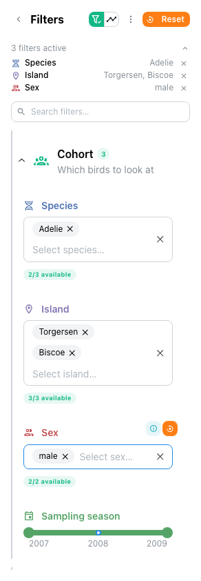
The Palmer Penguins filter set with funnelling on: Species, Island and Sex each state how many of their values are still live.
The panel header carries the two funnel controls as one attached pair: the toggle, and the overview beside it. The overview button stays mounted but disabled while funnelling is off, so switching it on does not reflow the header.
The funnel overview
The overview charts the restriction the filters apply as a whole: one band per filter, starting at the unfiltered row count and narrowing as each is applied. Every delta-backed data collection gets its own bar in each band, side by side, so a filter that guts one collection while leaving another untouched is visible at a glance. Bars can be labelled with rows, percent of start, or percent of the previous stage.
Since v1.11.0 a switch at the top of the overview picks what it counts: Rows by data collection, as above, or Values of a column. The second follows one column, picked with Data collection and Column, and charts how many of its distinct values survive each stage. A matrix under the chart shows which stage removed each value, searchable and capped at 200 rows. A stage that comes from a saved selection group takes that group's colour.
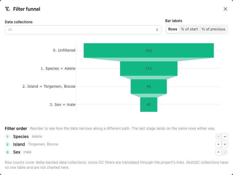
The stage order is editable, because the intermediate counts depend on the order the filters are applied in, and only the intermediate ones do.
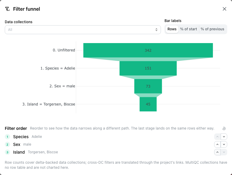
The same three filters with Sex moved ahead of Island: the middle stage reads 73 instead of 95, while the last still lands on 45 rows, because an intersection does not care about sequence. That invariant is precisely what makes the middle of the funnel the interesting part: it tells you which filter is doing the work, and reordering is how you find out.
Scope and defaults
Funnel filtering is on by default: knowing which values still lead somewhere is
rather the point of a filter panel, so authors opt out rather than in. The author-level
default is a switch in the editor's Settings → Filtering, stored on the dashboard as
funnel_filtering and round-tripping through YAML Sync;
the button in the filter panel flips it for your page view only and writes nothing, so
viewers without edit rights can still turn it off.
In this first version the live availability sets cover categorical controls (multi-select, select, segmented control); sliders and date pickers are untouched. The overview counts delta-backed data collections, so MultiQC collections, which have no row table, do not appear. Caps: 32 controls, 12 stages, 1000 values per control.
Right Panel (Visualizations)
The right panel is the main canvas where visualization components are displayed:
- Dragged to reposition
- Resized by dragging edges/corners
- Configured through component edit menus
- Cross-panel filtering - Responds to filters from the left panel
- Grouped into sections (v1.4.0+) -
grid_sectionssplits the canvas into named, foldable boxes; see Sections below - Laid out for the screen (v1.14.0+) - A read-only grid counts in half-height rows, so text and cards fit to the nearest half row while figures keep their pixels. On a phone, tiles reflow in reading order, quarter-width tiles two to a row and wider ones full width
Available component types include:
| Component Type | Description |
|---|---|
| Figures | Interactive charts and visualizations |
| Tables | Data tables with filtering and pagination |
| Cards | Summary statistics and KPIs |
| Interactive Filters | Dropdowns, sliders, and other controls |
| Text/Headers | Headings and prose; block markdown since v1.14.0 |
| Highlights | Another tab's figure, redrawn here (v1.14.0+) |
| Maps | Geospatial scatter, density and choropleth maps |
| MultiQC | Quality control report visualizations |
| Images | Display grid of static images (PNG, JPEG, SVG) |
A map can also leave the grid entirely and become a dashboard-wide panel that follows the viewer across every tab. See Components.
Future Components
Additional component types may be added in future releases based on user needs and feedback (Network Graphs, JBrowse2).
Sections (v1.4.0+)
Both panels can be grouped into named, foldable sections, each with its own icon,
colour, description and default state. grid_sections organises the main canvas and
filter_sections the left panel; a component joins one by naming it in its section
field. See YAML Sync for the schema.
The two panels draw sections differently on purpose. The grid uses a box; the filter panel uses a rail and an indent, because at panel width a box would spend its border and padding on the very filters it is meant to organise.
Folding is not just visual: a folded section fetches nothing until you open it. It still reports itself, though: a folded grid section of cards shows their numbers inline, and any other section shows a component count. A folded filter section keeps the count of active filters inside it.
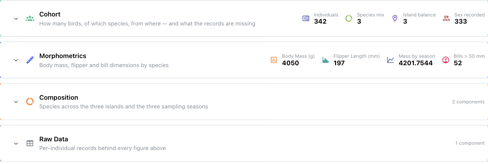
Four folded grid sections: Cohort and Morphometrics hold cards, so their numbers ride along on the header; Composition and Raw Data hold figures and a table, so they report a component count instead.
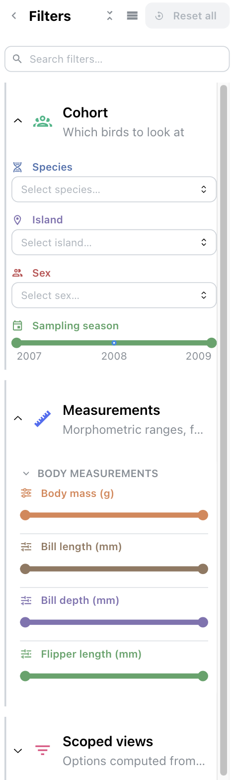
The same dashboard's filter panel, drawn with a rail and an indent rather than a box. Cohort and Measurements are open, Scoped views is folded.
Folding is remembered per viewer, in the browser: it is not part of the dashboard, so collapsing a section you are reading never changes what anyone else sees. A section that lives on every tab is remembered once for the whole dashboard rather than per tab, so it does not unfold as you move between them.
Sections on every tab (v1.6.0+)
A section normally belongs to the tab that declares it. Switch on Show on every tab and it belongs to the dashboard instead, which is what a filter everyone needs, or one table every tab refers back to, actually wants. A pin rides on the section header wherever it is drawn, so it is clear the section is shared rather than a copy someone made on each tab.
The two panels use it differently:
- a grid section renders on every other tab as well, read-only there. Its components cannot be dragged, resized or deleted from a tab that does not own them, and they never enter that tab's saved layout.
- a filter section's controls join every tab's filter panel as ordinary controls, and the values you pick in them survive a tab switch. Switching tabs loads a new page, so this is a real change: before v1.6.0 a variety picked on one tab was gone on the next, and a filter you wanted everywhere had to be rebuilt on every tab.
Position on every tab decides whether the shared section leads or trails each tab's own content: before suits a filter, after suits reference material like a raw-data table, which would otherwise push every tab's own introduction down the page. The choice applies on all tabs, the owning one included, so the section keeps the same place wherever you land.
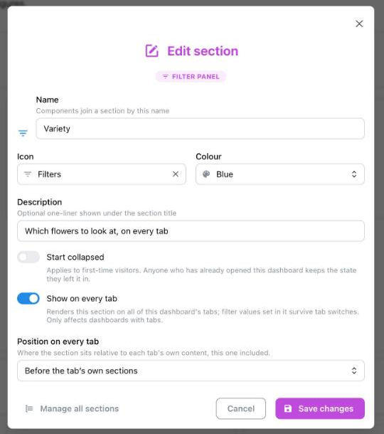
The bundled Iris demo's Variety filter section. Position on every tab appears only once Show on every tab is on.
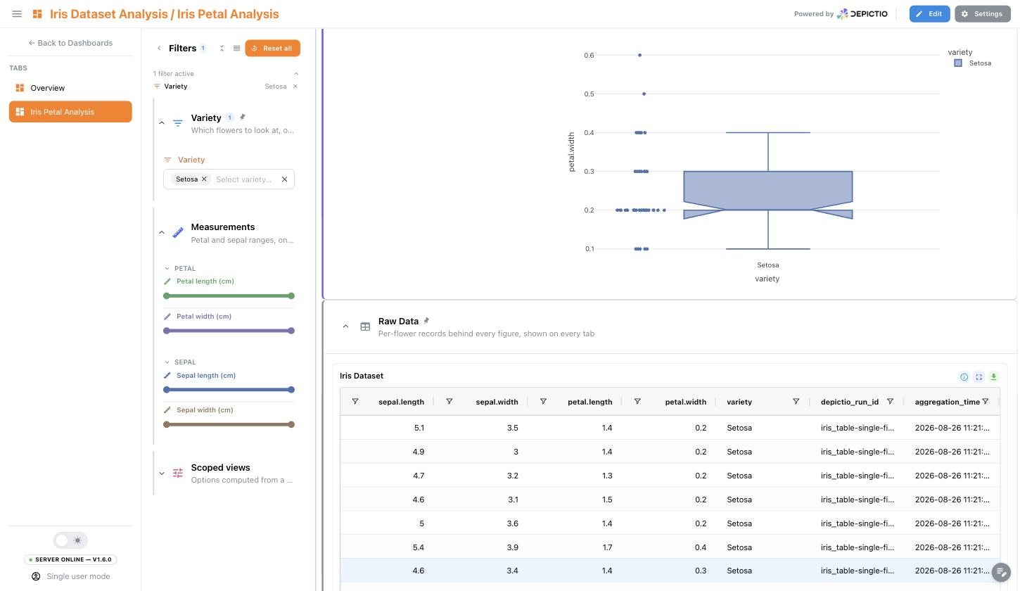
The same dashboard's second tab, Iris Petal Analysis, which declares neither section. Variety arrives in its filter panel still holding the Setosa picked on the first tab, so the figures and the pinned Raw Data table below them are already narrowed to that variety. Both headers carry the pin.
Editing stays with the tab that declares the section. From anywhere else the section's menu offers a jump to that tab rather than controls that would not work. In edit mode the section is still drawn where it will appear, so you can see the space it takes on the tab you are laying out.
What carries across a tab switch, and what does not
Only two things are carried: selections made in a floating map (which already were, before v1.6.0) and the values of controls inside a persistent filter section. A selection made by clicking a chart or picking table rows is not, nor is any ordinary per-tab control.
Carried values are held for the browser tab you are working in, so they are gone when you close it and never leak into someone else's visit. They are also dropped if the control they belong to has since been pointed at another data collection or column, rather than being replayed against data they no longer describe.
Persistent sections do nothing on a dashboard with a single tab. See
YAML Sync for the persistent and pin
keys.
Since v1.14.0 exclude_tabs lists the tabs a persistent section stays off, its own
tab included, by displayed name (the main tab by its main_tab_name), case ignored. A
landing tab that already sums up the sample sheet does not need it pinned under its own
key figures. In the section form it is Hide on these tabs, under Every tab; the
editor still draws such a section on the tab being edited, badged Hidden on this tab.
On a tab that does not own it, a pinned grid section says Filtered while a filter narrows it; folded, its cards read filtered / total, and Reset filters clears the filters.
Landing tabs (v1.14.0+)
A landing tab opens a dashboard with prose and a few chosen figures rather than a grid of analyses: what the study is, its key numbers, what the data says and which tab shows it. Every piece below is an option on an existing component or section, set in YAML or in the editor, and off by default, so a dashboard that sets none of them looks as it did.
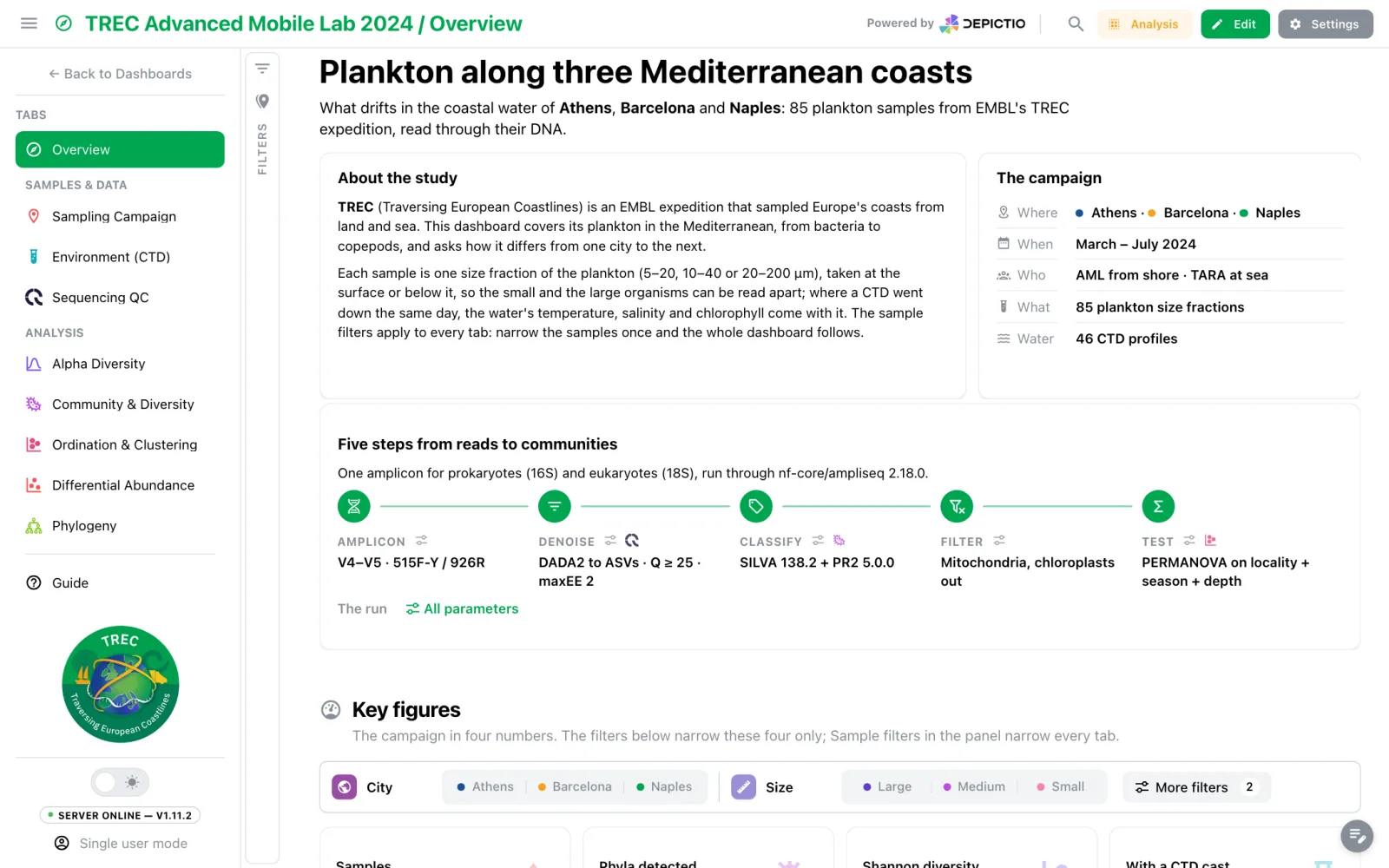
The TREC AML2024 Overview. show_tab_header: false lets the first text tile be the page
title. About the study and The campaign are framed text tiles, the campaign's colour
dots are swatches, and the five steps are a steps block whose small icons link to
the run's settings and to the tabs that show each step. See Text Components.
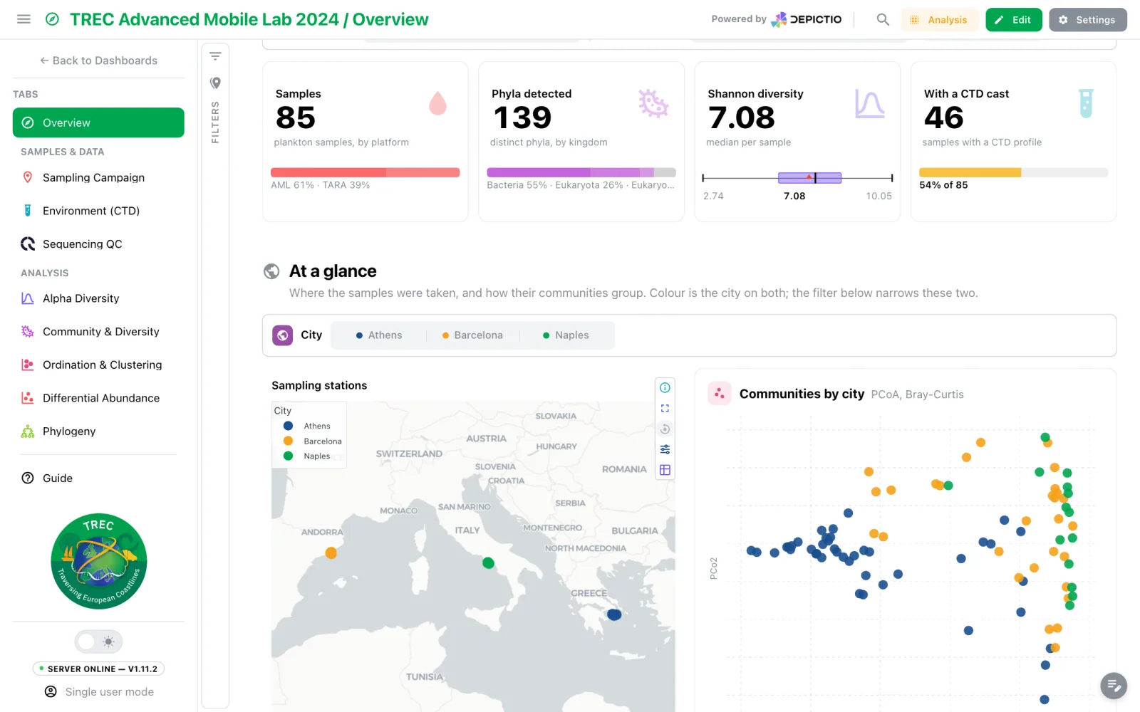
Key figures is a plain section with a filter bar of its own: City and Size, with
two more filters behind More filters, narrow its four cards and nothing else. The
cards are headline cards with a caption and fixed decimals. At a glance draws a map
and, in the minimal figure style, a PCoA, both coloured by city in the colours
category_colors gives it, written into each one's own colour map.
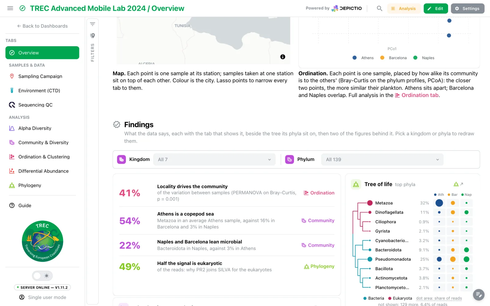
Findings: result rows whose figure takes the linked tab's colour, beside a phylogeny summary collapsed to phyla, sized by share of reads, with one column of dots per city.
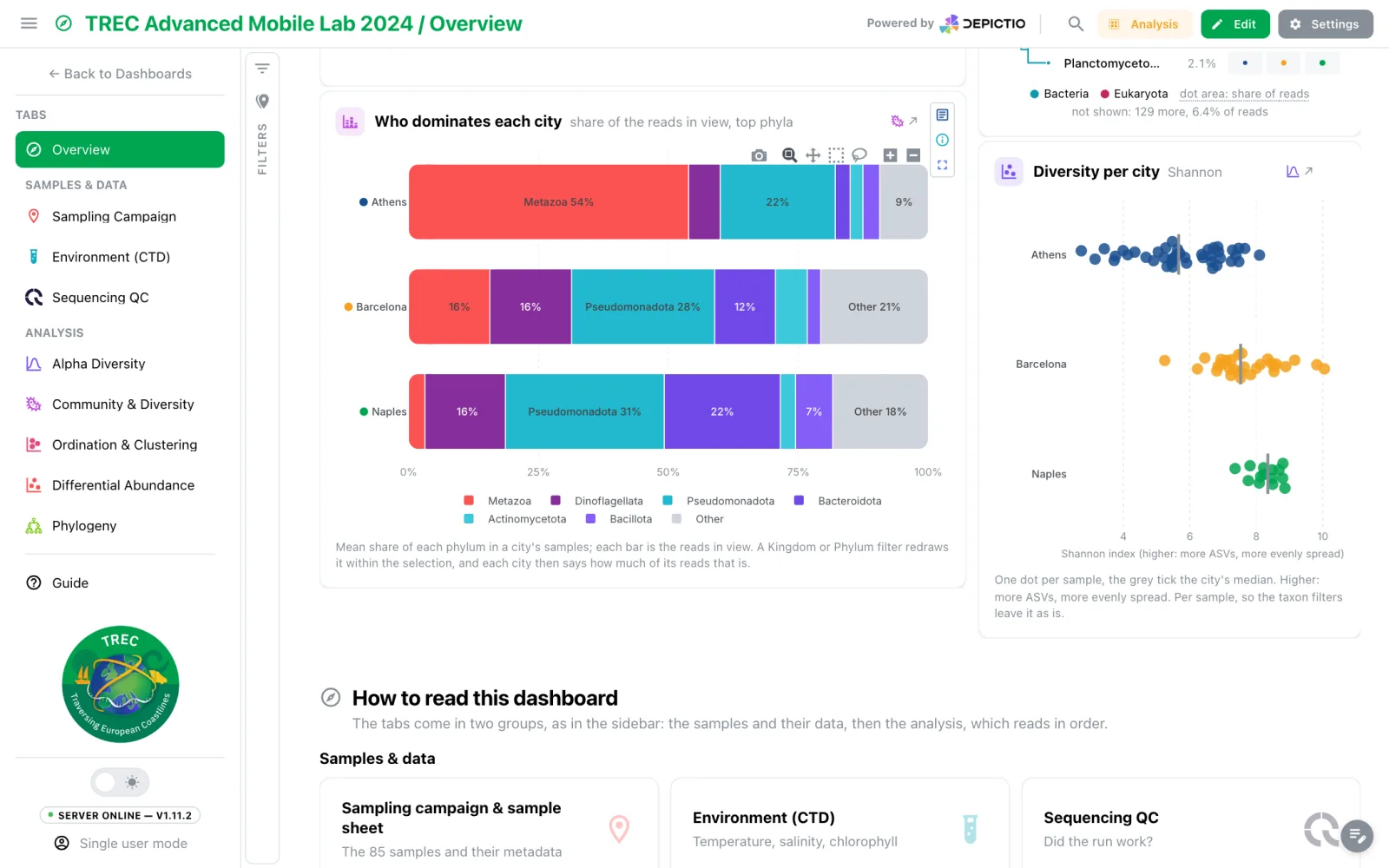
Minimal figures with a caption under the plot and a link back to their tab, then
How to read this dashboard: two lists of tab: links drawn as tab tiles, under
headings that repeat the sidebar's groups.
| Building block | Where it is documented |
|---|---|
Block markdown, tab: links, swatches, steps, framed tiles |
Text Components |
icon_style, caption, decimals, variant, link on cards |
Card Components |
figure_style: minimal, caption, link on figures |
Figure Components |
| Another tab's figure, redrawn here | Highlight |
| Phylogeny summary by rank | Phylogenetic |
| An UpSet that filters the tab | UpSet |
| Plain sections, filter bars, colours, tab defaults | Below, and YAML Sync |
Plain sections
appearance: plain draws a grid section as a heading and its description over the tiles:
no frame, no chevron, never folded. It suits tiles that are already cards. A grid section
can also set the style its members take unless they set their own: card_variant for
its cards and figure_style for its figures and advanced visualizations.
The section form groups its fields as Look, Layout, Section filters, Card and figure style and Every tab. Layout is a choice of tiles or a filter bar, each with a thumbnail saying what its filters narrow, and Plain heading sits there too.
Filter bars
The interactive components that name a bar section leave the left filter panel and are drawn as one compact row of controls. There are two kinds of bar:
| Key on the grid section | What its filters narrow |
|---|---|
display: strip |
The whole tab, like the filter panel. The section is the bar; any other members render as tiles under it |
filter_bar: true |
Only the tiles of that section, drawn under its heading. The rest of the tab, the panel and the other tabs ignore it |
A categorical control is chosen by how many values the column has:
- up to 3: a segmented control, with as many segments pressed at once as the filter allows;
- 4 to 10: a dropdown listing the values as chips in their colour;
- more than 10: a dropdown with a plain list and a search field.
A RangeSlider or Slider becomes a thin inline slider, a Switch or Checkbox a small
switch, and a date filter the panel's date picker. A Timeline (placement: top) stays out
of bars. A value carries a colour dot when its column is in category_colors (grey for a
value the map leaves out), else when the column has ten values or fewer and no more than
the colorway has colours.
visible_filters caps how many controls a bar shows before a More filters toggle,
which counts the filters folded behind it and, separately, how many of those are set; it
unfolds them in place. Unset, it is 2 on a section's own bar and every filter on a
display: strip bar. A section narrowed by its own bar shows Filtered beside its
heading, and each bar offers Reset, which clears its own controls only. A section's
bar adds to the tab's filters rather than replacing them.
On each filter, strip_label sets a shorter label for the bar (Habitat for Sampling
habitat), and strip_icon: false drops the icon badge before it. See
In a filter bar.
Category colours
category_colors, at dashboard level, gives one colour per value of a column, so a city
is the same colour on every tile: the filter bar's chips, a figure's points and bars, an
UpSet's sets, sunburst, sankey and tree colours, the map's markers (since v1.14.1), and
code figures. Child tabs inherit the main tab's map, and a child's own map overrides it
value by value.
A figure's own color_discrete_map still wins value by value. Values left out fall back
to the brand colorway, then to grey (grey on a filter chip). In code mode the map is
available as depictio_category_colors, and a code figure that sets no colours of its
own is recoloured from it when every trace name, Other aside, is a value of one
coloured column. See Code Mode.
Since v1.14.1 a dashboard can also let the import pick the colours from a
colour-blind-safe palette (auto), and a re-import keeps the colours the values
already had. See YAML Sync for the keys.
Advanced visualization controls
An advanced visualization has controls: the view, the colour, the labels. They dock next to the plot when the tile has room, so a reader sees how the figure is set without opening a menu. The tile's width decides where:
| Tile | Controls |
|---|---|
| Spans its row, and at least 720 px wide | In a column on the right of the plot |
| Narrower, and at least 300 px wide | In a row above the plot |
| Narrower than 300 px | Behind the settings icon |
- A docked panel shows its first few controls and puts the rest under More options. A view switch (volcano, MA, QQ) comes first.
- The settings icon folds a docked panel away, and back.
- Tiles in the minimal landing-page style, highlights included, keep their controls behind the icon.
Leave the placement unset
The rule needs no key. Leave the component's controls_placement unset, and leave
config.controls_placement and the dashboard's advanced_viz_controls at their
default, popover: rail or header there turn docking off for the tile. A
component can force a side with controls_placement: right, top or popover,
but the nf-core templates never set it.
Dashboard Tabs
Organize complex dashboards with tabs (v0.6.0+):
Tab Navigation
- Tabs are displayed vertically in the collapsible left navbar
- Click a tab name to switch views
- The navbar can be collapsed using the burger menu icon
- Each tab lays out its own components, apart from any section shown on every tab
Tab Features
- Multiple Tabs: Create multiple views within a single dashboard
- Custom Icons: Material Design icons for visual identification
- Custom Colors: Match your organization's theme
- Own Layouts: Each tab arranges its own components, and a tab cannot rearrange a section another tab shares with it
- Shared Settings: Theme and permissions apply across all tabs, as do sections marked Show on every tab and the filter values set in them
- Shared colours: the category colours of the main tab apply to every tab
Canvas tab header (v1.8.3+)
The canvas opens with the tab's own header rather than going straight to the grid:
its icon, its name and its description, all fields a tab already carried
and none of which were shown here before. A tab can therefore state what it is for
without spending a grid row on a text component, and a
section shown on every tab with pin: top lands below that
statement rather than introducing someone else's tab first.
Image-path icons render too, which is the only kind a MultiQC tab has; previously such a tab opened on a bare title while every other tab got its glyph.
Reading order is the authored order
The viewer sorted child tabs alphabetically while the editor sorted them by
tab_order, so a reader never saw the order the dashboard laid out. Since
v1.8.3 both honour tab_order.
Tab groups (v1.14.0+)
A child tab takes an optional tab_group, such as Samples & data or Analysis. The
sidebar lists ungrouped tabs first, then each group under a small uppercase heading, in
the order of its first tab; moving a tab up or down stays within its group. The main tab
is never grouped, and names differing only in case or spacing are one group. In the
editor, the sidebar's Add tab or group button offers Add tab or Add group,
which can move existing tabs into the new group. A group's ⋮ menu offers Rename
group… (another group's name merges the two), Add tab to this group, Move group
up / Move group down and Ungroup; a tab joins a group from its own Move to
group or the Group field of its dialog.
Tab defaults (v1.14.0+)
Three keys set what a tab opens with before a viewer has chosen otherwise. A viewer's own choice, kept in their browser, still wins.
| Key | Values | Default | Effect |
|---|---|---|---|
filter_panel_default |
open | collapsed |
open |
Whether the left filter panel starts open |
content_width_default |
full | wide | comfortable | compact |
full |
Page width on a large screen: full fills it; the others cap it at 1600, 1240 or 1080 px, centred |
show_tab_header |
bool | true |
Show the tab's icon, name and description above the canvas. Off for a tab whose first text tile is its title |
In the editor they sit under Settings → Tab defaults (Page width, Filter panel, Show the tab's name). A viewer's width is kept per tab, their filter panel per dashboard.
Creating a Tab
- In edit mode, click Add tab or group at the foot of the sidebar's tab list, then Add tab
- Enter a Tab name
- Optionally pick a Group (v1.14.0+)
- Enter an Icon (an Iconify name)
- Choose an Icon color
- Click Add Tab
Copy to tab (v1.14.0+)
In the editor, a component's ⋮ menu offers Copy to tab…, which adds a copy to another tab of the dashboard, the main tab included. The copy keeps its section when the target tab has one of that name, and a notification links to where it landed. Filters and floating maps are not offered: a filter acts on its own tab, and a filter meant for every tab belongs in a section shown on every tab.
Auto-Save Behavior
Depictio automatically saves certain changes to prevent data loss. Understanding what is and isn't auto-saved helps you work more effectively.
What IS Auto-Saved
| Action | Description |
|---|---|
| Component Creation | Adding new components to the dashboard |
| Component Edition | Modifying component configuration (data source, visualization type, etc.) |
| Component Deletion | Removing components from the dashboard |
| Tab Operations | Creating, renaming, or deleting tabs |
What is NOT Auto-Saved
| Action | Description |
|---|---|
| Layout Positions | Dragging components to new positions requires manual save |
| Interactive Filter Values | Filter selections are never saved to the dashboard. Most reset on reload; values set in a section shown on every tab are carried across tab switches for as long as the browser tab is open |
| Component Resize | Resizing components requires manual save |
Saving Layout Changes
After repositioning or resizing components, use the Save Layout button in the dashboard toolbar to persist your layout changes.
Every save, automatic or not, is also kept as a version of the dashboard, which can be previewed or restored from Settings → History in the editor. See Dashboard and data versions.
Ingestion Report & Health
Every project carries an ingestion report, answering "did all the data this dashboard needs actually land?" at a glance. What it can compare against depends on where the project came from, and since v1.6.0 a badge in the report header says which of the two you are reading:
- Template manifest — the project was created from a
pipeline template by
depictio ingest, which froze the list of data collections the template expected. The report compares that list against what was actually found and aggregated during the scan. - Live project — there is no such list, so the report is read from the collections the project declares today. It tells you which of them have data; it cannot tell you a collection is missing entirely, because nothing recorded that it was ever expected.
Templates seeded at first boot read as Live project
The nf-core projects a fresh deployment seeds for you carry no manifest. Only a
project you create yourself from a template with depictio ingest does.
Since v1.15.0 the Ingestion tab has two views, Report and
History, and, where the server allows it, a
Run ingestion button next to them. A link to the project page
ending in #ingestion-history opens the history directly.
What the report shows
The report lists every expected data collection with a status:
| Status | Meaning |
|---|---|
| Identified | Included in this configuration and files were found and/or aggregated. |
| Found zero | Included but nothing matched — no files identified and not aggregated. |
| Gated out | Intentionally excluded by a template conditional or missing-file prune (not a gap). |
Expand a row to see its files (or the Delta-table path once aggregated), and filter or group rows by status.
For a collection a recipe builds, the row also names the recipe and its Aggregation
inputs. Since v1.16.0 an input is shown as the template stores it, joined to the data
root. The server looks it up on its own disk only under depictio local, below an
allowed folder, so the report no longer tells a reader whether a file exists on the
server or where a symbolic link leads.
A Changes column (v1.15.0+) shows what the latest scan of each run
changed in that collection: +12 new, 3 updated, 1 failed, or — when nothing
changed. It is not an all-time total. The Runs identified table below gives the new
and updated counts per run, next to its number of Files.
Reading a Live project, the report drops what it cannot honestly state: Gated out
shows — rather than 0, since only a manifest records what a conditional excluded, and
the required and optional tiles count the collections that have data without a total to
measure them against.
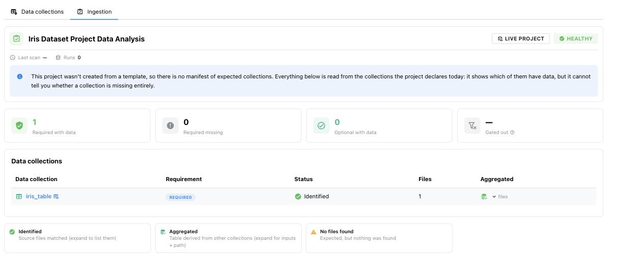
The report for a project never built from a template. Before v1.6.0 this tab was not offered at all, though the report behind it worked.
Run provenance (v1.8.3+)
Below the collections, a Run provenance card lists the parameters the pipeline
actually ran with, read from the run's own params, software-version and recap files.
Entries are grouped into accordions, each row copyable, with a full-text search across
keys and values and the source files named at the bottom.
What is collected is declared by the template, so the card is complete by construction: only keys the template explicitly excludes are omitted, and anything no group rule matches lands in Other. See Run provenance.
What triggered the run (v1.10.0+)
A project records what invoked its latest ingestion, from --triggered-by.
Anything other than a manual run shows a badge on the project's ingestion tab: a
project the Nextflow trigger ingests shows
Triggered by Nextflow, with the Nextflow logo. For a project built from a
template, its tooltip also gives the pipeline and engine versions, the number of
tools that ran and the directory that was ingested.
Health status & banner
The report rolls up into a single project health value:
- ok — every required collection was identified.
- partial — some optional collections are missing.
- missing required — a required collection is missing or empty.
When a template-derived dashboard is missing or only partially has a required collection, a dismissible health banner appears above the dashboard. The full report is reachable from any project's Ingestion tab on its project page, and from the View ingestion report row in a dashboard's Settings.
Ingestion history (v1.15.0+)
History lists this project's ingestion runs, newest first: status, what started it (Manual, Watch or UI), the command, how long it took and when it started. Expand a run for its instance, CLI version, start time, a tally of its steps, the steps as a timeline, and its error if it failed. A search box filters the runs.
From v1.16.0 the list also holds the runs the server makes for remote data: the
ingestion of a project created from a run folder,
command from_run, and each Data refresh,
command refresh_manifest. They show Manual as their trigger and one step per data
collection.
These are the runs the admin Log & Task → Ingestion pane shows, limited to this project, for anyone who can open it. Owners, editors and admins see each run in full. Other viewers, such as visitors of a public project, do not see local paths, host details, e-mail addresses or the text of each step, and a line above the list says so.
The list refreshes every 30 seconds, and every 3 seconds while a run is in progress. With
no run recorded yet, it shows the depictio ingest and depictio watch commands to start
one. It needs DEPICTIO_MONITORING_ENABLED, which is on by default.
Run ingestion (v1.15.0+)
Run ingestion starts an ingestion of the whole project on the server, without the CLI. It only works where the server can read the project's data, such as a shared volume or a mounted export, so it is off by default. When the server does not offer it, the button is not shown. An administrator turns it on as described in Starting an ingestion from the browser.
The button is shown but disabled, with the reason in its tooltip, when:
- you are not an owner or an editor of the project, or an admin;
- one of the project's data locations, single-file paths or image directories lies outside the directories the server may read, or no such directory is set;
- the server cannot find one of the project's data locations.
From v1.16.0, an s3:// or https:// location always lies outside the directories the
server may read. A project made from a run folder on S3 or from a manifest, or one with a
Remote URL collection, therefore cannot use Run ingestion: its remote collections
are re-read with Data refresh
instead. A depictio local server does not offer the button.
Run ingestion opens a dialog with an Overwrite existing tables switch. Start
runs the same steps as depictio ingest: scan, process with image upload, then joins. It
does not sync the project configuration or import dashboards, and unlike the CLI it skips
symlinks that point outside the scanned directory.
Leave Overwrite on for a project that already has data
The dialog describes the switch as rebuilding everything rather than only what
changed. In v1.15.0 it does not work that way. With the switch off, each data
collection whose Delta table already exists fails with already exists and overwrite
is disabled, as depictio data process does without --overwrite. Off is only
useful for a project that has never been ingested.
Once the run starts, the tab switches to History, where it shows as UI with the source Server in the admin pane. The button shows the current step and a progress bar. A notification reports the end: Ingestion finished, Ingestion finished with errors when some collections or joins failed, or Ingestion failed. A project runs one ingestion at a time. Starting another while one runs follows the one in progress instead (Already running). The run stops after 2 hours.
The ingestion runs as you. It reads your most recent token from the server, so it fails with sign in again when none is valid.
Sharing Dashboards
Permissions
Dashboards inherit permissions from their project:
| Role | View | Edit | Delete |
|---|---|---|---|
| Admin | Yes | Yes | Yes |
| Editor | Yes | Yes | No |
| :material-shield-eye: Viewer | Yes | No | No |
Sharing URLs
- Viewer URL:
/dashboard/{id}- Safe to share with collaborators - Editor URL:
/dashboard-edit/{id}- Only for authorized editors
Embedding a component (v1.17.0+)
One component at a time can be served to another website, as a Plotly spec for the
site's own plotly.js or as a self-contained page for an <iframe>, from the tile's
Export / embed action. The feature is off until an administrator turns it on. See
Component export and embedding.