Dashboard YAML Management
Depictio supports managing dashboards as human-readable YAML files using the depictio command-line tool. This enables Infrastructure-as-Code (IaC) workflows, version control integration, and reproducible dashboard deployments.
Implementation Reference
The DashboardDataLite model and CLI dashboard commands were introduced in PR #663. Domain validation (enum constraints, cross-field rules, server schema checks) was added in PR #684.
Overview
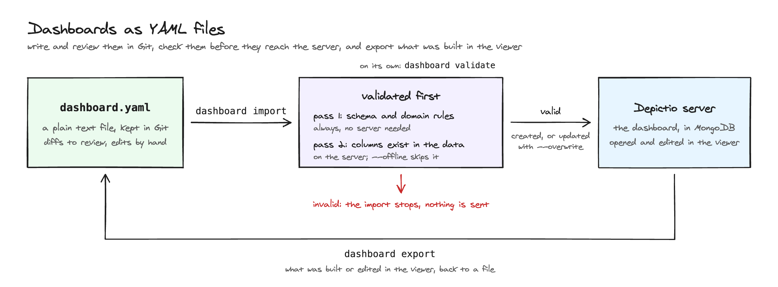
Key Benefits:
- Version Control: Track dashboard changes in Git with meaningful diffs
- Infrastructure-as-Code: Manage dashboards alongside your project configuration
- Human-Readable Format: Edit dashboards directly in YAML (60-80 lines vs 500+ in MongoDB)
- Reproducible Deployments: Import dashboards to any Depictio instance
- Early Validation: Catch invalid field values and incompatible combinations before importing
CLI Commands
The depictio dashboard command group provides three commands for YAML management. Each one takes --server, either local or a CLI configuration file; without it, the default server is used. See Which server a command uses.
| Command | Description | Server Required |
|---|---|---|
validate |
Validate YAML (schema + server schema) | Optional (for Pass 2) |
import |
Import YAML to server | Yes (unless --dry-run) |
export |
Export dashboard to YAML | Yes |
Here the Iris example dashboard is exported, edited, validated, then imported back over itself:
Validate
Validate a dashboard YAML file. Runs in two passes:
- Pass 1 — schema + domain (always, no server required): checks required fields, enum values (
visu_type,column_type), and cross-field rules (aggregation × column_type, interactive_type × column_type, mode/code_content). - Pass 2: server schema (when a server is configured): resolves each component's
workflow_tag+data_collection_tagagainst the live delta table schema, checks thatcolumn_nameexists, and validates aggregation/interactive type against the inferred column type. Without--server, it uses the default server, is skipped when that has no configuration, and reports its findings as warnings only. Skip it with--offline.
| Option | Description |
|---|---|
--server |
local, or a CLI configuration file. Default: the default server (Pass 2) |
--offline |
Skip the server schema check (Pass 1 only, useful without server access) |
Examples:
# Schema + domain, plus the server check when a default server is set up
depictio dashboard validate my_dashboard.yaml

# Full validation against the server `depictio local up` runs
depictio dashboard validate my_dashboard.yaml --server local

# Full validation against another server
depictio dashboard validate my_dashboard.yaml --server ~/.depictio/admin_config.yaml

# Schema + domain only, even when a server is configured
depictio dashboard validate my_dashboard.yaml --offline
For detailed logs, put -v before the command: depictio -v dashboard validate my_dashboard.yaml.
Example Output (all passes OK):
Validating: my_dashboard.yaml
  Pass 1: schema + domain constraints
  ✓ Schema + domain OK
  Pass 2: server schema validation
  ✓ Server schema OK

✓ Validation passed
Example Output (domain error — invalid visu_type):
Validating: my_dashboard.yaml
  Pass 1: schema + domain constraints
✗ Schema/domain validation failed
                         Validation Errors
┏━━━━━━━━━━━━━━━┳━━━━━━━━━━━┳━━━━━━━━━━━━━━━━━━━━━━━━━━━━━━━━━━━━━━━━━━━━━━━━━━━━┓
┃ Component     ┃ Field     ┃ Message                                            ┃
┡━━━━━━━━━━━━━━━╇━━━━━━━━━━━╇━━━━━━━━━━━━━━━━━━━━━━━━━━━━━━━━━━━━━━━━━━━━━━━━━━━━┩
│ pie-chart     │ -         │ Invalid visu_type 'pie' for mode='ui'.             │
│               │           │ Valid values: scatter, line, bar, box, histogram   │
│ treemap-chart │ -         │ Invalid visu_type 'treemap' for mode='ui'.         │
│               │           │ Valid values: scatter, line, bar, box, histogram   │
└───────────────┴───────────┴────────────────────────────────────────────────────┘
Import
Import a dashboard YAML file to the server. Always runs schema + domain validation first (Pass 1). Also runs server schema validation by default (Pass 2); skip it with --offline.
| Option | Description |
|---|---|
--server |
local, or a CLI configuration file. Default: the default server (none needed with --dry-run) |
--project, -p |
Project ID (overrides project_tag in YAML) |
--overwrite |
Update existing dashboard with same title |
--dry-run |
Validate schema + domain only, don't import (no server needed) |
--offline |
Skip server schema check (column names not verified) |
Validation before import
dashboard import always validates your YAML before sending it to the server. A failed validation aborts the import — you never import a dashboard that fails schema or domain checks.
Examples:
# Schema + domain validation only (no server, no import)
depictio dashboard import dashboard.yaml --dry-run

# Full validation + import into the server `depictio local up` runs
depictio dashboard import dashboard.yaml --server local

# Full validation + import into another server
depictio dashboard import dashboard.yaml --server ~/.depictio/admin_config.yaml

# Import without server schema check
depictio dashboard import dashboard.yaml --server ~/.depictio/admin_config.yaml --offline

# Update existing dashboard with same title
depictio dashboard import dashboard.yaml --server ~/.depictio/admin_config.yaml --overwrite

# Override project from YAML
depictio dashboard import dashboard.yaml --server ~/.depictio/admin_config.yaml --project 646b0f3c1e4a2d7f8e5b8c9a
Example Output:
Validating: dashboard.yaml
  Checks: schema + domain constraints
✓ Validation passed
  Title: Iris Dashboard Demo
  Components: 7
  Project: Iris_Dataset_Project (from YAML project_tag)

• Server: http://127.0.0.1:8058 (local server, as no ~/.depictio/CLI.yaml exists; configuration ~/.depictio/local/cli/admin_config.yaml)

Validating column names against server schema...
✓ Server schema OK

Importing dashboard (project: Iris_Dataset_Project)...
✓ Dashboard imported successfully!
  Dashboard ID: 6824cb3b89d2b72169309737
  Title: Iris Dashboard Demo
  Project ID: 650a1b2c3d4e5f6a7b8c9d0e

View at: http://127.0.0.1:8058/dashboard/6824cb3b89d2b72169309737
Re-importing a dashboard
Without --overwrite, importing a title the project already has fails with a conflict.
With it, the import replaces that dashboard with the YAML's: layout and components
edited in the viewer since are lost.
For a multi-tab YAML (main_dashboard and tabs), the main dashboard and each tab the
YAML holds are replaced, matched by title. What else happens:
- Tabs added in the viewer stay. They come from no YAML, so no import replaces them.
- Tabs the YAML no longer holds (renamed or removed in the file) are removed when the
import knows which file each tab came from: a template refresh with
depictio ingest --reset-dashboards(see Refreshing a project).depictio dashboard import --overwritematches by title only and leaves such a tab in place: delete it in the viewer. - Colours resolved from
autoare kept: each value keeps the colour it already had.
Every import, the first one included, also drops what the project's data cannot fill: a highlight (a figure redrawn from another tab) whose source tab or figure is gone, and each list item of a text tile that cites a live value whose data collection is missing or empty in the project.
Export
Export a dashboard from the server to a YAML file.
| Option | Description |
|---|---|
--server |
local, or a CLI configuration file. Default: the default server |
--output, -o |
Output file path (default: dashboard.yaml) |
Examples:
# Export to default file, from the default server
depictio dashboard export 6824cb3b89d2b72169309737

# Export to specific file, from another server
depictio dashboard export 6824cb3b89d2b72169309737 --server ~/.depictio/admin_config.yaml -o iris_dashboard.yaml
YAML Format
DashboardDataLite Structure
The lite format is designed for human readability:
title: Dashboard Title
subtitle: Optional subtitle
project_tag: Project_Name

grid_sections: []      # optional — see Dashboard Sections below
filter_sections: []    # optional
autofit: true          # optional (v1.13.0+) — see Tile height below
advanced_viz_controls: popover   # optional (v1.13.0+) — popover, rail or header

components:
  - tag: component-identifier
    component_type: figure|card|text|highlight|interactive|table|image|multiqc|map|advanced_viz
    workflow_tag: engine/workflow_name
    data_collection_tag: dc_tag
    section: Section Name   # optional — the section this component belongs to
    layout: {x: 0, y: 0, w: 6, h: 4, fit: fixed}   # optional; fit is v1.13.0+
    # Component-specific fields...
Tile height and control placement (v1.13.0+)
A tile takes the height its content needs, within bounds set per component type, and the tiles of one grid row are levelled to the same height. Two keys decide which tiles do this:
| Key | Where | Default | Meaning |
|---|---|---|---|
autofit |
dashboard | true |
false turns content-fitting off for the whole dashboard: every tile keeps the height of its layout |
fit |
a component's layout block |
per type | auto follows the content, fixed keeps the layout height. Unset, text, card, table and advanced visualization tiles follow their content, while figure and MultiQC tiles keep their height, since their aspect ratio is an authoring choice |
Resizing a tile by hand in the editor writes fit: fixed on it, so a height set on purpose is
never overridden. The height is only pinned at the grid breakpoint the dashboard is saved at.
advanced_viz_controls sets where the controls of every advanced visualization on the
dashboard sit: behind the settings icon (popover), in a rail beside the plot (rail) or
under the tile title (header). A tile's own controls_placement wins over it. See
Shared settings.
title: Variant QC
autofit: true
advanced_viz_controls: header
components:
  - tag: coverage-by-sample
    component_type: figure
    layout: {x: 0, y: 0, w: 6, h: 5, fit: auto}   # let this figure grow with its legend
Dashboard Sections (v1.4.0+)
Two independent lists group a dashboard into named, foldable sections: grid_sections
organises the main canvas, filter_sections organises the left filter panel. A component
joins one by naming it in its own section field.
grid_sections:
  - name: Cohort
    icon: mdi:counter
    color: teal
    description: How many samples, and of what
    collapsed: false
  - name: Quality control
    icon: mdi:check-decagram
    color: orange
    collapsed: true

filter_sections:
  - name: Sample
    icon: mdi:test-tube
    color: blue

components:
  - tag: sample-count
    component_type: card
    section: Cohort
    # ...
  - tag: habitat-filter
    component_type: interactive
    section: Sample
    # ...
| Field | Type | Default | Description |
|---|---|---|---|
name |
str | required | Matched against each component's section |
icon |
str | null |
Iconify id, drawn in the section header |
color |
str | null |
Mantine palette name (teal, orange, …). An unknown name falls back to the theme default rather than failing the import |
description |
str | null |
Hint line under the header |
collapsed |
bool | false |
Start folded |
persistent |
bool | false |
Render on every tab of the dashboard (v1.6.0+) |
pin |
str | top |
top or bottom: which edge a persistent section sits at. Ignored unless persistent (v1.6.0+) |
exclude_tabs |
list[str] | null |
Tabs a persistent section is not shown on, by displayed name (the main tab by its main_tab_name, the owning tab included). Ignored unless persistent (v1.14.0+) |
appearance |
str | box |
box, or plain: a heading over the tiles, no frame, never folded. Grid sections only (v1.14.0+) |
card_variant |
str | null |
default, headline, compact, minimal, accent or split: style of every card in the section that sets no variant of its own. Grid sections only (v1.14.0+) |
figure_style |
str | null |
default or minimal: style of every figure and advanced visualization in the section that sets no figure_style of its own. Grid sections only (v1.14.0+) |
display |
str | null |
grid (same as unset): one tile per member; strip: the section is a filter bar that filters the whole tab. Grid sections only (v1.14.0+) |
filter_bar |
bool | null |
A filter bar under the section's heading that narrows only its own tiles. Ignored with display: strip (v1.14.0+) |
visible_filters |
int (≥1) | null |
Controls a bar shows before More filters. Unset: 2 on a filter_bar, all on a display: strip bar (v1.14.0+) |
Both lists default to empty, so a dashboard that declares no sections renders exactly the flat grid it did before.
What section accepts
sectionis valid on every component type, not just interactive ones.- A component with no
sectionrenders above the first section. - Section specs reject unknown keys outright, so a typo fails the import rather than being silently ignored.
- An interactive
groupmay not span two sections — grouped controls must sit together, or the import fails with "Interactive component groups must sit in a single section". - Folding is not just visual: a folded section fetches nothing until you open it.
Sections on every tab (v1.6.0+)
persistent: true hands a section to the whole dashboard instead of the tab that declares
it. The flag is valid in both lists, and means something slightly different in each:
- a grid section renders on every other tab too, read-only, above or below that tab's own content;
- a filter section's controls join every tab's filter panel, and the values picked in them survive a tab switch.
pin chooses which edge it sits at, on every tab including the one that declares it:
top (the default) before that tab's own sections, bottom after them. bottom is what
a reference block usually wants: a raw-data table present everywhere without pushing
aside each tab's own introduction.
filter_sections:
  - name: Variety
    icon: mdi:filter-variant
    color: blue
    description: Which flowers to look at, on every tab
    persistent: true          # pin defaults to top

grid_sections:
  - name: Raw Data
    icon: mdi:table
    color: gray
    description: Per-flower records behind every figure
    collapsed: true
    persistent: true
    pin: bottom
Only the declaring tab lists the section and its components; the other tabs say nothing about it and receive it automatically. This is the bundled Iris demo, whose Overview tab declares both of the above while Iris Petal Analysis declares neither and shows both.
How a persistent section behaves
- Sections are still matched by name, so two tabs may each declare a persistent section called Filters without colliding: identity is the declaring tab plus the list plus the name.
- A tab cannot edit a section it does not declare. In the editor the section's menu offers a jump to the tab that owns it instead.
- Folding is shared: folding a persistent section on one tab folds it on all of them.
pinaccepts onlytoporbottom; anything else fails the import.- Both keys round-trip through
dashboard exportunchanged. - Neither key does anything on a dashboard with a single tab.
Funnel filtering (v1.7.0+)
funnel_filtering is a dashboard-level boolean deciding whether the filter panel marks
which values still lead to a non-empty result. It defaults to true, so it only needs
writing when opting a dashboard out:
The key round-trips through dashboard export / import like any other dashboard field.
What the flag does and does not control
- It is the author's default, not a lock. The button in the filter panel flips funnelling for a single page view without writing anything, so a viewer with no edit rights can still turn it off, and a viewer turning it on cannot change what the next person sees.
- A dashboard saved before v1.7.0 has no such key. Readers test
!== falserather than truthiness, so an absent value inherits the funnel rather than falling throughundefinedto off; only an explicitfalseopts out. - It gates both affordances at once: the per-value highlighting and the funnel overview button.
See Funnel filtering for what it looks like in the panel.
Landing-tab keys (v1.14.0+)
Tab-level keys for a landing tab. Each is left out of an export while it holds its default.
| Key | Type | Default | Description |
|---|---|---|---|
tab_group |
str | null |
Sidebar group of a child tab. See Tab groups |
filter_panel_default |
open | collapsed |
open |
Where the filter panel starts. See Tab defaults |
content_width_default |
full | wide | comfortable | compact |
full |
The page width the tab opens at |
show_tab_header |
bool | true |
Show the tab's icon, name and (child tabs) description above the canvas |
category_colors |
dict[str, dict[str, str]] | null |
One colour per value of a column. Child tabs inherit the main tab's, and a child's own map overrides it per value. See Category colours |
show_guide |
bool | true |
Offer the Guide. Read from the main tab |
guide_intro |
str | "" |
Markdown note shown at the top of the Guide. Read from the main tab |
title: TREC Advanced Mobile Lab 2024
main_tab_name: Overview
filter_panel_default: collapsed
content_width_default: comfortable
show_tab_header: false
guide_intro: Start with **Key figures**, then follow the tabs in order.
category_colors:
  locality: {Athens: "#1f4e8c", Barcelona: "#f59f00", Naples: "#2b8a3e"}

grid_sections:
  - name: Key figures
    icon: mdi:gauge
    appearance: plain
    card_variant: headline
    filter_bar: true          # City and Size narrow these cards only
  - name: At a glance
    appearance: plain
    figure_style: minimal

components:
  - tag: city-filter
    component_type: interactive
    interactive_component_type: MultiSelect
    column_name: locality
    section: Key figures
    strip_label: City
    # workflow_tag, data_collection_tag, ...
A child tab's YAML adds tab_group: Analysis beside its parent_dashboard_tag. An export
writes a filter's strip_label and strip_icon under its display: block, like a card's
display keys; the import reads them there or at the top level, as above.
Since v1.14.0 an export also keeps what a round trip used to drop: a component's
description, a text tile's body, level and alignment, a figure's header and style keys,
and an advanced visualization's viz_kind and config, the latter without the keys left
at their default.
Category colours
category_colors gives each value of a categorical column one colour, which figures,
advanced visualizations, maps and filter chips all use. Declare it on the main tab
(main_dashboard in a multi-tab YAML): the child tabs inherit it, so a value has the
same colour on every tab.
main_dashboard:
  title: nf-core/ampliseq
  category_colors:
    "{GROUP_COL}": auto            # in a template, a variable works as a key
    Kingdom:
      "*": auto                    # every value not pinned below
      Unclassified: "#adb5bd"
    Phylum:
      "*": "auto:rel_abundance"    # the largest phyla by summed rel_abundance
      Other: "#adb5bd"
| Entry | Colours |
|---|---|
column: {value: "#hex", …} |
The values listed. Other values take the dashboard's colorway, then grey |
column: auto |
Every value of the column, from an 8-colour, colour-blind-safe palette, in natural order (S2 before S10) |
column: {"*": auto, value: "#hex"} |
The pinned values as written, every other value from the palette colours the pins leave free |
column: {"*": "auto:<column>"} |
The values ranked by the sum of the numeric <column>, largest first, until the palette runs out. The rest get no fixed colour |
The import turns auto into plain colours, read from a table of the project that has
the column (the metadata or sample sheet first). An export writes those colours.
What auto does and does not do
- A re-import keeps the colour each value already had, so a refresh never reshuffles them. That colour comes before a pin added since.
- Plain
autoon a column with more values than free palette colours colours none of them. Useauto:<column>for such a column (phyla, genera), and pinOtherandUnclassifiedbeside it. - With
auto:<column>, one table must hold both columns. - A column that no table of the project holds is dropped, its pins included.
"*"only takesautoorauto:<column>, andautois only valid there or as the whole entry. Anything else fails validation.
See Category colours for how the viewer uses them.
Complete Example
title: Iris Dashboard Demo
subtitle: Sample analysis dashboard
project_tag: Iris_Dataset_Project

grid_sections:              # optional — foldable groups in the main canvas
  - name: Overview
    icon: mdi:counter
    color: teal
  - name: Distributions
    icon: mdi:chart-box
    color: violet

filter_sections:            # optional — foldable groups in the left filter panel
  - name: Sample
    icon: mdi:test-tube
    color: blue

components:
  # Figure: Box plot
  - tag: box-variety-sepal-length
    component_type: figure
    workflow_tag: python/iris_workflow
    data_collection_tag: iris_table
    section: Distributions
    visu_type: box
    dict_kwargs:
      x: variety
      y: sepal.length
      color: variety
      title: Sepal Length by Variety

  # Figure: Scatter plot
  - tag: scatter-sepal-petal
    component_type: figure
    workflow_tag: python/iris_workflow
    data_collection_tag: iris_table
    section: Distributions
    visu_type: scatter
    dict_kwargs:
      x: sepal.length
      y: petal.length
      color: variety

  # Card: Metric with aggregation
  - tag: sepal-length-average
    component_type: card
    workflow_tag: python/iris_workflow
    data_collection_tag: iris_table
    section: Overview
    aggregation: average
    column_name: sepal.length
    icon_name: mdi:leaf
    icon_color: "#8BC34A"

  # Interactive: MultiSelect filter
  - tag: variety-filter
    component_type: interactive
    workflow_tag: python/iris_workflow
    data_collection_tag: iris_table
    section: Sample
    interactive_component_type: MultiSelect
    column_name: variety
    custom_color: "#858585"

  # Interactive: RangeSlider filter
  - tag: sepal-length-filter
    component_type: interactive
    workflow_tag: python/iris_workflow
    data_collection_tag: iris_table
    section: Sample
    interactive_component_type: RangeSlider
    column_name: sepal.length

  # Table: Data display
  - tag: data-table
    component_type: table
    workflow_tag: python/iris_workflow
    data_collection_tag: iris_table

  # Image: Gallery component
  - tag: sample-gallery
    component_type: image
    workflow_tag: python/image_workflow
    data_collection_tag: sample_images
    image_column: image_path
    thumbnail_size: 150
    columns: 3
    max_images: 9

  # MultiQC: Quality control report
  - tag: fastqc-quality
    component_type: multiqc
    workflow_tag: python/nf_workflow
    data_collection_tag: multiqc_report
    selected_module: fastqc
    selected_plot: per_base_sequence_quality

  # Figure: Clustered heatmap
  - tag: gene-expression-heatmap
    component_type: figure
    workflow_tag: python/bio_workflow
    data_collection_tag: expression_matrix
    visu_type: heatmap
    dict_kwargs:
      index_column: gene_name
      row_annotations: [gene_type]
      cluster_rows: true
      normalize: zscore

  # Map: Scatter map with selection
  - tag: sampling-map
    component_type: map
    workflow_tag: python/my_workflow
    data_collection_tag: sample_metadata
    lat_column: latitude
    lon_column: longitude
    color_column: biome
    hover_columns: [sample_id, site_name]
    map_style: carto-positron
    selection_enabled: true
    selection_column: sample_id
Component Types Reference
| Type | Description | Required Fields |
|---|---|---|
figure |
Plotly charts (scatter, box, heatmap, etc.) | visu_type (ui mode) or code_content (code mode) |
card |
Metric cards with aggregations | aggregation, column_name |
interactive |
Filters (RangeSlider, MultiSelect, etc.) | interactive_component_type, column_name |
table |
Data tables | (none required — title auto-generated from DC tag) |
text |
Headings and prose tiles | (none required — title is the heading, body the prose) |
image |
Image galleries from S3/MinIO | image_column |
multiqc |
MultiQC quality control report viewer | selected_module, selected_plot |
map |
Geospatial maps (scatter, density, choropleth) | lat_column, lon_column (scatter/density) or locations_column, GeoJSON source (choropleth) |
Figure Component
Two rendering modes are supported:
UI Mode (default) — select a chart type and pass Plotly Express parameters:
- tag: scatter-plot
  component_type: figure
  workflow_tag: python/workflow_name
  data_collection_tag: table_dc
  visu_type: scatter       # see valid values below
  dict_kwargs:
    x: column_x
    y: column_y
    color: category_column
    title: Chart Title
Valid visu_type values (UI mode): scatter, line, bar, box, violin (v1.13.0+), histogram, ecdf, strip, area, funnel, density_heatmap, density_contour (v1.15.0+), heatmap
Code Mode — write arbitrary Python/Plotly code for full flexibility:
- tag: custom-plot
  component_type: figure
  workflow_tag: python/workflow_name
  data_collection_tag: table_dc
  mode: code
  code_content: |
    import plotly.express as px
    fig = px.scatter_matrix(df, dimensions=["sepal.length", "sepal.width", "petal.length"])
ComplexHeatmap — clustered heatmap with annotations (via plotly-complexheatmap):
- tag: gene-expression-heatmap
  component_type: figure
  workflow_tag: python/workflow_name
  data_collection_tag: expression_dc
  visu_type: heatmap
  dict_kwargs:
    index_column: gene_name
    value_columns: [sample_A, sample_B, sample_C]
    row_annotations: [gene_type, pathway]
    cluster_rows: true
    cluster_cols: true
    normalize: zscore
    colorscale: RdBu_r
    split_rows_by: gene_type
    cluster_method: ward
    cluster_metric: euclidean
Heatmap dict_kwargs parameters:
| Parameter | Type | Description |
|---|---|---|
index_column |
string | Column for row labels |
value_columns |
list | Numeric columns for the matrix (omit for all numeric) |
row_annotations |
list | Columns shown as colored side bars |
cluster_rows / cluster_cols |
bool | Enable hierarchical clustering |
normalize |
string | zscore, minmax, or none |
colorscale |
string | Plotly colorscale (e.g. RdBu_r, Viridis) |
split_rows_by |
string | Split heatmap rows by annotation column |
cluster_method |
string | ward, average, complete, single |
cluster_metric |
string | euclidean, correlation, cosine |
Code mode and visu_type
visu_type is not validated when mode: code. Any Plotly chart can be built in code mode. code_content must be non-empty when mode: code.
Selection filtering — enable lasso/box selection to filter linked components:
- tag: scatter-with-selection
  component_type: figure
  visu_type: scatter
  selection_enabled: true
  selection_column: sample_id   # required when selection_enabled=true
  # ...
Card Component
Single-metric card:
- tag: metric-card
  component_type: card
  workflow_tag: python/workflow_name
  data_collection_tag: table_dc
  aggregation: average
  column_name: numeric_column
  column_type: float64     # optional — enables offline aggregation validation
  icon_name: mdi:chart-line
  icon_color: "#2196F3"
Multi-metric summary card — secondary aggregations displayed below the hero value:
- tag: petal-length-summary
  component_type: card
  workflow_tag: python/iris_workflow
  data_collection_tag: iris_table
  aggregation: average           # hero metric (large display)
  aggregations:                  # secondary metrics (compact rows)
    - median
    - std_dev
    - min
    - max
  secondary_layout: grid         # optional — how the block below the hero is drawn
  column_name: petal.length
  column_type: float64
  icon_name: mdi:leaf
  icon_color: "#43A047"
  title: "Petal Length"
aggregations is read by the four list-driven layouts (vertical, the default;
compact; grid; box_plot). The other twelve secondary_layout values compute their
own block and ignore it — see the field table below.
Number format — format sets how the value and its secondary print:
format |
Prints |
|---|---|
percent |
A 0 to 1 share as a percentage: 41%, 4.7% under 10%, 0.032% under 1% |
si |
A large value with a suffix: 214k, 3.7M, 1.2G |
integer |
A whole number with thousands separators |
decimals:N |
N decimals (0 to 6), kept as written so a row of values lines up |
format and decimals are exclusive, and percent is refused on a count or
nunique card. Unset, a value keeps fewer decimals as it grows (3,641, 12.35,
0.123, 0.00032). The same names apply to text live values.
- tag: mapped-share
  component_type: card
  workflow_tag: python/samples_workflow
  data_collection_tag: samples
  aggregation: median
  column_name: mapped_fraction
  column_type: float64
  format: percent
Conditional aggregation — pre-filter data before computing metrics:
- tag: high-coverage-count
  component_type: card
  workflow_tag: python/samples_workflow
  data_collection_tag: samples
  aggregation: count
  column_name: sample_id
  column_type: object
  filter_expr: "(col('coverage') >= 30) & (col('quality_score') > 80)"
  icon_name: mdi:filter-check-outline
  icon_color: "#F4511E"
  title: "High-Quality Samples"
filter_expr accepts a Polars expression string. See Filter Expressions for the full reference.
Aggregation × column_type compatibility:
| column_type | Valid aggregations |
|---|---|
int64 |
count, nunique, sum, average, median, min, max, range, variance, std_dev, percentile, q1, q3, box_plot_stats, skewness, kurtosis |
float64 |
count, nunique, sum, average, median, min, max, range, variance, std_dev, percentile, q1, q3, box_plot_stats, skewness, kurtosis |
bool |
count, sum, min, max |
datetime |
count, min, max |
timedelta |
count, sum, min, max |
category |
count, mode |
object |
count, mode, nunique |
column_type is optional
If you omit column_type, validation against the compatibility table is skipped offline. When a server is configured (--server, or the default server), the column type is inferred from the server schema and used for validation automatically.
Secondary layout fields — secondary_layout picks how the block under the hero value is
drawn, and each layout reads one companion field. The full list of layouts and what they
render is in Components.
| Field | Type | Default | Read by |
|---|---|---|---|
secondary_layout |
str | vertical |
(picks the layout) — one of the 16 modes |
aggregations |
list[str] | null |
vertical, compact, grid, box_plot |
breakdown_col |
str | null |
top_n, concentration, composition, donut |
top_n_count |
int (1–5) | 3 |
top_n, concentration, composition, donut |
coverage_max |
float | null |
coverage, gauge |
threshold_value (v1.4.0+) |
float | null |
threshold — the QC cut-off; without it the strip is not drawn |
threshold_direction (v1.4.0+) |
min | max |
min |
threshold — min is at-least (coverage, %Q30), max is at-most (duplication, contamination) |
threshold_warn (v1.4.0+) |
float | null |
threshold — must lie on the failing side of threshold_value (below it for min, above it for max), and needs threshold_value. Since v1.13.0 a warn value on the passing side fails validation instead of being dropped |
follow_region_filter (v1.13.0+) |
bool | false |
Any layout — let a genome region brushed on the dashboard narrow the card. See Which components follow a region |
attrition_cols (v1.4.0+) |
list[str] | [] |
attrition — ordered stage columns after the card's own, never re-sorted by value |
trend_col (v1.4.0+) |
str | null |
trend — the ordered column the sparkline buckets along |
# Pass/warn/fail against a QC cut-off
- tag: mean-coverage
  component_type: card
  workflow_tag: python/samples_workflow
  data_collection_tag: samples
  aggregation: average
  column_name: coverage
  column_type: float64
  secondary_layout: threshold
  threshold_value: 30
  threshold_warn: 20
  threshold_direction: min
  title: "Mean Coverage"
Interactive Component
# MultiSelect — for categorical/text columns
- tag: category-filter
  component_type: interactive
  workflow_tag: python/workflow_name
  data_collection_tag: table_dc
  interactive_component_type: MultiSelect
  column_name: category

# RangeSlider — for numeric columns
- tag: numeric-filter
  component_type: interactive
  workflow_tag: python/workflow_name
  data_collection_tag: table_dc
  interactive_component_type: RangeSlider
  column_name: value
  column_type: float64     # optional — enables offline type compatibility check

# DateRangePicker — for datetime columns
- tag: date-filter
  component_type: interactive
  workflow_tag: python/workflow_name
  data_collection_tag: table_dc
  interactive_component_type: DateRangePicker
  column_name: sample_date
Scoped interactive component — pre-filter data to restrict available options:
# Only show varieties present in rows where petal.length > 4
- tag: long-petal-variety-filter
  component_type: interactive
  workflow_tag: python/iris_workflow
  data_collection_tag: iris_table
  interactive_component_type: MultiSelect
  column_name: variety
  column_type: object
  filter_expr: "col('petal.length') > 4"
  title: "Varieties (petal > 4 cm)"
filter_expr scopes the component's options/range to the filtered subset. See Filter Expressions.
Initial values and slider options (v1.13.0+)
| Field | Type | Applies to | Meaning |
|---|---|---|---|
default_value |
value or list | Select, MultiSelect (list allowed), SegmentedControl, Slider (number), Checkbox, Switch |
The value the filter starts with, and returns to on Reset all |
default_range |
[low, high] |
RangeSlider (numbers), DateRangePicker (ISO dates) |
The range the filter starts with |
slider_mode |
gte, gt, lte, lt, eq, ne |
Slider |
How the column is compared with the slider's value. gte (keep rows at or above it) by default |
show_histogram |
bool | RangeSlider |
Draw the column's distribution above the slider track, on the same scale, so a threshold is placed against the data. Off by default |
show_mark_labels (v1.17.0+) |
bool | Slider, RangeSlider |
false keeps the tick marks but drops their values. Unset, every tick is labelled |
A default on the wrong control fails validation: default_value on a RangeSlider, a list on
a Slider, or a default_range whose low end is above its high end.
- tag: min-depth
  component_type: interactive
  workflow_tag: python/workflow_name
  data_collection_tag: table_dc
  interactive_component_type: Slider
  column_name: depth
  default_value: 10        # rows with depth >= 10 at first load
- tag: qvalue-range
  component_type: interactive
  workflow_tag: python/workflow_name
  data_collection_tag: table_dc
  interactive_component_type: RangeSlider
  column_name: qvalue
  default_range: [0, 0.05]
  show_histogram: true
A Slider is a threshold since v1.13.0
A single-value Slider used to keep only the rows equal to its value. It now keeps the
rows at or above it. Set slider_mode: eq on a slider that should keep the exact match.
Interactive type × column_type compatibility:
| column_type | Valid interactive_component_type |
|---|---|
int64 |
Slider, RangeSlider |
float64 |
Slider, RangeSlider |
datetime |
DateRangePicker |
category |
Select, MultiSelect, SegmentedControl |
object |
Select, MultiSelect, SegmentedControl |
bool |
(not yet supported) |
timedelta |
(not supported) |
Table Component
- tag: data-table
  component_type: table
  workflow_tag: python/workflow_name
  data_collection_tag: table_dc
  page_size: 25            # rows per page (default: 100)
  columns: [col1, col2]   # optional: allowlist of visible columns (omit to show all)
  compact: false          # optional: tighter row and header heights (default: false)
  title: "Sample Data"    # optional: auto-generated from DC tag if omitted
  description: "Complete measurements across all samples"  # optional subtitle
  title_size: h3          # h1, h2, h3, or sm (default: sm)
  title_align: left       # left (default), center, or right
Title / description fields are rendered as a header above the AG Grid table. When title is omitted, it is auto-generated from data_collection_tag.
Text Component
Headings and prose used to document and organise a dashboard. Text tiles bind to no data
source, so workflow_tag and data_collection_tag are unused.
- tag: section-overview
  component_type: text
  title: Within-Sample Diversity
  order: 2                    # heading level H1–H6 (default: 1)
  alignment: left             # horizontal: left (default), center, right
  vertical_alignment: center  # vertical: top, center (default), bottom
  body: |
    Shannon, observed features and Faith's PD measure within-sample
    richness and evenness.
| Field | Type | Default | Description |
|---|---|---|---|
order |
int (1–6) | 1 |
Heading level, H1 through H6 |
alignment |
left | center | right |
left |
Horizontal alignment of the title and body |
vertical_alignment |
top | center | bottom |
center |
Where the text block sits vertically in its tile |
body |
str | "" |
Optional paragraph below the heading. Block markdown since v1.14.0, see Components |
values |
map | null |
Live values the title and body print, see Live values |
surface (v1.14.0+) |
none | card | tinted |
none |
Bare prose, a framed card, or a tinted tile |
accent (v1.14.0+) |
str | null | null |
Palette name, CSS colour or tab:<name>: the tint of a tinted tile and the marks of a step flow; a tab: accent also rests the tab's icon in a card's corner. Ignored without a frame |
vertical_alignment defaults to center (v1.4.0+)
Set vertical_alignment: top for the pre-v1.4.0 rendering. See
Components for why the default changed.
Live values
A text tile can print values computed from the data. Declare each one under values,
then cite it as {{name}} in the title or the body. {{param:KEY}} prints a pipeline
parameter of the run, read from the project's
run provenance, and needs no declaration.
- tag: findings
  component_type: text
  values:
    top: {dc: taxonomy_rel_abundance, column: Phylum, aggregation: top, weight: rel_abundance}
    top_share: {dc: taxonomy_rel_abundance, column: Phylum, aggregation: top_share, weight: rel_abundance, format: percent}
    shannon: {dc: alpha_diversity, column: shannon, aggregation: median, format: "decimals:2"}
  body: |
    - **{{top_share}}** of the reads are {{top}}, the most abundant phylum
    - **{{shannon}}** median Shannon diversity
    - Classified against {{param:dada_ref_taxonomy}}
| Field | Required | Description |
|---|---|---|
dc |
yes | data_collection_tag the value is computed on |
column |
yes | Column to aggregate |
aggregation |
yes | A card aggregation except box_plot_stats (count, nunique, sum, average, median, min, max, mode, …), or top / top_share |
weight |
no | top and top_share only: the column summed per category. Without it, categories are ranked by row count |
filter_expr |
no | A filter expression applied before aggregating, as on a card |
format |
no | percent (a 0 to 1 fraction, printed as a percentage), integer, si (1.2k, 3.4M) or decimals:N, N from 0 to 6. Unset, a number prints as a card prints it and text as is |
top is the category with the largest summed weight, and top_share its share of the
total, as a fraction. Both are for text only: a card refuses them.
How live values behave
- They follow the filters, as cards do: the tab's filters, and the filter bar of the section the tile sits in. They are computed with the cards, in the same request.
- A value that cannot be computed prints a dash (–). While a value loads, the tile shows a dimmed ellipsis.
- Names are lower-case letters, digits and
_, start with a letter and have at most 12 characters. There is no space inside the braces. Validation fails on a placeholder that names no declared value, and on a value the tile never prints. - Placeholders fill prose, bold text, link labels, headings, tables and the title. Code spans stay literal.
- At import, a list item that cites a value whose data collection is missing or empty in the project is removed, so each item should make sense on its own. A line that is not a list item stays and prints the dash. A tile left with nothing to say is removed.
Image Component
- tag: image-gallery
  component_type: image
  workflow_tag: python/workflow_name
  data_collection_tag: images_dc
  image_column: image_path   # required: column with image paths
  thumbnail_size: 150        # pixels (default: 150)
  columns: 4                 # grid columns (default: 4)
  max_images: 20             # max images shown (default: 20)
s3_base_folder is optional
If omitted, the image base folder is resolved automatically from the data collection's S3 configuration at runtime.
MultiQC Component
Embeds a specific plot from a MultiQC quality control report. Both selected_module and selected_plot are required — they uniquely identify which plot to render.
- tag: fastqc-quality
  component_type: multiqc
  workflow_tag: python/nf_workflow
  data_collection_tag: multiqc_report
  selected_module: fastqc
  selected_plot: per_base_sequence_quality
Both fields are required
Omitting either selected_module or selected_plot will fail validation. YAML-defined components must be explicit about which plot to display.
Map Component
Supports three map types: scatter_map (default), density_map, and choropleth_map.
Scatter map — point markers at lat/lon coordinates:
- tag: sampling-map
  component_type: map
  workflow_tag: python/my_workflow
  data_collection_tag: sample_metadata
  lat_column: latitude
  lon_column: longitude
  color_column: biome
  size_column: read_count
  hover_columns: [sample_id, site_name]
  map_style: carto-positron
  selection_enabled: true
  selection_column: sample_id
Choropleth map — colored regions from GeoJSON:
- tag: country-choropleth
  component_type: map
  workflow_tag: python/my_workflow
  data_collection_tag: sample_metadata
  map_type: choropleth_map
  locations_column: country_name
  featureidkey: properties.NAME
  color_column: sample_id
  choropleth_aggregation: count
  color_continuous_scale: Viridis
  opacity: 0.6
  # GeoJSON source — pick one:
  geojson_url: "https://example.com/countries.geojson"   # URL
  # geojson_dc_tag: europe_geojson                        # DC tag
Valid map_type values: scatter_map, density_map, choropleth_map
Valid map_style values: open-street-map, carto-positron, carto-darkmatter
Choropleth requirements
Choropleth maps require locations_column, color_column, and a GeoJSON source (geojson_url, geojson_dc_tag, or geojson_data). Selection filtering is not supported on choropleth maps.
Placement (v1.4.0+) — a map can stay in the grid or be lifted into a dashboard-wide panel that follows the viewer across every tab. See Components for what each state looks like.
# two extra keys on any map component
placement: floating            # grid (default) or floating
floating_initial_state: docked # compact (default), expanded, docked, hidden
| Field | Values | Default | Description |
|---|---|---|---|
placement |
grid, floating |
grid |
floating claims no grid cell; the map belongs to the whole tab family |
floating_initial_state |
compact, expanded, docked, hidden |
compact |
The state the panel opens in. Ignored when placement: grid |
State is remembered per viewer
floating_initial_state only sets where the panel starts. Once a viewer moves, resizes
or folds it, their own choice is remembered for that dashboard family.
Validation
The CLI validates YAML files in two passes:
┌──────────────────────────────────────────────────────────────┐
│  Pass 1 — Schema + Domain  (always, no server needed)        │
│                                                              │
│  ✓ YAML syntax parsing                                       │
│  ✓ Required fields (title, component required fields)        │
│  ✓ visu_type enum (scatter, line, bar, box, histogram, ...)  │
│  ✓ mode/code_content cross-field rule                        │
│  ✓ selection_enabled/selection_column cross-field rule       │
│  ✓ aggregation × column_type compatibility (if provided)     │
│  ✓ interactive_type × column_type compatibility (if provided)│
│  ✓ MultiQC: selected_module + selected_plot both required    │
│  ✓ Image: image_column required                              │
├──────────────────────────────────────────────────────────────┤
│  Pass 2: Server Schema  (with a server, skip: --offline)     │
│                                                              │
│  ✓ Resolves workflow_tag + data_collection_tag → DC schema   │
│  ✓ Checks column_name exists in delta table schema           │
│  ✓ Infers column_type from schema → validates aggregation    │
│    and interactive_component_type against inferred type      │
└──────────────────────────────────────────────────────────────┘
Error output is a clean per-component table — each invalid field gets its own row:
                     Validation Errors
┏━━━━━━━━━━━━━━━━━━━━━━━━┳━━━━━━━━━━━━━━━━━┳━━━━━━━━━━━━━━━━┓
┃ Component              ┃ Field           ┃ Message        ┃
┡━━━━━━━━━━━━━━━━━━━━━━━━╇━━━━━━━━━━━━━━━━━╇━━━━━━━━━━━━━━━━┩
│ image-missing-column   │ image_column    │ Field required │
│ multiqc-missing-module │ selected_module │ Field required │
│ multiqc-missing-plot   │ selected_plot   │ Field required │
└────────────────────────┴─────────────────┴────────────────┘
Best Practices
File Organization
project/
├── project.yaml              # Project configuration
├── dashboards/
│   ├── overview.yaml         # Main overview dashboard
│   ├── qc_metrics.yaml       # QC-specific dashboard
│   └── samples.yaml          # Sample analysis dashboard
└── README.md
Component Naming
A component's tag is its identity. Since v1.15.0 a component without an index gets
an id derived from its tag, so importing the same YAML again gives the same ids and each
component keeps its history. On a child tab the id
also depends on the tab's title, so two tabs can reuse a tag. Within one tab, tags must
be unique: a YAML that repeats one is refused with Component tags must be unique within
a tab. A component without a tag gets a new id at each import.
Use descriptive tags that indicate purpose:
# Good: Descriptive tags
- tag: box-variety-sepal-length   # Chart type + data
- tag: sepal-length-average       # Metric + aggregation
- tag: variety-filter             # Column + purpose

# Avoid: Generic tags
- tag: figure-1
- tag: card-2
Incremental Validation Workflow
# Step 1: check schema and domain constraints (no server needed)
depictio dashboard validate my.yaml --offline

# Step 2: full validation including column names
depictio dashboard validate my.yaml --server ~/.depictio/admin_config.yaml

# Step 3: dry import (schema check only, no write)
depictio dashboard import my.yaml --dry-run

# Step 4: actual import
depictio dashboard import my.yaml --server ~/.depictio/admin_config.yaml

# Step 5: roundtrip check (export back and diff)
depictio dashboard export <id> --server ~/.depictio/admin_config.yaml -o out.yaml
diff my.yaml out.yaml
Version Control
- Do version control dashboard YAML files
- Use meaningful commit messages describing dashboard changes
- Review diffs before merging dashboard changes
- Tag releases when deploying to production