Dashboard Creation
Video example
🎬 Depictio UI overview: Discover how to build a dashboard with Depictio
Add a component to the dashboard
Step 1: Component Selection
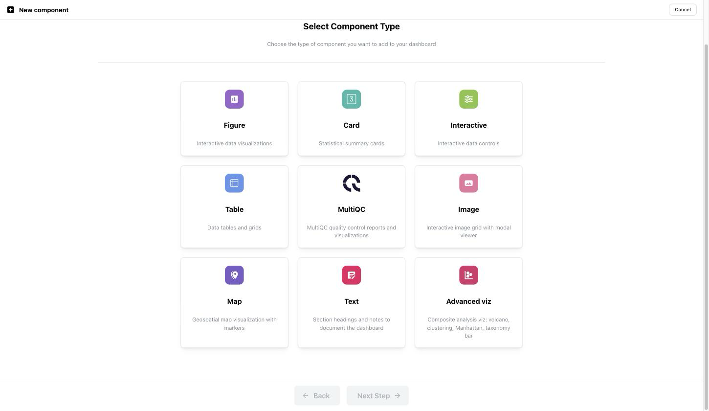
- Open a dashboard, click Edit, then Add component.
- Pick a component type: Figure, Card, Interactive, Table, MultiQC, Image, Map, Text or Advanced viz. Clicking a card takes you straight to the next step.
Or skip the stepper entirely (v1.9.0+)
Add component now opens a chooser first. Alongside New component, which is the flow described here, Pick from catalog offers pre-configured visualizations that Depictio recognised in the project's ingested data. See Picking a component from the catalog.
Step 2: Data Selection
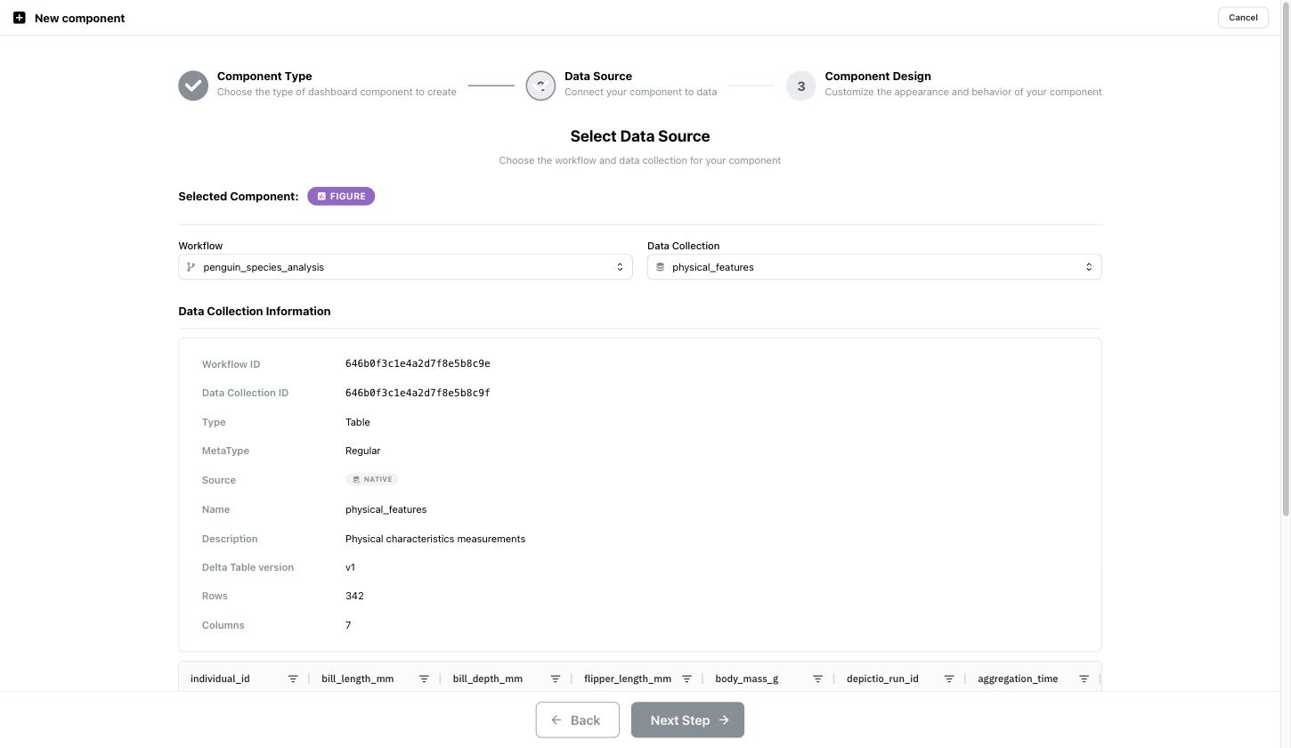
- Choose the workflow and data collection from the dropdowns.
- Check Data Collection Information: type, row and column counts, Delta table version, and the column preview underneath.
-
Click Next Step.
The first compatible data collection is pre-selected, so you only touch the dropdowns when you need another one. Here that is
joined_penguins_complete, the join ofphysical_featuresanddemographic_data. Text components skip this step entirely, since they read no data collection.The Selected Component badge at the top of the step names the type you picked in step 1. Before v1.6.0 the MultiQC badge rendered white on white and read as an empty row.
Step 3: Customize Your Component
-
Customise your component:
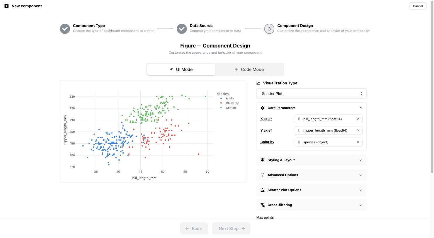
- For Figure components, you can select the type of figure (e.g., scatter plot, histogram) and customize its appearance.
- For Interactive components, you can set up interactive elements like sliders or dropdowns to allow users to filter or manipulate the data dynamically.
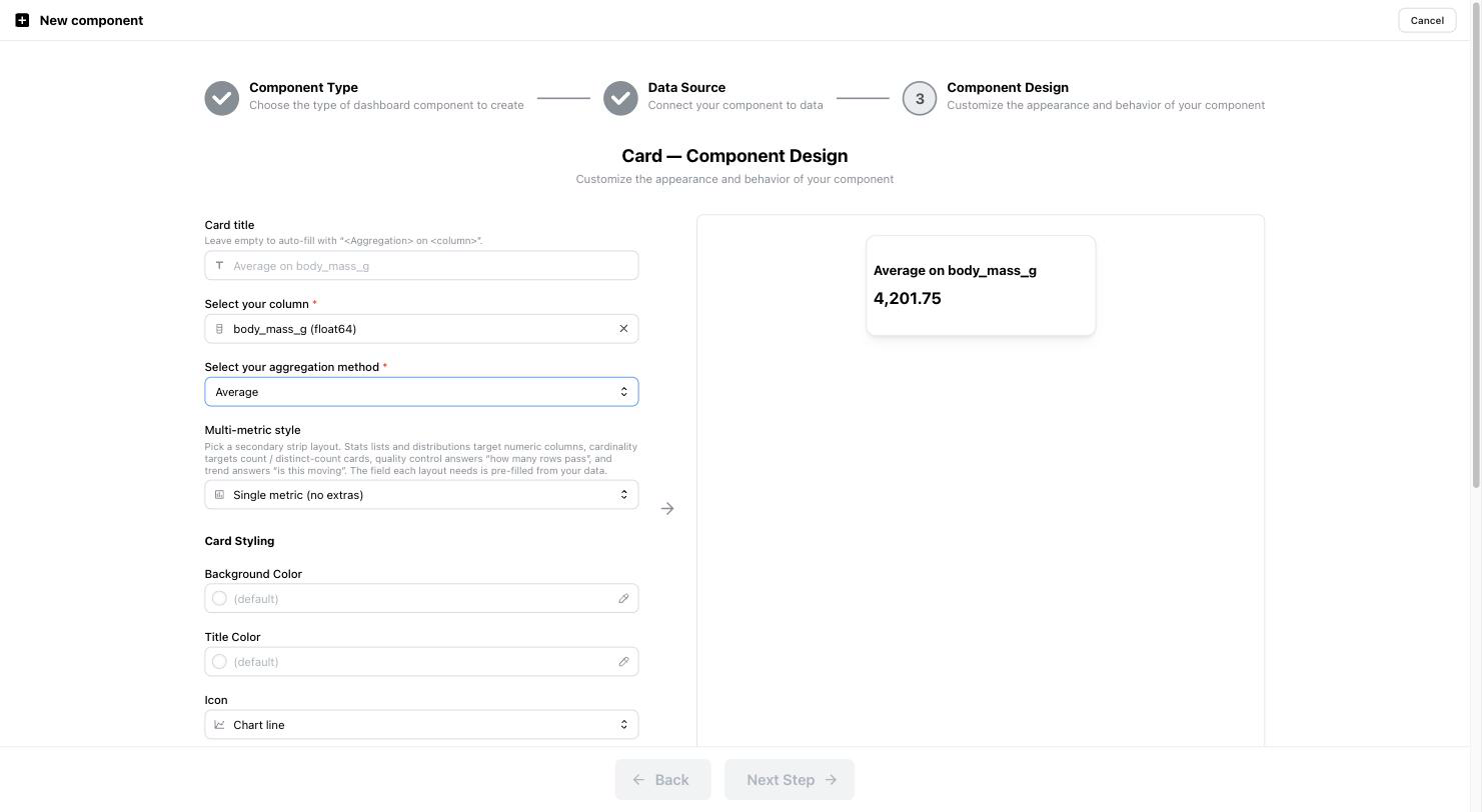
- For Card components, you can display key metrics of your data.
All options are dependent on the type of column in your data collection. For example, if you select a numeric column, you can choose to between a Slider or a RangeSlider for interactive components, and metrics like Mean, Median, or Standard Deviation for card components. If you select a string column, you can choose to display the Select/Multiselect or a SegmentedControl for interactive components, and metrics like Count or Unique Count for card components.
| Data Type | Interactive Options | Card Metrics |
|---|---|---|
| Numeric | Slider, RangeSlider | Mean, Median, Standard Deviation, Variance, ... |
| String | Select, Multiselect, SegmentedControl | Count, Unique Count, Most Frequent (mode) |
-
Set additional parameters:
-
For Figure components, you can tweak visualization settings such as colors, axis labels, and bin sizes. Settings are categorised in the following way:
- Core parameters: Define key parameters such as X-axis and Y-axis and Color, and assign the relevant data columns from your dataset.
- Styling & Layout: Adjust the layout of the figure, including titles and axis labels, colors, hover data, and more.
- Figure type specific options: Access additional options specific to the figure type, such as scatter plot or histogram settings.
- Advanced: For advanced users, additional settings can be configured here like facetting, animation and more.
-
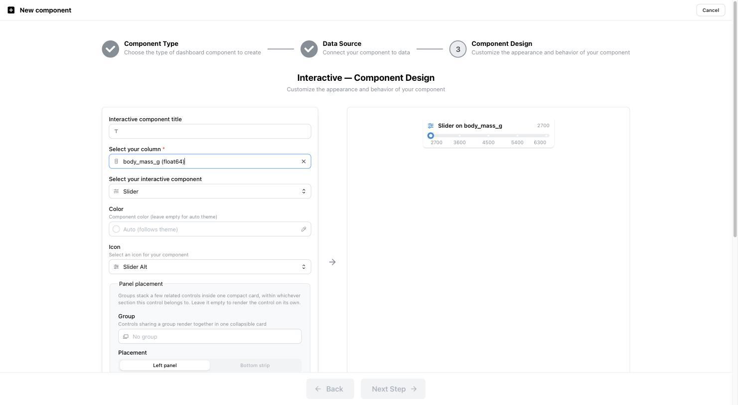
For Interactive components, you can set adjust sliders to have a given number of marks, use a linear or logarithmic scale.
Two panels sit at the end of that list, both folded and both optional (v1.6.0+):
- Placement — which section the component joins. It appears only once the dashboard has sections; you can also move a placed component later, from its own menu on the dashboard.
- Performance — for figures, Max points, the point count above which a scatter-family figure downsamples. Leave it blank for the global default; viewers can still load every point on demand.
Since v1.14.0 every builder lays its form out in collapsible sections, each headed by an icon, a title and a one-line subtitle. The sections holding what the component cannot work without open every time; the others reopen as you left them, per builder type, in this browser. The preview draws in the dashboard's brand (a child tab's in its main tab's).
-
Finalize Customization:
- Review the component preview and ensure all settings are accurate.
- Once complete, click Next Step to proceed to the final stage.
Previewing with active filters (v1.5.2+)
When the dashboard already has filters applied, the component builder previews the filtered data rather than the whole data collection. Before v1.5.2 the builder always showed the unfiltered dataset, and returning to the dashboard reset the grid.
Take a dashboard filtered on variety = Virginica. The card averages only the
50 matching rows, not all 150:


No filter: 5.8433 across 150 rows. Filtered on Virginica: 6.588 across 50.
Open the builder from there and the design step carries that filter, with a banner naming how many filters are active:
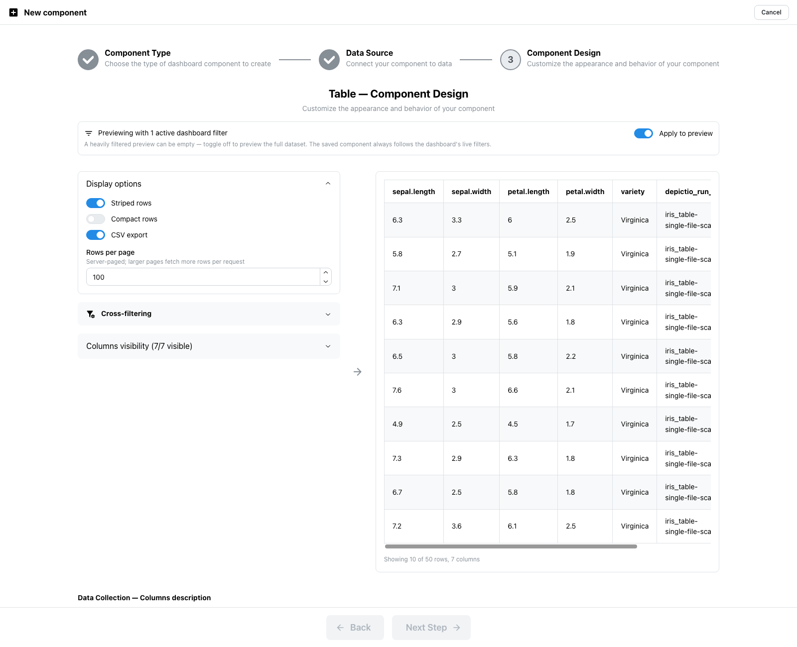
The table reports 10 of 50 rows: the filtered total, not the collection's 150.
Apply to preview is on by default. Switch it off to preview the full dataset, which matters when a narrow filter would otherwise leave you designing against an empty table:
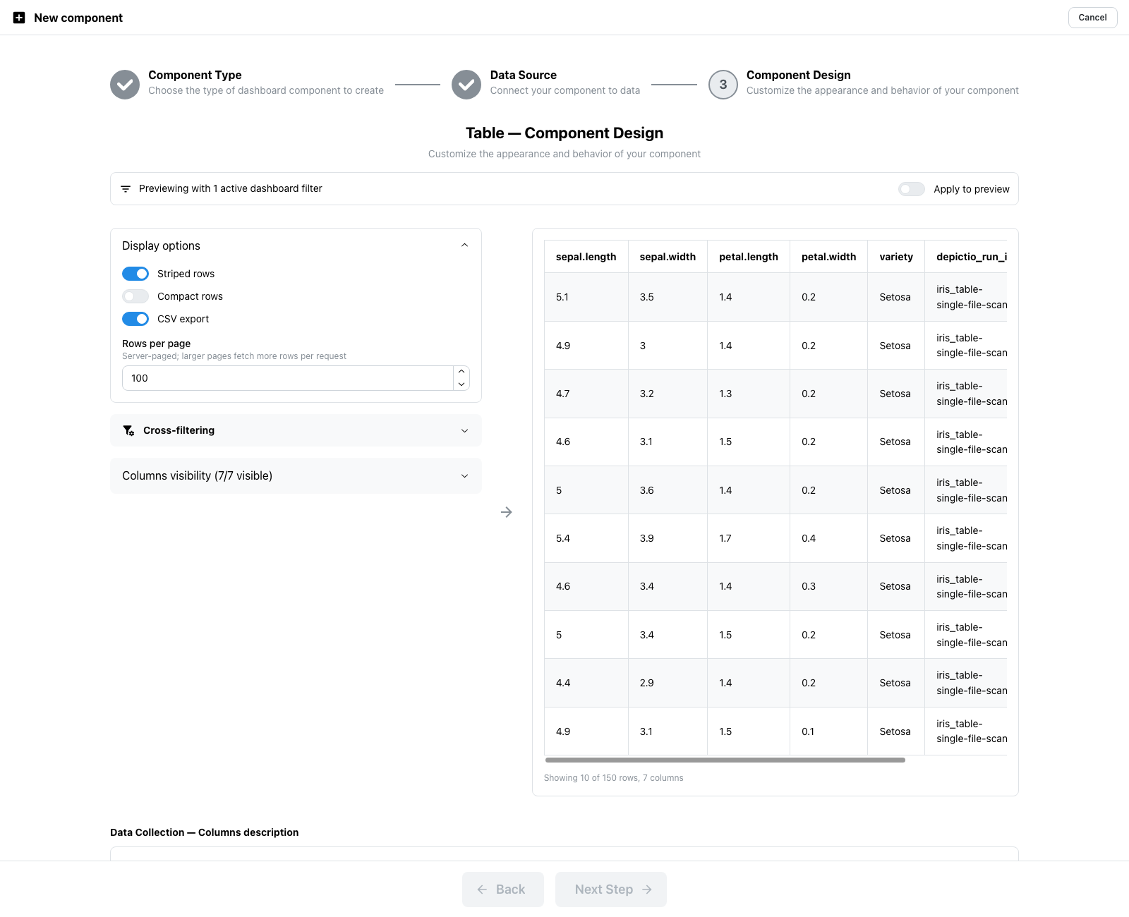
The toggle only affects the preview
Whichever way you leave it, the saved component always follows the dashboard's live filters. The toggle is a design-time convenience, not a property of the component.
Save, and the new component arrives already filtered, with no flash of unfiltered data on the way, and the filters you had set are still applied:
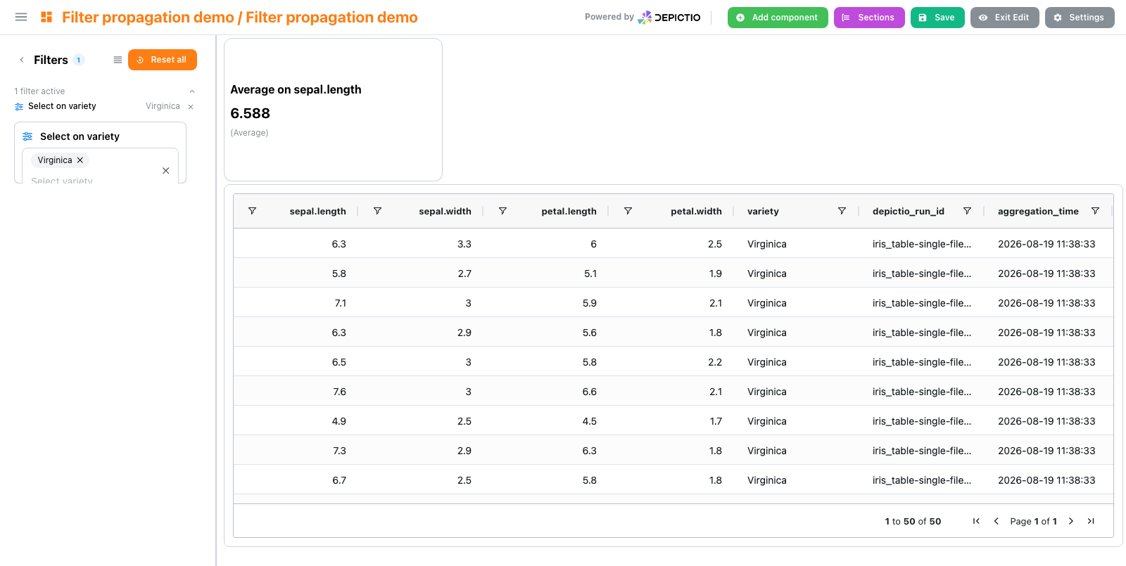
The banner appears only when at least one filter is active, and is suppressed for Text and MultiQC components, which have no notion of row filtering.
Figure Code Mode (v0.6.0+)
The Figure component includes a Code Mode for advanced users who want to write custom Python/Plotly code to generate visualizations. This provides maximum flexibility for complex or custom figures.
Accessing Code Mode
- In the Figure design interface, click the "Code" tab
- Switch from UI Mode to Code Mode at any time
- Switching from UI to Code Mode automatically generates code from your current UI settings
Available Variables
In Code Mode, the following variables are pre-loaded:
| Variable | Description |
|---|---|
df |
Your data as a Polars DataFrame |
px |
Plotly Express for quick visualizations |
pd |
Pandas for data manipulation |
pl |
Polars for high-performance data operations |
go |
Plotly Graph Objects for detailed customization |
Code Structure
Your code must follow this structure:
# Optional: any number of preprocessing statements
threshold = 0.5
keep = ["alpha", "beta"]
df_modified = (
    df.filter(pl.col("value") > threshold)
      .filter(pl.col("category").is_in(keep))
)

# Required: create the figure using px or go
fig = px.scatter(df_modified, x="col_x", y="col_y", color="category")

# Optional: post-figure customization
fig.update_layout(showlegend=False)
Everything before the fig = statement counts as preprocessing, whatever the
variables are called, and a statement may span several lines: parentheses and
brackets are both tracked, so agg([ continues across a line break just as
agg( does.
Changed in v1.8.3
Preprocessing used to be recognised by variable name: a line had to mention
df_modified or start with df_, and every other line was silently
discarded. The figure then ran without it and failed on the first name it
could no longer resolve, pointing at the fig = line rather than at the
dropped one.
Code Constraints
- The final
figvariable must be a Plotly Figure object - The figure must use something the preprocessing produced, or
dfitself - Only the pre-loaded libraries are available for security
Code Mode Features
- Live Preview: Click "Execute Code" to preview your figure instantly
- Syntax Highlighting: Python syntax highlighting with the Ace editor
- Theme Support: Editor theme follows the dashboard light/dark mode
- Resizable Editor: Drag the editor border to adjust panel size
- Error Messages: Clear error feedback for syntax and execution issues
Component design Examples:
Figure design - scatter plot - UI mode
bill_length_mm against flipper_length_mm, coloured by species. The preview redraws on every change.
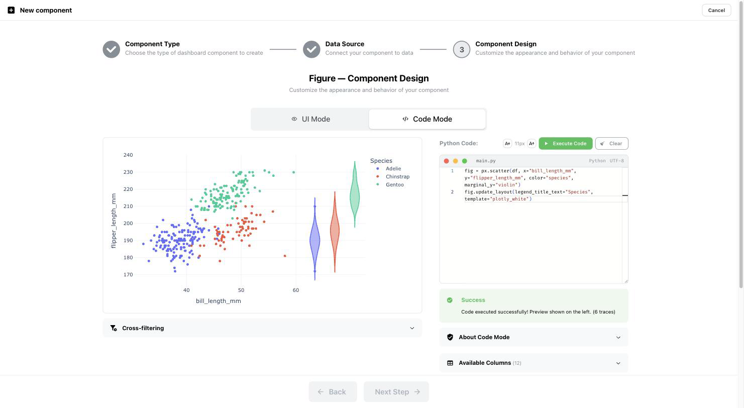
Figure design - scatter plot - code mode
Switching to Code Mode carries the UI settings over as a px.scatter call, which you can then take past what the form exposes: here, marginal violins and a fig.update_layout() override.
Interactive design - RangeSlider example
Card design - metrics selection
 MultiQC Integration (v0.5.0+)
As of version 0.5.0, Depictio includes dedicated support for MultiQC quality control reports. This integration allows you to:
- Automatically scan and aggregate MultiQC output reports
- Create components directly from MultiQC data using the MultiQC API
- Link figures with external metadata for enhanced analysis
- Filter datasets to display specific samples based on QC metrics
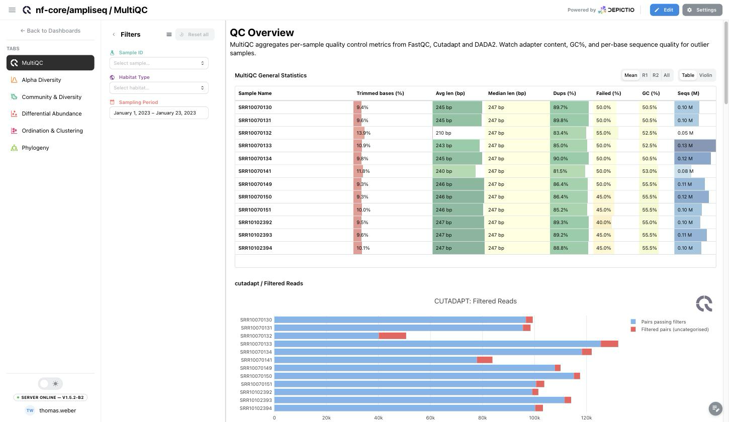
Components land on the dashboard with the report's own controls intact: the general statistics table keeps its Mean / R1 / R2 / All read selector and its Table / Violin toggle, and the dashboard filters apply on top.
Adding MultiQC Components
- Pick MultiQC in Step 1. The data collection dropdown then narrows to the MultiQC collections of your project, so Step 2 is usually already filled in.
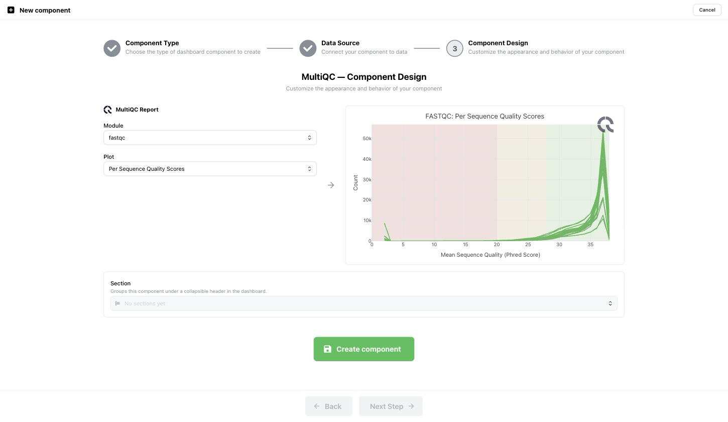
- In Step 3, choose a Module, then a Plot inside it. Both lists are read from the report itself. For an nf-core/ampliseq run that means
General Stats Table,cutadaptandfastqc. The preview renders on the right as soon as you pick. - Repeat for every plot you want: each one becomes its own component, and they can sit in different sections or tabs.
MultiQC data collections show no data preview in Step 2 because they aren't tabular, so Rows and Columns read N/A and the visualizations are rendered by the MultiQC component itself.
MultiQC Data Ingestion
To ingest MultiQC reports into Depictio, use the Depictio-CLI with your project configuration file. MultiQC reports should be specified in your YAML configuration under the appropriate workflow section.