Interactive Selection Filtering
Filter dashboard components by selecting points on scatter plots or rows in tables—no pre-configuration needed.
Overview
Interactive Selection Filtering extends the filtering system beyond traditional dropdowns and sliders. You can now:
- Lasso or box-select points on scatter plots
- Click individual points on scatter plots
- Select rows in AG Grid tables
- Lasso or click markers on scatter maps
Selected values automatically filter other components on the same Data Collection.
┌─────────────────────┐         ┌─────────────────────┐
│  Scatter Plot       │         │  Image Gallery      │
│                     │         │                     │
│  [lasso select]     │────────▶│  [auto-filters]     │
│  ○ ○ ● ● ○         │         │  [shows 2 images]   │
└─────────────────────┘         └─────────────────────┘
Scatter Plot Selection
Selection Modes
| Mode | Action | Result |
|---|---|---|
| Lasso | Draw freeform shape around points | Select all enclosed points |
| Box | Draw rectangle around points | Select all enclosed points |
| Click | Click individual point | Select single point |
Enabling Selection
Add these properties to your figure component:
components:
  - tag: quality-scatter
    component_type: figure
    workflow_tag: python/my_workflow
    data_collection_tag: sample_data
    visu_type: scatter
    dict_kwargs:
      x: category
      y: quality_score
      color: category
    # Enable selection filtering
    selection_enabled: true
    selection_column: sample_id
Configuration Options
| Option | Required | Description |
|---|---|---|
selection_enabled |
Yes | Enable selection filtering (true/false) |
selection_column |
Yes | Column to extract from selected points for filtering |
Selection Column
The selection_column should contain unique identifiers (e.g., sample_id) that exist in other components' data. This enables cross-component filtering.
Using Selection in the Dashboard
- Enable Edit Mode and add a scatter plot with
selection_enabled: true - Switch to View Mode
- Use the toolbar to select Lasso or Box Select mode
- Draw a selection around points or click individual points
- Other components automatically filter to show only selected samples
Reset Selection
While the plot holds a selection, an orange Clear selection (N) button sits in its action row, N being the number of selected values. Click it to drop the selection and show all data. The button is gone again once nothing is selected (v1.13.0+); before v1.13.0 a Reset button was always shown.
Table Row Selection
Enabling Row Selection
Add these properties to your table component:
components:
  - tag: samples-table
    component_type: table
    workflow_tag: python/my_workflow
    data_collection_tag: sample_data
    page_size: 10
    # Enable row selection filtering
    row_selection_enabled: true
    row_selection_column: sample_id
Configuration Options
| Option | Required | Description |
|---|---|---|
row_selection_enabled |
Yes | Enable row selection filtering (true/false) |
row_selection_column |
Yes | Column to extract from selected rows for filtering |
Using Row Selection
- Click rows in the table to select them
- Hold
Ctrl/Cmdto select multiple rows - Other components automatically filter to show selected samples
Reset Selection
Click Clear selection (N) in the table's action row to clear the row selection. As on a scatter plot, the button only shows while rows are selected (v1.13.0+).
Map Selection
Scatter maps support the same selection modes as scatter plots (lasso, box, click). Add selection_enabled and selection_column to a map component:
- tag: sampling-map
  component_type: map
  workflow_tag: python/my_workflow
  data_collection_tag: sample_metadata
  lat_column: latitude
  lon_column: longitude
  color_column: biome
  selection_enabled: true
  selection_column: sample_id
Selected markers dim unselected points and filter other components on the same Data Collection. Choropleth maps do not support selection.
Selection groups (v1.7.0+)
A selection is normally a passing thing: draw the next one and the first is gone. Save it as a group and it becomes something you can name, colour and come back to.
Any component holding a live selection offers Save selection as group in its hover chrome. The group takes a name and a colour, both editable later, and saving clears the source selection so the component is free for the next one. Once saved, a group can be:
- toggled as a filter, narrowing the dashboard like any ordinary control. Groups project into the same filter machinery as everything else, so cross-DC links resolve through them and an active group appears as a removable row in the active-filter summary;
- used to colour every figure, so several groups are visible at once rather than one at a time;
- compared in the cards, which is where a group stops being a filter and becomes a cohort.
Where groups live
Groups are held in your browser, scoped to the dashboard family, so they survive a tab switch and are still there on your next visit. They are yours alone: saving one changes nothing for anyone else looking at the same dashboard, and nothing is written to the dashboard document. Sharing groups is a follow-up.
The Analysis panel
One Analysis popover in the dashboard header drives all of it, in three sections: Color by column, Groups, and Group options. Its Reset restores the defaults while keeping your saved groups.
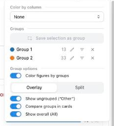
While analysis mode is engaged, any component that can feed a group (a scatter figure, a table, a map, an image gallery) is outlined and marked, so it is clear where a selection is worth making before you make one.
Colouring every figure at once
Color by column recolours every figure whose dataset carries that column, from one
stable palette, so a category keeps its colour across figures and survives filtering.
Each recoloured figure carries a by <column> badge.
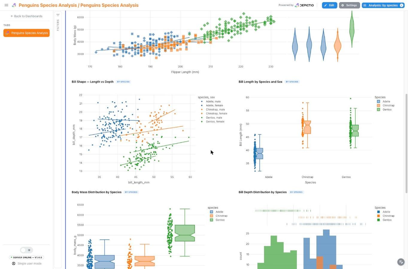
Split draws one panel per category instead of overlaying them, capped at 12. Where the number of categories cannot be known ahead of time, both client and server fall back to an overlay rather than faceting an unbounded column.
Since v1.11.0 every advanced visualization kind has a fixed answer to a group: it splits into panels, colours a single panel, or stays whole. A figure the groups cannot reach says so with a not grouped badge whose tooltip gives the reason, and groups reach figures on other tabs by following the dashboard's links in reverse. A lasso drawn on a Manhattan plot now holds in Split.
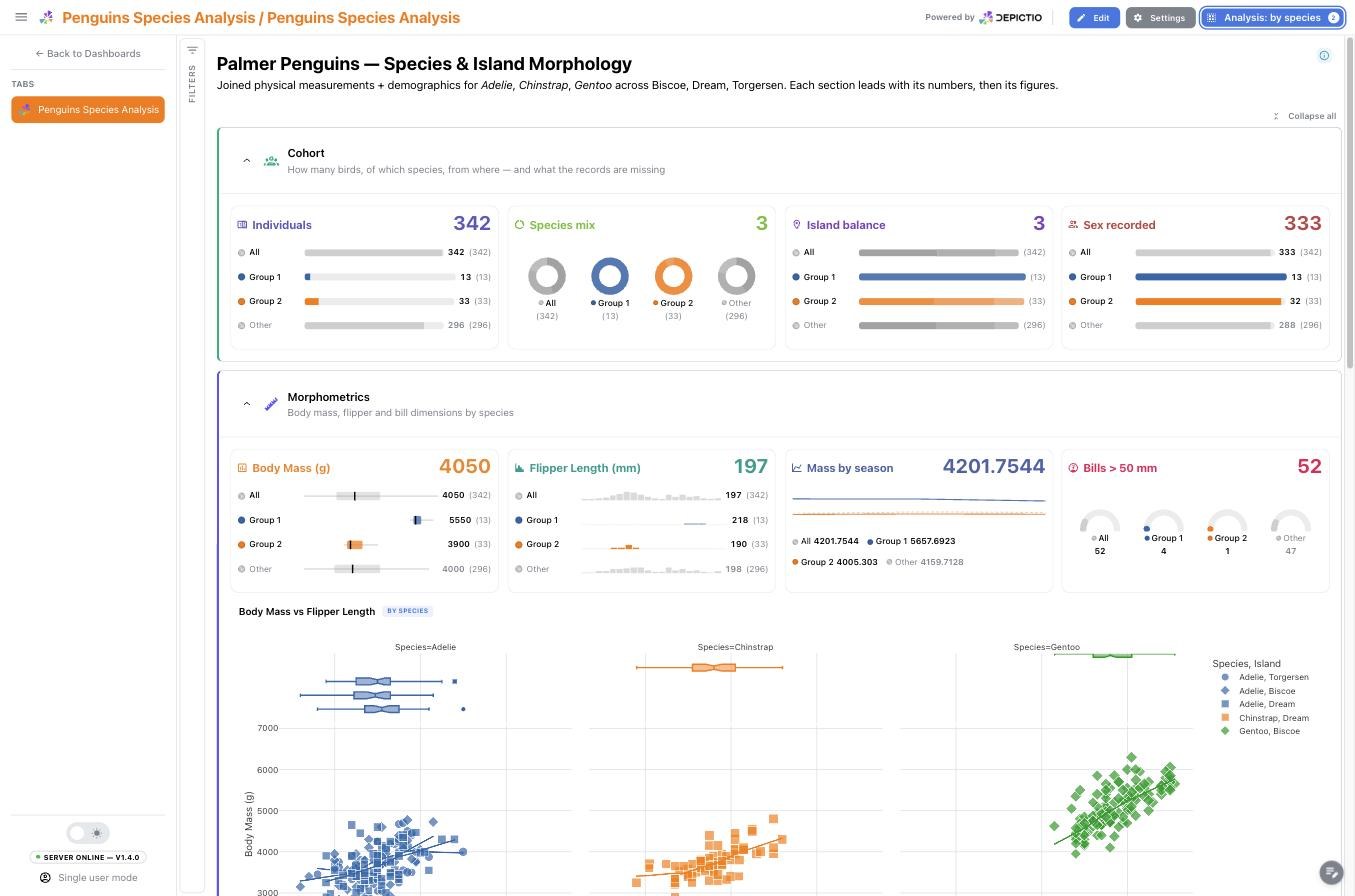
Colouring by a column and comparing groups in cards are two ways of grouping the same screen, so they are mutually exclusive: pick a column and card comparison is suspended, its toggle disabled and its value kept for when you clear the column again.
Comparing groups in the cards
With Compare groups in cards on, each card reduces its hero aggregation once per group and draws the results side by side in the group's colour, as meters, mini donuts, slim box plots, sparkbars, gauge dials or a trend overlay depending on the layout. The scales come from the whole frame rather than from each group, so the shapes are genuinely comparable. Two optional references sit alongside: All, the unsplit frame, and Other, the rows in no group.
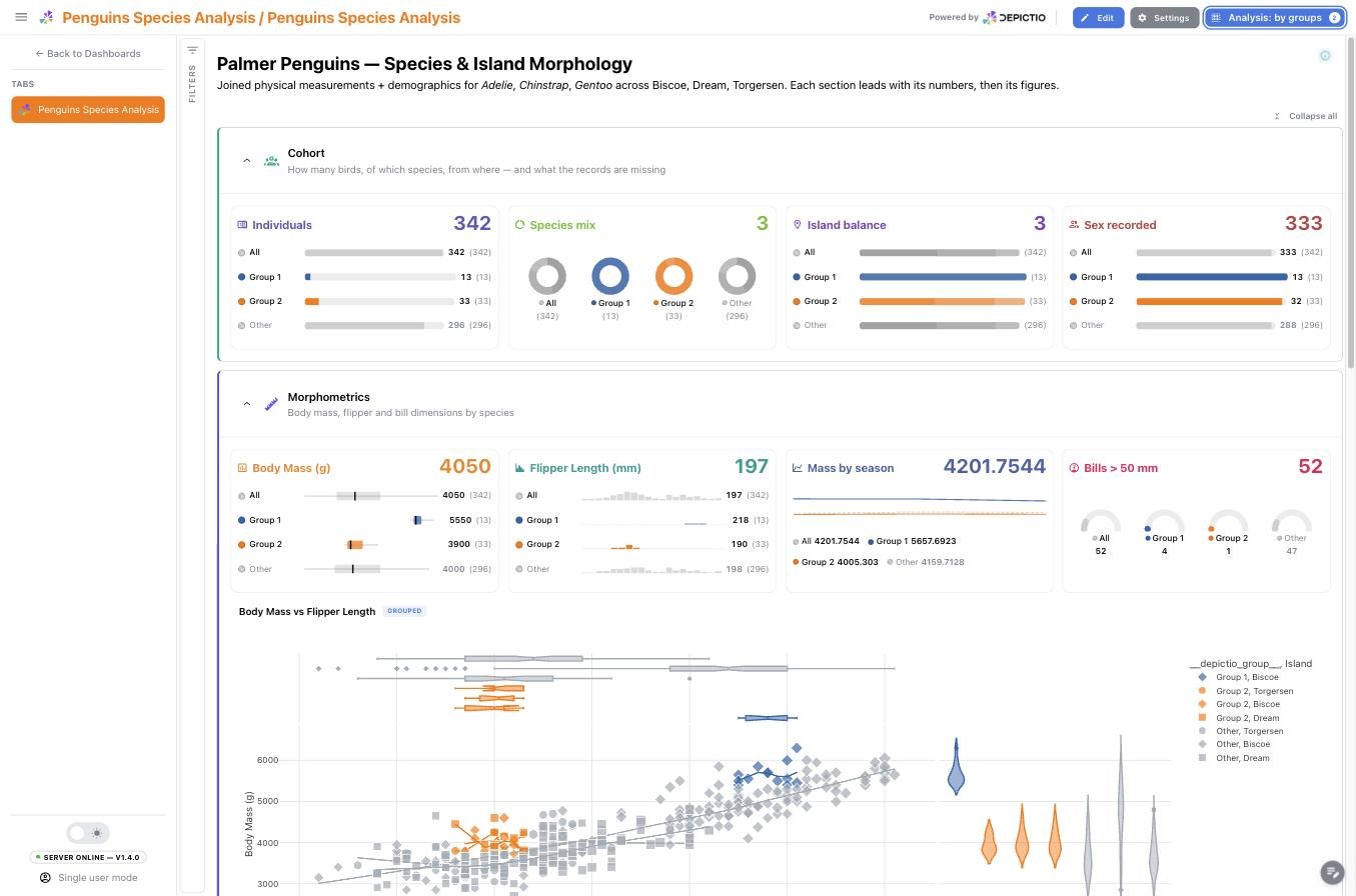
Two saved groups on the bundled Penguins dashboard, with every card comparing them: the neutral All reference leads, and the ungrouped rows trail as a dimmed Other.
Genome region selection
A genome track (a Genome view tile) can act as a locus
navigator: brushing along its genome axis, typing a locus, or opening on its
default_region selects a genomic region. A region is not a list of values, so it travels
as two ordinary filters on the track's own collection, both under the source
genome_selection:
- a chromosome multi-select on the track's chromosome column;
- a
[start, end]range on its position column, applied asstart <= position <= end.
Other tiles on the same collection narrow straight away. Tiles on another collection follow through a region link, which renames the two filters onto that collection's own coordinate columns. Clearing the brush clears both halves.
Which components follow a region
A region is a place to look, not a subset to summarise. If every component applied it, a tab opened on a small window would turn its run-wide cards into cards about that window: a mean depth of the window instead of the run, a per-chromosome donut showing one chromosome at 100 %. So the region is scoped:
| Component | Follows the region? |
|---|---|
| Genome tracks and other genomic advanced visualizations, tables | Yes |
| Figures | Only when an encoding (x, y, color, ...) names the region's chromosome or position column |
| Cards | No, unless the card sets follow_region_filter: true |
| Interactive filters | No: their options stay those of the whole collection, so a chromosome picker keeps offering every chromosome |
Every other active filter (dropdowns, selections, groups) still applies to all of them as usual; only the region pair is held back. The same rule runs in the viewer and on the server, so a card's saved value and its live preview agree.
- tag: depth-in-window
  component_type: card
  workflow_tag: my_pipeline
  data_collection_tag: coverage_bins
  aggregation: average
  column_name: depth
  column_type: float64
  follow_region_filter: true   # summarise the region in view, not the whole run
On a second genome track, follow_region_filter: true in its config means something
close but distinct: the track zooms to a region another tile sends, instead of keeping
its whole-genome overview. Stacking several such tracks in one section, with one of them
navigating, gives a multi-track locus view.
Record cards and their source
A Record card shows one record of a collection as labelled fields: the detail half of a master/detail layout. It has no selector of its own. It follows a selection made elsewhere and shows the record whose id column matches the picked value, with an empty state naming its source while nothing is picked.
linked_component ties the card to the component whose selection drives it, by that
component's tag:
- tag: samples-table
  component_type: table
  workflow_tag: my_pipeline
  data_collection_tag: sample_qc
  row_selection_enabled: true
  row_selection_column: sample
  layout: {x: 0, y: 0, w: 8, h: 6}

- tag: sample-record
  component_type: advanced_viz
  workflow_tag: my_pipeline
  data_collection_tag: sample_qc
  viz_kind: record_card
  config:
    viz_kind: record_card
    id_col: sample
    linked_component: samples-table
  layout: {x: 8, y: 0, w: 4, h: 6}
The link is checked, not just stored:
- The dashboard import resolves the tag to the component's index, which is what selection filters carry, and rejects a tag that names no component of the dashboard, or the card itself.
- The source has to emit a selection: a table with
row_selection_enabledandrow_selection_column, a figure or map withselection_enabledandselection_column, or an advanced visualization that selects (embedding, Manhattan, genome view, profile, scatter, chord) withselection_enabled. - When source and card read the same collection, the source must select on the card's
id_col, since that is the column the picked values are matched against. A source on another collection reaches the card through a project link instead, whose two sides are named independently.
A linked card placed in the same section and row as its source, touching it edge to edge,
is laid out as the source's collapsible side panel. Without linked_component the card
follows whichever selection arrives (selection_source: any), which suits a dashboard with
a single selecting tile.
How It Works
Selection filtering integrates with the existing interactive filtering system:
┌─────────────────────────────────────────────────────────────┐
│                 interactive-values-store                     │
├─────────────────────────────────────────────────────────────┤
│  [                                                          │
│    {index: "dropdown-1", value: ["A", "B"], source: null},  │
│    {index: "scatter-1", value: ["S1", "S2"],                │
│     source: "scatter_selection"},                           │
│    {index: "table-1", value: ["S3"],                        │
│     source: "table_selection"},                             │
│  ]                                                          │
└─────────────────────────────────────────────────────────────┘
                              │
                              ▼
           ┌──────────────────┴──────────────────┐
           │         All Components Filter        │
           │  (cards, figures, tables, images)   │
           └─────────────────────────────────────┘
Selection data is stored with a source field:
scatter_selection- From scatter plot lasso/box/clicktable_selection- From table row selectionnull- From interactive components (dropdowns, sliders)
All sources combine to filter dashboard components.
Complete Example
title: "Sample Analysis Dashboard"
subtitle: "Interactive filtering with scatter and table selection"
project_tag: "My Project"

components:
  # Scatter plot with selection enabled
  - tag: quality-scatter
    component_type: figure
    workflow_tag: python/analysis_workflow
    data_collection_tag: sample_data
    visu_type: scatter
    dict_kwargs:
      x: category
      y: quality_score
      title: "Quality by Category (select to filter)"
      color: category
    selection_enabled: true
    selection_column: sample_id

  # Table with row selection enabled
  - tag: samples-table
    component_type: table
    workflow_tag: python/analysis_workflow
    data_collection_tag: sample_data
    page_size: 10
    row_selection_enabled: true
    row_selection_column: sample_id

  # Image gallery (filters based on selections)
  - tag: sample-images
    component_type: image
    workflow_tag: python/analysis_workflow
    data_collection_tag: sample_data
    image_column: image_path
    s3_base_folder: "s3://bucket/images/"
    thumbnail_size: 150
    columns: 3

  # Card showing count (filters based on selections)
  - tag: selected-count
    component_type: card
    workflow_tag: python/analysis_workflow
    data_collection_tag: sample_data
    aggregation: count
    column_name: sample_id
    column_type: object
    icon_name: mdi:counter

  # Traditional dropdown filter (works alongside selections)
  - tag: category-filter
    component_type: interactive
    workflow_tag: python/analysis_workflow
    data_collection_tag: sample_data
    interactive_component_type: MultiSelect
    column_name: category
    column_type: object
Selection vs Interactive Components
| Feature | Selection | Interactive |
|---|---|---|
| Input method | Click/drag on visualization | Dropdown/slider/picker |
| Multi-select | Yes (lasso, box, ctrl+click) | Depends on component type |
| Visual feedback | Highlighted points/rows | Selected values in control |
| Best for | Exploratory filtering | Known filter criteria |
| Reset | Clear selection on the component, shown while it holds a selection | Per-component or global reset |
Combine Both Methods
Selection filtering and interactive components work together. Use dropdowns for known categories, then refine with scatter selections for data exploration.
Limitations
- Same Data Collection: a live selection filters within its own Data Collection; for cross-DC filtering, use Links. Saving it as a selection group lifts this: a group projects into an ordinary filter, so links resolve through it like any other.
- Scatter & Maps Only: Currently scatter plots and scatter maps support selection (not bar charts, histograms, or choropleth maps).
- Live selections do not persist: a selection is cleared on page reload and is not carried between tabs. Only a floating map's selection and the values of controls in a section shown on every tab survive a tab switch; a selection made by clicking a chart or ticking table rows does not. Save it as a selection group (v1.7.0+) and it survives both, for you, in that browser.
- Groups are per browser: a saved group is not shared with other viewers and is not written to the dashboard, so it is gone if you clear site data or open the dashboard elsewhere.
FAQ
Can I select points across multiple scatter plots?
Each scatter plot maintains its own selection. Selections from multiple plots combine (AND logic) to filter other components.
How do I know which column to use for selection_column?
Use a column with unique identifiers that exists in all components you want to filter. Typically this is sample_id, id, or similar.
Can I disable the reset button?
No, but it only takes space when there is something to clear. Since v1.13.0 the Clear selection button appears on a component while it holds a selection, the scatter's lasso, a table's rows or a pick on an advanced visualization, and disappears once the selection is cleared.
Does selection work with Code Mode figures?
Yes, but you must include the selection_column in your figure's custom_data parameter for the selection to extract values correctly.