Dashboard Components
Depictio provides a variety of component types for building interactive dashboards. This guide covers each component type, when to use it, and how to configure it.
Browse the live catalog
To see which bioinformatics tool outputs map to these components, explore the Depictio Tools Catalog: every recognised tool, the data collections it emits, and the renders they offer, previewed on real fixture data.
Component Overview
-
Charts and plots (scatter, bar, histogram, line, box, pie, and more)
-
Interactive data tables with filtering and sorting
-
Metric display with aggregations
-
Headings and prose, with block markdown and links to tabs since v1.14.0
-
Another tab's figure, redrawn on this one (v1.14.0+)
-
User input components for filtering (slider, dropdown, date picker)
-
Quality control report visualizations
-
Image galleries with S3/MinIO storage integration
-
Geospatial map visualization with markers
-
Domain-specific scientific viz (volcano, MA, manhattan, ComplexHeatmap, UpSet, sankey, …) backed by canonical column schemas
Building under active filters (v1.5.2+)
With filters applied, the builder previews the filtered data. An Apply to preview toggle switches back to the full dataset. Applies to every type except Text and MultiQC, which have no row filtering. See Dashboard creation.
Figure Components (v0.0.1+)
Figure components display data visualizations using Plotly charts. They support both UI Mode (drag-and-drop configuration) and Code Mode (Python code for custom plots).
Supported Chart Types
UI Mode provides a curated selection of chart types through the visual interface:
| Category | Chart Types |
|---|---|
| Basic Charts | Scatter, Bar, Line |
| Statistical | Histogram, Box |
| Matrix | ComplexHeatmap (via plotly-complexheatmap) |
Unlimited Charts with Code Mode
Code Mode supports the entire Plotly library, giving you access to all chart types including 3D plots, maps, financial charts, and more. See the Plotly Python documentation for the complete reference.
UI Mode
In UI Mode, configure charts through the visual interface:
- Select a Data Collection as your data source
- Choose the Chart Type (scatter, bar, histogram, etc.)
- Map data columns to X-axis, Y-axis, and optional Color dimension
- Customize appearance (title, axis labels, colors)
Code Mode
Code Mode allows custom Python code for advanced visualizations:
import plotly.express as px

# df is your data collection as a pandas DataFrame
fig = px.scatter(
    df,
    x="coverage",
    y="quality_score",
    color="sample_type",
    title="Coverage vs Quality by Sample Type"
)

# Return the figure object
fig
Since v1.14.0 a code figure that sets no colours of its own is drawn in the
dashboard's category colours when every trace name,
Other aside, is a value of one coloured column; the map itself is
depictio_category_colors. A template's
color_discrete_map=depictio_group_kwargs.get("color_discrete_map", {}) counts as setting
none while no analysis group is active.
Security Note
Code Mode uses RestrictedPython for security. Only approved libraries (pandas, plotly) are available. See Security for details.
Configuration Options
| Option | Description | Default |
|---|---|---|
| Title | Chart title displayed at top | Auto-generated |
| X-axis label | Label for horizontal axis | Column name |
| Y-axis label | Label for vertical axis | Column name |
| Color | Column for color encoding | None |
| Hover data | Additional columns shown on hover | None |
max_points |
Point cap for scatter-family figures before downsampling (v1.3.0+) | Global default (10,000) |
font_scale |
Font-size multiplier for the whole figure layout font: axis labels, ticks and legend. Set from the tile's edit menu, 0.7× to 2×, with a full lite-YAML round trip (v1.8.0+) | Unset (1×) |
| Theme | Plotly template for this figure. mantine_light / mantine_dark mean follow the UI colour scheme. Unset falls back to the dashboard default, then to instance branding (v1.8.0+) |
Unset |
Figure style (v1.14.0+)
figure_style: minimal gives a figure the landing-page look: the title in the card
header beside an icon badge with the subtitle inline, a transparent plot with faint
dashed grid lines and no axis lines, the legend in one line under the plot, large
unoutlined markers, tight margins and the toolbar only on hover. Bars end in a slight
round, stacked segments are parted by a hairline, and grouped bars get a coloured
underline naming each group instead of facet titles. Plots in this style are set in Inter
unless the figure or the brand sets a font. Unset, a figure takes the figure_style of
its grid section, else default. In the builder these keys
are the Card header & style section.
| Option | Description |
|---|---|
figure_style |
default or minimal |
subtitle |
A few dimmed words after the title (minimal) |
icon_name / icon_color |
Iconify id and colour of the header badge (minimal). The colour defaults to the brand's primary |
hide_legend |
Draw the figure without its legend, for a small tile |
caption |
A line or two under the plot saying how to read it, in any style |
link |
tab:<name>: the tab this figure summarises, linked from the end of the header (minimal) or from the tile's actions |
An advanced visualization takes figure_style, subtitle, icon_name, icon_color and
link for its card only: minimal draws the header and the frame, not the plot overlay,
and link shows in that header alone. hide_legend is honoured by the
phylogeny summary, and caption is not drawn. Its component-level
controls_placement says where its controls dock; see
Shared settings.
- tag: pcoa-overview
  component_type: figure
  visu_type: scatter
  figure_style: minimal
  title: Communities by city
  subtitle: PCoA, Bray-Curtis
  icon_name: mdi:scatter-plot
  caption: Each point is one sample; the closer two points, the more alike their plankton.
  link: "tab:Ordination & Clustering"
  # workflow_tag, data_collection_tag, dict_kwargs...
Clustered heatmaps moved
The ComplexHeatmap viz has been renamed and is now part of the Advanced Visualizations section below — see Hierarchical Heatmap for the full config, alongside the rest of the domain-specific viz family (volcano, MA, sankey, …).
Selection Filtering (Scatter Plots)
Scatter plots can act as interactive filters. Enable selection to let users lasso, box-select, or click points to filter other components.
| Option | Description |
|---|---|
selection_enabled |
Enable selection filtering (true/false) |
selection_column |
Column to extract from selected points |
See Interactive Selection Filtering for details.
Table Components (v0.0.2+)
Table components display data in interactive tables with built-in filtering and sorting.
Features
| Feature | Description |
|---|---|
| Server-Side Pagination | Efficiently handles large datasets by loading data in pages |
| Server-Side Scrolling | Virtual scrolling for smooth navigation through large tables |
| Column Sorting | Click headers to sort ascending/descending |
| Column Filtering | Filter by column values |
| Export (v0.6.0+) | Download data as CSV |
Configuration
| Option | Description | Default |
|---|---|---|
| Data Collection | Source data for the table | Required |
| Visible Columns | Allowlist of columns to display; omit to show all | All columns |
| Page Size | Rows per page (10, 25, 50 or 100) |
100 |
| Compact (v1.2.2+) | Tighter row and header heights | Off |
| Style | Column width, text alignment | Auto |
| Title | Header text above the table | Auto (from DC tag) |
| Description | Subtitle text below the title | None |
| Title Size | Header level: h1, h2, h3, or sm |
sm |
| Title Align | Text alignment: left, center, or right |
left |
Row Selection Filtering
Tables can act as interactive filters. Enable row selection to let users click rows to filter other components.
| Option | Description |
|---|---|
row_selection_enabled |
Enable row selection filtering (true/false) |
row_selection_column |
Column to extract from selected rows |
See Interactive Selection Filtering for details.
Advanced Visualizations (v0.13.0+)
Advanced Visualizations are a family of domain-specific scientific charts (catalogued below). Unlike the generic Figure component, which accepts any numeric columns, each advanced viz declares a canonical column-role schema: a volcano plot knows it needs a feature_id, an effect_size, and a significance column — wired to your DC's actual column names through the viz's config.
Two ingredients work together:
- a per-viz
Configclass (e.g.VolcanoConfig,DotPlotConfig) that captures the role → column mapping plus per-viz display defaults (thresholds, top-N, sort order); - a
CANONICAL_SCHEMASentry declaring the required and optional roles plus their accepted polars dtypes, used by the dashboard builder to validate the binding and surface errors before the viz renders.
Source of truth in the codebase:
depictio/models/components/advanced_viz/configs.py— per-viz Pydantic configsdepictio/models/components/advanced_viz/schemas.py—CANONICAL_SCHEMAS+validate_binding()depictio/models/components/types.py—AdvancedVizKindliteral enum
Shared settings (v1.13.0+)
Every kind accepts one layout setting on top of its own:
| Option | Type | Default | Description |
|---|---|---|---|
controls_placement |
popover | rail | header |
popover |
Where the tile draws its controls. popover keeps them behind the settings icon, unless the tile docks them (below). header draws the primary controls as a strip under the tile title and leaves the cosmetic ones in the popover. rail draws all of them in a 220 px column right of the plot (under the plot on a tile narrower than 480 px), and the tile then has no settings popover. |
Each kind splits its controls into two tiers. The primary tier changes what the plot shows: the view switch, axes, colour by, thresholds, a gene, sample or chromosome picker. The cosmetic tier changes how it is drawn: marker sizes, palettes, labels, legend. A kind with no primary tier, such as Record card, puts its cosmetic controls in the header strip instead. Every controls block but a docked panel carries a placement picker: a reader's choice lasts the session, and in the editor it is saved as the tile's controls_placement.
(v1.14.0+) A popover tile with room docks its controls instead: beside the
plot when it spans its row and is at least 720 px wide, above it when it is at least
300 px wide. A minimal card, a narrower tile, a tile split into group panels and a
builder preview keep the popover. The panel, titled Controls, shows the first three
controls that do something and folds the rest under More options (n); the view switch
heads it. The settings icon folds the panel away, remembered per tile in this browser.
A second controls_placement, on the component rather than in its config, overrides
the choice: auto (the default), right, top or popover, the builder's Viz
controls section (Auto, Right, Top, Behind icon). right and top dock
there whatever the width, and popover keeps the icon. It has no effect under rail or
header.
- tag: viz-de
  component_type: advanced_viz
  viz_kind: volcano
  controls_placement: popover   # the v1.13 look: controls behind the icon
  config:
    viz_kind: volcano
    controls_placement: popover # the tier placement, as before
    # column bindings...


A dashboard sets the placement for every tile that leaves controls_placement unset with its own advanced_viz_controls key. See Tile height and control placement.
Switchable views
Some kinds draw the same rows in more than one way. They carry a view field, the view the tile opens on, and a views list, the views the tile offers. The switch between views is a primary control, so it sits wherever controls_placement puts that tier, and it is not drawn when only one view is offered. A view is offered only when the tile can draw it, whether views is unset or lists it:
| Kind | Views (default first) | Offered when | Takes over |
|---|---|---|---|
| Volcano | volcano, ma, qq |
ma: avg_log_intensity_col is bound. qq: p_value_col is bound, or significance_is_neg_log10 is false |
the former ma and qq kinds |
| Dot plot | dotplot, enrichment |
dotplot: the four marker columns are bound. enrichment: term_col and nes_col are bound |
the former enrichment kind |
pr_benchmark |
pr, roc, both |
roc, both: threshold_col or fpr_col is bound, or a group holds more than one point |
the former roc_pr_curve kind |
| Coverage track | track, locus |
always | |
| Copy-number profile | plotly, locus |
always | |
sashimi |
plotly, genomespy |
always |
Retired kinds still load
viz_kind: ma, qq, enrichment and roc_pr_curve are still accepted, in a YAML file as in a stored dashboard. The config is rewritten when it is read into the surviving kind's, with view set to match, and every field keeps its name, so nothing needs editing. The stored dashboard only changes when it is saved again. The add-component wizard no longer offers the retired kinds.
Automatic DC recognition (v0.13.10+)
When a file is registered as a Data Collection, Depictio scans its column set against a library of producer fingerprints — named patterns that recognise the output of common upstream tools or standard tidy-table shapes. When a fingerprint matches, the dashboard builder surfaces a "Looks like X" hint and pre-selects the matching visualization type in the add-component wizard, saving manual column-binding work.
The four fingerprints added in v0.13.10 cover the metagenomics / ampliseq family:
| Fingerprint name | Detected columns | Suggested viz types |
|---|---|---|
taxonomy_levels_long |
Taxonomic rank columns (e.g. Kingdom, Phylum, …, Genus/Species) + an abundance / fraction column | Sankey, Sunburst |
rarefaction_iter_long |
sample_id, a sequencing-depth column, an iteration column, and ≥1 alpha-diversity metric |
Rarefaction |
alpha_diversity_wide |
sample_id, shannon (or shannon_entropy), observed_features, evenness |
Advanced viz > alpha diversity |
taxonomy_abundance_long |
sample_id, a taxonomy column, a relative-abundance column |
ComplexHeatmap, Stacked taxonomy, Sunburst |
Fingerprint matching is additive: a single DC can match several fingerprints (e.g. a long taxonomy table with per-iteration depth columns would match both taxonomy_levels_long and rarefaction_iter_long). Unmatched DCs behave as before — all viz types remain available for manual binding.
Source of truth: depictio/models/components/advanced_viz/producer_fingerprints.py.
The kind picker (v1.13.0+)
The builder's kind picker splits the kinds into three groups: the kind the tile already uses, pinned at the top whatever its fit, then Recommended, the kinds that fit the bound collection well, then the other kinds, folded. Each kind carries a badge saying what the suggestion rests on:
| Badge | Meaning |
|---|---|
| Named match | The collection has columns named for the kind's roles (log2FoldChange, padj, …) |
| Shape match | The columns have the right types and shape, such as a coordinate pair for a scatter, without matching names |
| Fits your selection | The kind fits the tab, not just the collection: a Record card is suggested when another tile on the tab emits a selection on one of the collection's columns |
| Weak | Pickable, but some required role has no good column |
Hovering a kind lists the reasons and any role the collection cannot fill. The retired kinds
(ma, qq, enrichment, roc_pr_curve) are not offered; see
Switchable views.
Catalog
Every advanced viz consumes a tabular DC (CSV / TSV / Parquet → polars) with the column roles documented per-viz below. The Accepted input column lists upstream tools whose output natively has — or trivially reshapes to — those columns. Web renderers that look like a viz (Microreact, iTOL, IGV, JBrowse, Krona, EnhancedVolcano, qqman, …) aren't listed here — they're peers, not data sources; we call them out in the per-viz prose where the framing helps.
| Viz | Description | Accepted input (canonical producer) |
|---|---|---|
| Volcano | Effect size vs significance scatter for differential analysis. | DESeq2 results table (results() → TSV) |
| MA | Mean intensity vs log fold change for DE / proteomics QC. A view of Volcano since v1.13.0. | DESeq2 results table: log2(baseMean+1) (or log10) → avg_log_intensity, log2FoldChange straight |
| DA barplot | Ranked signed-LFC bars for differential abundance — single panel or faceted by contrast. | ANCOM-BC output$res (feature, contrast, lfc, q-value) |
| Enrichment | Pathway / GO-term enrichment dot plot. A view of Dot plot since v1.13.0. | clusterProfiler GSEA / ORA result (term, NES, padj, gene-count) |
| Manhattan | Genome-wide signal scatter across chromosomes (GWAS). | PLINK .assoc (chr, pos, p-value) |
| Lollipop | Variant / mutation track along a gene body. | maftools / vcf2maf Mutation Annotation Format table — Hugo_Symbol, Start_Position, Variant_Classification (file format, not Minor Allele Frequency) |
| Coverage track | Read depth / signal along genomic coordinates. | mosdepth per-base / by-region BED (chrom, pos, depth) |
| Stacked taxonomy | Per-sample relative-abundance composition by taxonomic rank. | QIIME2 taxa-collapse table (sample × taxon abundance) |
| Sunburst | Hierarchical taxonomy / pathway viewer. | Kraken2 .kreport parsed into rank columns + fraction_total_reads (Bracken .bracken is flat single-rank, needs lineage expansion first) |
| Rarefaction | Alpha-diversity vs sequencing-depth saturation curve. | QIIME2 alpha-rarefaction (sample, depth, alpha-metric) |
| Phylogenetic | Newick tree + tip metadata. Renders Microreact-style. | IQ-TREE Newick + a tabular tip-metadata TSV |
| Dot plot | Single-cell marker-gene expression by cluster. | scanpy aggregation (sc.get.aggregate or groupby on adata.X) producing (cluster, gene, mean_expression, frac_expressing) — rank_genes_groups.to_df() alone is DE stats, not the dot-plot schema |
| Embedding | 2D / 3D sample projection for cluster inspection (precomputed or live PCA / UMAP / t-SNE / PCoA). | scanpy adata.obsm['X_umap'] (sample, dim1, dim2) |
| Hierarchical Heatmap | Clustered matrix with dendrograms + annotation tracks. | DESeq2 vst() matrix (sample × gene wide) |
| p-value distribution QC for inflation / deflation. A view of Volcano since v1.13.0. | PLINK .assoc (or any p-value column) |
|
| UpSet | Set-intersection visualisation, alternative to Venn. | Any binary membership matrix (sample × set) |
| Sankey | Categorical flow across N ordered levels. | Any tidy table with ≥2 ordered categorical columns |
| Oncoplot | Sample × gene mutation matrix. | maftools / vcf2maf Mutation Annotation Format table — Tumor_Sample_Barcode, Hugo_Symbol, Variant_Classification (file format, not Minor Allele Frequency) |
| Contact map | Binned Hi-C contact matrix, square or as a triangle under a genome track. | cooler .mcool pixels dumped per resolution (chrom1, start1, chrom2, start2, count) |
| Knee plot | Barcode-rank curve with the cell-calling cutoff. | STARsolo, alevin-fry or Cell Ranger barcode counts (sample, rank, UMI count) |
| Damage profile | Ancient-DNA misincorporation frequency by distance from the read end. | DamageProfiler or mapDamage substitution tables |
| Genome view | Zoomable GenomeSpy track on a chromosome axis, with per-sample lanes, a gene lane and a region brush. | Any chr / pos / score table (peaks, depth bins, association scores), or an indexed VCF, BAM, bigWig, GFF3 or tabix file |
| Group compare | Two groups of rows tested feature by feature on demand, drawn as a volcano with a ranked table. | Observation × feature matrix (cells × genes, samples × normalised counts) |
| Transcript structure | Isoforms of one gene, one lane per transcript. | StringTie or bambu GTF exon / CDS rows |
| Copy-number profile | Log2 ratio per bin, called segments and B-allele frequency along the genome. | CNVkit, ASCAT or Control-FREEC bins and segments |
| Genome chord | Chromosomes on a ring, one chord per link between two loci. | Manta, TIDDIT or SvABA breakends, arriba or STAR-Fusion fusions |
| Parallel coordinates | One polyline per sample across many metric axes, brushable per axis. | Any per-sample QC table (MultiQC general statistics) |
| Record card | One record of a collection as labelled fields and links, following a selection made elsewhere. | Any table with an identifier column |
Reading the schema tables
Each viz subsection lists its required column roles (must be bound for the viz to render) and optional roles (extra colour / size / label dimensions). Types use polars dtype families — Float accepts Float32 / Float64, Int accepts Int8–Int64 and unsigned widths, String accepts String / Utf8, Numeric is Int ∪ Float. The dashboard builder validates the binding via validate_binding() and surfaces dtype mismatches in-place.
Volcano
Effect size vs significance scatter — classic differential-expression view with threshold lines, point search, and top-N labels.
Columns
| Role | Required | Type | Description |
|---|---|---|---|
feature_id |
✓ | String | Feature identifier (gene, peak, …) |
effect_size |
✓ | Float | Effect size (e.g. log2FC, lfc) |
significance |
✓ | Float | p-value or padj/q-value |
label |
— | String | Hover label override |
category |
— | String | Categorical annotation (pathway, cluster…). Splits the QQ view into one trace per value; volcano and MA points stay coloured by tier |
p_value |
— | Float | Raw p-value (0–1), bound as p_value_col: adds the QQ view. Offered by the builder (v1.14.0+) |
avg_log_intensity |
— | Float | Mean (log) abundance, bound as avg_log_intensity_col: adds the MA view. Offered by the builder (v1.14.0+) |
Settings
| Option | Type | Default | Description |
|---|---|---|---|
significance_is_neg_log10 |
bool | false |
True if significance_col already contains -log10(p); else applied client-side |
significance_threshold |
float | 0.05 |
Cutoff applied to the significance column |
effect_threshold |
float | 1.0 |
Absolute effect_size cutoff |
top_n_labels |
int (≥0) | 20 |
Max features to auto-label |
show_labels |
bool | true |
Draw text labels on the highlighted points |
view |
volcano | ma | qq |
volcano |
View the tile opens on (v1.13.0+) |
views |
list | null | null |
Views offered in the view switch; null offers every view the bindings allow (v1.13.0+) |
avg_log_intensity_col |
str | null | null |
MA view: average log intensity column (x axis). Without it the MA view is not offered (v1.13.0+) |
log2_fold_change_col |
str | null | null |
MA view: log2 fold change column (y axis); null reuses effect_size_col (v1.13.0+) |
fold_change_threshold |
float (≥0) | 1.0 |
MA view: absolute fold-change cutoff (v1.13.0+) |
p_value_col |
str | null | null |
QQ view: raw p-value column; null reuses significance_col (v1.13.0+) |
show_ci / show_identity / point_size |
bool / bool / int | true / true / 5 |
QQ view: 95% null band, y = x line, marker size (v1.13.0+) |
Filtering / row tagging
Every row is classified client-side as UP, DOWN, or NS based on significance ≤ significance_threshold combined with |effect_size| ≥ effect_threshold. The backend returns raw rows; classification + colouring happens in the viewer (deViews.ts, VolcanoRenderer.tsx).
Views (v1.13.0+)
One differential-expression table, three readings: effect against significance (volcano), effect against abundance (MA) and observed against expected significance (QQ). The tile fetches once and the view switch changes the projection; the significance threshold, labels, search and selection are shared. The MA view tiers its points against fold_change_threshold (its own |log2 FC| input) rather than effect_threshold, so its UP / DOWN counts can differ, and the QQ view draws no tiers.
The view switch, thresholds, Top-N labels and Search are primary controls. Show top-N labels is cosmetic, and so are the QQ view's identity line, 95% band and point size.
Volcano with the MA and QQ views
- tag: viz-de
  component_type: advanced_viz
  workflow_tag: my_workflow
  data_collection_tag: de_results
  viz_kind: volcano
  config:
    viz_kind: volcano
    feature_id_col: gene_id
    effect_size_col: log2FoldChange
    significance_col: padj
    avg_log_intensity_col: log2_baseMean
    p_value_col: pvalue
    view: volcano
    views: [volcano, ma, qq]
    controls_placement: header
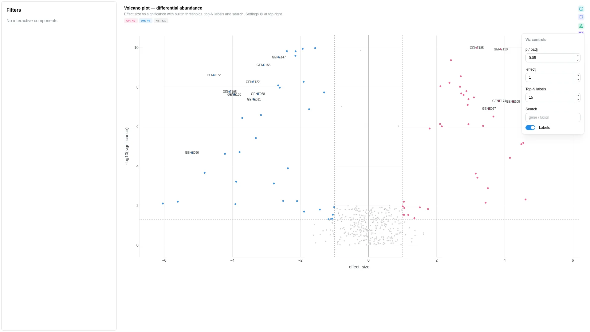
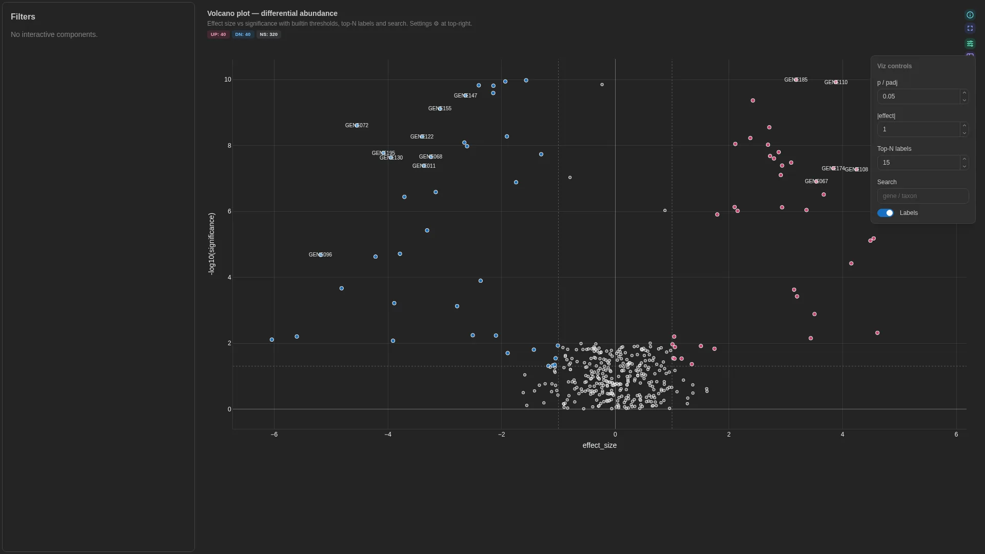
MA
Mean log intensity (x) vs log2 fold change (y) — same hits as volcano, classic DE / proteomics layout. Shares the UP / DOWN / NS tier scheme with Volcano.
A view of Volcano since v1.13.0
MA is now the ma view of the Volcano tile: bind avg_log_intensity_col on a volcano config and the MA plot is one click away in the view switch, with the same significance threshold and selection; its fold-change cutoff is fold_change_threshold. A viz_kind: ma config keeps loading and opens on the MA view, its log2_fold_change_col also serving as the volcano's effect size. The roles below are those of the retired kind; it is read as a volcano config, so a setting it leaves unset takes the volcano default.
Columns
| Role | Required | Type | Description |
|---|---|---|---|
feature_id |
✓ | String | Feature identifier |
avg_log_intensity |
✓ | Float | Mean log intensity (A in MA, x-axis). For DESeq2: pre-transform baseMean with log2(baseMean + 1) (or log10) — baseMean itself is untransformed normalised counts. |
log2_fold_change |
✓ | Float | Log2 fold change (M in MA, y-axis). DESeq2 log2FoldChange maps directly. |
significance |
— | Float | p / padj column for tier colouring |
label |
— | String | Hover label override |
Settings
| Option | Type | Default | Description |
|---|---|---|---|
significance_threshold |
float | 0.05 |
Cutoff for significance |
fold_change_threshold |
float (≥0) | 1.0 |
Absolute log2_fold_change cutoff |
top_n_labels |
int (≥0) | 20 |
Max features to auto-label. The retired kind defaulted to 15 |
show_labels |
bool | true |
Draw text labels on the highlighted points |
Filtering / row tagging
Same UP / DOWN / NS scheme as the Volcano, against significance_threshold and fold_change_threshold on the log2_fold_change column, computed client-side (deViews.ts).
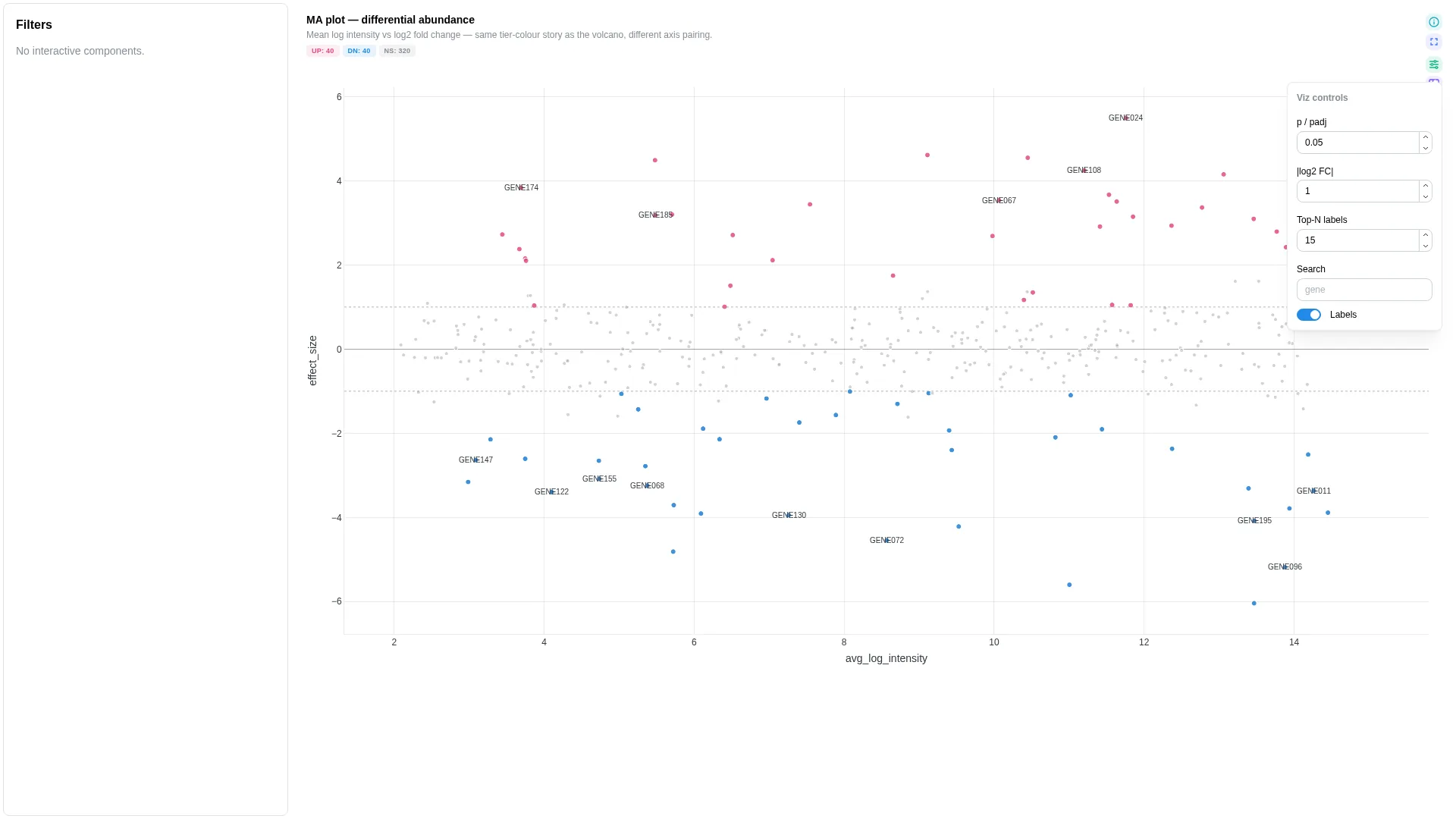
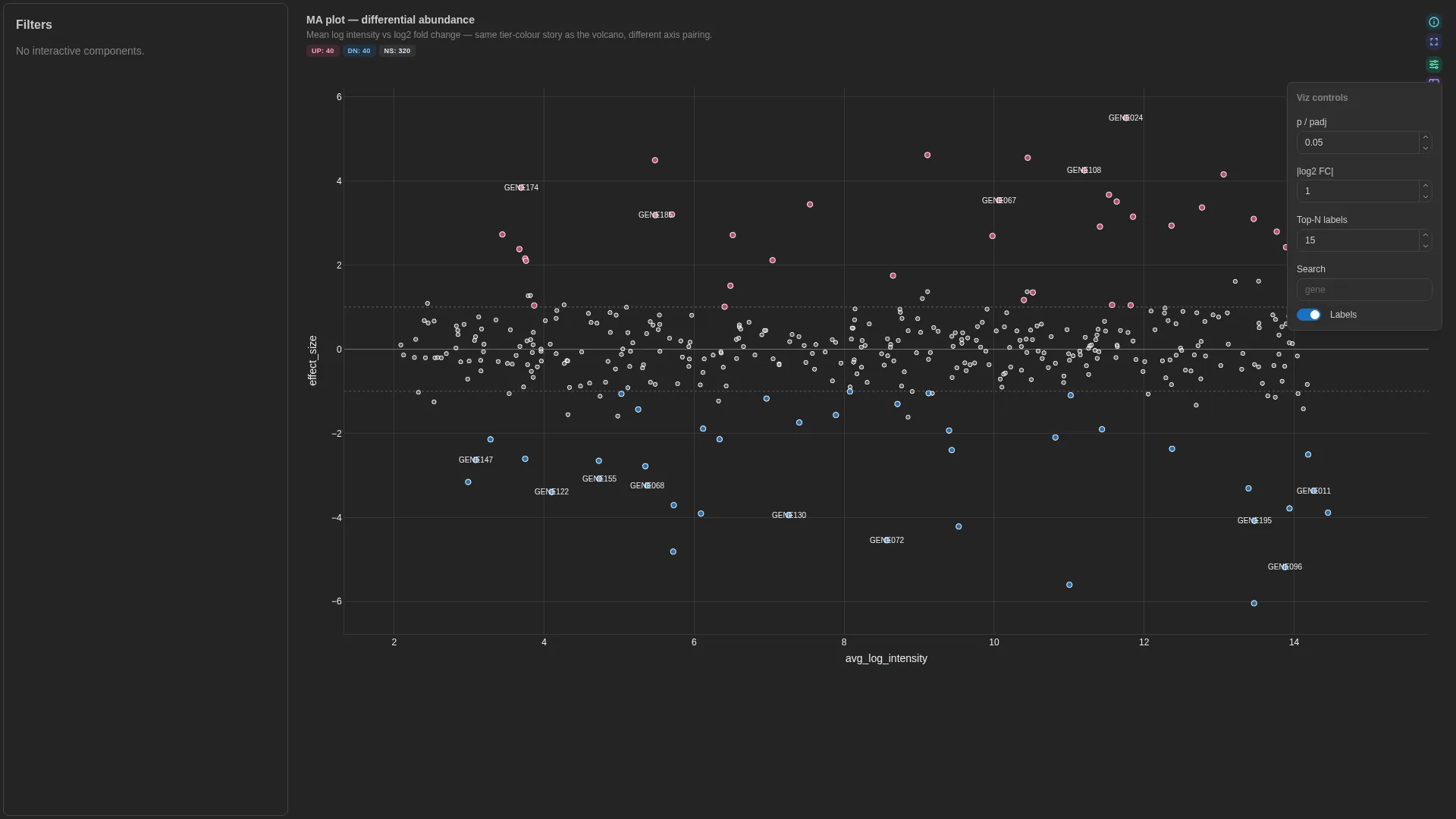
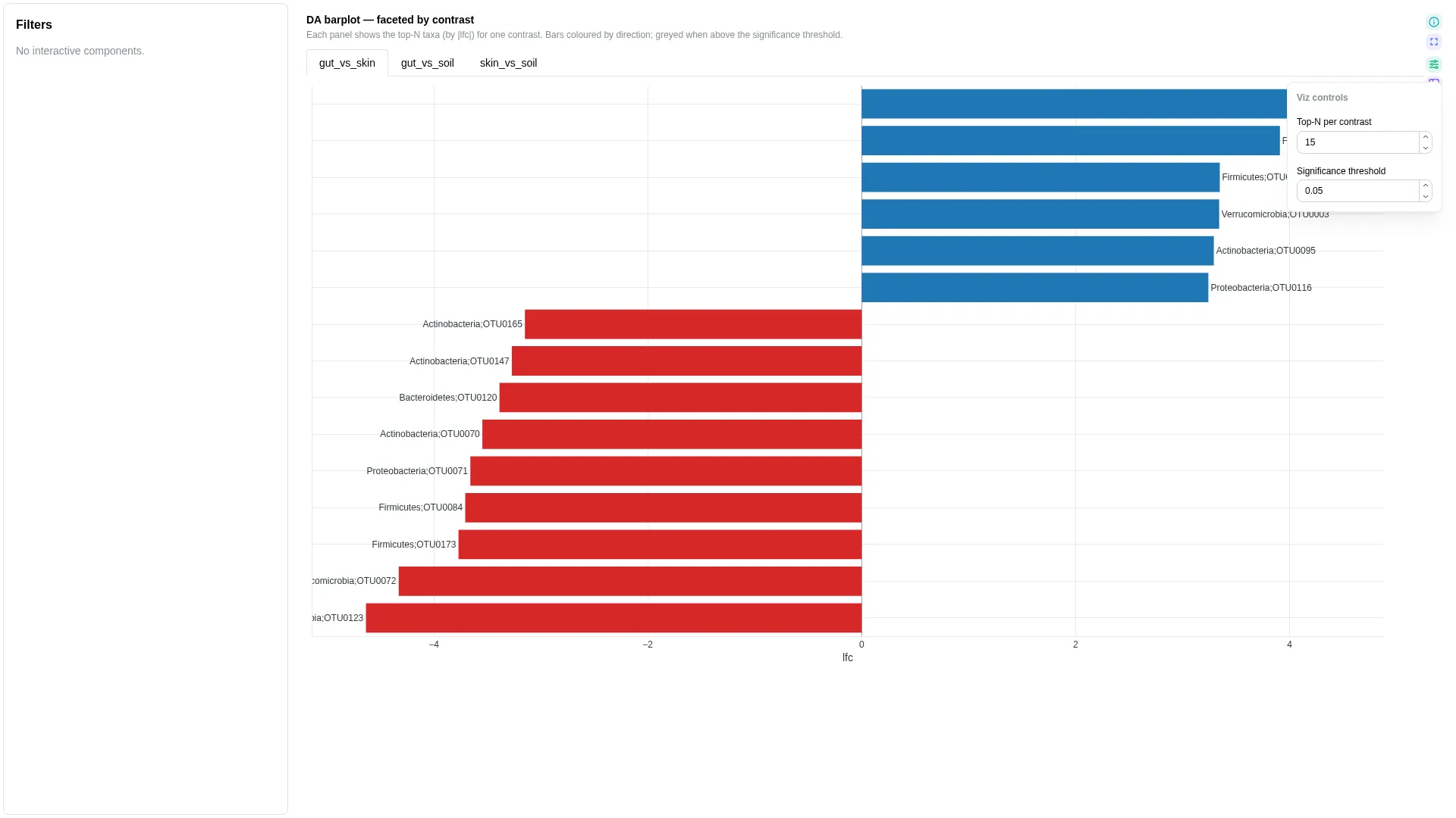
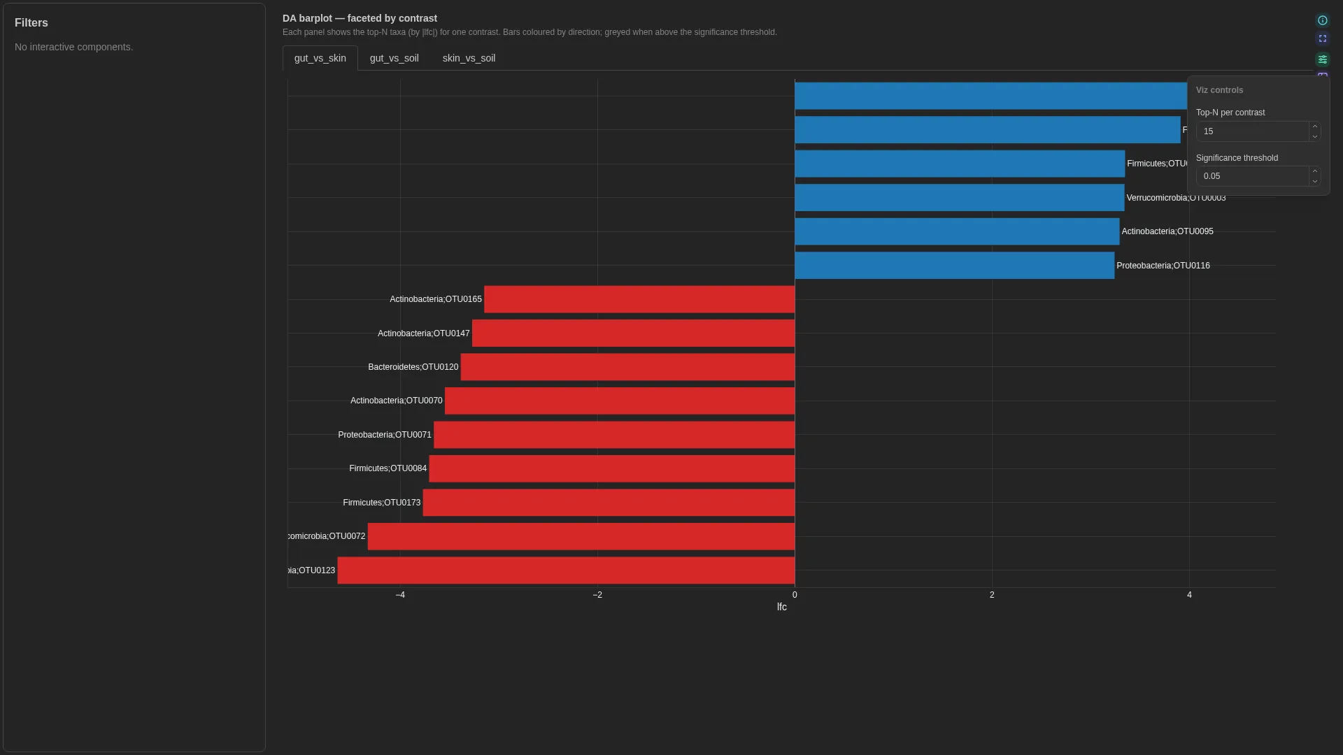
DA barplot
Ranked signed-LFC horizontal bars for differential abundance — single panel or faceted across contrasts. Same input shape as the upstream tool (ANCOM-BC, ALDEx2, MaAsLin2): one row per (feature, contrast) with lfc and optional significance.
Columns
| Role | Required | Type | Description |
|---|---|---|---|
feature_id |
✓ | String | Feature / taxon identifier |
contrast |
✓ | String | Contrast name (faceting + single-panel filter) |
lfc |
✓ | Float | Log-fold-change (signed) |
significance |
— | Float | FDR-adjusted p-value; significant bars are highlighted when bound |
label |
— | String | Display label for bars |
Settings
| Option | Type | Default | Description |
|---|---|---|---|
contrast_view |
str | "all" |
"all" → faceted small-multiples (one panel per contrast); any specific contrast value → single-panel drill-in |
significance_threshold |
float (0–1) | 0.05 |
Highlight cutoff for significance |
top_n |
int (≥1) | 15 |
Top features by \|lfc\| shown per panel |
Filtering / row tagging
When contrast_view == "all" the renderer facets by contrast (one panel per unique value, top-N per panel). When contrast_view matches a specific contrast value, the renderer collapses to a single panel showing only that contrast — useful when one comparison is the focus.
Legacy viz_kind: ancombc_differentials
Previously this single-panel layout was a separate viz kind named ancombc_differentials. It's now merged into DA barplot — viz_kind: ancombc_differentials is still accepted at deserialisation and rewritten to da_barplot with contrast_view defaulted from the persisted config.
Enrichment
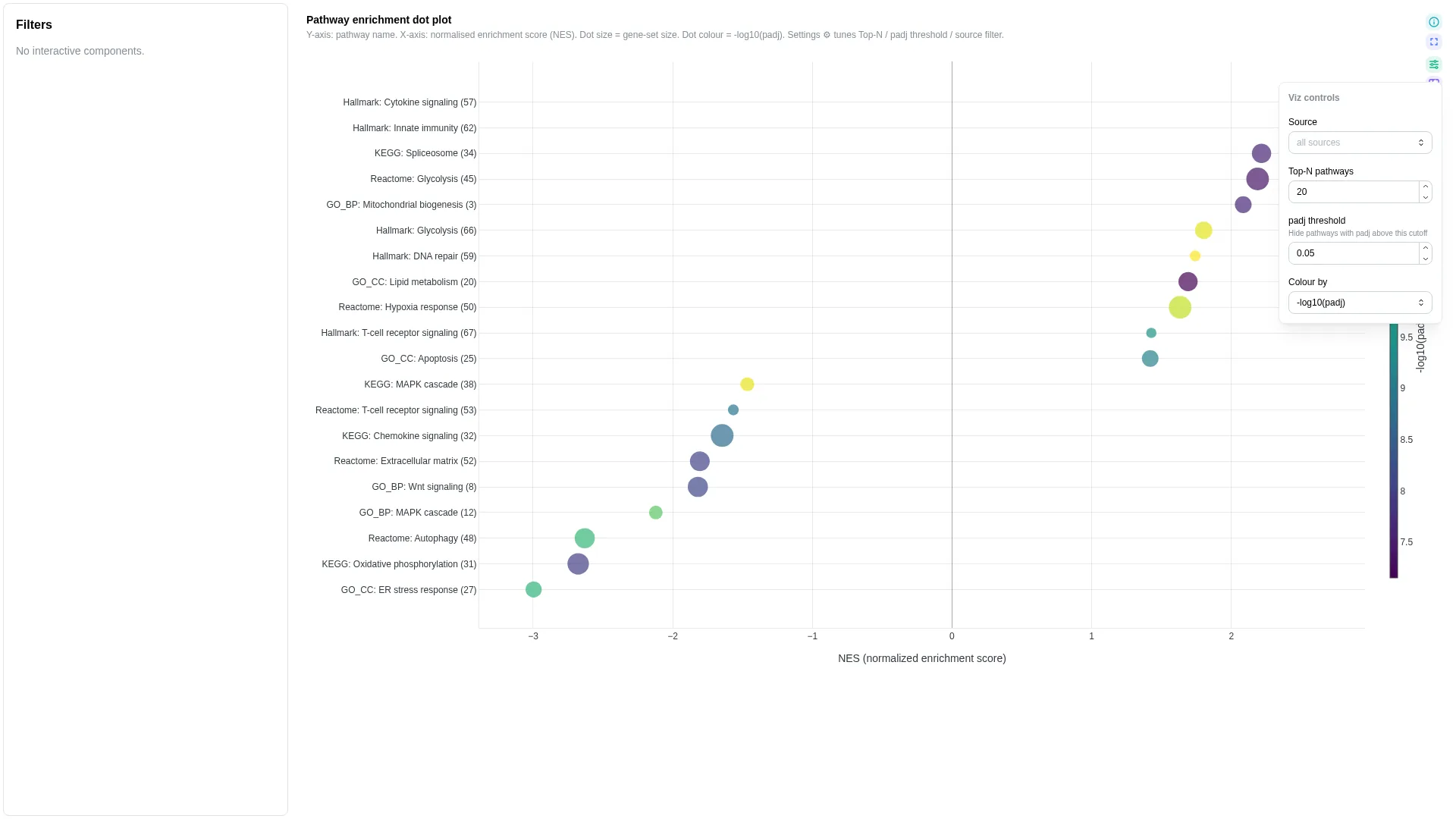
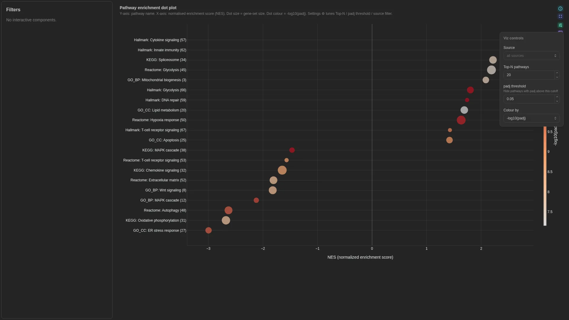
GSEA / GO / KEGG / Reactome pathway-enrichment dot plot: term on y, NES on x, dot size = gene-set size, colour = -log10(padj).
A view of Dot plot since v1.13.0
Enrichment is now the enrichment view of the Dot plot tile: the same marks and the same size and colour channels, read over a gene-set table. Bind term_col and nes_col on a dot_plot config, plus padj_col for the cutoff and gene_count_col for the dot size, and set view: enrichment. A viz_kind: enrichment config keeps loading and offers the enrichment view only, since its table has no cluster column for the marker view. The roles and settings below keep their names on the dot plot; display settings the retired config left unset now take the dot plot's defaults (max_dot_size 22, min_dot_size 2, colour_scale Viridis, outline on).
Enrichment view of a dot plot
Columns
| Role | Required | Type | Description |
|---|---|---|---|
term |
✓ | String | Pathway / GO-term name |
nes |
✓ | Float | Normalised enrichment score (signed, x-axis) |
padj |
✓ | Float | FDR-adjusted p-value |
gene_count |
✓ | Numeric | Gene-set size (dot size) |
source |
— | String | Ontology / source label (GO_BP, KEGG, Reactome, Hallmark, …) |
Settings
| Option | Type | Default | Description |
|---|---|---|---|
padj_threshold |
float (0–1) | 0.05 |
Filter cutoff |
top_n |
int (≥1) | 20 |
Max pathways shown |
default_colour_by |
neg_log10_padj | abs_nes | nes_sign | gene_count |
neg_log10_padj |
What the dot colour encodes on first render; Colour by in the tile |
term_sort |
nes | significance | gene_count | name |
nes |
Order of the terms on the y axis; Sort terms in the tile |
Filtering / row tagging
Terms above padj_threshold are dropped, the top_n most significant are kept, then ordered by term_sort. A Source multi-select narrows the terms when source_col is bound. These are primary controls, as are Top-N pathways, padj threshold and Colour by; colour scale, dot sizes and outline are cosmetic.
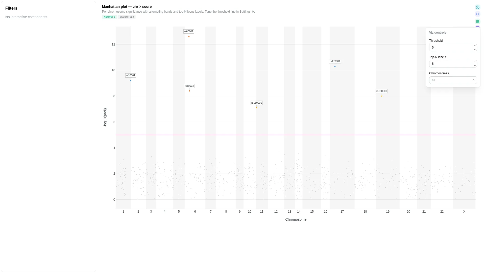
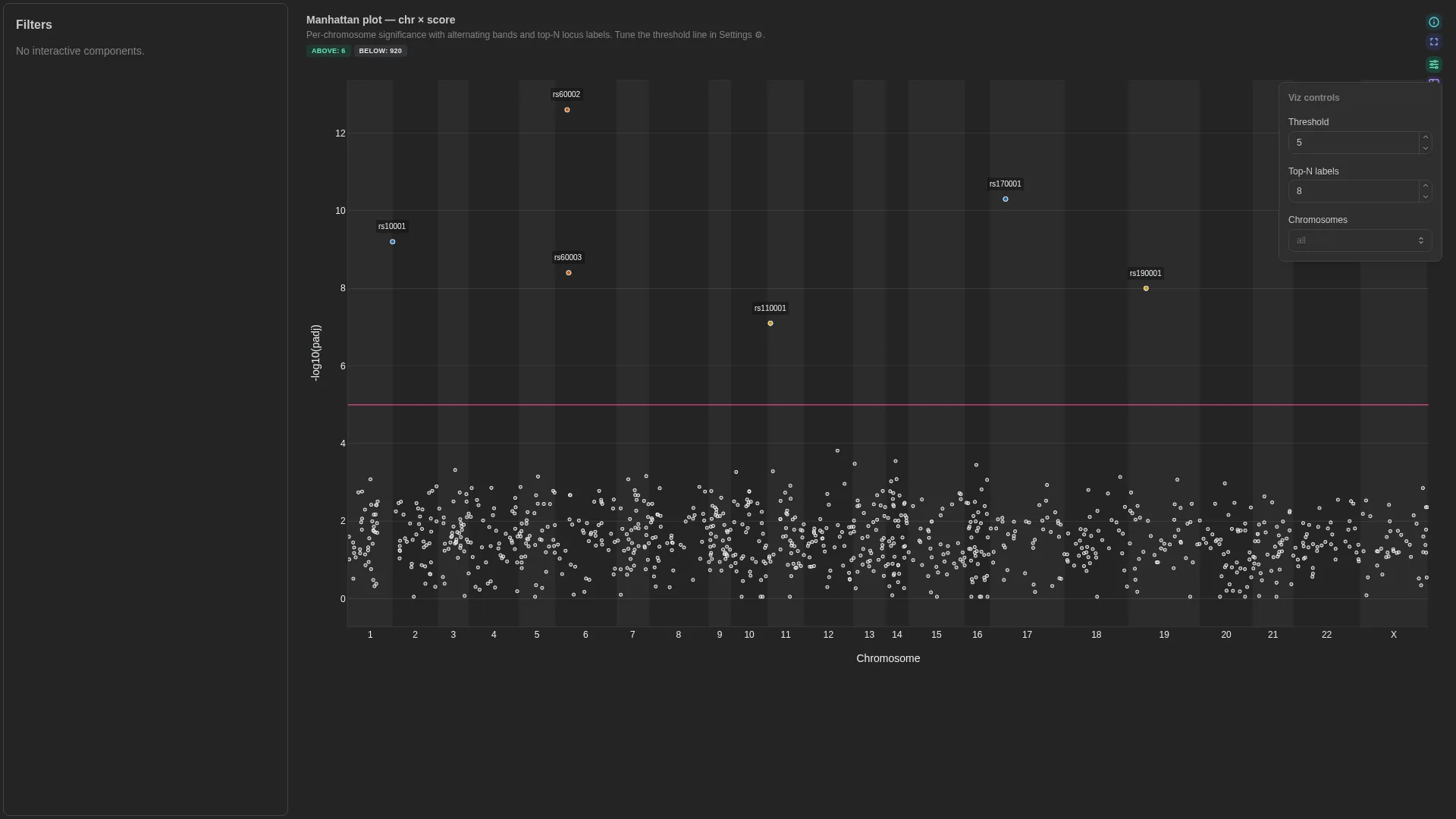
Manhattan
Generic chr / pos / score plot — works for true GWAS (variants), peak significance (ATAC/ChIP narrowPeak), or viral variant tracks. score_kind keeps the y-axis label honest.
Columns
| Role | Required | Type | Description |
|---|---|---|---|
chr |
✓ | String | Chromosome label |
pos |
✓ | Int | Genomic position (1-based) |
score |
✓ | Float | Y-axis score (e.g. -log10(padj)) |
feature |
— | String | Feature / locus id (gene, SNP, peak) |
effect |
— | Float | Signed effect. Not drawn by itself: list it in color_by_columns to colour by it |
Settings
| Option | Type | Default | Description |
|---|---|---|---|
score_kind |
str | -log10(padj) |
Y-axis label override |
score_threshold |
float | null | null |
Horizontal threshold line; null hides it |
highlight |
above | below | none |
above |
Which side of score_threshold gets emphasised. above colours and enlarges points at/above the threshold (GWAS / consensus-variant default); below inverts it (useful for minority-allele / sub-threshold candidates); none colours both sides equally. No effect when score_threshold is null. |
marker_size_above |
int (1–30) | 6 |
Marker size (px) for points at or above score_threshold. Only used when a threshold is set. |
marker_size_below |
int (1–30) | 4 |
Marker size (px) for sub-threshold points. Lower by default so the eye lands on the hits. |
marker_size_uniform |
int (1–30) | 5 |
Marker size when no threshold is set (uniform sizing). |
color_by_columns |
list[str] | [] |
Extra columns fetched alongside the required roles, offered in the tile's Colour by select, which only appears once this lists a column. The renderer auto-detects numeric vs categorical (continuous colorscale vs palette). Chromosome and Score (the y-axis column) are always available without listing them here. Typical viralrecon usage: ['effect', 'lineage', 'sample']. |
default_color_by |
str | null | null |
Initial value for the Colour-by dropdown. Either Chromosome, Score, or one of color_by_columns. Defaults to Chromosome when null. |
top_n_labels |
int (≥0) | 8 |
Highest-scoring loci labelled |
selection_enabled / selection_column |
bool / str | null | false / null |
A click or lasso on markers emits that column's values as a selection filter |
mode |
manhattan | rainfall |
manhattan |
rainfall plots log10 of the distance to the previous variant on the same chromosome instead of the score: clustered mutations (kataegis) sink to the bottom. Switchable from the tile (Score / Rainfall) (v1.13.0+) |
rainfall_class_col |
str | null | null |
Rainfall mode: column whose values colour each point (mutation class, consequence); null colours by chromosome (v1.13.0+) |
Filtering / row tagging
Renderer lays the chromosomes end to end on one genome-wide axis, in alternating bands; the Chromosomes select narrows it. The optional score_threshold draws a horizontal cutoff line — no explicit per-row tag, but the line gives a visual significance reference.
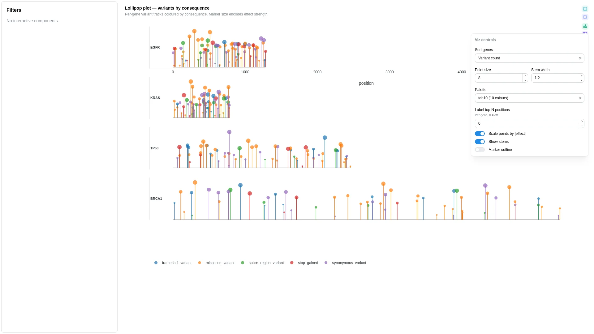
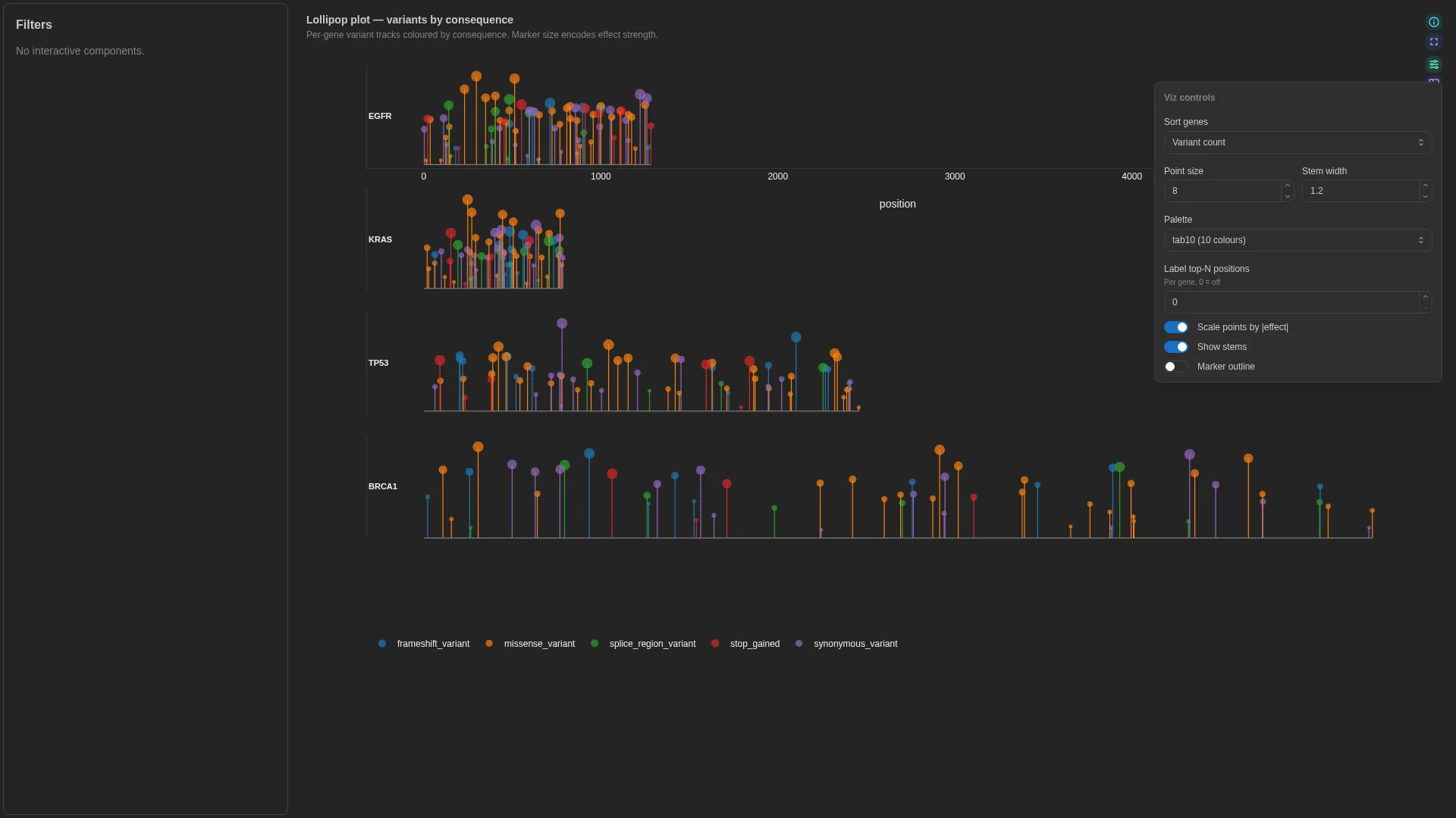
Lollipop
Needle / variant track along a gene — each gene body as a horizontal line, each variant as a vertical stem with a category-coloured marker on top.
Columns — straight rename from canonical Mutation Annotation Format (VEP / vcf2maf / maftools — the cancer-mutation file format, not Minor Allele Frequency):
| Role | Required | Type | Description | Mutation Annotation Format column |
|---|---|---|---|---|
feature_id |
✓ | String | Gene / feature the variant is on | Hugo_Symbol |
position |
✓ | Int | Position along the feature | Start_Position (or Protein_position for AA-space tracks) |
category |
✓ | String | Variant consequence category (colour) | Variant_Classification |
effect |
— | Float | Numeric effect (marker size) | e.g. VAF, t_alt_count / t_depth |
label |
— | String | Names each stem in the hover and the top-N labels | e.g. HGVSp_Short |
Settings
| Option | Type | Default | Description |
|---|---|---|---|
max_subplot_genes |
int (≥1) | 6 |
If the gene universe exceeds this, switch to a single-gene picker |
gene_sort |
name | count | effect |
count |
Order of the gene panels |
point_size / stem_width |
int (1–40) / float (0–10) | 8 / 1.2 |
Head size and stem width |
scale_points_by_effect / show_stems / marker_outline |
bool | true / true / false |
Size heads by effect, draw the stems, outline the heads |
palette |
tab10 | tab20 |
tab10 |
Palette of the consequence categories |
top_n_labels |
int (≥0) | 0 |
Label the most extreme points per gene; 0 draws none |
Filtering / row tagging
Renderer facets by feature (one subplot per gene, or a picker once the universe exceeds max_subplot_genes). Markers are coloured by category and sized by effect when bound. The gene picker and Sort genes are primary controls; the marker, stem, palette and label settings are cosmetic.
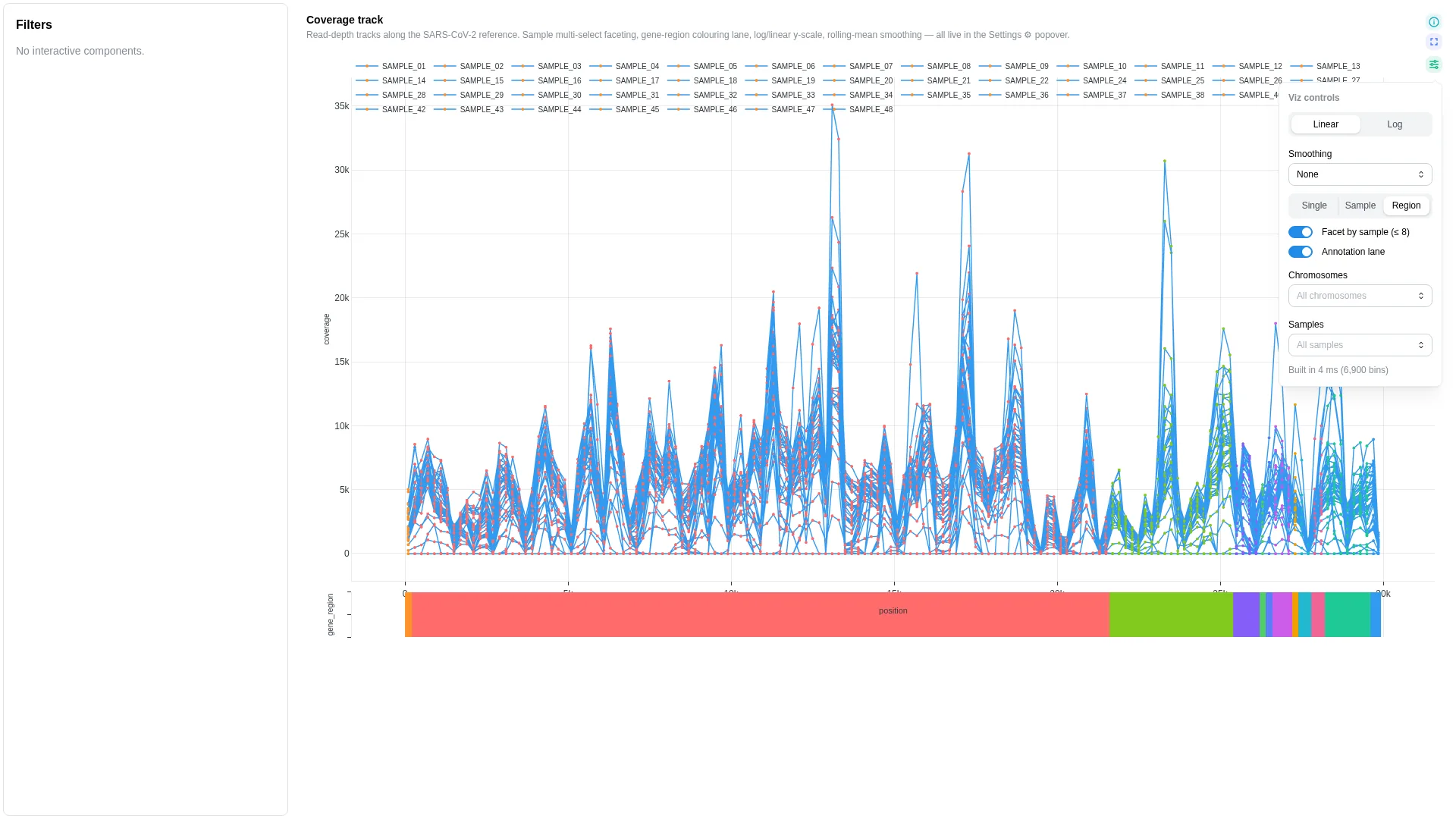
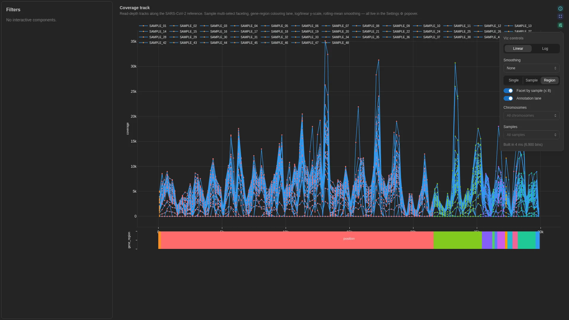
Coverage track
Read depth / signal along a coordinate axis. Universal genomics primitive — covers mosdepth bins, BigWig-derived transcript coverage, peak signal, methylseq depth, contig coverage, sarek QC.
Columns
| Role | Required | Type | Description |
|---|---|---|---|
chromosome |
✓ | String | Chromosome / contig label |
position |
✓ | Int | Bin centre or single-base position |
value |
✓ | Numeric | Coverage / signal value |
end |
— | Int | Bin end — when set with position, treated as interval |
sample |
— | String | Per-sample faceting (stacked subplots) |
category |
— | String | Categorical annotation (gene region, peak class, …) |
Settings
| Option | Type | Default | Description |
|---|---|---|---|
y_scale |
linear | log |
linear |
Y-axis scale |
smoothing_window |
int (0–200) | 5 |
Rolling-mean window in bins (0 disables). Default 5 ≈ 1 kb at 200-bp mosdepth bins — kills high-frequency wiggle without flattening amplicon-scale dropouts. |
color_by |
single | category | sample |
single |
Trace colour assignment mode |
show_annotation_lane |
bool | true |
Draw the bundled gene strip under the track when the assembly is recognised or pinned by annotation_id; Gene strip in the tile |
annotation_id |
str | null | null |
Optional bundled-annotation override for the genome-feature overlay strip. When null, the renderer auto-detects the assembly from the bound DC's chromosome value (e.g. MN908947.3 → SARS-CoV-2). Pin this when your data uses non-standard chromosome names but corresponds to a known assembly. Valid ids: sars_cov_2, rsv_a, hiv_1, hbv (see depictio-react-core's genome_annotations registry). |
chromosomes_filter |
list[str] | null | null |
Whitelist of chromosomes; null = all |
samples_filter |
list[str] | null | null |
Whitelist of samples; null = all |
view_mode |
aggregate | facet | overlay | null |
null |
How samples share the track: a cohort median with an IQR ribbon, one lane each, or all overlaid. Null picks from the sample count |
show_individuals |
bool | true |
Aggregate layout: draw each sample's trace faintly under the median |
facet_by_sample |
bool | false |
One lane per sample whatever view_mode says, in both views (v1.13.0+) |
mark |
line | rect | point |
line |
Trace geometry of the per-sample traces: a continuous line, one filled bar per bin, or discrete points. The aggregate view's median and IQR ribbon has no single-mark equivalent and ignores it. Also switchable from the tile (v1.13.0+) |
view |
track | locus |
track |
track draws the smoothed Plotly line; locus draws the same rows as a zoomable GenomeSpy track, the one Genome view draws (v1.13.0+) |
views |
list | null | null |
Views offered in the view switch; null offers both (v1.13.0+) |
locus_annotation |
none | hg38 | mm10 |
none |
Locus view: bundled gene lane drawn under the track (v1.13.0+) |
locus_assembly |
str | null | null |
Locus view: assembly whose contig lengths lay out the genome axis; null derives the axis from the rows (v1.13.0+) |
Filtering / row tagging
Renderer draws one base-pair axis. The Chromosomes and Samples selects, seeded from chromosomes_filter / samples_filter, narrow it, and Aggregate / Per-sample / Overlay sets how samples share it. category feeds the Region colour mode. The view switch, sample layout, y scale, smoothing and the two selects are primary controls; mark, colour mode, individual traces and gene strip are cosmetic.
Since v1.13.0 the track also follows a genomic region published elsewhere on the dashboard (a Genome view brush or locus field, or a plain chromosome filter): rows bound to the same columns are narrowed by the filter as usual, and the x axis clamps to the region.
Coverage track with points and the locus view
- tag: viz-coverage
  component_type: advanced_viz
  workflow_tag: my_workflow
  data_collection_tag: depth_bins
  viz_kind: coverage_track
  config:
    viz_kind: coverage_track
    chromosome_col: chrom
    position_col: start
    end_col: end
    value_col: depth
    sample_col: sample
    mark: point
    view: track
    views: [track, locus]
Stacked taxonomy
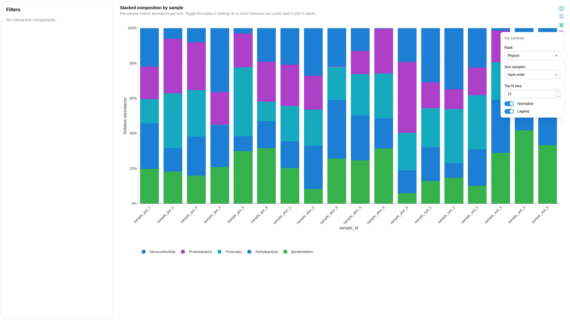
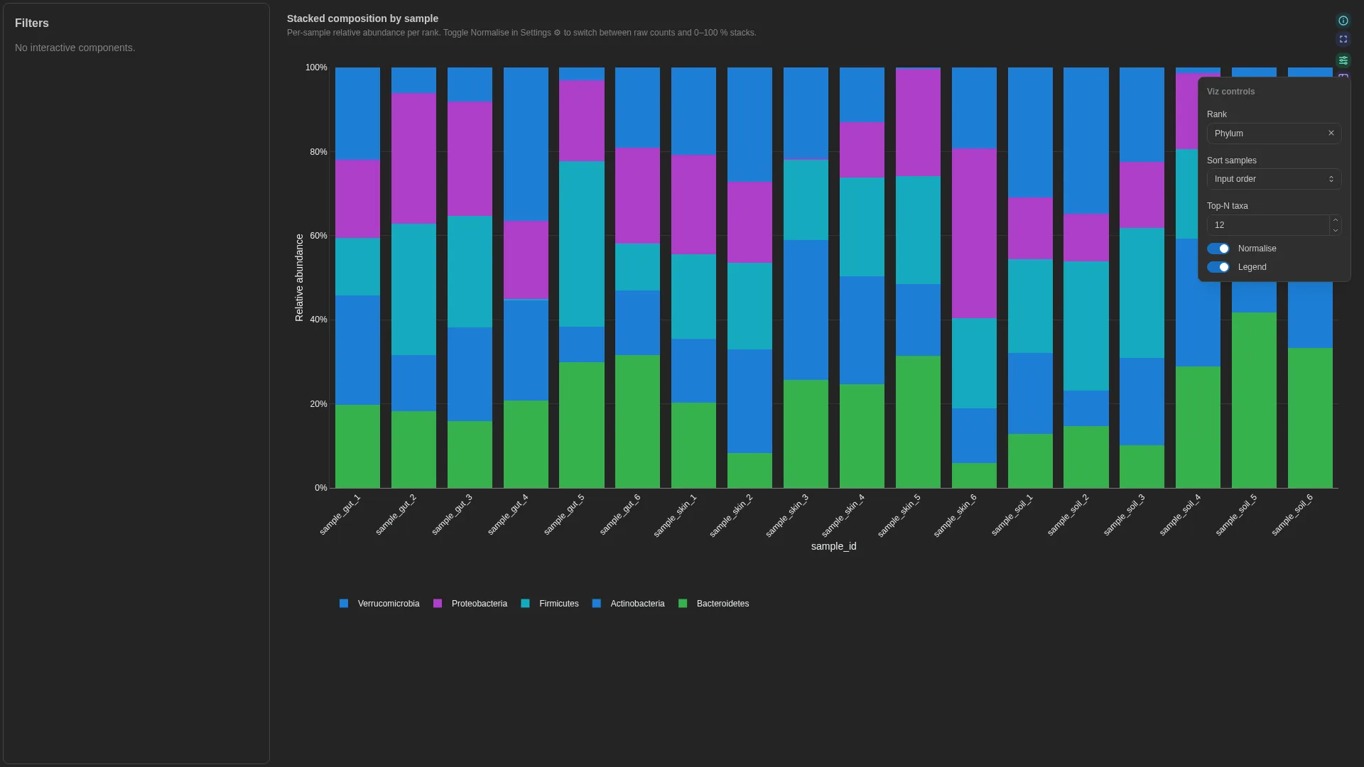
Per-sample stacked relative-abundance bar with a rank dropdown.
Columns
| Role | Required | Type | Description |
|---|---|---|---|
sample_id |
✓ | String | Sample identifier |
taxon |
✓ | String | Taxon name |
rank |
✓ | String | Taxonomic rank label |
abundance |
✓ | Numeric | Relative or absolute abundance |
Settings
| Option | Type | Default | Description |
|---|---|---|---|
default_rank |
str | null | null |
If rank carries multiple ranks, default-filter to this one |
top_n |
int (≥1) | 20 |
Show top-N taxa, lump rest into Other |
sort_by |
abundance | alphabetical |
abundance |
Stack-ordering rule. Accepted, but the viewer always ranks taxa by total abundance |
sample_sort |
input | total_abundance | first_taxon |
input |
Order of the samples on the x axis |
normalise_to_one |
bool | true |
Force each sample's bars to sum to 1 (true % composition) |
annotation_strips |
list[dict] | null | null |
Per-sample categorical annotation strips drawn above or below the stacked bars. Each entry is a dict with: column (str, required), label (str, optional — defaults to column name), position (top | bottom, default bottom), palette ({value: hex}, optional). Reusable across any per-sample categorical metadata (habitat, batch, treatment, timepoint) — renderer pulls the columns automatically, no recipe change needed. |
show_legend / log_y |
bool | true / false |
Taxon legend; log y axis, only offered when normalise_to_one is off |
taxon_palette |
dict[str, str] | null | null |
{taxon: hex} colours pinned for the bars. Unlisted taxa keep the default cycle, which repeats past twelve taxa (v1.12.0+) |
Annotation strips YAML
(v1.12.0+) Each strip is a row of cells under or over the bars, one per
sample. Hovering a cell shows the sample and its category. Since v1.14.0 a strip whose
categories each span a wide enough block is labelled on itself, the others get a compact
key of their own above the plot, and the taxa legend is titled with the active rank. A
strip reads its column from the data collection the figure draws. The bundled QIIME2 recipe behind the nf-core/ampliseq stacked taxonomy
joins every categorical column of the sample metadata with at most 25 categories (text,
categorical or boolean), so a strip can follow locality, batch or any other grouping,
not only habitat. Samples are ordered by habitat when that column exists, otherwise
by the first column joined. Collections ingested before v1.12.0 carry only habitat:
re-ingest them to colour by another column. A taxon with no name at the shown rank is
labelled Unclassified.
Filtering / row tagging
Renderer filters by rank (Rank select sourced from the unique rank values). Within the active rank, taxa are ranked by total abundance; everything past top_n is collapsed into an Other slice. Rank, sample order, top-N and normalisation are primary controls; legend and log y are cosmetic.
Sunburst
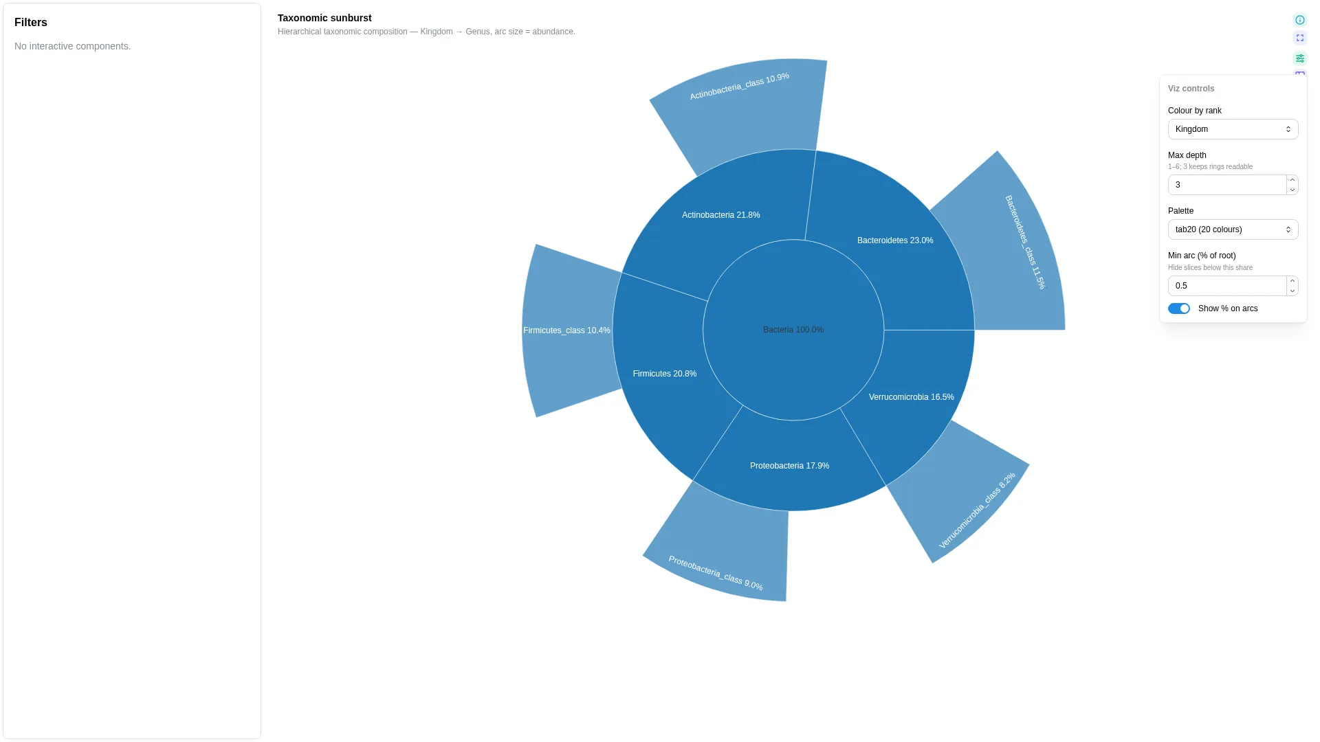
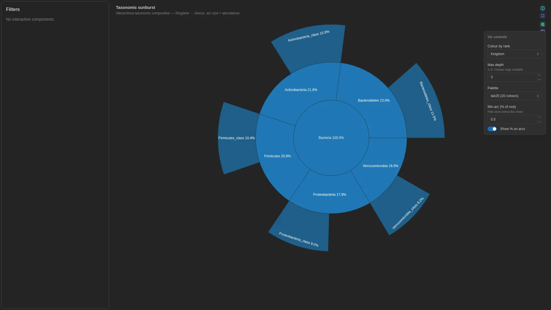
Hierarchical taxonomy / pathway viewer — concentric rings from root to leaf. Unlike most viz, Sunburst uses a multi-column rank_cols list rather than the standard single-column <role>_col pattern; the abundance role is bound via the abundance_col setting below.
Bracken vs Kraken2 — what to ingest
A raw .bracken file is flat for a single target rank (columns: name, taxonomy_id, taxonomy_lvl, fraction_total_reads, …) and does not carry explicit Kingdom→Genus rank columns. To bind it to Sunburst, either (a) ingest the Kraken2 .kreport instead and pivot the indented lineage into rank columns, or (b) map each Bracken taxonomy_id back to the NCBI taxonomy tree (e.g. taxonkit lineage, ete3) and expand to rank columns before upload. The DC must end up with one column per rank used in rank_cols plus one numeric abundance_col.
Columns
| Role | Required | Type | Description |
|---|---|---|---|
abundance |
✓ | Numeric | Leaf abundance weight (bound via abundance_col). For Bracken: fraction_total_reads or new_est_reads. |
Settings
| Option | Type | Default | Description |
|---|---|---|---|
rank_cols |
list[str] (≥2) | required | Hierarchical columns from root to leaf (e.g. [Kingdom, Phylum, Class, Order, Family, Genus]) |
abundance_col |
str | abundance |
DC column that satisfies the abundance role above |
start_rank |
str | null | null |
Rank of the innermost ring; null starts at the first of rank_cols |
colour_by_rank |
str | null | null |
Rank driving the colour key; null colours by the innermost visible ring. Since v1.14.0 its values take the dashboard's category_colors, then category_palette, then palette; each outer ring is a lighter shade of its lineage's colour, and Unclassified / Other are grey |
max_depth |
int (≥1) | 3 |
Rings drawn from the start rank outwards |
palette |
tab10 | tab20 |
tab20 |
Categorical palette |
min_percent |
float (0–50) | 0.5 |
Arcs below this share of the root, in percent, fold into a grey Other (n) when two or more share a parent (v1.14.0+) |
show_counts |
bool | true |
Label each arc with its share of the root |
category_palette |
dict[str, str] | null | null |
Explicit value→colour overrides for the colour-key categories (whichever rank the user's Colour-by picker chooses). Pin domain palettes (e.g. Habitat → Set1) so the same category lands on the same colour across PCoA / UpSet / heatmap tiles. |
Filtering / row tagging
Renderer hierarchically aggregates by the rank_cols sequence. Intermediate arc sizes are reconstructed via Plotly's branchvalues='total'. Since v1.14.0 the centre is All, and hovering an arc gives its share of the whole and of its parent. No per-row tag — aggregation is deterministic and lossless. Start rank, colour rank and depth are primary controls; palette, minimum arc and arc labels are cosmetic.
Rarefaction
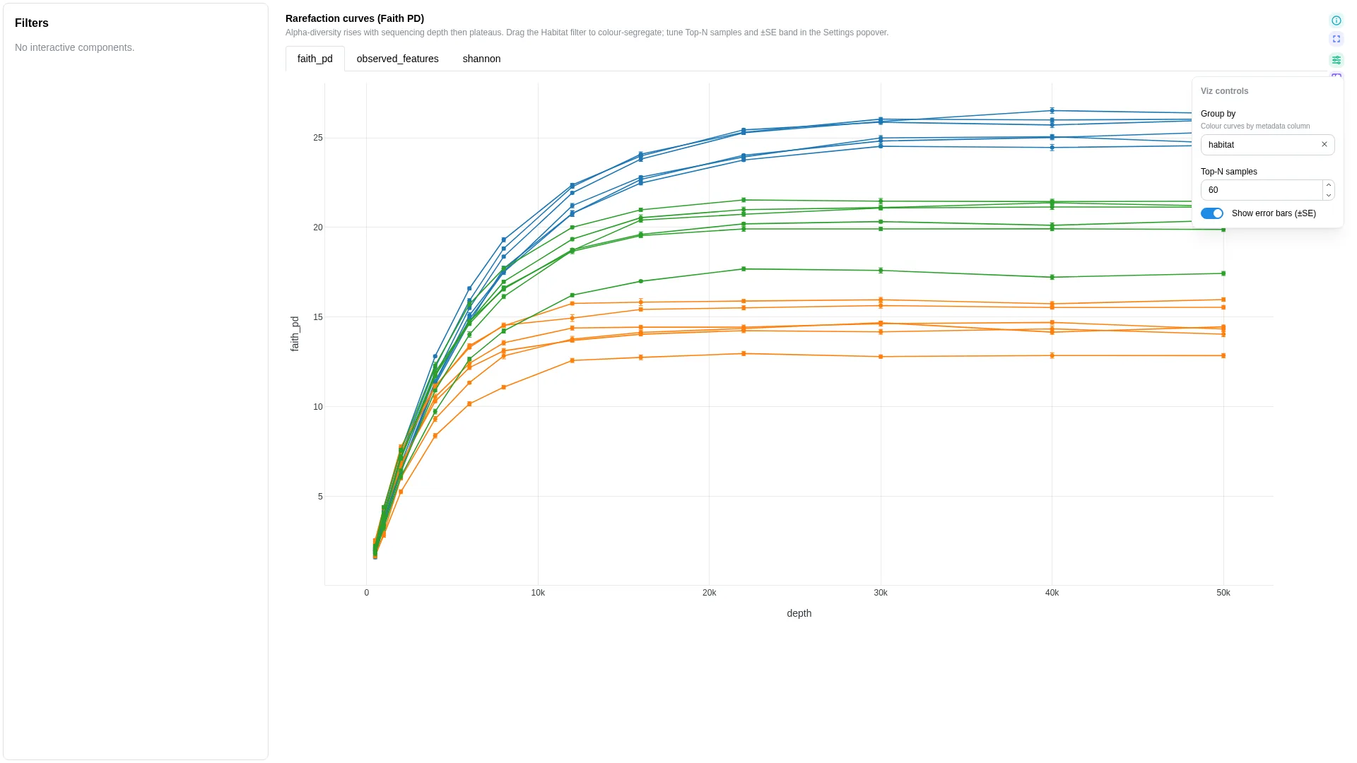
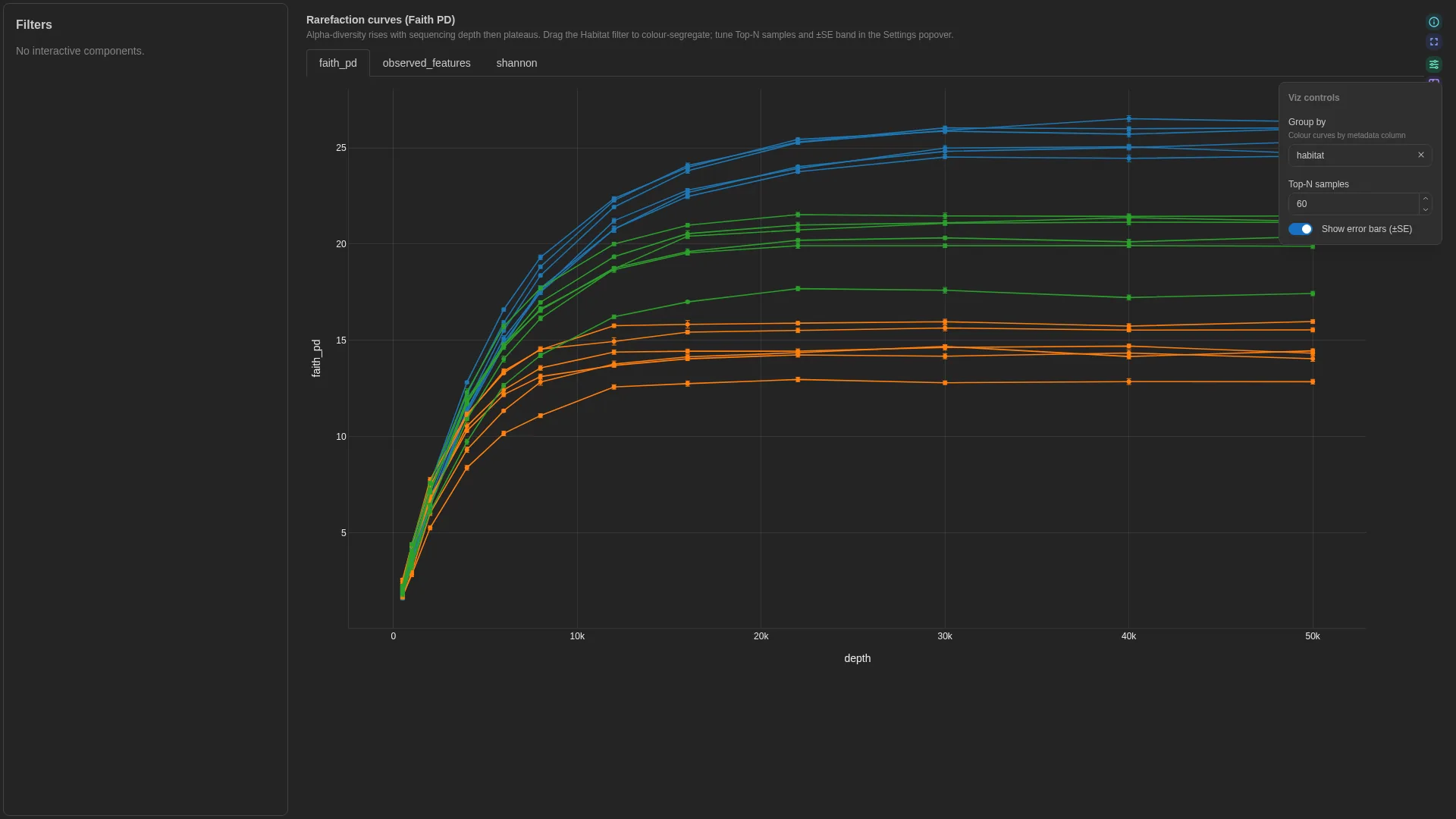
Alpha-diversity vs sequencing depth — one line per sample with optional ±SE error bars and group colouring.
Columns
| Role | Required | Type | Description |
|---|---|---|---|
sample_id |
✓ | String | Sample identifier |
depth |
✓ | Numeric | Subsampling depth (x-axis) |
metric |
✓ | Numeric | Alpha-diversity metric value (y-axis) |
iter |
— | Numeric | Iteration column to aggregate over |
group |
— | String | Categorical column for line colour grouping |
Settings
| Option | Type | Default | Description |
|---|---|---|---|
metric_options |
list[str] | null | null |
Metric columns offered as tabs above the plot, each an alternative y axis; null shows metric_col only |
top_n |
int (≥1) | 60 |
Samples drawn before truncating |
show_ci |
bool | true |
Draw ±1 SE error bars on each sample's curve |
category_palette |
dict[str, str] | null | null |
Explicit value→colour overrides for the group categories. Pins domain palettes (e.g. habitat → Set1) across PCoA + UpSet + heatmap + rarefaction for cross-tab consistency. |
Filtering / row tagging
Renderer aggregates over iter per (sample_id, depth) — computes mean ± SE. Optional group adds a colour split; otherwise one line per sample. No binary row tag. Group by and Top-N samples are primary controls, the error bars cosmetic.
Phylogenetic
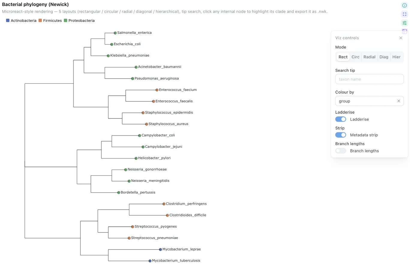
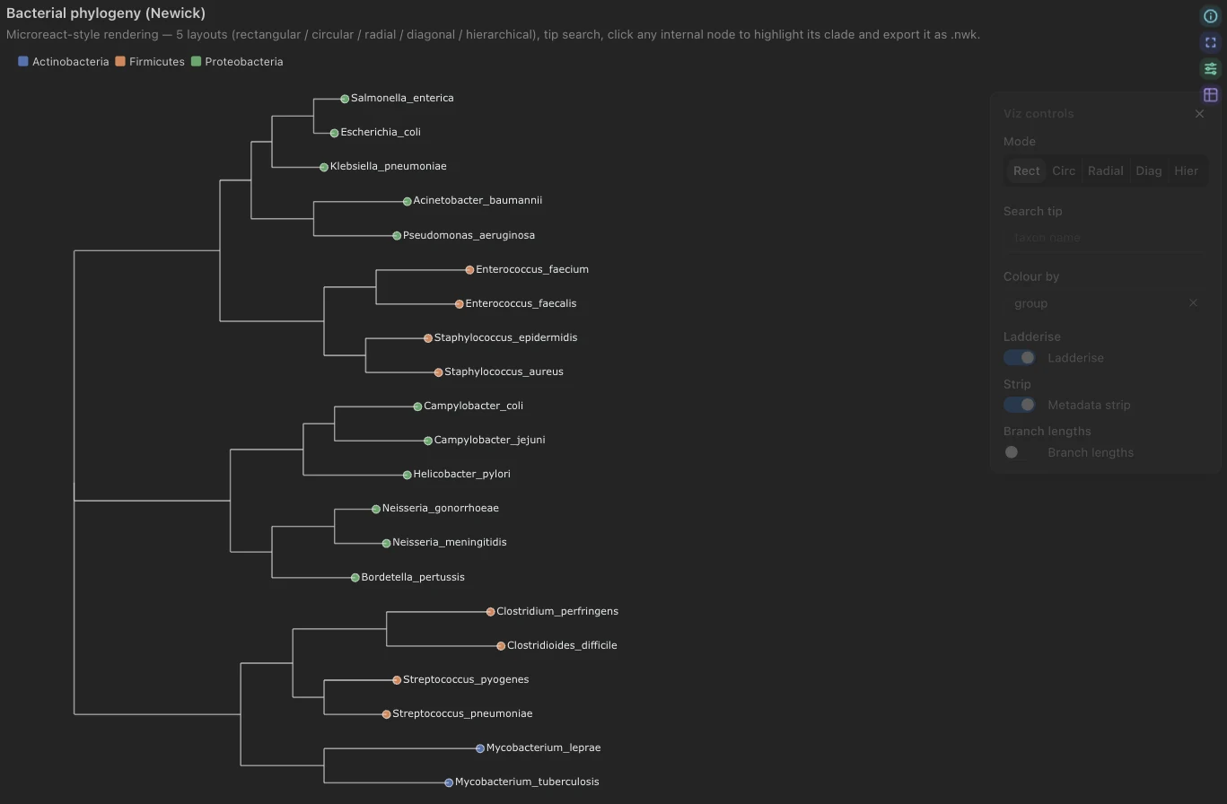
Newick tree + tip metadata (Microreact-style): 5 layouts, tip search, subtree highlight, and since v1.8.0 a navigable viewport with cross-filtering. See Reading and navigating the tree.
The tree itself comes from a separate DC with dc_type: phylogeny (served via /advanced_viz/phylogeny/{dc_id}/newick). Tip annotations live in a regular Table DC and are joined to tip labels at render time via taxon_col. The schema below validates the metadata DC only. Since v1.14.0 the component itself may be bound to the phylogeny DC, the one non-table DC an advanced visualization accepts.
Columns (metadata DC)
| Role | Required | Type | Description |
|---|---|---|---|
taxon |
✓ | String | Joins metadata rows to tip labels in the tree |
color |
— | Numeric | String | Tip colouring (categorical or continuous) |
label |
— | String | Metadata column shown alongside the tip label (e.g. clade name) |
Settings
| Option | Type | Default | Description |
|---|---|---|---|
tree_wf_id / tree_dc_id |
str | required | Workflow + DC ids of the phylogeny DC |
metadata_wf_id / metadata_dc_id |
str | null | null |
Optional metadata DC for tip annotations |
tree_dc_tag / metadata_dc_tag |
str | null | null |
DC tags of the same two collections, for a YAML file; resolved to ids at import |
taxon_col |
str | "taxon" |
Column in the metadata DC matching tip labels in the tree |
color_col |
str | null | null |
Metadata column for tip colouring (categorical or continuous) |
label_col |
str | null | null |
Metadata column used to label the tips, so a tree whose tip names are hashes can read as something else. Changeable at view time from Label by (v1.8.0+) |
extra_color_cols |
list[str] | null | null |
Extra metadata columns to pre-fetch so they appear in the viz Colour-by Select. Typical use: taxonomic ranks on ASV trees (Kingdom/Phylum/.../Species) so the user can re-colour tips at a different rank without reloading. |
category_palettes |
dict[str, dict[str, str]] | null | null |
Per-column palette overrides for the Colour-by selector. Shape: {column_name: {category_value: hex}}. Pin domain palettes (e.g. dominant_habitat → Set1) so the same category lands on the same colour across PCoA / UpSet / heatmap / phylogeny tiles. Since v1.14.0 layered over the dashboard's category_colors, so a column pinned there needs no entry |
default_layout |
rectangular | circular | radial | diagonal | hierarchical |
rectangular |
Initial tree layout |
ladderize |
bool | true |
Ladderise the tree by default |
show_metadata_strip |
bool | true |
Render Microreact-style metadata strips beside the tips. Strips get their own legend sections (v1.8.0+) |
show_branch_lengths |
bool | true |
Annotate branches with lengths. Drawn as a clipped trace capped at the longest branches, so a dense tree is not buried in text (v1.8.0+) |
show_internal_labels |
bool | false |
Annotate internal nodes with their labels. Accepted, not drawn by the v1.13.0 viewer |
Summary by rank (v1.14.0+)
collapse_rank draws the same component as a summary for a landing tile: a cladogram
with one tip per value of a tip-metadata column, such as Phylum, the top top_n by
share. Each value sits at its core clade, the largest clade whose classified tips all
carry it, and the legend counts what is not shown. Dashboard filters reach the summary as
they reach the full tree. Unset, the full tree is drawn as before.
| Option | Type | Default | Description |
|---|---|---|---|
collapse_rank |
str | null | null |
Tip-metadata column to collapse to. Needs metadata_dc_tag (or metadata_dc_id) |
top_n |
int (1–60) | 10 |
How many values to draw, by share |
size_by |
tips | abundance |
tips |
What a dot measures: the share of the tree's tips, or the mean share of a sample's reads from the abundance table |
show_shares |
bool | null | null |
Print each value's % beside it. Unset: shown only with size_by: abundance |
abundance_dc_tag |
str | null | null |
Abundance table, one row per sample and taxon, with a column named like collapse_rank. It or abundance_wf_id / abundance_dc_id is required by size_by: abundance; the tag is resolved to the ids at import |
abundance_col / abundance_sample_col |
str | rel_abundance / sample |
Its relative-abundance and sample columns; a table without the sample column has its abundance summed |
abundance_split_col |
str | null | null |
A column of the abundance table, such as a site, drawn as one column of dots per value beside the tips. Each column wears that value's colour from the dashboard's category_colors or category_palettes[abundance_split_col], else the lineage's. Viewers can switch it to any text column of the table with 2–8 values |
show_split |
bool | true |
Draw those columns; off keeps the setting for a viewer to switch back on |
split_scale |
shared | row |
shared |
One dot scale for every dot, or relative to each value's largest, to show where it is concentrated |
show_tip_dots |
bool | true |
Draw a dot sized by the share at each tip |
- component_type: advanced_viz
  viz_kind: phylogenetic
  workflow_tag: ampliseq
  data_collection_tag: phylogenetic_tree_canonical
  figure_style: minimal
  title: Tree of life
  subtitle: top phyla
  config:
    viz_kind: phylogenetic
    tree_wf_id: 646b0f3c1e4a2d7f8e5b8ca3   # placeholders, rewritten from
    tree_dc_id: 646b0f3c1e4a2d7f8e5b8cdb   # tree_dc_tag at import
    tree_dc_tag: phylogenetic_tree_canonical
    metadata_dc_tag: phylogenetic_tree_metadata_canonical
    color_col: Kingdom
    extra_color_cols: [Phylum, Class, Order]   # what Collapse to offers
    collapse_rank: Phylum
    top_n: 10
    size_by: abundance
    abundance_dc_tag: taxonomy_rel_abundance   # has a Phylum column
    abundance_split_col: locality              # one column of dots per site
In the component builder the tree is set up in steps, each marked required or optional: Tree (required, and enough to draw it), Tip metadata (the table and the tip, colour and label bindings), View (Full tree or Summary by rank, with Collapse to, Lineages shown, Size by, Show %, Tip dots and the Columns viewers can switch to) and Read shares (the Abundance table, its Value column, Sample column and Split by, and the Strip dot scale). The form and the preview write the same keys, so they cannot disagree. Collapse to lists ranks from root to leaf (Domain, Kingdom, Supergroup, Division, Subdivision, Phylum, Class, … Species), then any other column; other rank pickers (Colour by, the stacked taxonomy's Rank, UpSet and heatmap annotations) put rank columns in that order where they stand.
On the dashboard, the tile's settings open on a View switch between the full tree and its summary, which keeps the summary's settings across a switch. The summary tile shrinks to the rows it draws.
Reading and navigating the tree (v1.8.0+)
A fixed strip above the tree holds undo / redo over the view state, a zoom and pan toggle (off by default, so a click still selects; on, drag pans and the wheel zooms), Reset view, focus mode, which prunes to the tips in scope rather than ghosting the rest, and Expand all.
Clicking an internal node marks its clade by taking contrast from everything else, and floats a box over the tree naming the clade and reporting Tips, Branch points, Max depth, Root support where the node carries one, and how the clade breaks down by each coloured column. It offers Filter, Collapse, .nwk and Back to full tree.


Filter emits an ordinary dashboard filter on the metadata DC's taxon column, listed in the sidebar and cleared like any other. The tree strips its own entry before fetching, so its tips never dim from its own selection, and the highlight is restored by taxon name after a tab switch rather than by parse-order node ids. Move the highlight while a filter is live and a separate Clear filter appears.


Collapse draws the clade as a wedge sized by its real depth, summing the branches beneath it so root-to-tip distances stay honest; click the wedge to expand it.


Colour by, Label by and Scale bar re-colour, re-label and annotate at view time. The View switch (v1.14.0+), colour by, tip search, layout mode and ladderise are primary controls; labels, metadata strips, legend, support values and the scale bar are cosmetic. One colour scale per column feeds the tips, the strips and the legend, and the legend lists only what is drawn, shortening as you focus or collapse.
Dot plot
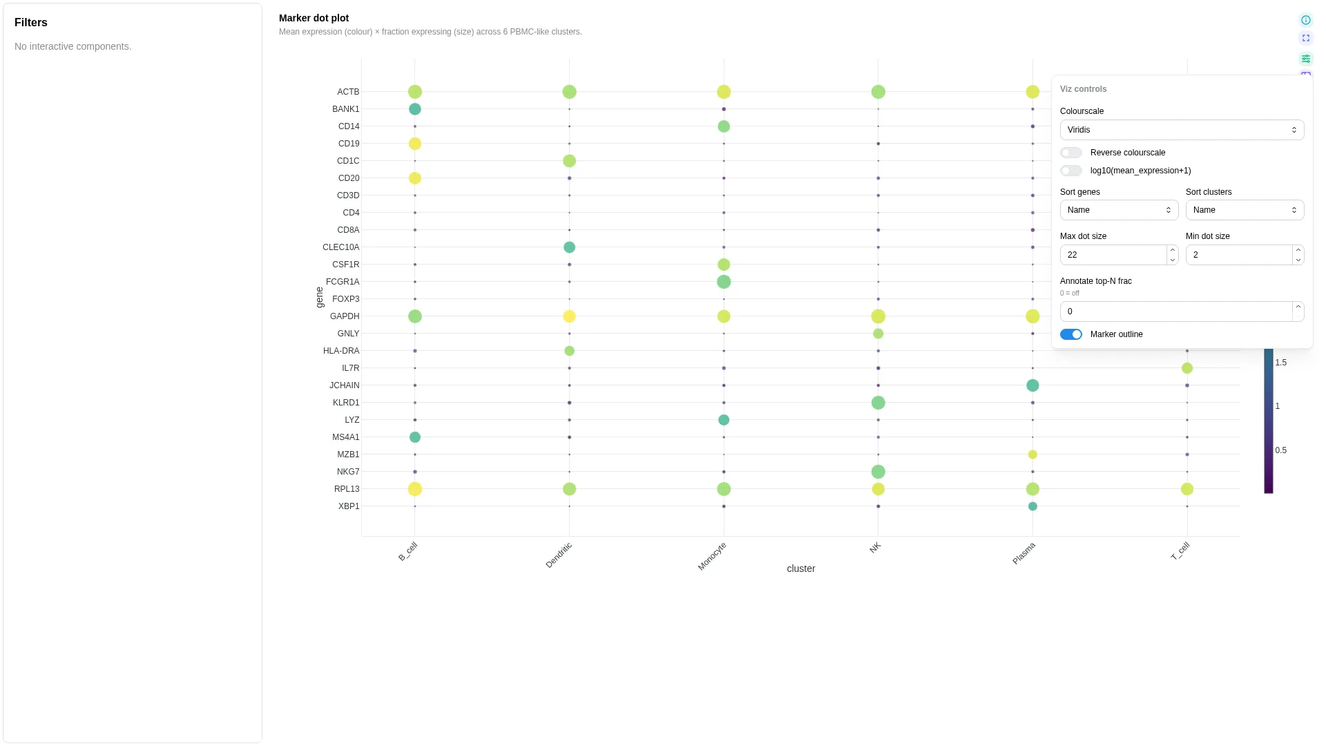
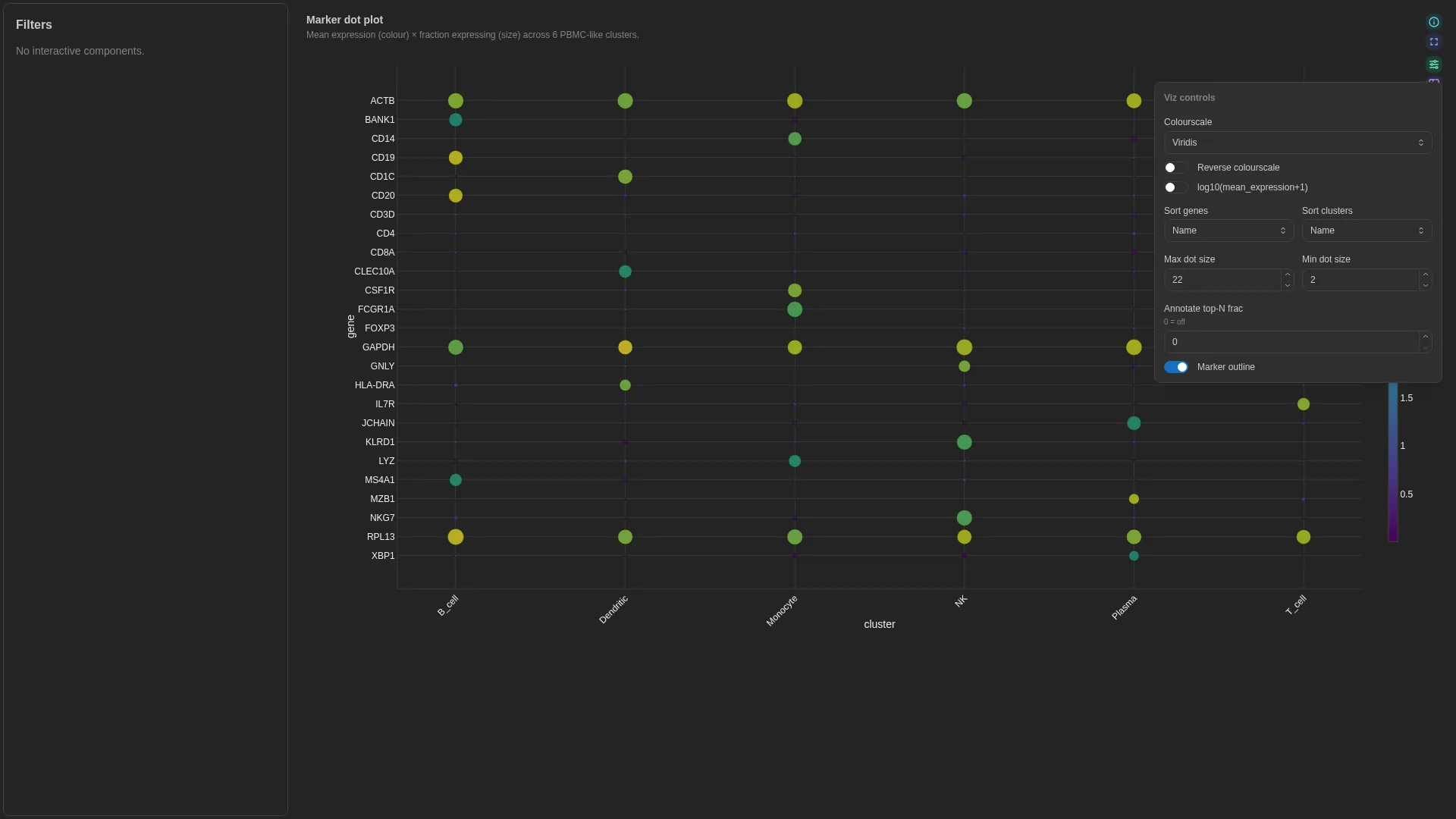
scanpy / Seurat marker-gene dot plot — cluster × gene with size = fraction expressing, colour = mean expression. The schema expects a cluster-aggregated long table — derive it from AnnData via sc.get.aggregate (or a manual groupby on adata.X), not from rank_genes_groups (which returns DE statistics, not aggregates).
Columns
| Role | Required | Type | Description |
|---|---|---|---|
cluster |
✓ | String | Cluster / group (x-axis) |
gene |
✓ | String | Gene / feature (y-axis) |
mean_expression |
✓ | Float | Mean expression per (cluster, gene) — dot colour |
frac_expressing |
✓ | Float | Fraction of cells with X > 0 per (cluster, gene) — dot size |
Settings
| Option | Type | Default | Description |
|---|---|---|---|
max_dot_size |
int (4–60) | 22 |
Max marker size in pixels |
min_dot_size |
int (0–20) | 2 |
Min marker size in pixels |
colour_scale / reverse_scale |
str / bool | Viridis / false |
Continuous colour scale (Viridis, Plasma, Inferno, Magma, Cividis, RdBu, Spectral, or Auto, which follows the colour mode and the theme) |
log_transform |
bool | false |
Colour by log10(mean expression + 1) |
gene_sort / cluster_sort |
name | mean | frac |
name |
Order of the genes and of the clusters |
max_genes |
int (≥1) | 50 |
Genes drawn before truncating |
marker_outline |
bool | true |
Outline each dot |
annotate_top_n |
int (≥0) | 0 |
Label the highest-mean dots; 0 draws none |
view |
dotplot | enrichment |
dotplot |
View the tile opens on (v1.13.0+) |
views |
list | null | null |
Views offered in the view switch; null offers every view the bindings allow (v1.13.0+) |
term_col, nes_col, padj_col, gene_count_col, source_col |
str | null | null |
Enrichment view bindings; see Enrichment for their meaning and the view's own settings (v1.13.0+) |
The view switch, gene and cluster order and Max genes are primary controls; colour scale, dot sizes, outline and labels are cosmetic.
Embedding
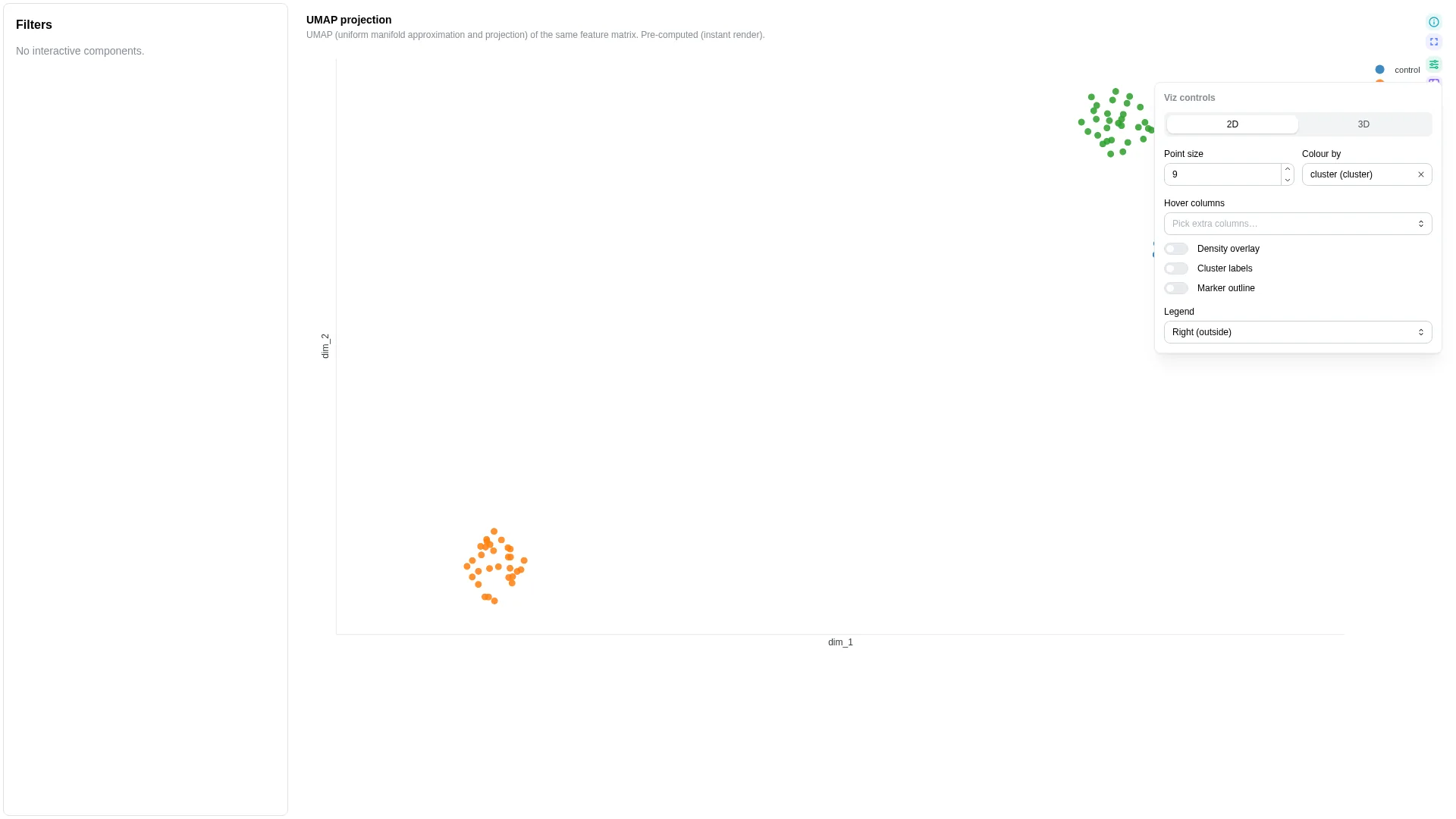
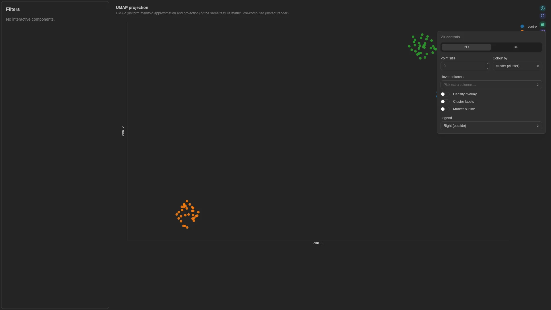
2D / 3D sample embedding (PCA / UMAP / t-SNE / PCoA) — supports a precomputed DC (dim_1, dim_2 columns already materialised) or live-compute mode (run the reduction on the fly via a Celery task and cache by (dc, method, params, filters)).
Columns
| Role | Required | Type | Description |
|---|---|---|---|
sample_id |
✓ | String | Sample identifier |
dim_1 |
✓ | Float | First embedding dim (precomputed mode) |
dim_2 |
✓ | Float | Second embedding dim (precomputed mode) |
dim_3 |
— | Float | Third dim — enables 3D |
cluster |
— | String | Cluster assignment column |
color |
— | Numeric | String | Point colouring (metadata or expression) |
Settings
| Option | Type | Default | Description |
|---|---|---|---|
compute_method |
pca | umap | tsne | pcoa | null |
null |
When set, runs the reduction live on the server; null = precomputed mode |
umap_n_neighbors |
int (2–100) | 15 |
UMAP n_neighbors |
umap_min_dist |
float (0–1) | 0.1 |
UMAP min_dist |
tsne_perplexity |
float (2–100) | 30.0 |
t-SNE perplexity |
tsne_n_iter |
int (250–5000) | 1000 |
t-SNE iterations |
pcoa_distance |
bray_curtis |
bray_curtis |
PCoA distance metric |
show_density |
bool | false |
Overlay density contours |
point_size |
int (1–30) | 6 |
Marker size |
marker_outline / marker_outline_width |
bool / float (0.5–4) | false / 1.5 |
Point outline and its width in px |
ncontours / density_opacity |
int (≥1) / float (0–1) | 14 / 0.45 |
Density overlay: contour count and opacity |
show_centroids |
bool | false |
Mark each colour group's centroid |
view_3d |
bool | false |
Open in 3D; needs dim_3 |
default_color_by |
str | null | null |
Initial Colour by column; null falls back to color, then cluster |
reverse_scale |
bool | true |
Reverse the continuous colour scale |
plot_style |
default | grid | clean |
default |
Axis lines only, with gridlines and ticks, or no axes |
legend_pos |
right | bottom | in-tr | hidden |
right |
Colour legend position |
hover_cols |
list[str] | [] |
Extra columns in the hover |
selection_enabled / selection_column |
bool / str | null | false / null |
A lasso, box or click emits a selection filter on that column (null: sample_id) |
category_palette |
dict[str, str] | null | null |
Explicit value→colour overrides for the categorical color column. Wins over the default palette-index assignment so dashboards can pin domain-specific colours (e.g. habitat → Set1) without forking the renderer per project. |
Filtering / row tagging
In precomputed mode the renderer just plots the pre-existing coordinates. In live-compute mode it dispatches POST /advanced_viz/compute_embedding, which runs the chosen reduction on the wide sample × feature matrix and returns coordinates. Results are cached by (dc_id, method, params, filters); changing a method parameter dispatches a fresh job. Method (live mode), 2D / 3D and Colour by are primary controls; the method parameters and every display setting are cosmetic.
Hierarchical Heatmap
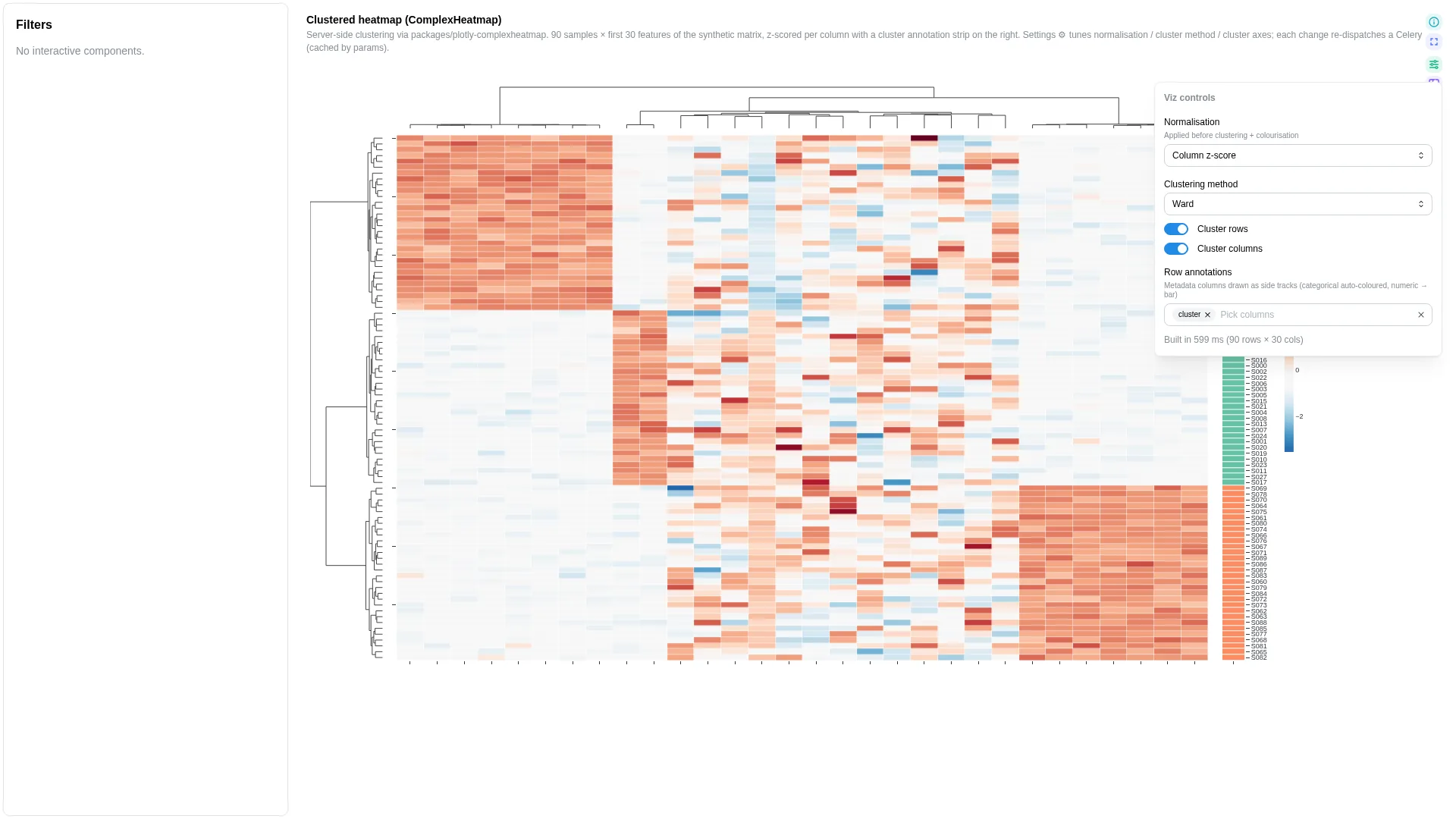
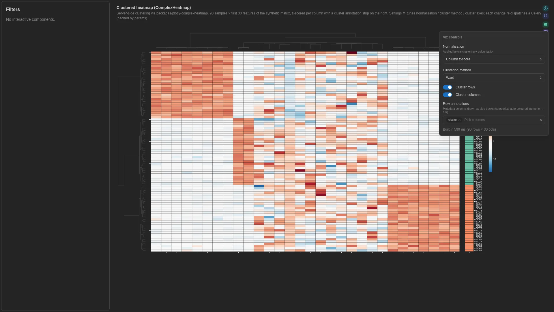
Clustered heatmap with dendrograms + annotation tracks, à la R's ComplexHeatmap / pheatmap. Wraps the in-tree plotly-complexheatmap library; heavy compute (clustering, dendrogram layout) runs in a Celery worker and is cached by (dc, params hash).
Columns
| Role | Required | Type | Description |
|---|---|---|---|
index |
✓ | String | Row-label column (typically sample_id) |
Numeric matrix columns are inferred from the rest of the DC schema at compute time — there's no per-role binding for the value columns.
Settings
| Option | Type | Default | Description |
|---|---|---|---|
matrix_wf_id / matrix_dc_id |
str | null | null |
Deprecated and unused: the tile reads the DC it is bound to |
index_column |
str | sample_id |
Row-label column |
value_columns |
list[str] | null | null |
Subset of numeric columns; null = all numeric |
value_columns_pattern |
str | null | null |
Regex naming the value columns, for a matrix whose column names depend on the run. Cannot be combined with value_columns (v1.11.0+) |
row_annotation_cols |
list[str] | [] |
Categorical columns rendered as a right-side annotation strip |
col_annotations |
dict[str, dict[str, str]] | null | null |
Per-column categorical annotations rendered as a top strip. Shape: {annotation_name: {column_label: category_value}} (e.g. {'habitat': {'SRR10070130': 'Riverwater', ...}}). The renderer aligns the values to the matrix's column order. Use when per-sample metadata (treatment / habitat / batch) needs to live on the column axis without joining a second DC. |
col_annotation_cols |
list[str] | [] |
Columns of the linked metadata DC drawn as the top strip, instead of spelling them out in col_annotations (v1.11.0+) |
annotation_source_dc_tag |
str | null | null |
Which linked metadata DC col_annotation_cols reads, when the matrix has several (v1.11.0+) |
col_annotation_colors |
dict[str, dict[str, str]] | null | null |
Per-annotation palette overrides for the column-annotation track. Shape: {annotation_name: {category_value: hex}}. When unset the server picks colours from a Dark2 palette (chosen to contrast with the row-track's Set2 pastels). Use to pin domain palettes (e.g. habitat → Set1) across PCoA + UpSet + heatmap. |
cluster_rows / cluster_cols |
bool | true |
Enable hierarchical clustering |
cluster_method |
ward | single | complete | average |
ward |
Linkage method |
cluster_metric |
euclidean | correlation | cosine |
euclidean |
Distance metric |
normalize |
none | row_z | col_z | log1p |
none |
Pre-clustering normalisation |
colorscale |
str | null | null |
Plotly colorscale name override |
Filtering / row tagging
Normalisation, clustering method and row / column clustering are primary controls; the annotation pickers are cosmetic. A sample filter is mirrored as a column subset, since samples are the matrix's columns. Since v1.8.3 this uses the same value-matching rule as UpSet: a filter whose values are column names filters that axis, whatever the filter's own column is called. Before that it fired only for a filter literally named sample or sample_id, which is not what a metadata pick or a map lasso sends, so selecting samples left every column on screen.
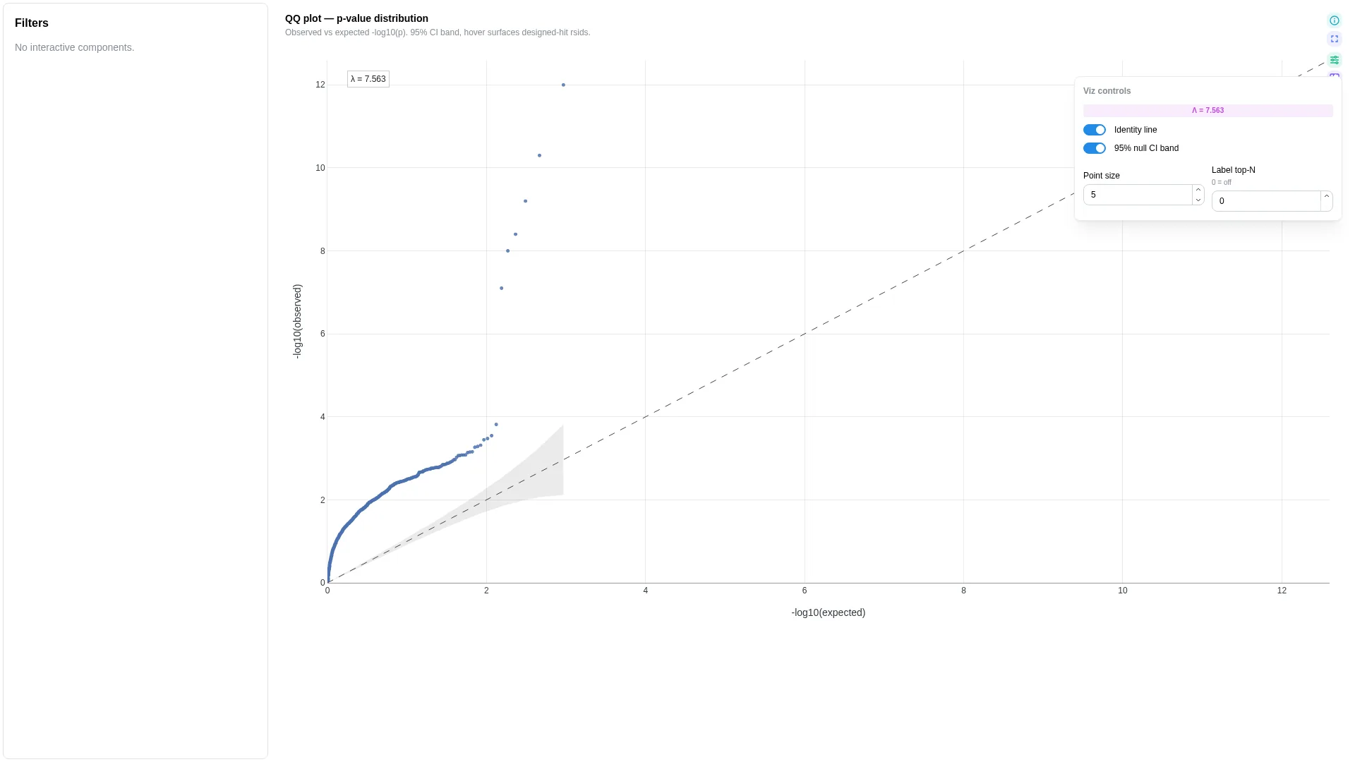
QQ
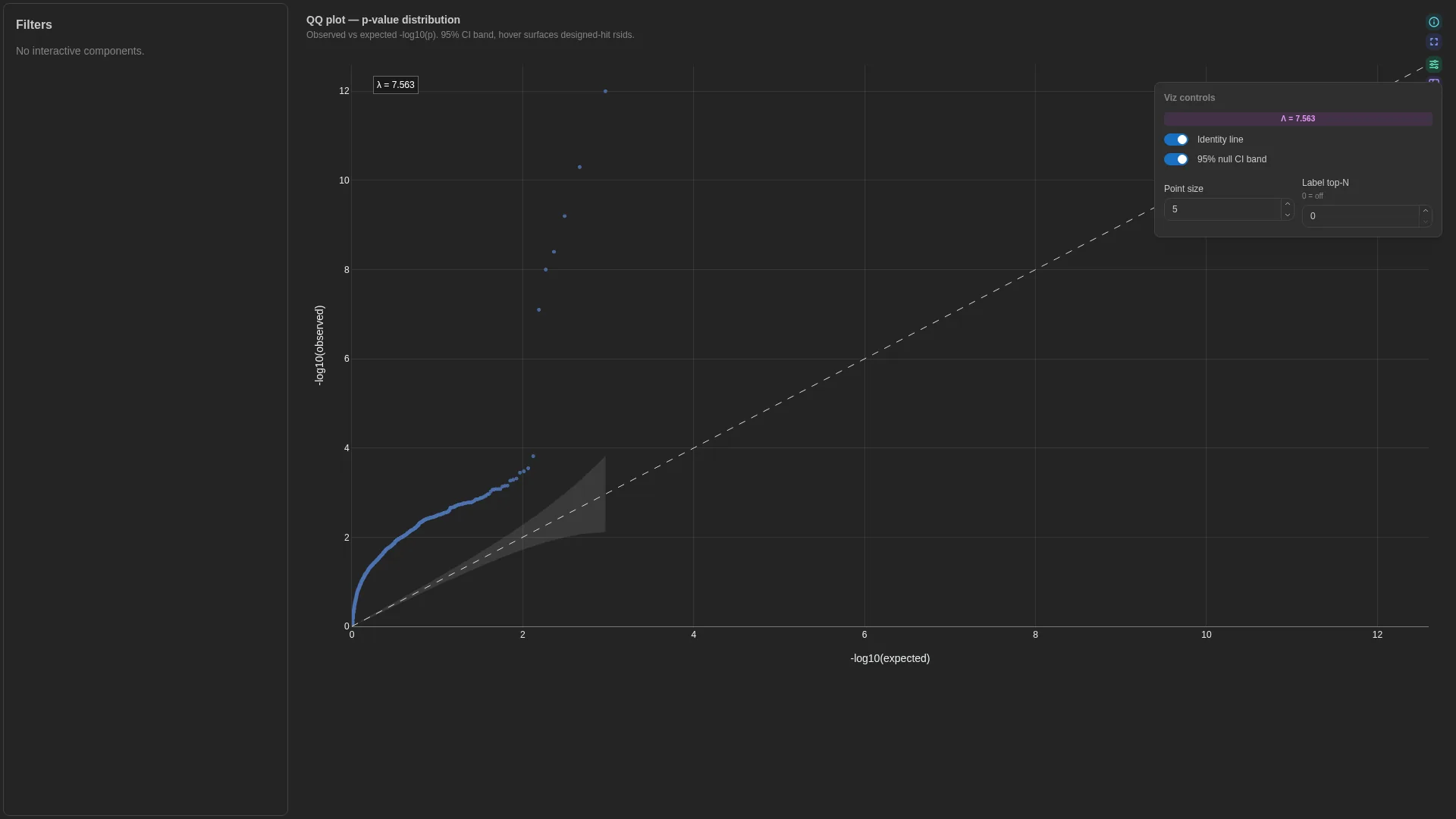
Quantile-quantile plot for p-value distributions (GWAS / DE / eQTL QC). Sorts p-values and plots -log10(observed) against the theoretical -log10(expected) under a uniform null.
A view of Volcano since v1.13.0
QQ is now the qq view of the Volcano tile, which reads p_value_col (or significance_col when that holds raw p-values). It is the question a reader asks of the same column just before or after reading the volcano, so the two share one tile, one fetch and the view switch. A viz_kind: qq config keeps loading and opens on the QQ view, its p_value_col also serving as the volcano's significance. The roles below are those of the retired kind.
Columns
| Role | Required | Type | Description |
|---|---|---|---|
p_value |
✓ | Float | Raw p-value (0–1) |
feature_id |
— | String | Hover-only id |
category |
— | String | Stratification column (one trace per stratum) |
Settings
| Option | Type | Default | Description |
|---|---|---|---|
show_ci |
bool | true |
Shade the 95% null CI band |
show_identity |
bool | true |
Draw the y = x reference line |
point_size |
int (1–30) | 5 |
Marker size |
top_n_labels |
int (≥0) | 0 |
Most significant points labelled, when feature_id is bound. A retired config is read as a volcano, so it labels the volcano's default of 20 unless set |
Filtering / row tagging
When category is bound, the renderer produces one trace per stratum (e.g. genome partitions, ancestry groups). Otherwise a single trace plus the y = x reference line and the optional 95% null CI band.
UpSet
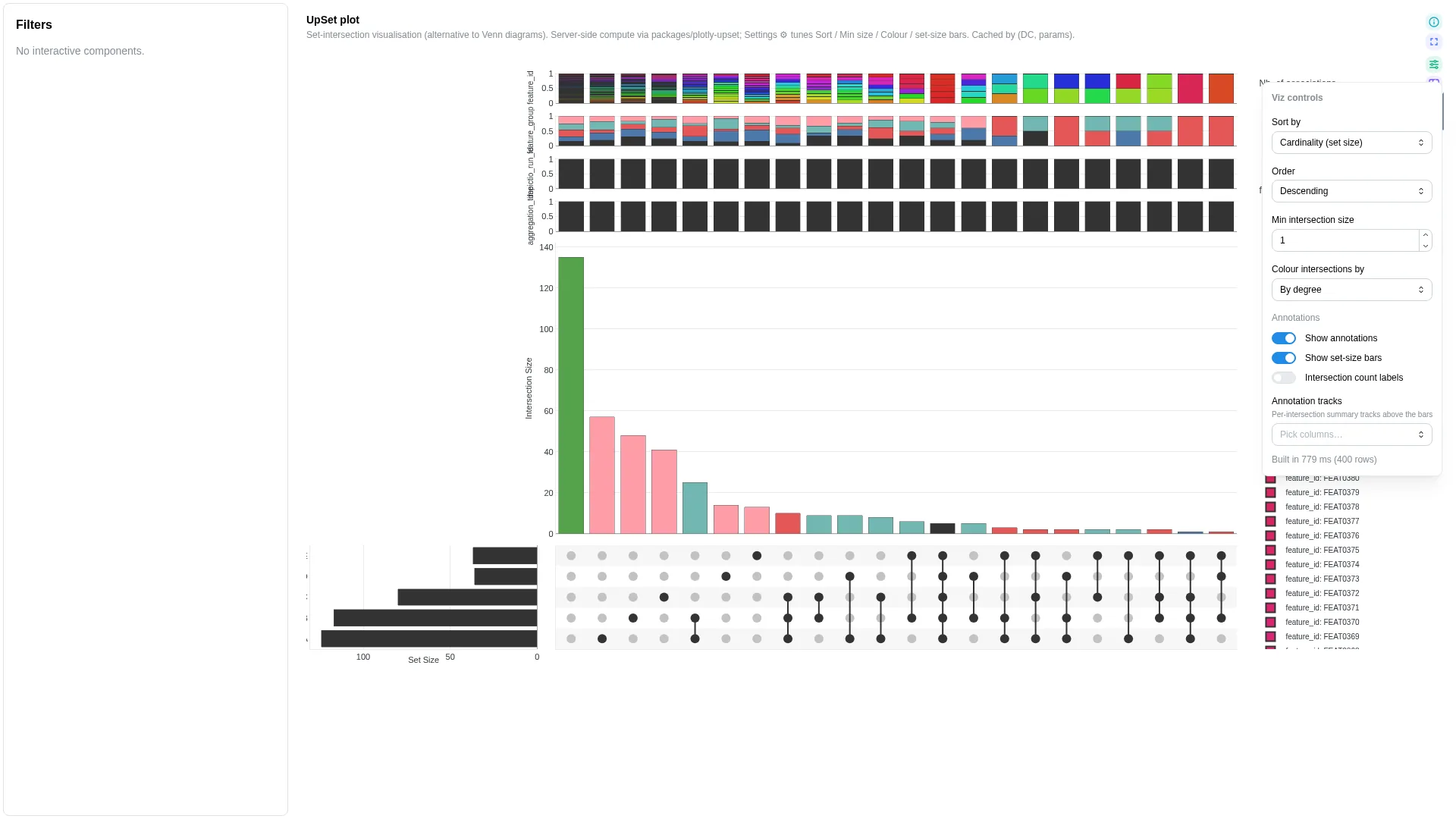
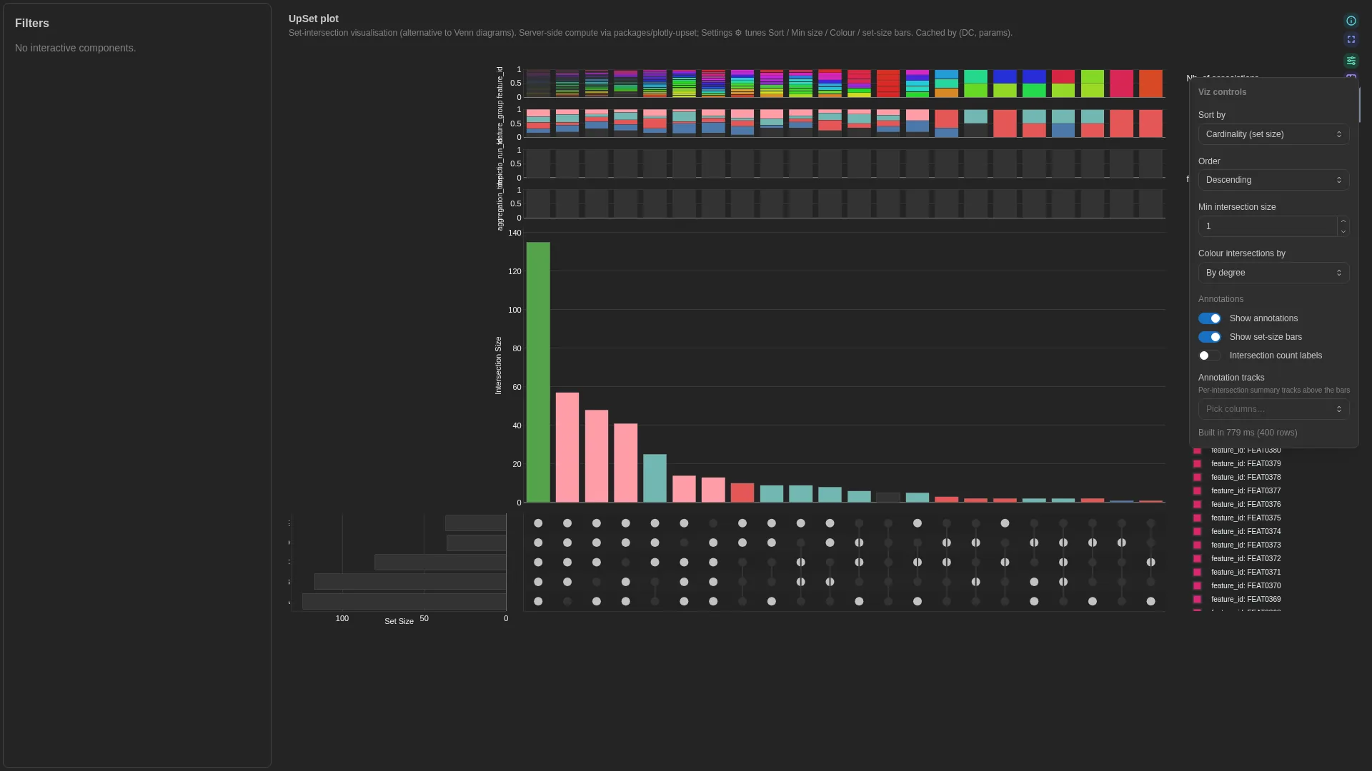
Set-intersection visualisation (alternative to Venn diagrams). Wraps the in-tree plotly-upset library (vendored under packages/plotly-upset/, not yet a standalone public repo); intersection enumeration + sorting runs in a Celery worker and is cached by (dc, params hash). Input DC: a binary table where each row is an element and each set_col is a 0/1 membership indicator.
Columns
No canonical role-based schema — the renderer enumerates binary columns at compute time. Editor binding validation is a no-op.
Settings
| Option | Type | Default | Description |
|---|---|---|---|
matrix_wf_id / matrix_dc_id |
str | null | null |
Deprecated and unused: the tile reads the DC it is bound to |
set_columns |
list[str] | null | null |
Explicit list of set columns; null = auto-detect binary |
set_columns_pattern |
str | null | null |
Regex naming the set columns, for a table whose column names depend on the run. Cannot be combined with set_columns (v1.11.0+) |
sort_by |
cardinality | degree | degree-cardinality | input |
cardinality |
Intersection ordering |
sort_order |
descending | ascending |
descending |
Ordering direction |
min_size |
int (≥0) | 1 |
Hide intersections smaller than this |
max_degree |
int | null | null |
Hide intersections involving more than N sets |
show_set_sizes |
bool | true |
Show horizontal set-size bar chart |
color_intersections_by |
none | set | degree |
none |
Intersection-bar colour mode |
set_colors |
dict[str, str] | null | null |
Per-set colour overrides (set name → hex). Drives set-size bars + matrix dots + intersection bars (when color_intersections_by="set"). Pin domain palettes (e.g. habitat → Set1) so the same set lands on the same colour across tiles. |
default_annotation_cols |
list[str] | null | null |
Columns drawn as annotation tracks under the matrix on first paint |
show_annotations |
bool | true |
Set-size bars and annotation tracks together |
show_values |
bool | false |
Print the count above each intersection bar |
set_category_column |
str | null | null |
The column the sets are values of (locality). Set bars, matrix dots and, with color_intersections_by: set, single-set intersections take that column's category_colors. Unset, the column is found by value: the one coloured column that pins every set drawn. set_colors still wins per set (v1.14.0+) |
selection_enabled |
bool | false |
Clicking an intersection, its bar or its matrix column, filters the dashboard to the rows it counts. Requires selection_column (v1.14.0+) |
selection_column |
str | null | null |
The column whose values the selection emits. Pick an identifier the other tiles share (Phylum), not a set column; one listed in set_columns is rejected (v1.14.0+) |
Filtering / row tagging
Renderer filters by intersection size and degree — min_size drops intersections below the threshold, max_degree drops intersections involving more sets than the limit. Sort, order, minimum size and intersection colouring are primary controls; annotations, set-size bars and count labels are cosmetic.
Since v1.8.3 dashboard filters reach the plot as well. The grouping values are matrix columns, so a filter on that column has no row to match; instead a filter whose values are set names is applied as a subset over the sets, whatever the filter's own column is called, with the sets auto-detected the same way the library detects them. A filter on any other column narrows rows as usual, provided the matrix carries that column: the ampliseq matrix now carries the source DC's per-taxon attributes, so a filter on a taxonomic rank has something to bite on.
Since v1.14.0 an UpSet can be a filter itself. With selection_enabled, a click on an
intersection emits the values its rows hold in selection_column, as a lasso does on a
scatter: the UpSet highlights that intersection and dims the rest, and a second click or
the tile's Reset selection clears it. The UpSet is not narrowed by its own selection,
and its intersections cannot be clicked when the server had to sample the matrix.
Sankey
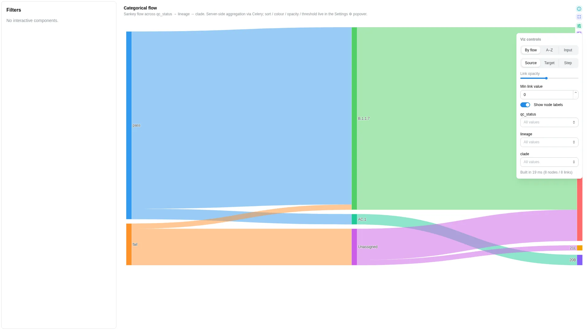
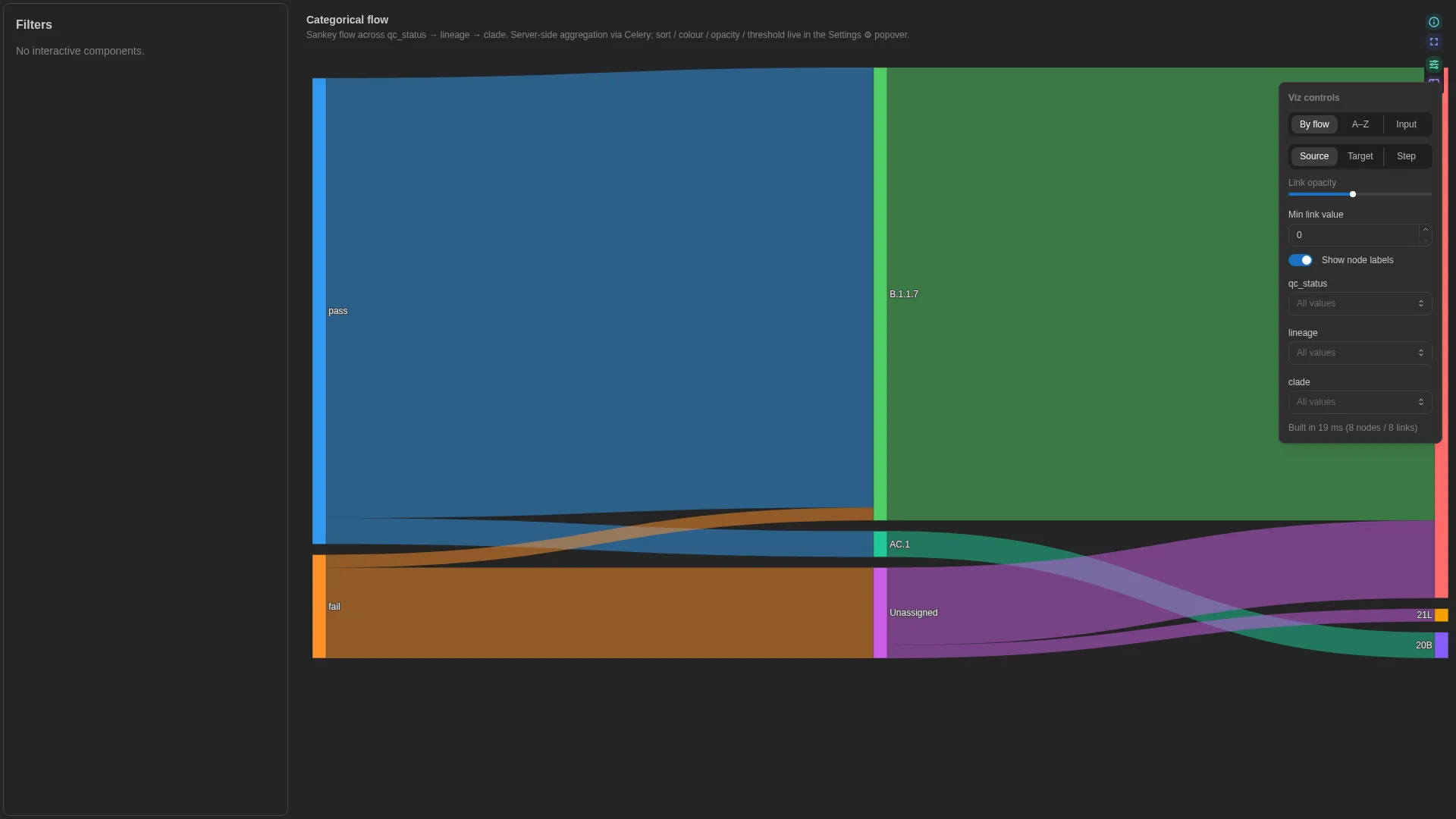
Categorical-flow diagram across N ordered categorical levels (e.g. sample → lineage → clade, sample → kingdom → phylum → genus). Server-side aggregation via Celery, client-side colour / opacity tweaks.
Columns
No canonical role-based schema — step_cols is a multi-column list (≥2 ordered categorical columns). The renderer validates step presence at compute time; the editor enforces min_length=2.
Settings
| Option | Type | Default | Description |
|---|---|---|---|
step_cols |
list[str] (≥2, unique) | required | Ordered categorical columns from source to leaf |
available_step_cols |
list[str] | null | null |
Full ordered list of columns the user can wire as steps. When it holds more than two columns, the tile shows a Depth control that draws the first N of them; step_cols becomes the initial prefix. Leaving it null locks the diagram to step_cols. |
depth |
int (≥2) | null | null |
How many of available_step_cols to draw first; null uses the length of step_cols |
value_col |
str | null | null |
Optional numeric weight; null = each row counts as 1 |
value_label |
str | null | null |
Human-readable label for value_col shown in hover tooltips. Defaults to value_col when unset (e.g. "abundance"). |
value_format |
raw | fraction | count |
raw |
Hover display mode. fraction multiplies by 100 and appends %; count uses thousands separators; raw adapts decimal precision to magnitude. |
sort_mode |
alphabetical | total_flow | input |
total_flow |
Node-ordering rule |
color_mode |
source | target | step |
source |
Link colouring rule, the tile's Colour links by: Lineage (source), Target or Step. Since v1.14.0, under source and target a node wears its lineage's colour, from the dashboard's category_colors when they pin that column, lighter at each step; Unclassified is grey |
link_opacity |
float (0.05–1) | 0.4 |
Link transparency (0.5 before v1.14.0) |
min_link_value |
float (≥0) | 0.0 |
Hide links whose aggregated value is below this threshold |
show_node_labels |
bool | true |
Render node labels |
Recipe-coupled normalisation (ampliseq)
The bundled sankey_canonical recipe for nf-core/ampliseq pre-divides per-sample relative abundance by sample count so the renderer's sum-aggregation reads as a mean-per-sample at the root (≈1.0 = 100%). This bakes a sum-aggregation assumption into the canonical DC and is recomputed once at recipe time — cross-DC sample filters do not rescale the divisor, so heavy filtering yields scaled-down totals. Treat the values as relative composition, not absolute. See depictio/projects/nf-core/ampliseq/recipes/sankey_canonical.py for the full caveat.
Filtering / row tagging
Renderer aggregates by the step_cols sequence (via Celery compute_sankey) and filters out links whose aggregated value is below min_link_value. Depth, node order and link colouring are primary controls; link opacity, node labels, minimum link value and the per-step value filters are cosmetic.
Oncoplot
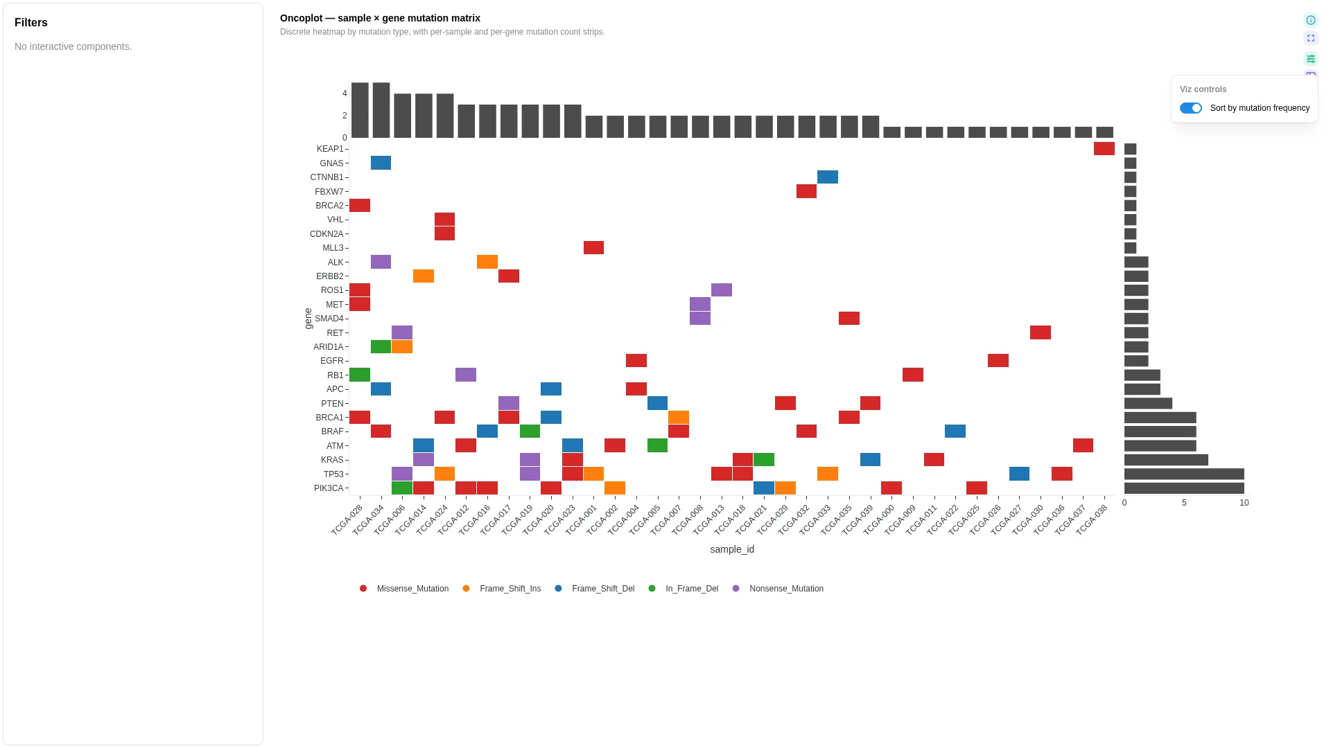
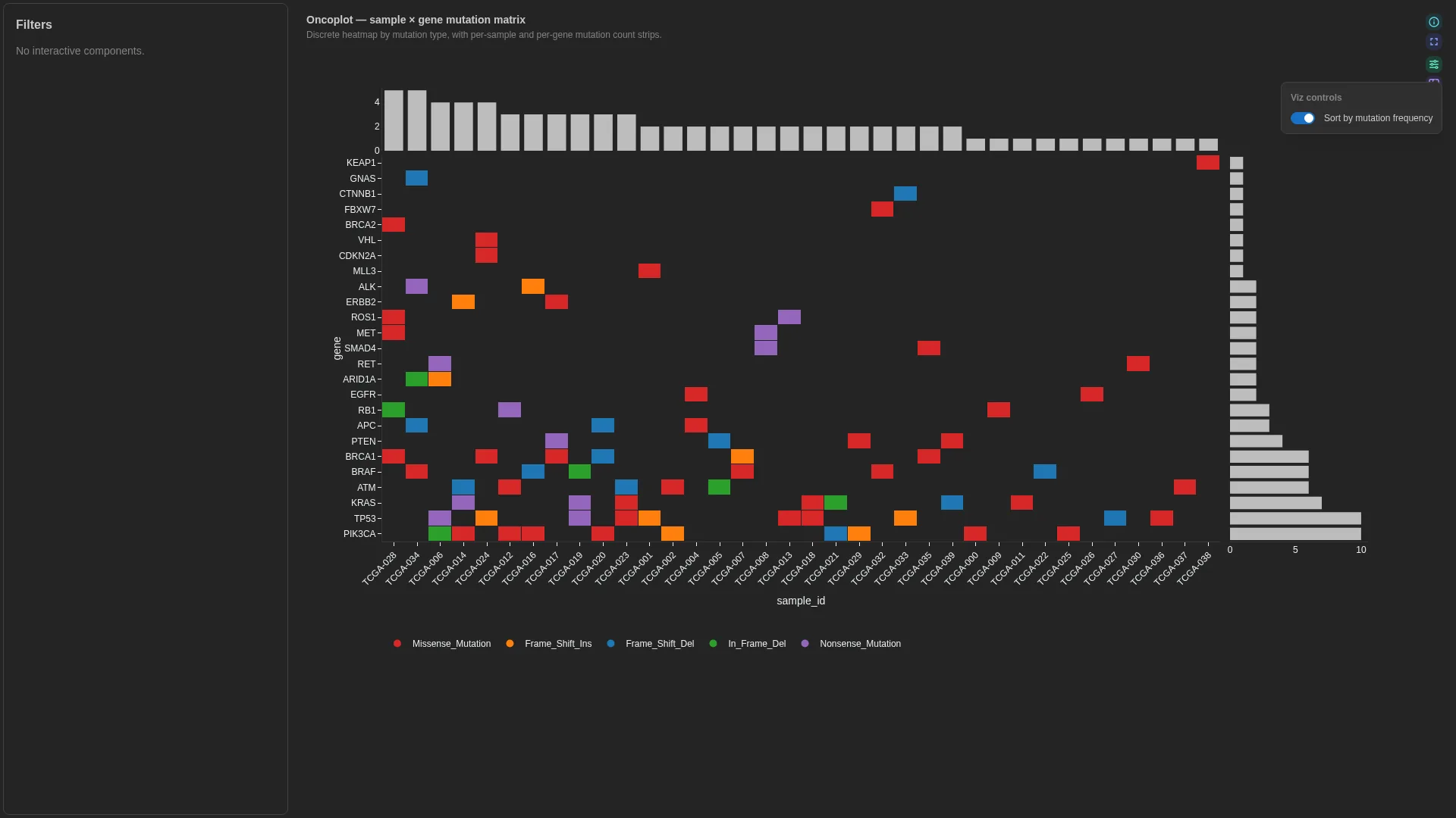
Sample × gene mutation matrix with discrete mutation-type colours and per-gene / per-sample frequency strips.
Columns — straight rename from canonical Mutation Annotation Format (VEP / vcf2maf / maftools — the cancer-mutation file format, not Minor Allele Frequency):
| Role | Required | Type | Description | Mutation Annotation Format column |
|---|---|---|---|---|
sample_id |
✓ | String | Sample identifier (x-axis) | Tumor_Sample_Barcode |
gene |
✓ | String | Gene identifier (y-axis) | Hugo_Symbol |
mutation_type |
✓ | String | Categorical mutation type (cell colour) | Variant_Classification |
Settings
| Option | Type | Default | Description |
|---|---|---|---|
sort_by_freq |
bool | true |
Order genes and samples by mutation count; off sorts them by name. The tile's only control, Sort by mutation frequency, is primary |
Filtering / row tagging
Cells are coloured categorically by mutation_type (NA cells stay blank). Side strips show per-gene and per-sample mutation counts.
Contact map (v1.13.0+)
Binned Hi-C contact matrix, one row per pair of bins. It draws binned counts, never per-read pairs: only one triangle of the matrix needs to be in the data, and the renderer mirrors it across the diagonal. Two displays: square, with genomic position on both axes, and triangle, which rotates the matrix 45 degrees so x is genomic position on the same scale as a Genome view track stacked above it and y is the distance between the two bins. A domain then reads as a triangle and a loop as a dot at its apex.
Columns
| Role | Required | Type | Description |
|---|---|---|---|
chrom1 |
✓ | String | Chromosome of the first bin |
start1 |
✓ | Numeric | Start of the first bin |
chrom2 |
✓ | String | Chromosome of the second bin |
start2 |
✓ | Numeric | Start of the second bin |
count |
✓ | Numeric | Contact count or interaction score |
end1 / end2 |
— | Numeric | Bin ends |
sample |
— | String | Sample a row belongs to; the tile has no sample picker, so narrow a multi-sample collection with a dashboard filter |
resolution |
— | Numeric | Bin size each row was counted at, for a collection holding several resolutions |
Settings
| Option | Type | Default | Description |
|---|---|---|---|
chrom |
str | null | null |
Chromosome to draw (intra-chromosomal view); null picks the first one seen |
display |
square | triangle | null |
null |
Unset draws a triangle when a region filter reaches the tile and a square otherwise |
max_separation_bins |
int (0–5000) | 0 |
Triangle only: bins of separation drawn before the apex is cut off, since the far corner flattens the colour scale. 0 keeps every separation |
log_scale |
bool | true |
Log-transform counts before colouring |
colour_scale |
Viridis | Plasma | Inferno | Magma | Cividis | RdBu | Spectral |
Viridis |
Continuous colour scale |
balance |
bool | false |
Single-pass row and column coverage normalisation before display (not iterative ICE) |
max_bins |
int (10–5000) | 500 |
Guard on the matrix side length; a whole chromosome above it is coarsened by merging adjacent bins |
Filtering / row tagging
With no region in force the tile reads the whole chromosome; when the collection carries a resolution column it draws the coarsest level. Once a region reaches the tile (a brush or locus field on a genome view, through a project region link when the two collections differ) or the reader zooms, the window is read by a background job from the resolution that best fits the visible span. Zooming in further re-reads a finer level; panning inside the loaded window does not. A collection with a single resolution behaves the same way without any extra configuration.
Chromosome, display and resolution are primary controls; colour scale, log scale, balancing and the separation cut-off are cosmetic.
YAML
- tag: viz-contacts
  component_type: advanced_viz
  workflow_tag: my_workflow
  data_collection_tag: hic_pixels
  viz_kind: contact_map
  config:
    viz_kind: contact_map
    chrom1_col: chrom
    start1_col: start
    end1_col: end
    chrom2_col: chrom2
    start2_col: start2
    end2_col: end2
    count_col: count
    resolution_col: resolution
    display: triangle


Knee plot (v1.13.0+)
Barcode-rank curve for single-cell libraries: UMI count against barcode rank, one line per sample, usually log-log. The called cells form a plateau, then the curve drops into the empty-droplet background; a reference line marks the cell-calling cutoff.
Columns
| Role | Required | Type | Description |
|---|---|---|---|
sample |
✓ | String | Library or sample, one curve each |
rank |
✓ | Numeric | Barcode rank, ascending from 1 |
umi_count |
✓ | Numeric | UMI count at that rank |
is_cell |
— | Boolean | Marks called cells; the cutoff is read from where it switches off |
Settings
| Option | Type | Default | Description |
|---|---|---|---|
log_x |
bool | true |
Log-scale the rank axis |
log_y |
bool | true |
Log-scale the UMI-count axis |
show_cutoff |
bool | true |
Draw the cell-calling threshold as a reference line |
Filtering / row tagging
When is_cell is not bound, the cutoff is estimated from the curve's inflection. A barcode table can run into millions of rows, so the server thins it with a log-rank reduction: dense near rank 1, where the cells give way to the background, sparse across the flat tail.
YAML


Damage profile (v1.13.0+)
Ancient-DNA misincorporation profile: substitution frequency by distance from the read end, one panel for the 5' end and one for the 3' end. C>T rising at the 5' end and G>A at the 3' end is the deamination signature that authenticates ancient DNA; those two substitutions are highlighted and every other one is drawn muted.
Columns
| Role | Required | Type | Description |
|---|---|---|---|
sample |
✓ | String | Sample or library |
end |
✓ | String | Read end the position is measured from: 5p or 3p |
position |
✓ | Numeric | Distance from the read end |
base_change |
✓ | String | Substitution, e.g. C>T, G>A, other |
frequency |
✓ | Numeric | Substitution frequency at that position |
Settings
| Option | Type | Default | Description |
|---|---|---|---|
ends |
both | 5p | 3p |
both |
Read ends drawn, one panel each |
max_position |
int (1–200) | 25 |
Furthest distance from the read end displayed |
highlight |
list[str] | ["C>T", "G>A"] |
Substitutions drawn in the deamination colours |
facet_by |
none | length_bin |
none |
length_bin draws one lane per read-length bin, since short reads should carry more damage than long ones |
length_bin_col |
str | length_bin |
Column holding the read-length bin when facet_by is length_bin |
max_facets |
int (1–20) | 6 |
Length-bin lanes drawn before truncating |
Filtering / row tagging
The table is already aggregated and is read whole, without sampling. Dashboard filters (a sample picker, typically) narrow the rows before they are drawn.
YAML


Genome view (v1.13.0+)
A genomic track drawn by GenomeSpy on a chromosome-aware axis: chromosomes are concatenated, the reader scrolls to zoom and drags to pan, and the marks are GenomeSpy's own. It binds the same chr / pos / score roles as Manhattan, so any collection a Manhattan reads renders here unchanged; the optional roles turn the same rows into intervals, per-sample lanes and a coloured profile.
A tile binds one data collection, so a multi-track browser is several genome view tiles stacked in one section, sharing the region filter described below.
Columns
| Role | Required | Type | Description |
|---|---|---|---|
chr |
✓ | String | Chromosome or contig |
pos |
✓ | Int | Genomic start position |
score |
✓ | Float | Y-axis value |
feature |
— | String | Names the row (SNP, peak, gene) in the hover |
end |
— | Int | Interval end: each row becomes a rectangle from pos to end |
sample |
— | String | Sample a row belongs to, for per-sample lanes |
category |
— | String | Per-row annotation used as the colour channel instead of the chromosome |
Settings
| Option | Type | Default | Description |
|---|---|---|---|
mark |
point | rect | bar |
point |
rect draws one rectangle per interval; bar draws the score as a bar from a baseline, which is the coverage-profile look. Without end_col both fall back to points |
facet_by_sample |
bool | false |
Stack one lane per sample on the shared genome axis. Needs sample_col |
max_facets |
int (1–40) | 8 |
Lanes drawn before the rest are dropped, with a note saying how many |
annotation |
none | hg38 | mm10 |
none |
Bundled protein-coding gene lane drawn under the track. GRCh38 and GRCm38 are accepted as aliases; any other value draws no lane |
assembly |
str | null | null |
GenomeSpy built-in assembly (hg38, hg19, hg18, mm10, mm9, dm6). Null derives contigs and sizes from the data, which suits a viral or draft reference |
score_title |
str | score |
Y-axis label |
score_threshold |
float | null | null |
Horizontal reference rule |
point_size / opacity |
int / float | 5 / 0.85 |
Mark size and opacity |
region_filter_enabled |
bool | true |
Let a brush on the genome axis, or the tile's locus field, publish the region as a dashboard filter. Off, the locus field is disabled |
follow_region_filter |
bool | false |
Zoom to an incoming region instead of showing the whole genome |
default_region |
str | null | null |
Region the tile opens on, e.g. chr1:10,000,000-12,000,000, chr1:10Mb-12Mb, a single coordinate (a 10 kb window around it) or a bare contig name. Emitted once per session and only when no region is in force. Needs region_filter_enabled |
selection_enabled / selection_column |
bool / str | null | false / null |
A click on a mark emits that column's value as a selection filter, as on Manhattan |
source |
table | file |
table |
file hands GenomeSpy an indexed file (VCF, BAM, bigWig, GFF3, bgzip and tabix intervals) that the browser range-loads itself, for tracks too dense to materialise as a table. The file_* options tune that mode (VCF INFO fields, lane count, fetch window, BAM coverage or pileup) |
Filtering / row tagging
The tile's primary controls are a chromosome picker and a Locus or gene field: type a region such as chr7:55,000,000-56,000,000, or a gene symbol when a gene table is available for the track's assembly (hg38 or mm10). Typing a locus, brushing the axis and picking a chromosome in the left panel are the same act: each publishes the region as two ordinary filters on the tile's own collection, a chromosome multi-select and a position range. Every tile bound to the same columns, directly or through a project link, is narrowed by them. Genomic kinds that know their coordinate columns go further and follow the region: a genome view with follow_region_filter zooms to it, a Coverage track clamps its axis, a Contact map reads the window (as a triangle unless display is pinned), a Transcript structure changes gene. A tile never narrows itself by its own brush.
A navigator and a per-sample track that follows it
- tag: viz-navigator
  component_type: advanced_viz
  workflow_tag: my_workflow
  data_collection_tag: peaks
  viz_kind: genome_view
  config:
    viz_kind: genome_view
    controls_placement: header
    chr_col: chrom
    pos_col: start
    end_col: end
    score_col: score
    category_col: peak_class
    mark: bar
    assembly: hg38
    default_region: "chr8:127,400,000-128,100,000"
    region_filter_enabled: true

- tag: viz-depth
  component_type: advanced_viz
  workflow_tag: my_workflow
  data_collection_tag: depth_bins
  viz_kind: genome_view
  config:
    viz_kind: genome_view
    chr_col: chrom
    pos_col: start
    end_col: end
    score_col: depth
    sample_col: sample
    mark: bar
    facet_by_sample: true
    annotation: hg38
    assembly: hg38
    region_filter_enabled: false
    follow_region_filter: true


Group compare (v1.13.0+)
Two groups of rows compared feature by feature, on demand. The rows are observations (cells, samples) named by index, and the features are every other numeric column, as in the Hierarchical Heatmap. The two groups are not columns of the data: they are picked in the tile's Group A and Group B pickers, either from the dashboard's selection groups (a lasso on an embedding, ticked table rows, saved from the Analysis panel) or from the values of group_col. The result is drawn as a volcano with the ranked features in a table underneath.
Columns
| Role | Required | Type | Description |
|---|---|---|---|
index |
✓ | String | Names each observation (cell, sample) |
group |
— | String | Precomputed group label (cluster, condition) offered as a group source |
The feature columns are inferred from the rest of the collection's numeric columns.
Settings
| Option | Type | Default | Description |
|---|---|---|---|
test |
wilcoxon | t_test |
wilcoxon |
Per-feature test: Wilcoxon rank-sum, or Welch's t-test |
log_transform |
bool | true |
log1p the values before testing. No effect on the rank-based Wilcoxon test; it is what makes the t-test usable on raw counts |
max_features |
int (10–20000) | 2000 |
Guard on the number of features tested |
min_observations |
int (≥2) | 3 |
Smallest group the test accepts |
fdr_threshold |
float (0–1) | 0.05 |
Significance line on the volcano |
log2fc_threshold |
float (≥0) | 1.0 |
Effect-size lines on the volcano |
top_n_labels |
int (0–200) | 20 |
Features labelled on the volcano |
default_group_a / default_group_b |
str | null | null |
Pair the tile opens on: a saved group name or a value of group_col. Must differ; unknown names fall back to the first two groups offered |
auto_run |
bool | false |
Run as soon as two groups are picked, instead of waiting for Compare |
Filtering / row tagging
The test runs as a background job over the rows the dashboard's filters leave, and p-values are adjusted with Benjamini-Hochberg. Fold changes read as A relative to B: a positive log2fc means higher in group A. A feature with no spread in either group scores p = 1 rather than being dropped. The server caches each result, so reopening the tab reuses it. Changing the test or the transform asks for a new job; the two thresholds and the label count only change how the finished result is read and apply at once. The table shows the top of the ranking; the full result (means per group, log2 fold change, p-value, FDR) is in the tile's data view.
YAML


Transcript structure (v1.13.0+)
The isoforms of one gene on a base-pair axis, one lane per transcript: exons are blocks, the coding part is drawn taller, introns are the line between blocks and their chevrons give the strand. One gene at a time is the design; a view of every locus at once is the job of Genome view.
Columns
| Role | Required | Type | Description |
|---|---|---|---|
transcript_id |
✓ | String | Isoform identifier |
gene_id |
✓ | String | Gene the isoform belongs to |
chrom |
✓ | String | Chromosome or contig of the block |
start |
✓ | Numeric | Block start (bp) |
end |
✓ | Numeric | Block end (bp) |
feature |
✓ | String | Block type: exon, CDS, UTR |
strand |
✓ | String | + or - |
sample |
— | String | Picks one sample |
gene_name |
— | String | Readable gene symbol |
transcript_class |
— | String | Novelty or class label (known, novel, NIC, NNC) |
expression |
— | Numeric | Per-transcript expression, for lane order or colour |
Settings
| Option | Type | Default | Description |
|---|---|---|---|
gene |
str | null | null |
Gene to draw; null picks the gene with the most transcripts. Changeable from the gene picker |
max_transcripts |
int (1–200) | 30 |
Lanes drawn per gene |
exon_feature |
str | exon |
feature value drawn as a block |
cds_feature |
str | CDS |
feature value drawn as a taller block |
colour_by |
transcript_class | expression | none |
transcript_class |
What the lane colour encodes |
colour_scale |
Viridis | Plasma | Inferno | Magma | Cividis | RdBu | Spectral |
Viridis |
Continuous colour scale for expression |
Filtering / row tagging
Dashboard filters narrow the rows as usual. A genomic region published by a genome view or a chromosome filter moves the tile to a gene in that region. The tile emits no selection of its own.
YAML
- tag: viz-isoforms
  component_type: advanced_viz
  workflow_tag: my_workflow
  data_collection_tag: transcript_blocks
  viz_kind: transcript_structure
  config:
    viz_kind: transcript_structure
    transcript_id_col: transcript_id
    gene_id_col: gene_id
    chrom_col: chrom
    start_col: start
    end_col: end
    feature_col: feature
    strand_col: strand
    gene_name_col: gene_name
    transcript_class_col: transcript_class


Copy-number profile (v1.13.0+)
Copy-number profile: the log2 ratio of every bin along the genome, the called segments laid over it as thick strokes coloured gain, neutral or loss, and the B-allele frequency underneath when the collection carries one. Chromosomes are laid end to end as on Manhattan, so picking a chromosome zooms onto it.
A second view, locus, redraws the profile with GenomeSpy in the allele-specific layout: major and minor copy number per segment, the log2 ratio, and a mirrored BAF track, zoomable and with an optional gene lane. That is where a copy-neutral loss of heterozygosity shows, flat in log2 but split in BAF.
Columns
| Role | Required | Type | Description |
|---|---|---|---|
sample |
✓ | String | Sample |
chrom |
✓ | String | Chromosome of the bin or segment |
start |
✓ | Numeric | Start (bp) |
end |
✓ | Numeric | End (bp) |
log2 |
✓ | Numeric | Log2 copy ratio |
baf |
— | Float | B-allele frequency, drawn underneath |
copy_number |
— | Numeric | Integer (or major-allele) copy number, colours the segments |
segment |
— | String | Row type: rows whose value is segment are drawn as segments, the rest as bins |
label |
— | String | Hover label (gene, cytoband) |
Settings
| Option | Type | Default | Description |
|---|---|---|---|
sample |
str | null | null |
Sample to draw; null picks the first seen |
chrom |
str | null | null |
Chromosome to zoom on; null draws the whole genome |
y_range |
float (0–10) | 3.0 |
Symmetric log2 axis limit |
show_baf |
bool | true |
Draw the BAF panel when baf_col is bound |
point_size |
int (1–12) | 3 |
Bin marker size |
gain_threshold / loss_threshold |
float | 0.3 / -0.3 |
Log2 above or below which a segment reads as a gain or a loss |
max_bins |
int (100–500000) | 50000 |
Guard on the number of bin rows requested |
view |
plotly | locus |
plotly |
View the tile opens on |
views |
list | null | null |
Views offered in the view switch; null offers both |
minor_copy_number_col |
str | null | null |
Minor-allele copy number. With copy_number_col bound, the locus view draws major and minor copy number as two rules per segment |
annotation |
none | hg38 | mm10 |
none |
Locus view: bundled gene lane, labelled on zoom |
facet_by_sample |
bool | false |
Locus view: one set of tracks per sample instead of the selected sample only |
Filtering / row tagging
The tile follows a region published elsewhere on the dashboard, like the other genomic kinds. In the locus view a brush on the genome axis publishes a region in turn, as a chromosome and position filter pair (see Genome view).
YAML
- tag: viz-cnv
  component_type: advanced_viz
  workflow_tag: my_workflow
  data_collection_tag: cnv_bins_segments
  viz_kind: cnv_profile
  config:
    viz_kind: cnv_profile
    sample_col: sample
    chrom_col: chrom
    start_col: start
    end_col: end
    log2_col: log2
    baf_col: baf
    copy_number_col: copy_number
    minor_copy_number_col: minor_copy_number
    segment_col: segment
    view: locus
    views: [plotly, locus]
    annotation: hg38


Genome chord (v1.13.0+)
Chromosomes on a ring, one chord per link between two loci: gene fusions, structural-variant breakends, translocations. Chord width follows the link weight and colour its class, so translocations cross the ring while local events stay near the rim.
Columns
| Role | Required | Type | Description |
|---|---|---|---|
chrom_a |
✓ | String | Chromosome of the first locus |
pos_a |
✓ | Numeric | Position of the first locus (bp) |
chrom_b |
✓ | String | Chromosome of the second locus |
pos_b |
✓ | Numeric | Position of the second locus (bp) |
label |
— | String | Link label (fusion name, SV id) |
weight |
— | Numeric | Link weight (supporting reads), drives chord width |
category |
— | String | Link class (fusion type, SV type), drives chord colour |
sample |
— | String | Sample a link belongs to, shown in the hover; name it as selection_column to select by sample |
Settings
| Option | Type | Default | Description |
|---|---|---|---|
assembly |
str | null | null |
Chromosome sizes for the ring (hg38, hg19, mm10); null derives them from the data |
max_links |
int (1–5000) | 500 |
Guard on the number of chords drawn |
min_weight |
float | null | null |
Drop links lighter than this |
colour_by |
category | chrom_a | none |
category |
What the chord colour encodes |
show_labels |
bool | true |
Label the chromosome arcs |
intra_chromosomal |
bool | true |
Draw links whose two loci share a chromosome |
selection_enabled |
bool | false |
Let a click on a chord emit a dashboard filter |
selection_column |
str | null | null |
Column the emitted values belong to. Null uses label_col; name the sample column instead to select every link of the picked chords' samples |
Filtering / row tagging
Hovering a chord shows its two loci. With selection_enabled, a click emits the chord's value of selection_column (or label_col) as a selection filter that the rest of the dashboard follows and the Analysis panel can save as a group; a click on the background clears it. With neither column bound the chords stay inert.
YAML
- tag: viz-rearrangements
  component_type: advanced_viz
  workflow_tag: my_workflow
  data_collection_tag: sv_links
  viz_kind: genome_chord
  config:
    viz_kind: genome_chord
    chrom_a_col: chrom_a
    pos_a_col: pos_a
    chrom_b_col: chrom_b
    pos_b_col: pos_b
    label_col: event_id
    weight_col: support
    category_col: sv_type
    assembly: hg38
    selection_enabled: true


Parallel coordinates (v1.13.0+)
One polyline per sample across N metric axes: the many-metric view a scatter cannot give, where a QC table with a dozen columns is read as a whole. A sample that is not the worst on any single axis but bends the same way as the failing ones across several shows up here.
Columns
| Role | Required | Type | Description |
|---|---|---|---|
sample |
✓ | String | Names each polyline (sample, library, run) |
group |
— | String | Categorical column driving the line colour |
The axes are the numeric columns of the collection, or the list in metric_cols.
Settings
| Option | Type | Default | Description |
|---|---|---|---|
metric_cols |
list[str] | null | null |
Axes, in order. Null takes every numeric column, capped at max_axes |
scale |
raw | zscore | minmax |
minmax |
Axis scaling. minmax and zscore make metrics in different units comparable; raw keeps the published values |
max_rows |
int (≥1) | 2000 |
Lines drawn; the server hands over the first max_rows |
max_axes |
int (2–30) | 12 |
Cap on the inferred axis count when metric_cols is null |
colour_scale |
Viridis | Plasma | Inferno | Magma | Cividis | RdBu | Spectral |
Viridis |
Colour scale when the colour column is numeric |
line_opacity |
float (0.05–1) | 0.6 |
Line transparency |
Filtering / row tagging
Dragging along an axis brushes a range on it. Once the brush settles, it becomes a dashboard filter: a range filter on that column, the same one the left panel's range slider emits, one per brushed axis. Every tile bound to the column narrows to it, the tile itself keeps drawing every line so the brush can be moved, and Reset brushes clears it. A brushed range is not offered as a selection group.
YAML
- tag: viz-qc-profile
  component_type: advanced_viz
  workflow_tag: my_workflow
  data_collection_tag: qc_metrics
  viz_kind: parallel_coordinates
  config:
    viz_kind: parallel_coordinates
    sample_col: sample
    group_col: group
    scale: minmax
    metric_cols: [total_reads, percent_duplicates, percent_gc, percent_aligned]


Record card (v1.13.0+)
One record of a collection, read as labelled fields and links rather than as a mark: the detail half of a master/detail dashboard. A scatter, a table or a genome view emits a selection, and the card shows the row behind the pick. Run identifiers, QC verdicts and links out to a report are text, and a chart of one row is a worse way to read them. The card shows one record at a time: when a selection holds several, a searchable picker above the card lists them and opens on the one picked last.
Columns
| Role | Required | Type | Description |
|---|---|---|---|
id |
✓ | String | Identifies the record; matched against the incoming selection |
title |
— | String | Card heading; defaults to the id value |
Every other column of the collection is a field the card can show.
Settings
| Option | Type | Default | Description |
|---|---|---|---|
sections |
dict[str, list[str]] | null | null |
Section title to the columns it holds, in order. Null groups the columns by the collection's own columns_description groups |
labels |
dict[str, str] | null | null |
Display label per column; unlisted columns fall back to a short column description, then the column name |
link_templates |
dict[str, str] | null | null |
Column to a URL template containing {value}; the column then renders as a link |
linked_component |
str | null | null |
Tag of the component whose selection drives the card. The card then follows that tile only, and when it sits directly beside it, on the same row of the same section, it is laid out as that tile's collapsible side panel |
selection_source |
scatter_selection | table_selection | any |
any |
Which kind of selection the card follows when linked_component is not set |
default_record |
str | null | null |
Id value shown when nothing is selected; a real selection always wins, and clearing it brings this record back |
max_fields |
int (≥1) | 40 |
Fields rendered before the card truncates and says so |
Filtering / row tagging
With no selection reaching it and no default_record, the card shows an empty state asking for a selection in a linked tile, never the first row of the collection: a card that silently showed row 0 would read as a pick. A default_record is labelled as the default so it never passes for one either. A pick on the card's own collection is matched directly; a pick on another collection is followed through the project's links.
The card emits no filter of its own: a detail panel that narrowed the dashboard would narrow the tile the reader picks from.
As a side panel, the card folds away while nothing is picked: its source takes the whole width the pair covered, and a slim rail on the source's edge stands in for the card. A pick unfolds it, and the rail's chevron folds or unfolds it by hand. This is a layout derived at view time; the stored dashboard keeps the author's geometry.
A scatter with its record card as a side panel
- tag: viz-gene-scatter
  component_type: advanced_viz
  workflow_tag: my_workflow
  data_collection_tag: gene_summary
  viz_kind: scatter_xy
  config:
    viz_kind: scatter_xy
    x_col: mean_expression
    y_col: effect_size
    label_col: gene_symbol
    selection_enabled: true
    selection_column: feature_id
  layout: { x: 0, y: 0, w: 5, h: 9 }

- tag: viz-gene-record
  component_type: advanced_viz
  workflow_tag: my_workflow
  data_collection_tag: gene_summary
  viz_kind: record_card
  config:
    viz_kind: record_card
    id_col: feature_id
    title_col: gene_symbol
    linked_component: viz-gene-scatter
    sections:
      Identity: [gene_symbol, biotype]
      Location: [chromosome, start, end, strand]
    link_templates:
      ensembl_id: "https://www.ensembl.org/id/{value}"
  layout: { x: 5, y: 0, w: 3, h: 9 }


Card Components (v0.0.1+)
Card components display metrics with aggregations. A card shows a hero metric (primary value) and can optionally display secondary metrics below it for at-a-glance summaries.
Aggregation Types
| Aggregation | Description | Example |
|---|---|---|
| count | Number of rows | Total samples |
| sum | Sum of values | Total reads |
| average | Average value | Average coverage |
| median | Median value | Median quality score |
| min | Minimum value | Minimum mapping rate |
| max | Maximum value | Maximum duplication rate |
| nunique | Count of unique values | Unique sample types |
| std_dev | Standard deviation | Coverage spread |
| variance | Variance | Expression variability |
| range | Max − Min | Read length range |
| skewness | Distribution skew | Quality score symmetry |
| kurtosis | Distribution tailedness | Outlier tendency |
| percentile | 50th percentile | Median coverage |
| mode | Most frequent value | Dominant sample type |
| q1 | 25th percentile | Lower-quartile coverage |
| q3 | 75th percentile | Upper-quartile coverage |
| box_plot_stats | Tukey 5-number summary (min, Q1, median, Q3, max) | Required by secondary_layout: box_plot |
Which aggregations a column accepts
Validity depends on column_type; the compatibility table lives in YAML Sync. As of v1.4.0 percentile is accepted on int64 as well as float64 — quantiles are well defined on integers, and the compute path already recorded them.
A distinct count is spelled nunique. The builder wrote unique before v1.4.0, which rendered correctly but failed every validating path (YAML export, CLI, catalog) with "Invalid aggregation 'unique'". Collections ingested under the old spelling still resolve, so no re-ingest is needed.
Configuration
- Select a Data Collection
- Choose a Column to aggregate
- Select an Aggregation type (hero metric)
- Optionally add Secondary Metrics (
aggregations) for a multi-metric summary - Optionally add a Filter Expression (
filter_expr) for conditional aggregation - Customize the Title, Icon, and Styling
Multi-Metric Summary Cards
Cards can display multiple aggregation results in a single component. The primary aggregation is shown as the large hero value, and aggregations are displayed as compact secondary rows below it.
┌─────────────────────────────────┐
│ Petal Length              [Icon]│
├─────────────────────────────────┤
│           4.5 cm                │
│          (Average)              │
├─────────────────────────────────┤
│ Median:       4.35              │
│ Std Dev:      0.82              │
│ Min:          1.00              │
│ Max:          6.90              │
└─────────────────────────────────┘
Secondary Layout Modes (v0.13.0+)
The default layout above stacks aggregations as a vertical list under the hero metric. Set secondary_layout on the card to switch to a richer one. Each is tuned for a specific summary intent, and most read a companion field naming the column or cut-off they work from.
From the aggregations list
secondary_layout |
Renders | Companion fields required |
|---|---|---|
vertical (default) |
Stacked rows from aggregations list |
aggregations |
compact |
Horizontal strip from aggregations |
aggregations |
grid (v1.4.0+) |
Two-column grid of aggregations |
aggregations |
box_plot |
Tukey box-and-whisker (min / Q1 / median / Q3 / max) | aggregations: [box_plot_stats] |
Distribution and quality (v1.4.0+)
secondary_layout |
Renders | Companion fields required |
|---|---|---|
histogram |
Binned sparkline of the column's distribution | (none) |
threshold |
Pass / warn / fail bar against a QC cut-off | threshold_value, optionally threshold_warn, threshold_direction |
completeness |
Filled versus missing share of the column | (none) |
uniqueness |
Distinct versus repeated share of the column | (none) |
trend |
Sparkline of the hero aggregation across buckets of an ordered column | trend_col |
attrition |
Retention across successive pipeline stages | attrition_cols |
A box_plot summarises a distribution by its quartiles, which says nothing about
modality — a bimodal column and a flat one can share the same five numbers. histogram
is the layout that shows the shape.
Breakdown by a categorical column
secondary_layout |
Renders | Companion fields required |
|---|---|---|
top_n |
Mini bar chart of top-N most frequent breakdown_col values |
breakdown_col, top_n_count (1–5) |
concentration |
Top-N share (%) by breakdown_col |
breakdown_col, top_n_count (1–5) |
composition (v1.4.0+) |
One 100%-wide bar split into top-N segments plus a muted Other, captioned with Pielou evenness | breakdown_col, top_n_count (1–5) |
donut (v1.4.0+) |
Same breakdown drawn as a ring | breakdown_col, top_n_count (1–5) |
What each group's bar measures follows the card's own aggregation (v1.13.0+).
A count or sum card splits its total, so each group shows its share of it. A card whose
hero is a max, min, average, median, range, variance or std_dev ranks the groups
by that same aggregation in the column's unit, the highest first (the lowest first under
min), with no percentages: a group's maximum is not a share of anything. Before v1.13.0
those cards counted rows per group.
Progress toward a maximum
secondary_layout |
Renders | Companion fields required |
|---|---|---|
coverage |
Fill bar showing value / coverage_max |
coverage_max |
gauge (v1.4.0+) |
Same ratio drawn as an arc | coverage_max |
YAML field reference (multi-metric extras)
| Field | Type | Default | Description |
|---|---|---|---|
secondary_layout |
enum (see tables above) | vertical |
Layout mode for the secondary block. |
aggregations |
list[str] | null | null |
Secondary aggregation functions (e.g. [median, std_dev, min, max] or [box_plot_stats]). Required by vertical, compact, grid, box_plot. |
breakdown_col |
str | null | null |
Group-by column for top_n / concentration / composition / donut. |
top_n_count |
int (1–5) | 3 |
Number of top values rendered by top_n, concentration, composition and donut. Capped at 5, past which the strip is illegible at a typical card size. |
coverage_max |
float | null | null |
Denominator for coverage and gauge. Falls back to vertical if missing. |
threshold_value |
float | null | null |
QC cut-off for threshold. Without it the strip is not drawn. |
threshold_direction |
min | max |
min |
Which side passes. min is at-least (coverage, %Q30), max is at-most (duplication, contamination). Explicit, because inferring it would silently invert a QC verdict. |
threshold_warn |
float | null | null |
Softer cut-off between pass and fail. It must lie on the failing side of threshold_value (below it under min, above it under max) and needs threshold_value. Since v1.13.0 a warn value on the passing side fails validation; earlier versions dropped it without a word. |
trend_col |
str | null | null |
Ordered column the trend sparkline is bucketed along — a date, a timestamp, or any sortable number. The card's own column is what is aggregated inside each bucket. |
attrition_cols |
list[str] | [] |
Ordered stage columns for attrition, following the card's own column as the first stage. The order is the pipeline's order and is the content of the chart, so stages are never sorted by value. |
Examples — the first three are from depictio/projects/init/iris/dashboards/overview.yaml; the rest are illustrative.
The seeded iris and penguins showcase dashboards exercise most of these at once:
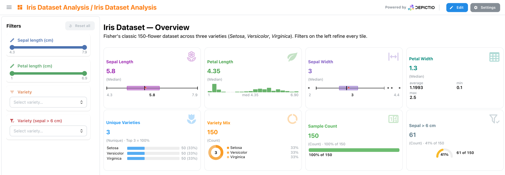
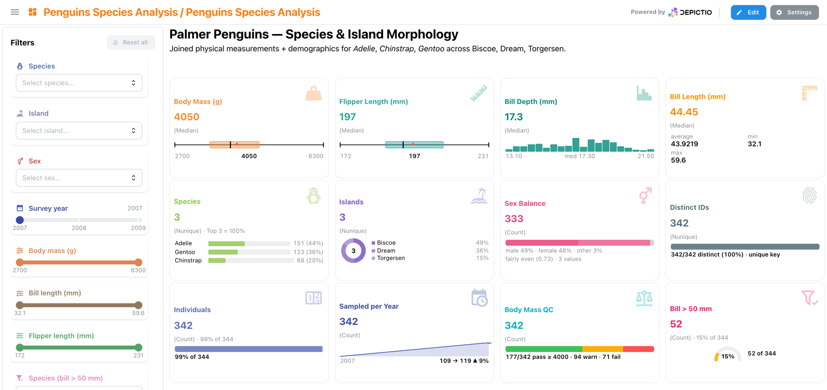
Conditional Aggregation (filter_expr)
Cards support a filter_expr field — a Polars expression that pre-filters the data before computing the aggregation. This enables conditional metrics like "count of samples with coverage > 30x" without creating a separate data collection.
filter_expr works on top of interactive filters (dual-layer filtering): interactive filters narrow the dataset first, then filter_expr applies an additional condition before aggregation.
See Filter Expressions for the complete expression reference.
Styling Options
| Option | Description | Example |
|---|---|---|
| Title | Metric label | "Total Samples" |
| Description | Shown in the tooltip on the card's title | "Across all batches" |
| Icon | Iconify icon name | mdi:chart-line |
| Icon Color | Icon accent color | #2196F3 |
| Title Color | Title text color | #333333 |
| Title Font Size | Title font size | sm |
| Value Font Size | Hero value font size | xl |
Display options (v1.14.0+)
| Option | Description |
|---|---|
variant |
How the card is drawn. default; headline, a key figure with a large value and a faint resting icon; compact, title and value on one line; minimal, headline type with no frame; accent, headline type with a coloured rail on the left; split, the icon in a tinted block beside the figure. Unset takes the section's card_variant, else default |
icon_style |
watermark (default), a large faint icon on the right, or badge, a small icon on a tint of icon_color before the title. badge applies to the default style only; the other styles place the icon themselves. YAML only |
caption |
One line under the value, in place of the aggregation label, which moves to a tooltip on the header |
decimals |
Decimal places of a fractional value, 0 to 6, trailing zeros kept so a row lines up; the card's strip follows. Unset, the places shrink as the value grows (0.0123, 12.35, 907.1, 3,641) |
link |
Where clicking the card goes: tab:<name> for a sibling tab, a URL (opened beside the dashboard) or a / path. A tab the dashboard lacks leaves the card unlinked |
Hovering the title shows the card's description and, when a caption takes the
aggregation line, how the value is computed, for example Median shannon. In the
builder, Style, Caption and Decimals are the Display block, and Link to a tab
and Description are Link & help. In a section with a card_variant, Style shows
the section's style with a hint; leaving it there stores nothing, so the card keeps
following its section, and variant: default opts a card out.
- tag: shannon-median
  component_type: card
  aggregation: median
  column_name: shannon
  title: Shannon diversity
  variant: headline
  icon_name: mdi:chart-bell-curve
  caption: median per sample
  decimals: 2
  link: "tab:Alpha Diversity"
  # workflow_tag, data_collection_tag, column_type...
Text Components (v0.2.0+)
Text components are presentational tiles for section delimiters, narrative intros, and small inline annotations. They have no data binding — they just render a heading + optional paragraph at the position they occupy in the grid.
YAML fields
| Field | Type | Default | Description |
|---|---|---|---|
component_type |
"text" |
— | Discriminator |
title |
str | "" |
Heading text |
order |
int (1–6) | 1 |
Heading level — renders as <h1> through <h6> (values outside 1–6 are clamped) |
alignment |
left | center | right |
left |
Horizontal alignment for both title and body |
vertical_alignment (v1.4.0+) |
top | center | bottom |
center |
Where the text block sits vertically within its tile |
body |
str | "" |
Optional paragraph rendered below the title. Block markdown since v1.14.0, see below |
surface (v1.14.0+) |
none | card | tinted |
none |
none: bare prose. card: framed like a metric card. tinted: on a tint of accent, grey without one. On either frame, a leading heading that holds a number (# 41%) is set as a headline figure with the line under it as its caption, and a fact list becomes a two-column table |
accent (v1.14.0+) |
str | null | null |
Mantine palette name, CSS colour, or tab:<name> to borrow a sibling tab's colour. Colours a tinted tile and the marks of a steps flow; a tab: accent on a card also rests that tab's icon in its corner. Ignored without a frame |
vertical_alignment defaults to center as of v1.4.0
The grid sizes a tile in whole row units, so a text tile is almost never the height of
its own text. Top-aligned, a one-line heading in an h: 2 tile spent the remainder as
dead space beneath itself. Set vertical_alignment: top to restore the earlier
rendering.
Markdown
The title is plain text. The body supports inline markdown: **bold**, *italic*,
`code` and links. No markdown library is loaded and HTML is never rendered; the
parsing is done client-side by the viewer.
Since v1.14.0 the body also supports block markdown and a few link schemes. A body with none of this syntax renders as before, as one paragraph that keeps its line breaks.
| Syntax | Renders as |
|---|---|
#, ##, ### |
Headings, drawn as H3, H4 and H5 whatever the title's level. #### stays text |
- item, 1. item |
Bullet and numbered lists |
| Pipe tables | Tables; a : in the separator row aligns the column |
--- |
A divider |
[label](https://…) |
A web link, opened beside the dashboard; a path such as /dashboards opens in place. Other schemes stay text |
[label](tab:Tab name) |
A link to a sibling tab by its displayed name, case-insensitive, wearing that tab's icon and colour. An unknown name renders as plain text |
[label](params:), [label](params:primer) |
Opens the Run parameters dialog, its search filled with the text after params: (letters, digits, _ . -) |
 |
An inline Iconify icon |
 |
A colour dot, the legend key of the category named beside it; a palette name such as color:teal works too |
Some lists are drawn as layouts:
| Pattern | Renders as |
|---|---|
Every item of a bullet list **Label** value, optionally led by  |
A fact list: one wrapping line of facts (grey label, bold value), or a two-column table on a framed tile. A numbered list stays a list |
A list inside steps … ::: |
A step flow, across the tile when it is wide, down it when narrow. Each item: an icon (else its number), a bold label, what was done; only the last is needed. Trailing · [label](params:…) or · [label](tab:…) links become small icons beside the step's name, the label on hover. On a framed tile the marks take its accent. Quarto's {.steps} works too |
Every item **41%** claim — context [Tab](tab:…): a bold figure holding a digit, then a context, a closing link or both |
Result rows, the figure in the linked tab's colour, the link on the right |
Every item [Label](tab:Name), optionally followed by : what it answers |
Tab tiles: the tab's icon, the link's label and the text after it, else the tab's subtitle. A numbered list numbers them 01, 02… as a reading order. Tabs the dashboard lacks are left out, so a template's landing page adapts to the run |
**See also** · [A](tab:A) · [B](tab:B), or two links or more |
A link row; links to tabs the dashboard lacks are dropped. On a framed tile, a closing paragraph of links alone, with no bold label, sits on its bottom edge |
- tag: reading-path
component_type: text
title: From reads to communities
surface: card
body: |
::: steps
1.  **Amplicon** V4–V5 · 515F-Y / 926R
2.  **Denoise** DADA2 to ASVs · [Settings](params:dada2) · [QC](tab:Sequencing QC)
3.  **Classify** SILVA 138.2 + PR2 5.0.0
:::
[All parameters](params:) · [Sequencing QC](tab:Sequencing QC)
The closing paragraph is links alone, so on this framed tile it sits on the bottom edge.
The editor's text builder sets these in Frame & accent: Frame (surface) and, on
a framed tile, Accent, a palette colour or a tab's. Its preview resolves tab: links,
accents and tiles, and a collapsible Markdown help under the body has a copyable
example of each syntax above except the colour dot, plus the headline figure.
Example (from depictio/projects/init/iris/dashboards/overview.yaml)
- tag: text-overview-intro
  component_type: text
  title: "Iris Dataset — Overview"
  order: 2
  alignment: left
  body: "Fisher's classic 150-flower dataset across three varieties (*Setosa*, *Versicolor*, *Virginica*). Filters on the left refine every tile."
  layout: {x: 0, y: 0, w: 8, h: 1}
Use Cases
- Dashboard section headers
- Visual organization of content
- Labeling groups of related components
- Short narrative intros above an analytical section
- A landing tab: a study recap, a reading path through the tabs, findings that link to the tab showing each one
Highlight Components (v1.14.0+)
A highlight draws a figure that lives on another tab of the dashboard, without copying it. The figure is rendered from its own definition, so an edit on its tab shows here too; the highlight only says how to draw it. It takes this tab's filters, as any figure here does, and links back to the tab it comes from: in its header for a figure, among the tile's actions for an advanced visualization. It does not filter in turn: its figure's selection is off.
The source can be a figure, restyled here (minimal unless figure_style says
otherwise), or an advanced visualization, drawn as it is on its tab.
| Field | Description |
|---|---|
source_tab |
The tab the figure lives on, by its displayed name (the main tab also by the dashboard title). Survives an export to another instance, which writes it in place of the id |
source_dashboard_id |
The tab's id, which the editor writes. Tried first; source_tab takes over when it is unknown |
source_component |
The figure: its index, else its title, ignoring case and spacing. A figure made in the editor is best named by its title, since a re-import replaces its id |
title, subtitle, icon_name, icon_color, hide_legend, caption |
As on a figure. Unset, each takes the source's value |
figure_style |
Style a figure is drawn in here; unset is minimal, whatever its tab draws it in. An advanced visualization keeps its own |
- component_type: highlight
  title: Faith PD per locality
  subtitle: at the deepest rarefaction depth
  source_tab: Alpha Diversity
  source_component: trec-fig-alpha-plateau
  icon_name: mdi:chart-scatter-plot
  layout: {x: 0, y: 0, w: 6, h: 7}
A highlight binds to no data collection of its own, so it carries no workflow_tag or
data_collection_tag.
In the editor, a figure's or advanced visualization's ⋮ menu offers Highlight on…, which lists the other tabs; the highlight lands on the chosen tab at the source's size, above its sections if it has any. Its Edit opens Figure shown (the tab and the figure) and Card header & style. A missing tab or figure draws a placeholder saying so.
Interactive Components (v0.0.1+)
Interactive components let users filter data across the dashboard. These components affect all linked visualization components.
Component Types
| Component | Input Type | Best For |
|---|---|---|
| RangeSlider | Numeric range | Coverage: 0-100x |
| Slider | Numeric threshold | Minimum depth: 10x |
| MultiSelect | Multiple choices | Sample types |
| DatePicker | Date range | Run dates |
| SegmentedControl | Single choice | Condition A/B |
| TextInput | Free text | Sample ID search |
RangeSlider
Filter data by numeric range:
| Option | Description |
|---|---|
| Column | Numeric column to filter |
| Min/Max | Range bounds |
| Step | Increment value |
| Default | Initial range values (default_range in YAML) |
| Histogram (v1.13.0+) | show_histogram: true draws the column's distribution above the track |
Slider
Filter by a single numeric value. Since v1.13.0 a slider is a threshold: it keeps the rows
at or above its value. slider_mode changes the comparison (gt, lte, lt, eq, ne);
eq restores the exact-match filter earlier versions applied. See
Initial values and slider options.
MultiSelect
Filter by selecting multiple values:
| Option | Description |
|---|---|
| Column | Categorical column to filter |
| Options | Available values (auto-populated) |
| Default | Initially selected values |
| Placeholder | Hint text when empty |
DatePicker
Filter by date range:
| Option | Description |
|---|---|
| Column | Date/datetime column to filter |
| Format | Date display format |
| Default | Initial date range |
SegmentedControl
Single-selection toggle:
| Option | Description |
|---|---|
| Column | Column to filter |
| Options | Available choices |
| Default | Initially selected option |
In a filter bar (v1.14.0+)
An interactive component placed in a grid section with display: strip or
filter_bar: true is drawn in that section's filter bar
instead of the left panel. Two keys apply there only:
| Option | Description |
|---|---|
strip_label |
Short label shown in the bar instead of the title |
strip_icon |
false hides the icon badge before the label. Unset: shown |
In the interactive builder these are the In a filter bar block: Short label in the bar (up to 40 characters) and Show icon badge. Hovering a short label shows the full title.
Scoped Filters (filter_expr)
Interactive components support a filter_expr field that pre-filters the underlying data before computing component options. Instead of showing all possible values, the component shows only values that exist in the filtered subset.
Example: A MultiSelect with filter_expr: "col('petal.length') > 4" only shows variety options that appear in rows where petal length exceeds 4 cm.
This is useful for:
- Cascading filters — show only relevant options based on data conditions
- Domain-specific scoping — e.g., only show taxa above an abundance threshold
- Focused analysis — restrict a slider's range to a meaningful subset
See Filter Expressions for the complete expression reference.
MultiQC Components (v0.5.0+)
MultiQC components display quality control reports generated by MultiQC.
Features
| Feature | Description |
|---|---|
| Report Embedding | Display MultiQC HTML reports inline |
| Interactive Navigation | Navigate between MultiQC sections |
| Tool Integration | Support for various QC tools (FastQC, Samtools, STAR, etc.) |
Configuration
| Option | Description |
|---|---|
| Report Path | Path to MultiQC report HTML file |
| Display Mode | Full report or specific sections |
Data Requirements
MultiQC components require pre-generated MultiQC reports. The report HTML files should be accessible via the configured data source. See Managing Data Collections from the viewer for the create / append / replace / clear lifecycle.
Image Components (v0.7.0+)
Image components display image galleries from S3/MinIO storage, with metadata filtering and thumbnail previews.
Features
| Feature | Description |
|---|---|
| Grid Layout | Configurable column layout for image thumbnails |
| Thumbnail Previews | Auto-generated thumbnails with configurable size |
| Metadata Filtering | Filter images using interactive components |
| S3 Integration | Serve images directly from S3/MinIO buckets |
| Click to Expand | View full-size images in a modal |
Configuration
| Option | Description | Default |
|---|---|---|
| Data Collection | Source table with image metadata | Required |
| Image Column | Column containing image paths | Required |
| S3 Base Folder | S3/MinIO bucket path prefix | Required |
| Thumbnail Size | Thumbnail height in pixels | 150 |
| Columns | Number of columns in grid | 4 |
| Max Images | Maximum images to display | 20 |
Data Collection Setup
Image components require a Table-type Data Collection with:
- A column containing relative image paths (e.g.,
image_path) - Optional metadata columns for filtering (e.g.,
category,quality_score)
Example CSV structure:
sample_id,image_path,category,quality_score
sample_001,images/sample_001.png,A,0.95
sample_002,images/sample_002.png,B,0.87
sample_003,images/sample_003.jpg,A,0.92
Project YAML Configuration
Configure the Image data collection in your project.yaml:
data_collections:
  - id: "650a1b2c3d4e5f6a7b8c9d10"
    data_collection_tag: "sample_images"
    description: "Sample images with metadata"
    config:
      type: "Image"
      metatype: "Images"
      scan:
        mode: single
        scan_parameters:
          filename: images_data.csv
      dc_specific_properties:
        # Table fields (required for delta table)
        format: "csv"
        columns_description:
          sample_id: "Unique sample identifier"
          image_path: "Relative path to image file"
          category: "Sample category"
          quality_score: "Quality score 0-1"
        # Image-specific fields (mandatory)
        image_column: "image_path"
        # Image display properties (optional)
        s3_base_folder: "s3://bucket-name/images/"
        local_images_path: ./images
        supported_formats: [".png", ".jpg", ".jpeg"]
        thumbnail_size: 150
Dashboard YAML Configuration
Add an image component in your dashboard_lite.yaml:
components:
  - tag: sample-gallery
    component_type: image
    workflow_tag: python/image_workflow
    data_collection_tag: sample_images
    image_column: image_path
    s3_base_folder: "s3://bucket-name/images/"
    thumbnail_size: 150
    columns: 3
    max_images: 9
Image Storage
Images can be stored and accessed in two ways:
Option 1: Images already on S3/MinIO
If your images are already uploaded to S3/MinIO, specify the location in your project configuration:
Option 2: Upload local images with the CLI (Recommended)
Use the depictio ingest command to upload images from a local directory to S3 as part of the ingestion:
# In project.yaml - dc_specific_properties
s3_base_folder: "s3://bucket-name/project/images/"  # Where the images go
local_images_path: ./images  # Local directory, relative to where you run the CLI
# Sync the project, process its data and upload the images
depictio ingest --project-config-path /path/to/project.yaml
The CLI will:
- Read the
local_images_pathfrom your project configuration - Upload the images to
s3_base_folder, skipping those already there - Check that every image the table references is in storage
s3_base_folder is required with local_images_path, and must be in the bucket
the server uses. To upload a directory by hand, use
depictio data push-images <directory> <s3_base_folder> (formerly images push).
Cross-DC Filtering
Image components support filtering via interactive components on the same Data Collection. Select samples using a MultiSelect filter, and the image gallery updates automatically.
Map Components (v0.8.0+)
Map components display geospatial data on interactive tile-based maps using Plotly Express (no API key required).
Declaring coordinates at the DC level
lat_column / lon_column can be set per-figure (below) or at the Data Collection level so every Map figure on that DC inherits them. Map is the first example of type-specific DC configuration; more visualization types will follow.
Coordinates Data Collection (v0.12.0+)
Map components require a Table DC that explicitly declares its latitude and longitude columns. The DCTableCoordinatesConfig variant — defined at depictio/models/models/data_collections_types/table_coordinates.py:6 — extends the standard Table DC with three fields:
| Field | Required | Type | Default | Description |
|---|---|---|---|---|
lat_column |
✓ | str | — | Column holding latitude values |
lon_column |
✓ | str | — | Column holding longitude values |
crs |
— | str | EPSG:4326 |
Coordinate reference system |
It inherits every standard Table DC capability (CSV / TSV / Parquet format, polars_kwargs, keep_columns, columns_description). The dc_type stays "table" — the variant is materialised at deserialisation when lat_column / lon_column are present. A model validator enforces that the two columns must differ.
Map Types
| Type | Function | Best For |
|---|---|---|
scatter_map |
Point markers at lat/lon coordinates | Sample locations, site maps |
density_map |
Heatmap overlay from point density | Concentration hotspots |
choropleth_map |
Colored polygon regions from GeoJSON | Per-country/region statistics |
Configuration Options
| Option | Applies To | Description |
|---|---|---|
lat_column / lon_column |
scatter, density | Columns with GPS coordinates (required) |
color_column |
scatter, choropleth | Column for color encoding |
size_column |
scatter | Column for marker size encoding |
hover_columns |
scatter, choropleth | Columns shown on hover tooltip |
map_style |
all | Tile style: open-street-map, carto-positron, carto-darkmatter |
opacity |
all | Marker/region opacity (0.0–1.0) |
default_zoom / default_center |
all | Override auto-computed viewport |
Choropleth GeoJSON Sources
Choropleth maps require a GeoJSON FeatureCollection to define region boundaries. Three sources are supported:
| Source | Field | Description |
|---|---|---|
| URL | geojson_url |
Public URL to a GeoJSON file |
| Data Collection | geojson_dc_tag |
Tag of a geojson-type Data Collection in the same project |
| Inline | geojson_data |
Embedded GeoJSON dict (large — prefer URL or DC) |
Selection Filtering
Scatter maps support the same lasso/box/click selection as scatter plots. Enable with selection_enabled: true and selection_column. See Interactive Selection Filtering for details.
Choropleth Limitation
Choropleth maps do not support selection filtering (Plotly does not expose click/lasso on choropleth traces).
Dashboard-wide map panel (v1.4.0+)
A map is often the thing every tab of a dashboard filters on, but a map in the grid belongs to one tab. Set placement: floating and the map leaves the grid entirely: it claims no cell, belongs to the whole tab family, and stays reachable from every tab of it.
- tag: sampling-sites
  component_type: map
  workflow_tag: python/my_workflow
  data_collection_tag: sample_metadata
  lat_column: latitude
  lon_column: longitude
  color_column: habitat
  selection_enabled: true
  selection_column: sample
  placement: floating             # grid (default) or floating
  floating_initial_state: docked  # compact (default), expanded, docked, hidden
floating_initial_state sets the state the panel opens in. Once a viewer moves, resizes or folds it, their own choice is remembered for that dashboard family.
A draggable card over the dashboard: compact is the small footprint shown here, expanded the larger one. The basemap credit stays folded into the ⓘ in its corner.
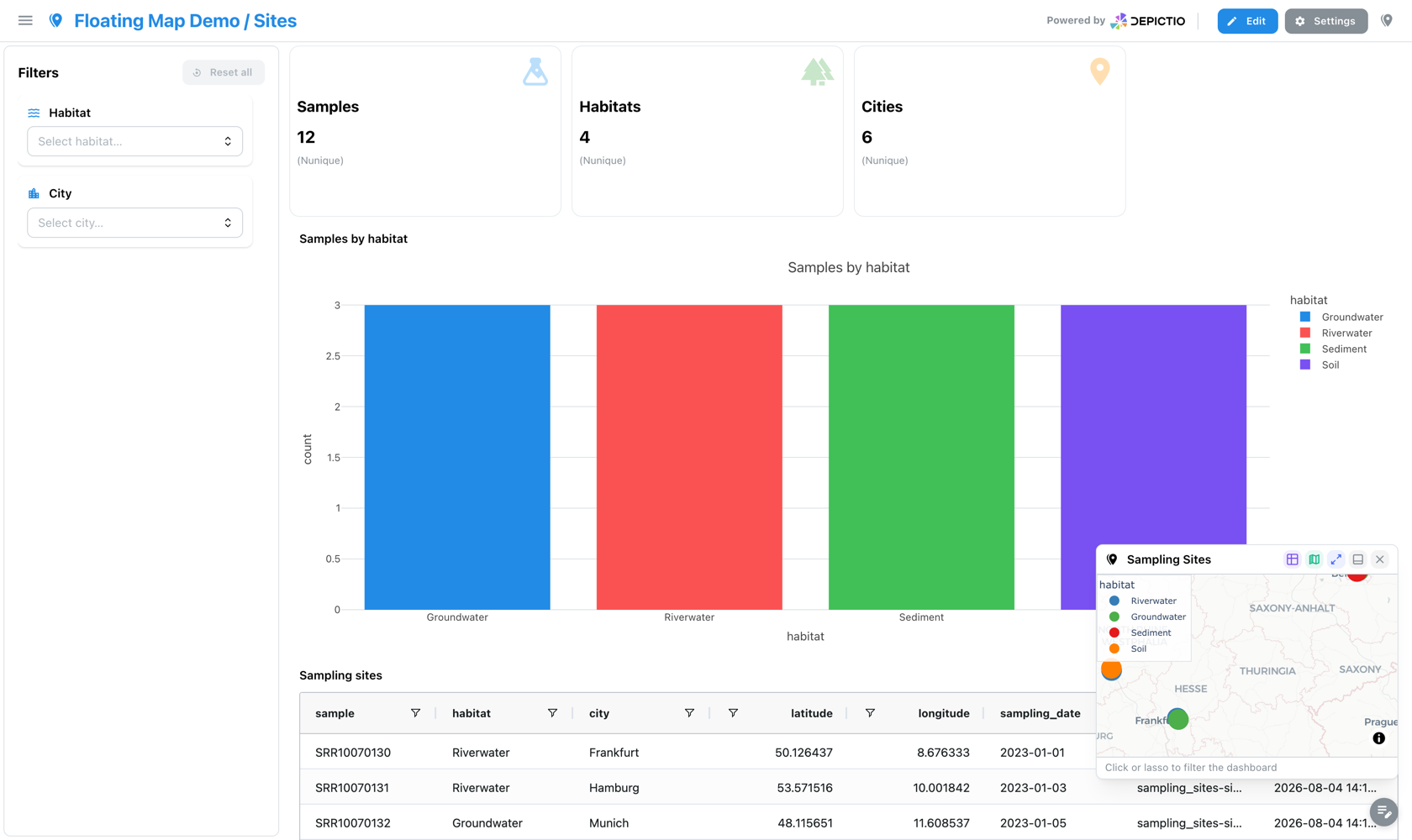
A column pinned under the filter panel, resized by dragging its top edge. Three sites are selected here, so the panel header carries a 3 SELECTED badge and its reset, the header control repeats the count, and the cards and the bar chart have all followed the selection.
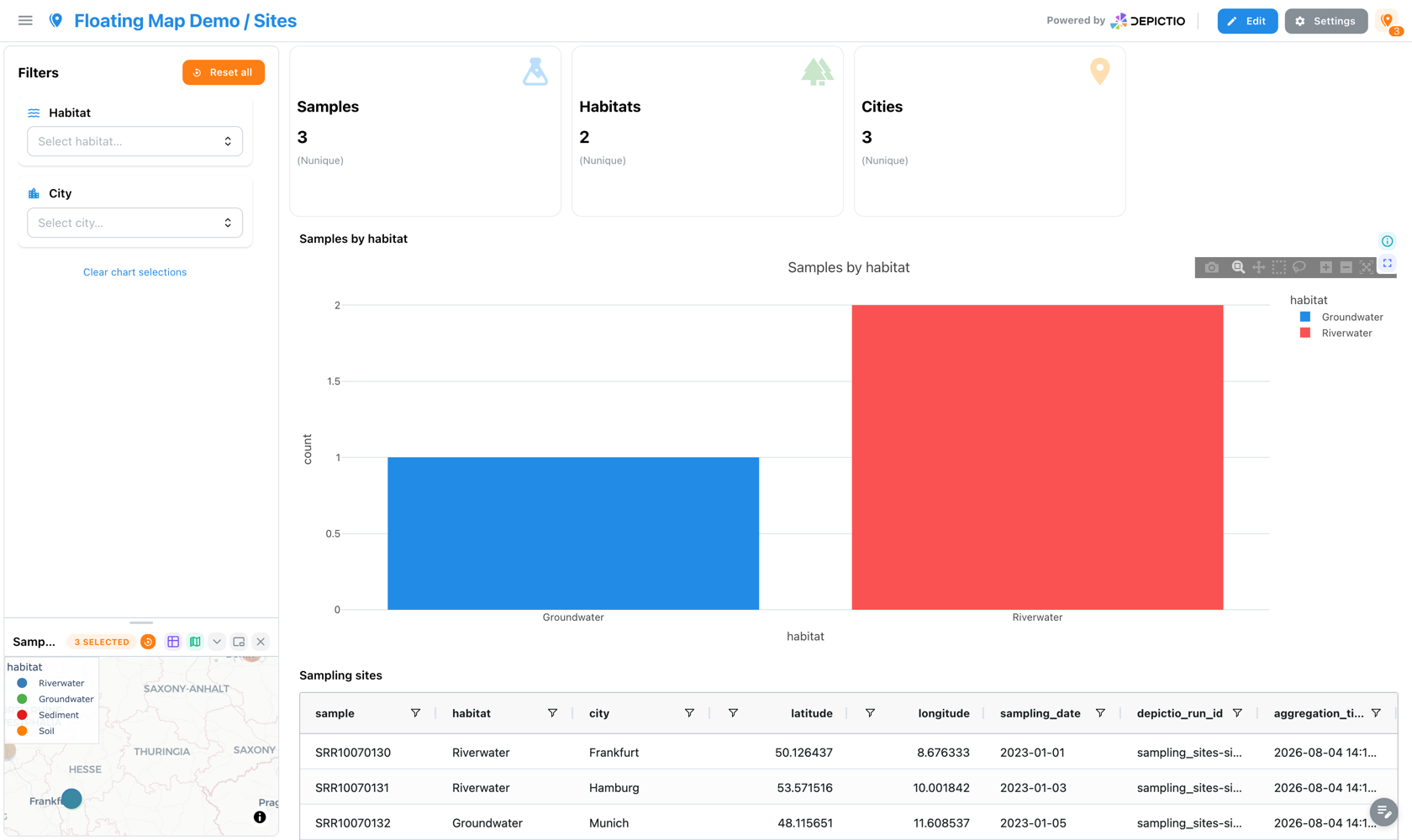
Folding is something the viewer does, not a state you can author. The dock collapses to its title bar. The selection and its reset stay reachable, and the map gives its height back to the filter list.
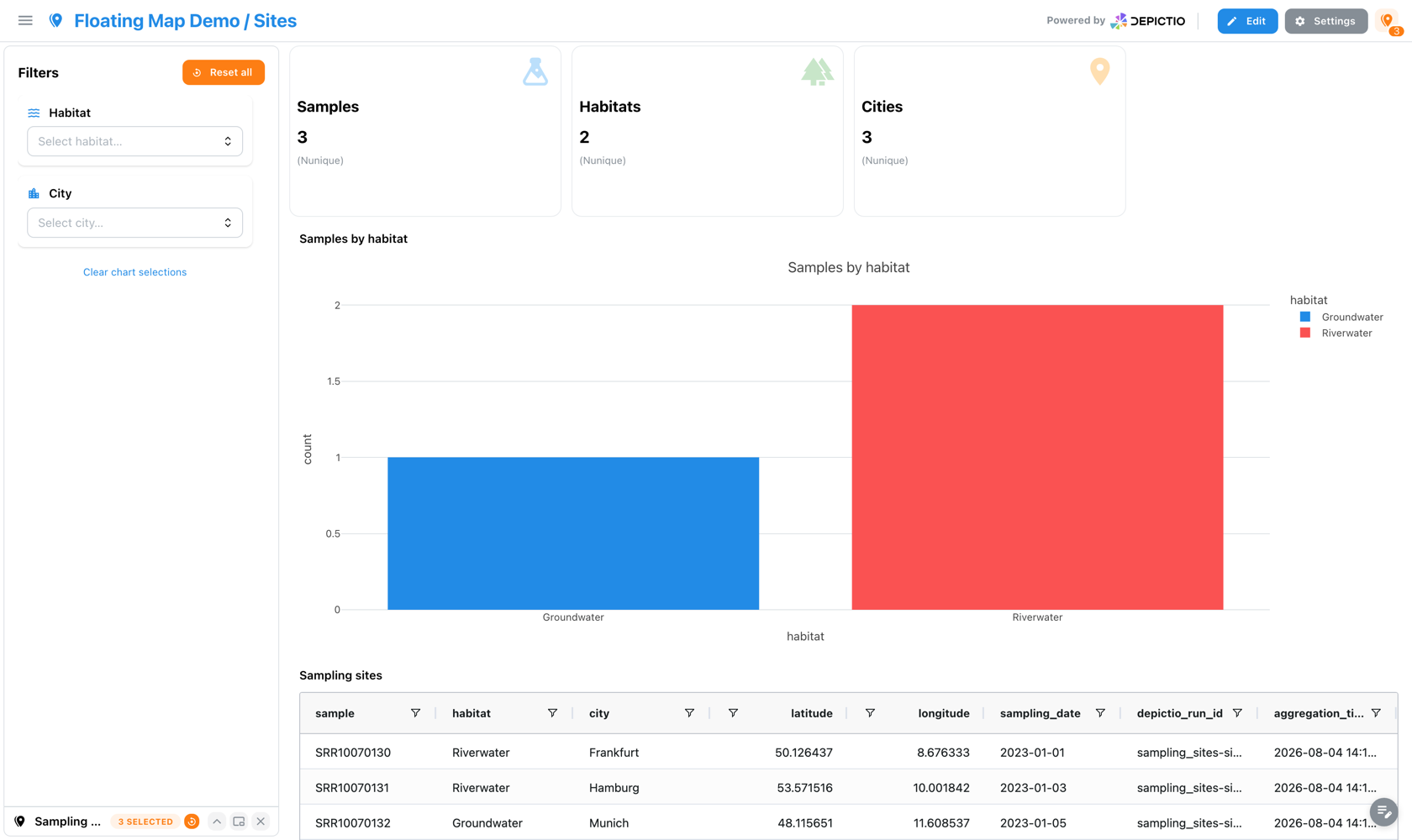
Nothing but the header control, which keeps showing how many values the map is filtering on.

A custom CSP must allow the basemap
Maps fetch their style document, glyphs, sprite and vector tiles over fetch/XHR, so connect-src governs them and img-src does not. The shipped policy allows the basemap CDNs; if you override it at a proxy or ingress, see Security.
The rows behind a map
A map shows where the data sits, not which rows are behind it. Open the underlying data from the grid tile's chrome or the panel header to see those rows, with the map's own columns ordered first and a notice when the list is truncated.
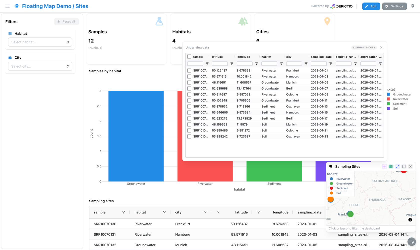
Ticking rows selects them on the map. Lasso, click and row-ticking all build the same filter, so they replace one another rather than compounding, and opening the table after a lasso shows those rows already ticked.
YAML Examples
Scatter map:
- tag: sampling-map
  component_type: map
  workflow_tag: python/my_workflow
  data_collection_tag: sample_metadata
  lat_column: latitude
  lon_column: longitude
  color_column: biome
  size_column: read_count
  hover_columns: [sample_id, site_name, country]
  map_style: carto-positron
  selection_enabled: true
  selection_column: sample_id
Choropleth map:
- tag: country-choropleth
  component_type: map
  workflow_tag: python/my_workflow
  data_collection_tag: sample_metadata
  map_type: choropleth_map
  locations_column: country_name
  featureidkey: properties.NAME
  color_column: sample_id
  choropleth_aggregation: count
  color_continuous_scale: Viridis
  geojson_url: "https://raw.githubusercontent.com/nvkelso/natural-earth-vector/master/geojson/ne_110m_admin_0_countries.geojson"
Cross-DC Filtering
Interactive components can filter across linked Data Collections using the Links system. See Cross-DC Filtering for details.
┌─────────────────┐         ┌─────────────────┐
│  Filter: Status │  link   │  Table: Samples │
│  [MultiSelect]  │────────▶│  [auto-filters] │
└─────────────────┘         └─────────────────┘
Component Creation
Using the Stepper Wizard
The component builder guides you through creation:
- Select Data Collection - Choose your data source
- Choose Component Type - Figure, Table, Card, Interactive, Text, MultiQC, or Map
- Configure Settings - Type-specific options
- Preview - See the component before adding
- Add to Dashboard - Place on the canvas
Positioning Components
- Drag and drop components in Edit Mode
- Components snap to a grid layout
- Resize by dragging corner handles