Using the Dashboard
Dashboard Modes (v0.6.0+)
Depictio dashboards operate in two distinct modes, each optimized for its specific purpose.
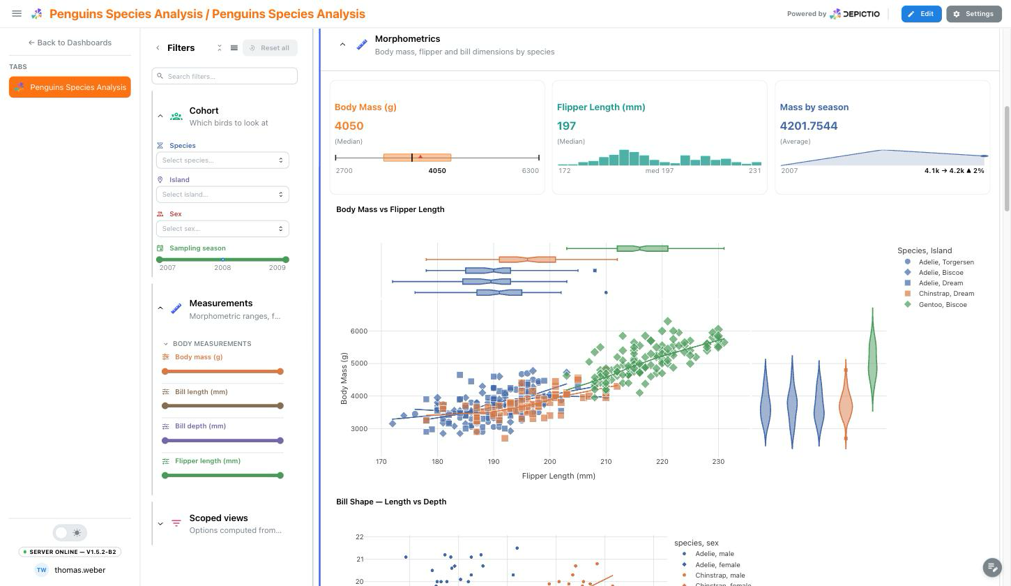
Viewer Mode
URL Pattern: /dashboard/{id}
Viewer mode provides a read-only experience optimized for data exploration:
- No editing controls - Clean interface focused on data
- Interactive filtering - Use filter components to explore data
- Data updates - Visualizations respond to filter changes in real-time
- Lightweight - Read-only rendering path, with none of the editing machinery loaded
When to Use Viewer Mode
Use Viewer mode when exploring dashboards, presenting to stakeholders, or sharing dashboard links with colleagues who don't need editing access.
Editor Mode
URL Pattern: /dashboard-edit/{id}
Editor mode enables full dashboard customization:
- Add components - Create new figures, tables, cards, and filters
- Edit components - Modify existing component configurations
- Drag and drop - Reposition and resize components
- Delete components - Remove unwanted elements
- Save changes - Persist your layout and component settings
- Tabs management - Create and organize dashboard tabs
Switching Between Modes
Click the Edit button in the dashboard header to switch from Viewer to Editor mode. Click View to return to read-only mode.
Two-Panel Layout (v0.6.0+)
Dashboards use a two-panel layout to organize components:
| Panel | Location | Component Types |
|---|---|---|
| Left Panel | ~20% width | Interactive filters (RangeSlider, MultiSelect, DatePicker) |
| Right Panel | ~80% width | Visualizations (Figure, Table, Card, Text) |
Components are automatically assigned to the appropriate panel based on their type when created.
Working with the filter panel (v1.4.0+)
- Collapse it with the control at its edge. It shrinks to a narrow rail rather than disappearing, and the rail keeps showing how many filters are active, so a filtered dashboard never looks unfiltered.
- Resize it by dragging its edge. The width is remembered, and the grid re-lays out to match.
- Fold a section with its header. A folded section fetches nothing until you open it, and keeps a badge with the number of active filters inside it. A folded grid section of cards shows its numbers as summary chips.
Since v1.8.3 the collapse, the width and the section folds are remembered for the whole tab family. A tab switch is a navigation to a sibling dashboard document, so before that each of the three reset on every switch: a panel collapsed on one tab reopened on the next. - Read what is applied from the summary above the controls: one aligned row per filter, each with its own control's icon and colour. Click a row's clear button to drop just that filter. The whole summary folds to a single line.
Sections in the main grid work the same way, and a folded section of cards still shows its numbers in the header. See Sections.
Sections shown on every tab (v1.6.0+)
A section whose header carries a pin belongs to the whole dashboard rather than the tab you are on. In the filter panel that means the controls are the same on every tab and keep the values you set when you switch, which is what a filter the whole dashboard shares should do. In the grid it means the section is there on every tab, read-only unless you are on the tab that owns it, sitting either above or below that tab's own content.
Folding one folds it everywhere, so it stays out of your way as you move around. See Sections on every tab.
The map panel (v1.4.0+)
When a dashboard has a map authored as a dashboard-wide panel, it follows you across every tab rather than living in one. Use the header control to move it between floating, docked and hidden, and the panel header's menu to edit, duplicate or delete it.
- Select on the map by lassoing, box-selecting or clicking; every tab of the dashboard follows the selection.
- Open the rows behind it from the panel header or the tile chrome. The map's own columns come first, and ticking rows selects them on the map.
- Lasso, click and row-ticking all produce the same filter, so they replace one another instead of stacking.
Dashboard settings
Settings, at the top right, opens Dashboard settings. Since v1.14.0 it is a dialog with a rail of sections beside the one you are on, full screen on a phone, where the rail becomes a select. It opens on Your view (on Tab defaults in the editor), then on the section you visited last, and changes save as you make them. Its icons and switches wear the dashboard's own brand.
| Section | Shown | What it holds |
|---|---|---|
| About this dashboard | Always | What the dashboard is, below |
| Your view | Always | Font size and Page width, for you only, saved in this browser. See Appearance |
| Tab defaults, Tiles, Filtering, Guide | Edit mode | Saved with the dashboard. See Settings for everyone |
| Branding | Edit mode | Logo, colours and figure palette. See Appearance |
| History | Edit mode | Every saved version of the dashboard, to preview, restore, bookmark or delete. See Dashboard and data versions |
| Data version | Edit mode | Draws the editor from earlier data, for you only, until you reload. See Data versions |
| Feedback | When a feedback link is configured | Report a problem or suggest an improvement |
About this dashboard gives its project, template, owner, visibility and last-modified date. Since v1.6.0 the project name is a link to that project's page, and View ingestion report below it opens the ingestion report for any project, not just one built from a template. Since v1.14.0 the dashboard and project IDs, each with a copy button, are folded under Identifiers. The same body backs the inspector's Info tab.
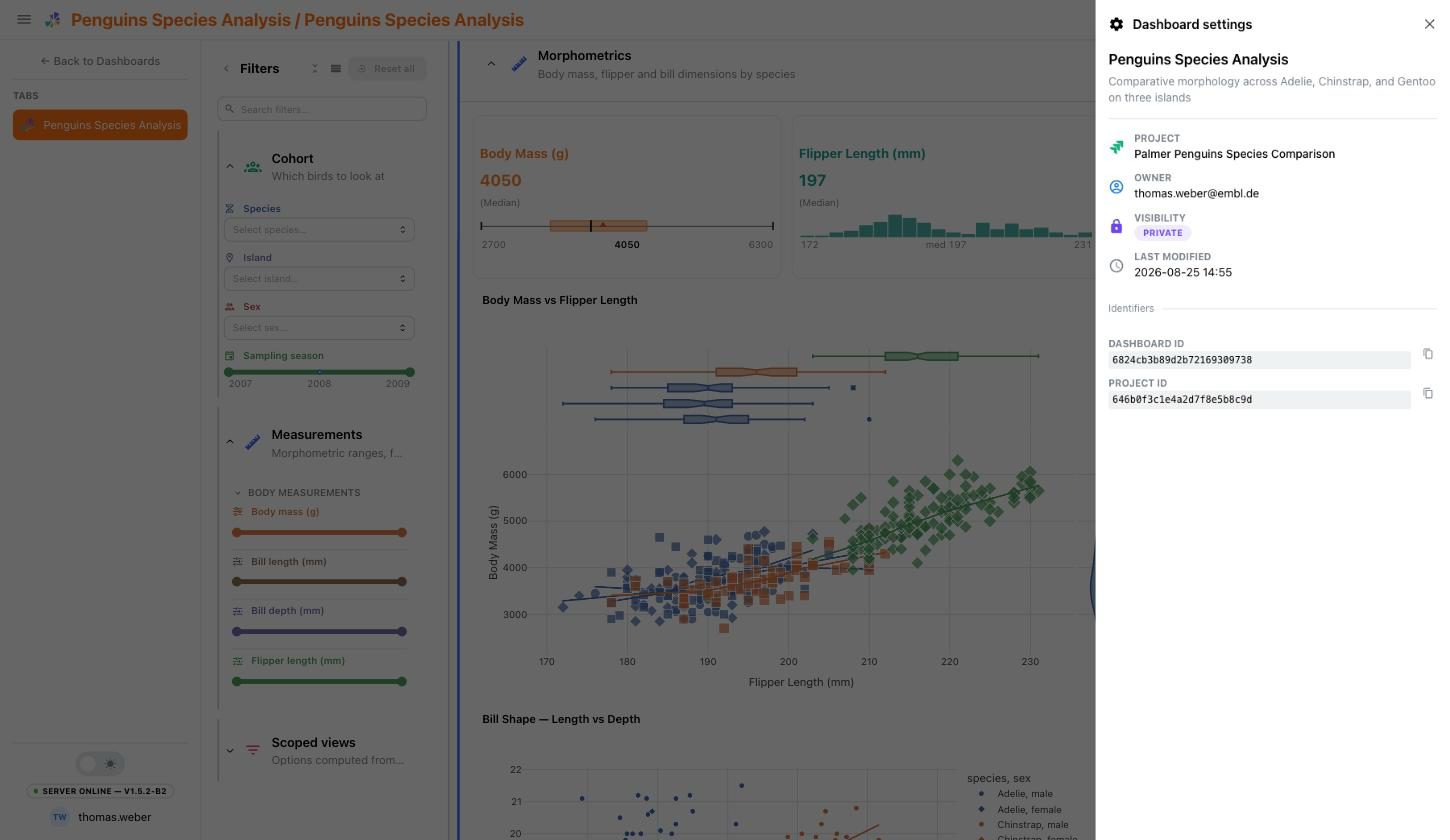
Since v1.8.3 a Run parameters row sits alongside it, showing the parameters the pipeline ran with. Only the keys the template highlights appear inline; All N parameters → opens the full grouped listing and Ingestion report → the report. Since v1.14.0 a text tile can open the same listing with a params: link. See Run provenance.
This replaced the Parameters panel (v1.0.0)
The Dash UI put a Parameters panel here, with switches for edit mode and interactivity and buttons to remove every component or reset every filter. Only one of those survived the React rewrite: Reset all, now at the top of the filter panel. Editing is the Edit button, and there is no global interactivity switch.
Appearance (v1.8.0+)
Since v1.14.0 the controls of this former section sit in Your view (Font size and Page width, in view and edit mode), Tiles and Branding, the last two in edit mode.
Font size. A- and A+ step the content through 85%, 100%, 115% and 130%. Figures, tables and cards scale; the header, sidebar and panels keep their size. The preference is stored per browser, like the dark-mode toggle, so it follows the reader rather than the dashboard.
Page width (v1.14.0+). Full, Wide (1600px), Comfortable (1240px) or Compact (1080px): how wide the dashboard runs on a large screen, centred. Each tab remembers its own, per browser.
Scaling one figure rather than all of them
A single tile takes a font_scale of its own from its edit menu, between 0.7× and 2×, applied to the whole Plotly layout font. See Components.
Branding. Source: Inherit instance (Inherit main tab on a child tab whose main tab is branded) or Customise. Under Customise, anything left empty still follows the instance branding, so an override states only what differs.
| Group | What it holds |
|---|---|
| Logo | Instance logo, Upload or None. Shown at the bottom of the dashboard sidebar |
| Brand colors | Primary, Secondary, Tertiary, and Reach: Primary accent re-tints the primary only, Full palette carries all three into buttons, tabs, badges and section accents |
| Status colors | Success, Warning, Danger, left alone by the reach above so pass, warn and fail keep reading as meaning |
| Surfaces | Page background, Cards & sections, Header & sidebar and Titles, stated separately for light and for dark |
| Typography & shape | Font stack, Heading font stack and Corner radius, with a live sample rendered beneath them |
| Figures | Plot template for figures whose component picks none, and Figure colorway, either From palette (derived from the brand colours above) or Custom |
A Preview at the bottom renders real components under the draft, with its own Light and Dark tabs, so both schemes can be checked without switching the app over.
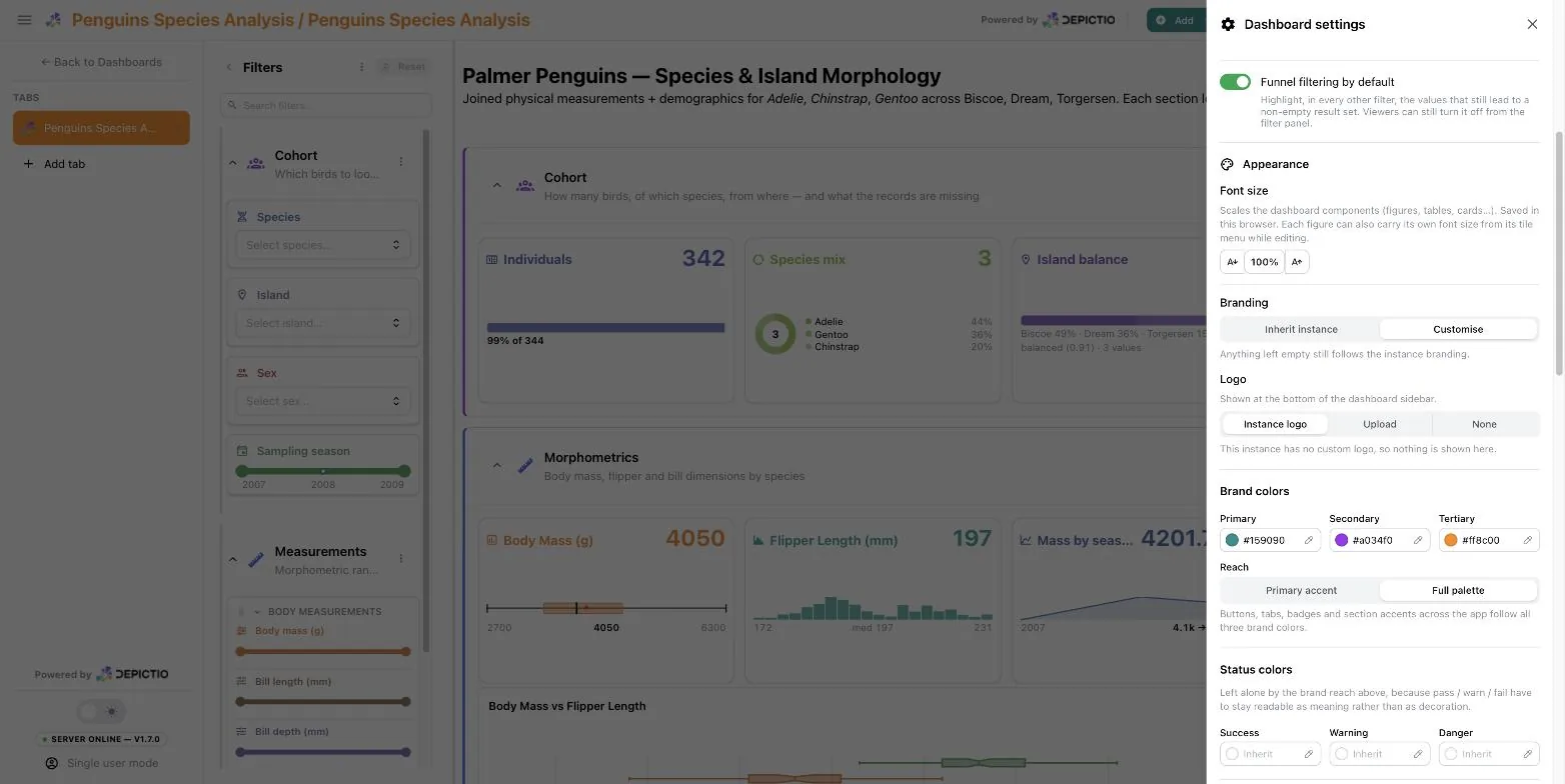
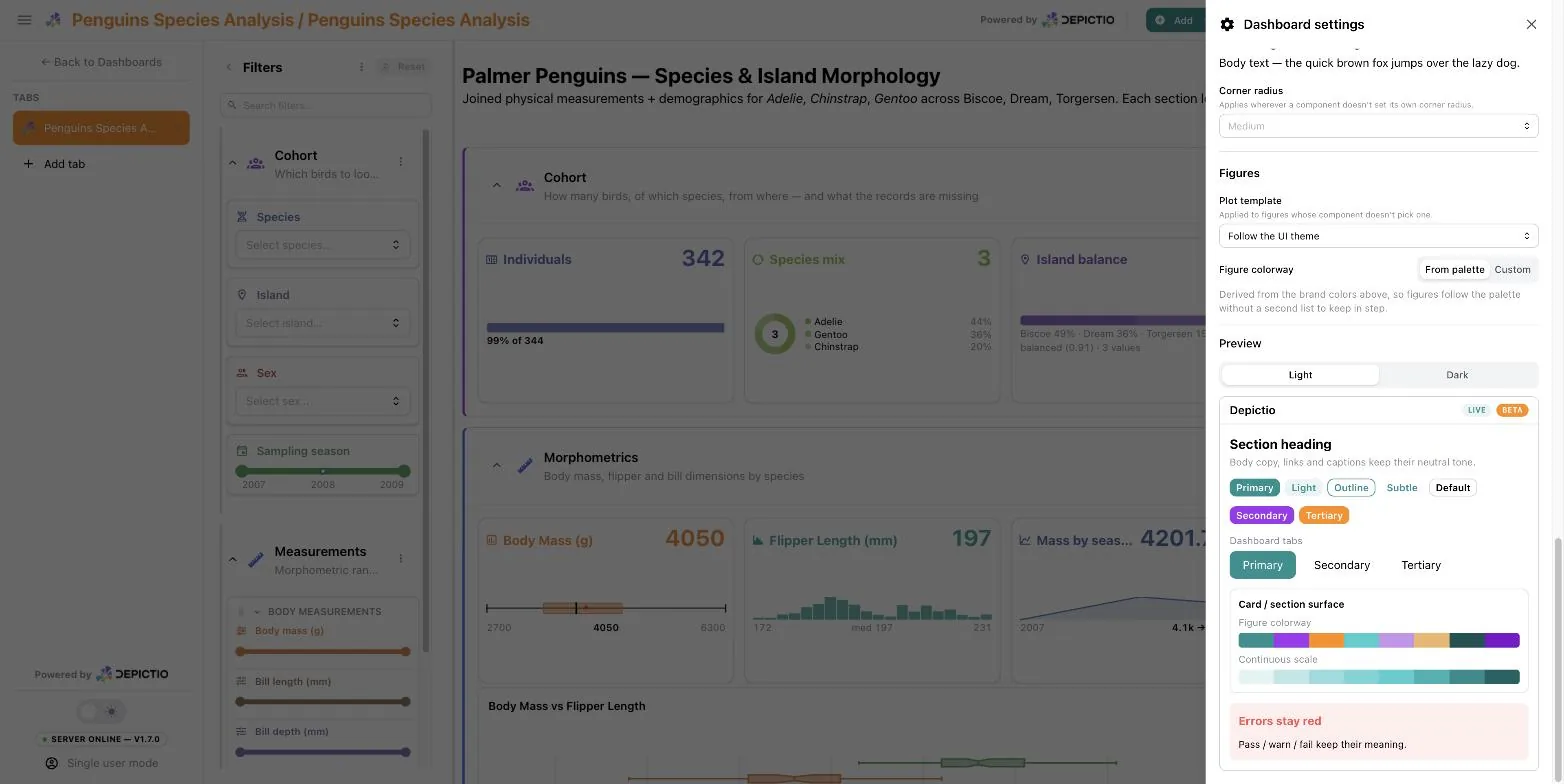
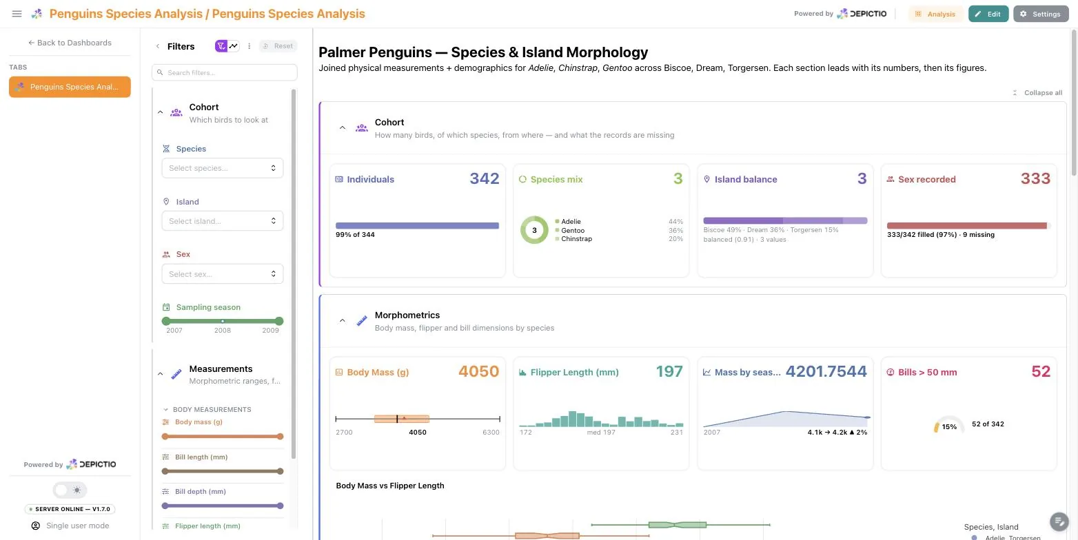
The override applies to this dashboard's page only, so it can wear its own identity inside a differently branded instance. The bundled penguins demo does exactly that:
Uploads are instance-local
An uploaded logo is served from the instance that received it, so it is excluded from YAML exports. A logo that has to survive a move belongs in logo_url as an absolute address.
Figure theming resolves in this order:
See Branding for the model behind all of this, and for the brand_theme: YAML equivalent.
Settings for everyone (v1.14.0+)
In edit mode, the sections after Your view are saved with the dashboard for every reader, and the Guide settings hold for every tab of it. Light or dark stays the sun / moon switch at the foot of the sidebar.
| Section | What it holds |
|---|---|
| Tab defaults | What this tab opens with: Page width, Filter panel open or collapsed, and Show the tab's name. A reader's own choice still wins. See Tab defaults |
| Tiles | Fit tiles to their content (autofit) and Advanced viz controls: Popover, Under title or Side rail (advanced_viz_controls). See Tile height and control placement |
| Filtering | Funnel filtering by default |
| Guide | Show the Guide and an Introduction shown at the top of it. See The dashboard Guide |
A child tab without a brand of its own now draws in its main tab's brand, figures and component builder previews included. Its Branding section offers Inherit main tab, and Customise starts from the main tab's brand.
Component-wise options
In edit mode, hovering a component reveals three icons in its top-right corner, and resize handles on its edges and corners.
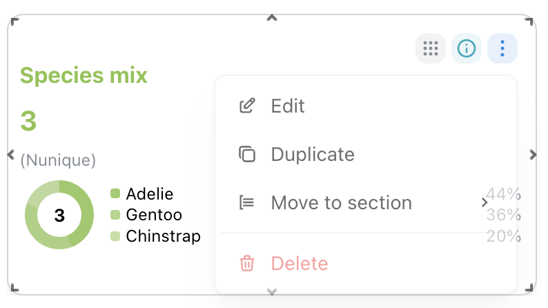
- Drag handle: grab it to move the component in the grid.
- Info: the component's metadata: type, data source, configuration.
- Menu: Edit reopens the builder on this component, History shows it across the dashboard's saved versions, to compare or restore it alone (see Component history), Duplicate copies it, Move to section hands it to another section, Copy to tab… (v1.14.0+) adds a copy to another tab (see Copy to tab), Highlight on… (v1.14.0+) shows a figure or advanced visualization on another tab without copying it (see Highlight Components), Delete removes it. A figure's menu also carries its Font size, and a tile resized by hand that could fit its content offers Reset to auto height.
To find a component on any tab, press ⌘K / Ctrl+K or click the magnifier in the header (v1.14.0+). See Spotlight search.
Table Component Features
Data Export (v0.6.0+)
Table components include a data export feature that allows you to download the displayed data:
- Click the Export button (download icon) in the table component header
- The table data will be exported as a CSV file
- The export respects current filters and sorting applied to the table
Export Limits
- Tables with < 100,000 rows: Instant export
- Tables with 100,000 - 1,000,000 rows: Export allowed with warning
- Tables with > 1,000,000 rows: Export blocked (use CLI for large exports)
How a Dashboard Loads (v1.3.0+)
A dashboard can hold dozens of panels, each needing its own request, so Depictio loads them as you reach them rather than all at once.
While the page opens
- The Depictio logo animates in the centre of the page while the dashboard itself is being fetched. No panels are known yet, so there is nothing to count.
- Panels load when they scroll into view. A panel below the fold shows a shimmering placeholder and costs nothing until you scroll near it, so opening a large dashboard stays responsive instead of waiting on every panel first.
- A progress ring and a count (for example
6/8) sit beside the dashboard title, then disappear once everything on screen is ready. Hover it for a breakdown: how many are still loading, how many failed, and how many are further down the page.
Why the count can go backwards
The count covers what is on screen, not the whole dashboard, so it always completes. Scrolling brings more panels in and the count grows to include them, so a number that briefly drops is work which has just started, not a problem.
Reduced views and the Load-all button
Large data collections are not sent to the browser whole. Where a panel is showing a reduced view, it says so and offers a way out:
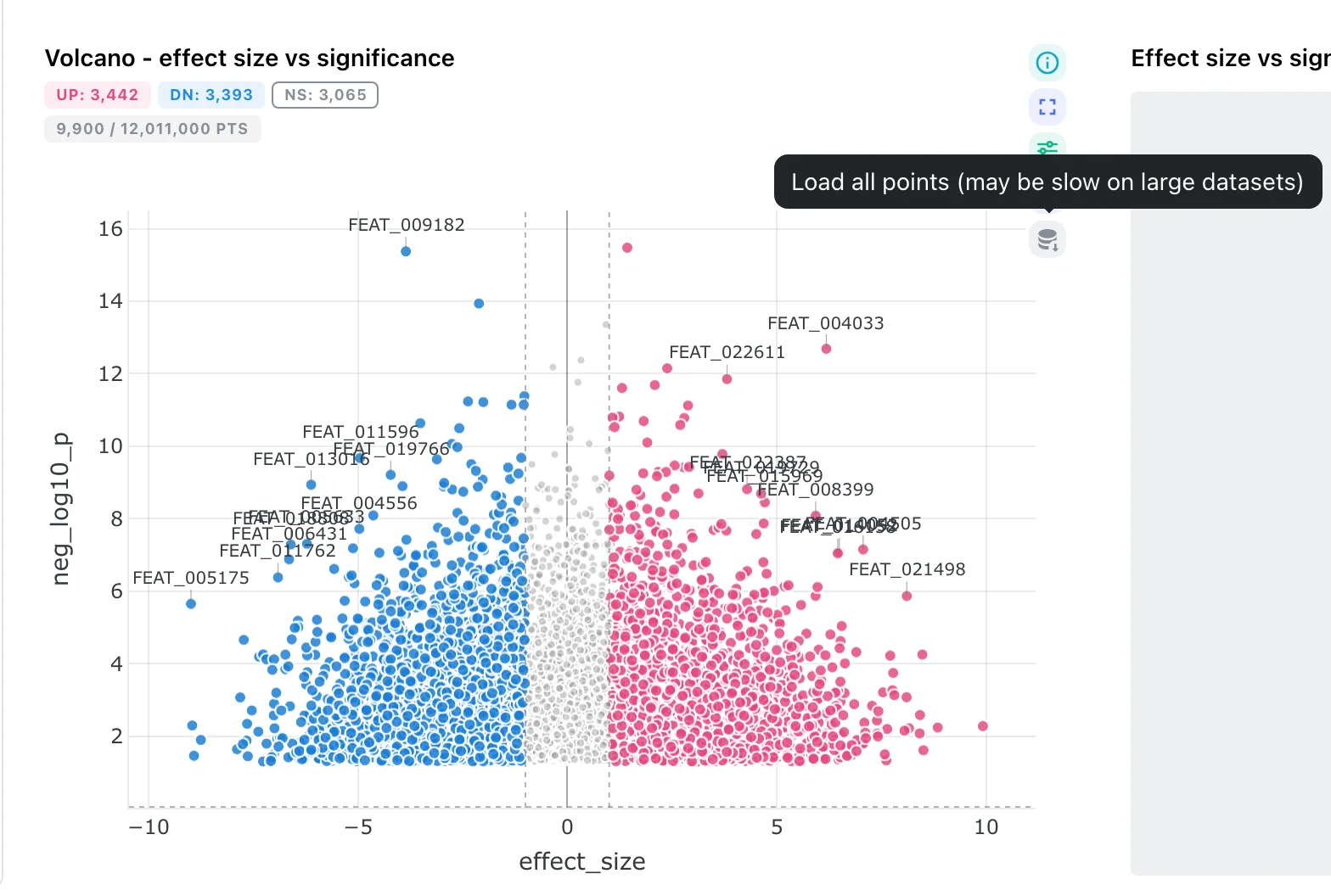
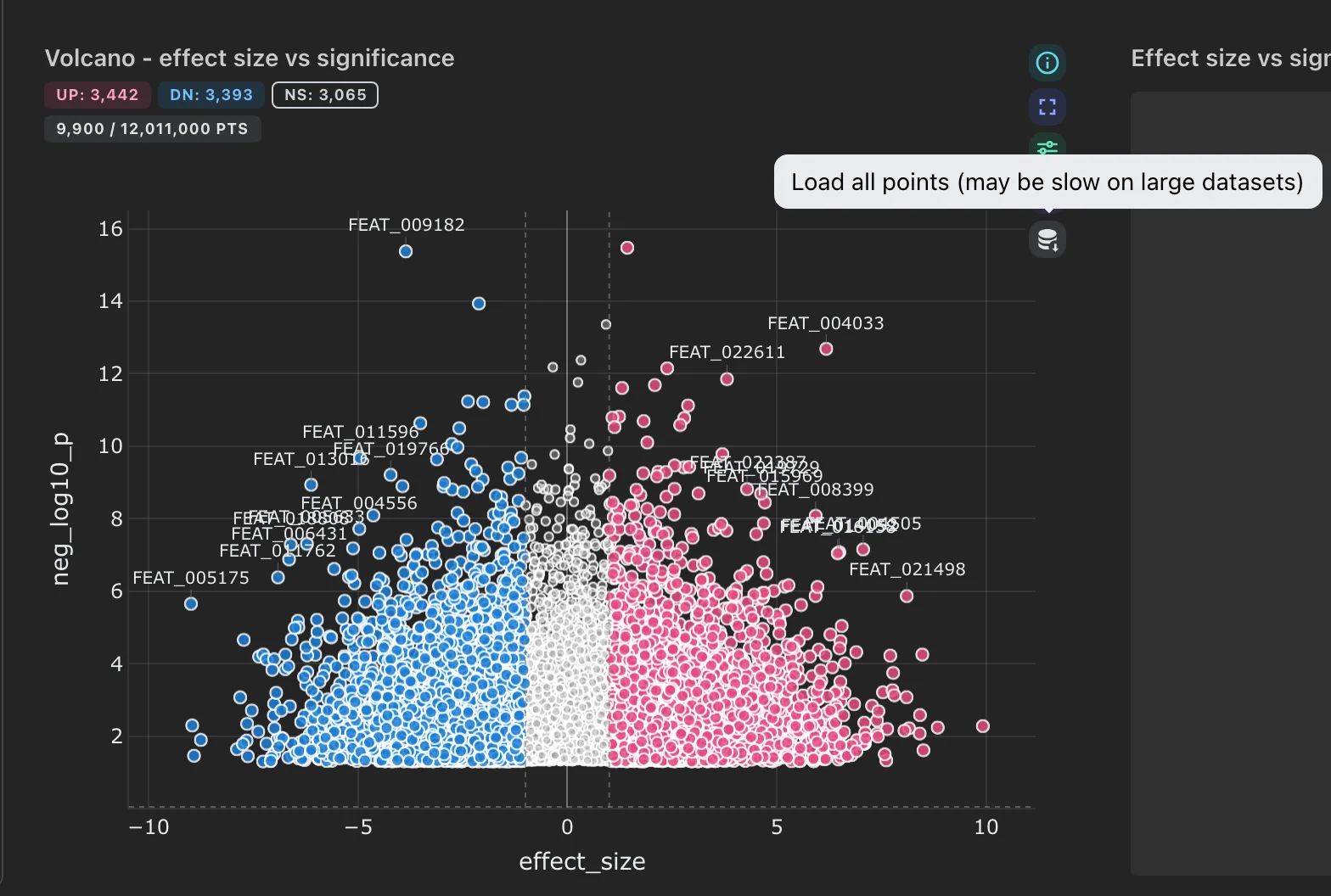
Hover a panel to reveal its action cluster. Load all is the bottom icon, and the badge beside the title says how much of the collection you are currently seeing.
- Figures show a badge such as
9,900 / 12,011,000 pts. Hover the panel and click the Load all icon () in the action cluster to fetch every point; the badge switches to(all)and the button toggles back to the reduced view. Loading everything can be slow on a very large collection. - Tables page rows on demand. On tables past roughly a million rows, sorting is turned off: the chevron disappears from the column headers rather than offering a sort that would silently return unsorted rows.
- Advanced visualisations that compute their values from the rows they receive (stacked taxonomy, DA barplot, enrichment, oncoplot, …) are normally sent the whole collection. If it is too large for that, they carry an orange estimated badge, meaning the values on screen are derived from a sample rather than being exact totals. The lollipop plot shows the same badge whenever its rows were sampled, since its per-gene counts are an aggregate.
See Performance & Scaling for the thresholds behind these behaviours and how to change them.
Interactivity
Interactive Actions
There are currently two types of interactive actions available in the dashboard:
- Through the interactive components (e.g., RangeSlider, MultiSelect, etc.).
- Through the graph components (only Scatter plots are handled yet).
- Click mode: When you click on a point in the scatter plot, the other components will be updated according to the data point clicked.
- Selection mode: When you select a region in the scatter plot (using the "Box select" option), the other components will be updated according to the data points in the selected region.
Reset Filters
- Reset all filters You can reset all filters applied to the components by clicking the Reset all filters button in the right sidebar. This will clear all filters applied to the components and reset them to their default state.
- Reset interactive component/scatter plot filter You can reset the filters applied to the graph components by clicking the orange Reset button in the component options at the top of the box. This will clear the filters applied to the graph component and reset it to its default state.
- Clear one filter from the summary (v1.4.0+) Each row of the filter panel's active-filter summary has its own clear button, so you can drop a single filter without touching the rest.
Where the reset icon stays visible (v1.4.0+)
On figures, tables and maps the reset icon stays pinned while a selection is active, since a selection there is easy to miss. On an interactive control it appears on hover, so that it cannot sit on top of the select's chevron or the slider track.
Saving the Dashboard
Layout and section changes persist on their own, about half a second after you stop editing. There is no unsaved state to lose if you close the tab.
Save, in the editor toolbar, writes immediately instead of waiting for that delay, and queues a fresh thumbnail for the dashboard card. A short notification confirms it.
Every save is kept as a version: the automatic ones fold into one version per 5 minutes of editing, and Save always records its own. Settings → History lists them, to preview or restore one. See Dashboard and data versions.

Exit Edit returns to viewer mode. The dashboard then shows up with its new thumbnail under Recently opened on the dashboards page.
Example Dashboard result