Performance & Scaling
This page describes how Depictio handles large data collections: what the server does to avoid reading rows it doesn't need, how much data reaches the browser, and which settings let you tune that for your deployment. It is in three parts: how the design keeps things fast, what that costs in practice on a 12-million-row benchmark project, and what you can change.
The guiding idea is that a dashboard should stay usable at any collection size: work is pushed as close to the stored data as possible, payloads are bounded by default, and when a bound is applied it is made visible rather than hidden.
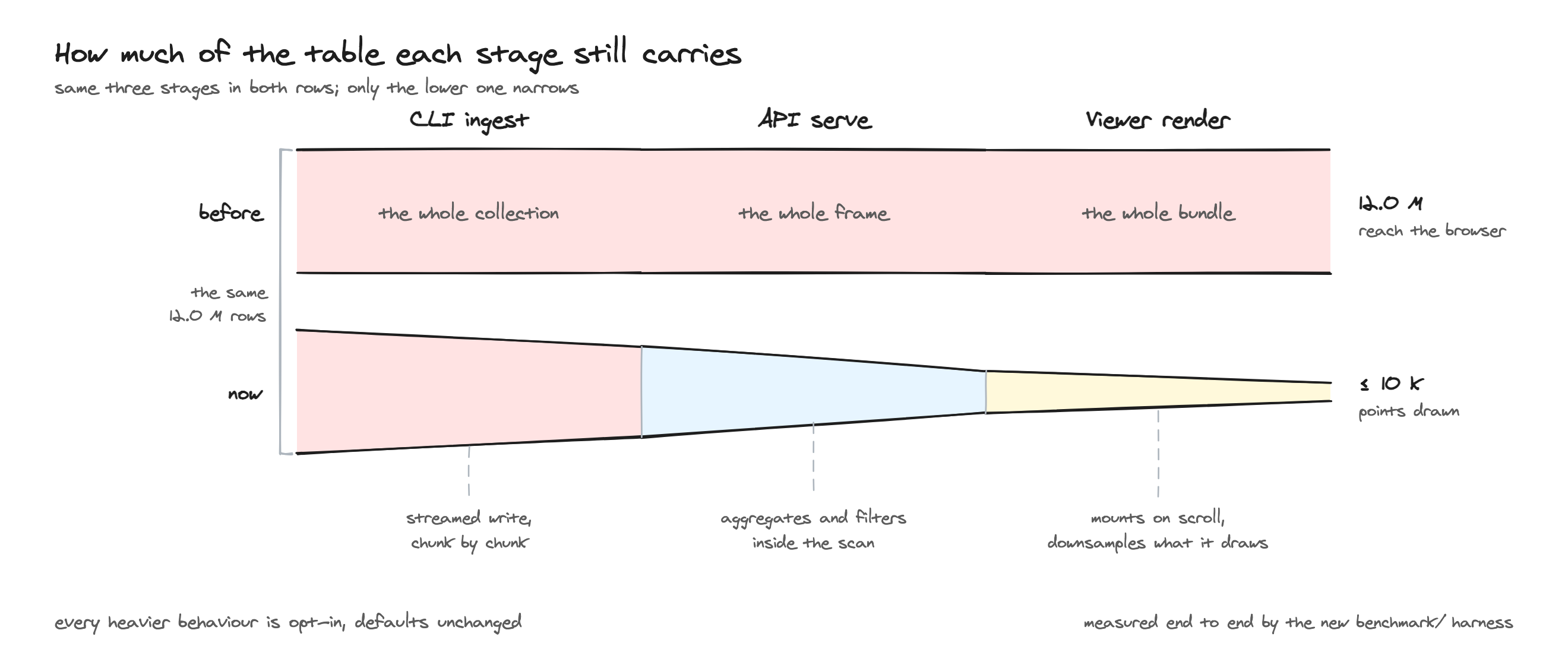
How Depictio keeps it fast
The design has one goal at every stage: touch less data. A panel does not fetch until it is on screen, the response it gets is a bounded slice, and the query behind that slice is pushed into the Delta scan so most rows are never read at all.
Opening a dashboard
A dashboard can hold dozens of panels, each needing its own request. Rather than requesting all of them up front, Depictio loads them as you reach them.
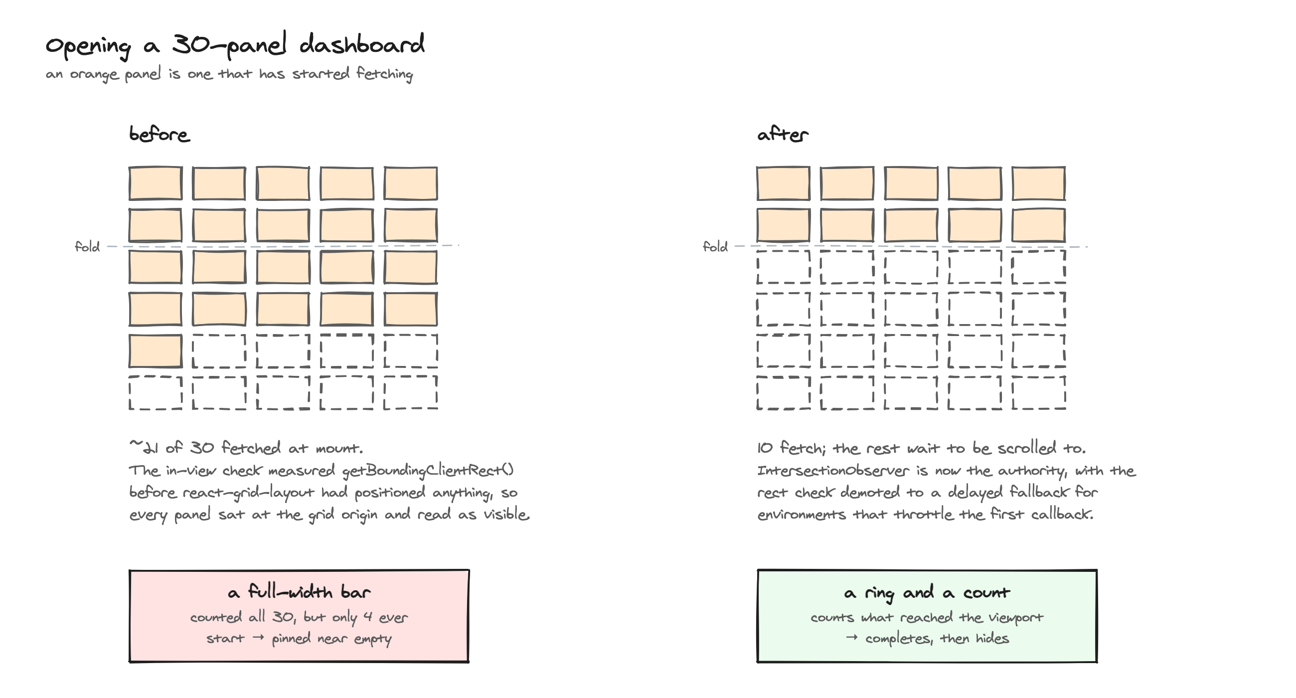
- Panels load when they scroll into view. A panel below the fold shows a placeholder and issues no data request until you scroll near it, so opening a large dashboard stays responsive instead of waiting on every panel first. Advanced-viz, MultiQC and JBrowse panels defer their code chunk as well, since their renderers fetch on mount; figure and table panels load their chunk when they mount but still gate the fetch.
- Progress is scoped to the viewport. A ring and a count beside the dashboard title cover what is on screen rather than the whole dashboard, so they always complete.
For what this looks like while a dashboard opens, see using the dashboard.
The viewer bundle is split along the same lines: route trees and the heavy visualisation libraries (Plotly, AG Grid, Cytoscape) load as separate chunks on demand, so a page only parses the code it actually renders.
WebGL budget
Browsers allow only a handful of simultaneous WebGL contexts. Past roughly five accelerated plots the oldest ones used to lose their context and blank out. Depictio now budgets contexts and falls back to a lighter SVG renderer for the plots that miss out, so a dense dashboard degrades in quality rather than showing nothing.
Bounded payloads and the Load-all control
By default every data panel is served a bounded slice rather than the whole collection. Where a bound has been applied, the panel says so, and you can override it.
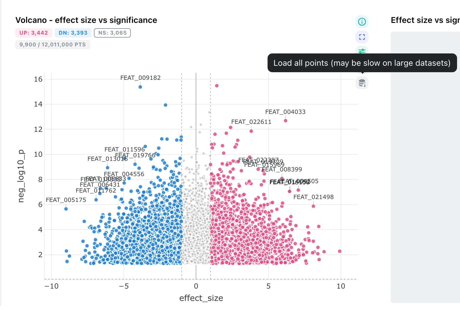
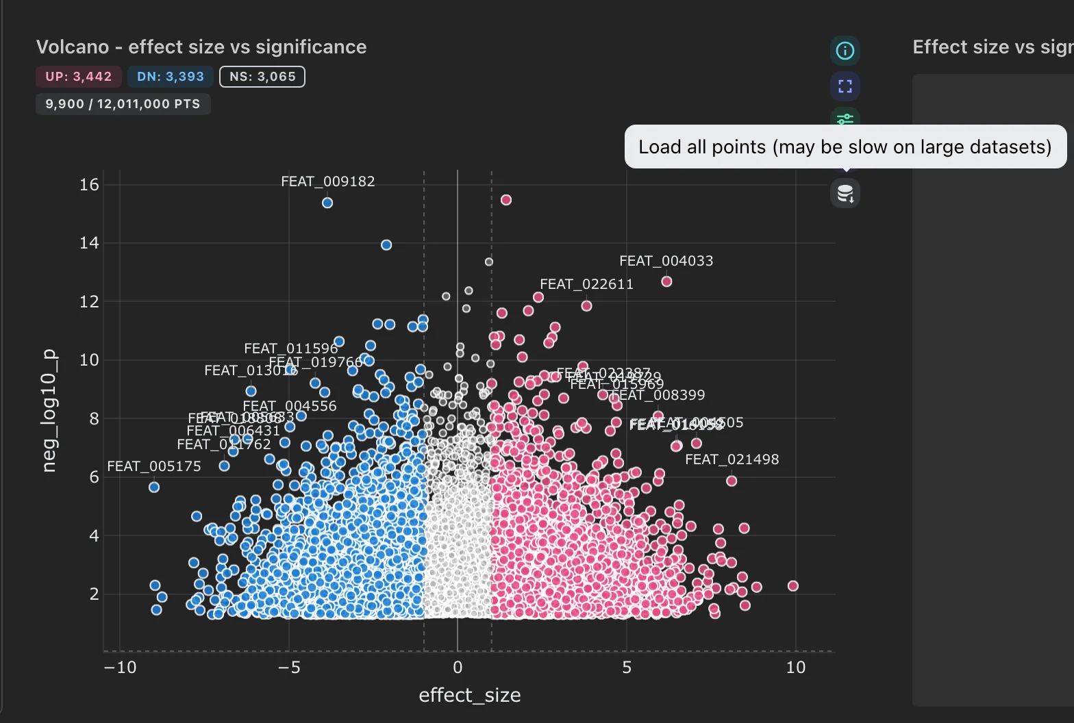
A figure serving 9,900 of 12 million points. The badge sits beside the panel title, and the Load-all icon is the bottom entry in the action cluster, which appears on hover.
- The Load-all button — an action icon in each panel's hover cluster toggles between the reduced view and a full load of every point or row, and back again.
- Figures carry a badge reading e.g.
9,900 / 12,011,000 pts, or12,011,000 pts (all)once fully loaded. Point plots are downsampled abovefigure_max_points(10,000 by default); a per-componentmax_pointsoverrides it for a single figure. - Tables page at scan level, so a deep page costs the same as a shallow one. Above
table_sort_max_rows(1,000,000 by default) rows are served in natural scan order and the sort control disappears from the column headers, rather than offering a sort that silently does nothing. -
Advanced visualisations are reduced according to what their renderer can survive, not by a single global rule:
Policy Applies to Why Uniform sample embedding, QQ, lollipop, coverage track The renderer draws one mark per row and reads no aggregate, so a uniform subset is a faithful, lower-resolution picture. Tail-preserving volcano, MA, Manhattan Significant rows are kept whole and the dense middle is strided. On a multi-million-row DE table a uniform sample keeps almost none of the hits, so the plot would become a cloud with nothing to label. Never sampled stacked taxonomy, rarefaction, DA barplot, enrichment, sunburst, dot plot, oncoplot, UpSet, hierarchical heatmap, sankey, phylogenetic These renderers aggregate client-side (per-sample sums, top-N rankings), so a sample would change the reported values, not their resolution. The never-sampled kinds are served whole up to
advanced_viz_no_sample_max_rows(2,000,000 by default). Past that ceiling they fall back to a uniform sample and the chart is badged orange estimated, so an approximation is never presented as a total. The lollipop plot carries the same badge whenever its rows were sampled, since it aggregates them into per-gene counts.
Server-side work
Most of the work happens server-side, in a Polars + Delta Lake + Celery pipeline, so the browser receives compact, ready-to-draw payloads rather than raw data.
- Aggregation pushdown — figures whose result is an aggregate (box plots, histograms, bar charts) are computed as a query over the Delta scan. The result is exact; the rows simply never leave storage. In the benchmark run below, 114 of 225 figure renders materialised zero rows.
- Column projection — figures and cards read only the columns they need, which reduces I/O on wide tables.
- Filters pushed into the scan — categorical and temporal filters are kept in a form the parquet reader can use, so row groups that cannot match are skipped instead of being read and discarded.
- Delta clustering — tables are sorted on the columns they actually get filtered by before being written, which makes that row-group skipping more effective. This sort is skipped when the CLI's opt-in streamed write is enabled, since sorting the whole dataset would materialise exactly what streaming avoids.
- Cross-DC links resolved once — a link filter is resolved a single time per fan-out and evaluated lazily, rather than re-derived for every component that depends on it.
- Polars-native figure building — figures are built directly from Polars frames, avoiding a second in-memory copy via pandas.
- Compressed responses — large figure/table JSON is gzip-compressed in transit.
Render offload
Depictio renders figures adaptively: cheap figures render inline on the API process,
while figures over a source-size threshold (50 MB by default) are dispatched to Celery
workers so the API stays responsive under concurrent load. A dispatched render that
exceeds the offload timeout returns 504 rather than blocking indefinitely.
Only figure renders have a Celery path. Tables, cards, interactive components and the advanced-viz data endpoint are synchronous handlers, which FastAPI already runs in its own thread pool, so they never needed the escape hatch.
Caching
- Arrow IPC (LZ4) cache — cached Polars frames are stored with Arrow IPC + LZ4 compression in Redis, a more compact serialization than pickle. Frames above the per-item cap are skipped rather than cached, so large frames don't silently bloat Redis.
- MultiQC resident report — parsed MultiQC reports are kept resident in the worker process across renders, so prewarming a dashboard's MultiQC figures doesn't re-deserialize the full report for every plot.
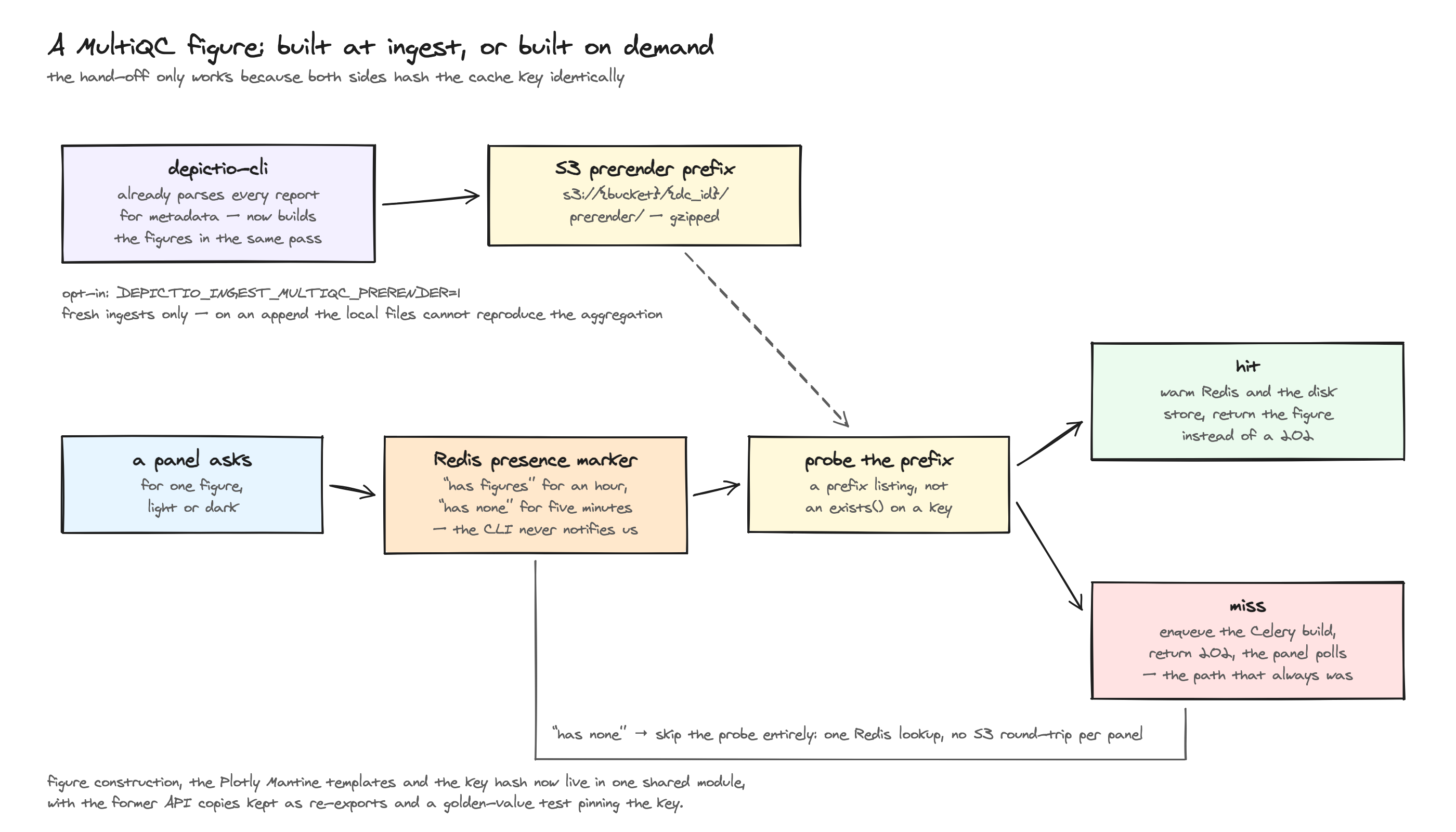
- MultiQC figures prerendered at ingest (opt-in) — the CLI already parses every
MultiQC report for metadata, so it can build the aggregated Plotly figures in that same
pass and upload them to S3. The render endpoint then serves them directly instead of
building them on the first cold open. Set
DEPICTIO_INGEST_MULTIQC_PRERENDER=1on the CLI; it costs ingest time and S3 storage, and applies to fresh ingests only. Collections that never opted in are not penalised, since a short-lived Redis marker spares them the S3 round-trip per panel.
🎬 Opening a MultiQC dashboard aggregating 50 reports across 600 samples.
What that costs in practice
The sections above describe the design. This is what it measured on a real project.
One benchmark run against the current build, on a linked 3-collection project. It
describes this setup, so treat it as an order of magnitude for a comparably sized
project rather than as a specification. The full run, with per-kind latency, the
methodology and its caveats, is committed alongside the harness as
benchmark/PERF_REPORT_v2.md in the
depictio repository.
| Dataset | 12,019,500 rows across 3 linked collections |
| Size | 1.025 GB raw / 1.429 GB Delta |
| Host | Apple M1 Max, 10 CPU, 32 GB, on a Colima VM with 8 vCPU / 20 GB |
| API container | 4 CPU, 1 uvicorn worker, dev mode |
| Celery | 4 CPU / 4 workers, 30 s offload timeout |
The single dev worker matters: a production deployment runs several, so these figures are pessimistic in that respect.
🎬 Opening a 30-component dashboard on a comparable linked project. Captured in the browser, so what you see includes rendering and painting, not only the server timings tabulated below.
Measured: opening a dashboard
Every component fetched at once, the way the page does it. First chart is the first figure or advanced viz to appear. Cold means the server caches were flushed beforehand.
| Components (fired) | Cache | First component | First chart | All components |
|---|---|---|---|---|
| 4 (18) | cold | 155 ms | 1.2 s | not reached |
| 4 (18) | warm | 133 ms | 218 ms | 816 ms |
| 8 (22) | cold | 162 ms | 184 ms | not reached |
| 8 (22) | warm | 140 ms | 1.5 s | 19.9 s |
| 16 (30) | cold | 135 ms | 190 ms | 3.3 s |
| 16 (30) | warm | 151 ms | 243 ms | 3.1 s |
| 30 (44) | cold | 224 ms | 4.3 s | not reached |
| 30 (44) | warm | 270 ms | 270 ms | 6.2 s |
The leading number is how many components issue a timed render; the parenthesised number is the dashboard's full panel count, since passive panels (text, interactive widgets reading precomputed specs) are on the page but not measured.
The page starts showing something in 133 to 270 ms regardless of dashboard size, and that barely moves between 4 and 30 components. What scales is the tail, not the first paint, which is the point of loading panels as they come into view. Not reached means a component was still outstanding when the run moved on, so no total is reported for that row.
Measured: changing a filter
Across the 3 linked collections. No round is a cache hit, since each applies a value no earlier round used.
| Components | Starts responding | Fully caught up | Worst round |
|---|---|---|---|
| 4 | 154 ms | 1.7 s | 1.9 s |
| 8 | 93 ms | 2.0 s | 3.0 s |
| 16 | 214 ms | 4.1 s | 33.5 s |
| 30 | 186 ms | 6.3 s | 92.9 s |
A round is one filter change, after which every component on the dashboard refetches; requests go out through a pool of 4, matching the viewer's own fetch queue. Fully caught up is the median across rounds in which every component landed, so it never quietly describes a partial dashboard.
Which collection the filter starts on barely matters: filtering from the 12-million-row feature matrix (2.0 s median) costs about the same as filtering from the 500-row sample sheet (2.4 s). That is what the bidirectional link graph buys, since both resolve to the same few hundred sample ids before any data is touched. Link translation itself is 25 ms median.
Measured: cost per component
Median and 95th-percentile render time across all 1,434 successful renders. One row per family; the full report linked above breaks these out per figure and per viz kind.
| Component | p50 | p95 | Median rows in memory |
|---|---|---|---|
| interactive | 11 ms | 132 ms | n/a |
| card | 119 ms | 1.3 s | n/a |
| table | 222 ms | 1.2 s | 100 (one page) |
| figure · aggregates (box, histogram, bar) | 271 ms to 709 ms | 4.3 s to 7.4 s | 0 |
| figure · point plots (scatter, line) | 696 ms to 1.1 s | 3.4 s to 4.2 s | 40,000 |
| advanced viz (11 kinds) | 691 ms to 1.2 s | 2.6 s to 6.0 s | 6,005,500 |
Two numbers carry the design: 114 of 225 figure renders materialised zero rows, computed as an exact aggregation over the Delta scan, and the largest frame any render held in memory was 1.57 MB (median 439 KB) against a 12-million-row table. The advanced-viz kinds are the exception, since they read the full matrix and sample from it, which is why their p95 is the widest here.
What you can change
Those numbers come from the defaults. These are the settings that move them, and the order worth trying them in. All are environment variables; see the environment reference for how to set them.
| Variable | Default | Purpose |
|---|---|---|
DEPICTIO_PERFORMANCE_FIGURE_MAX_POINTS |
10000 |
Target marker count for point plots before downsampling. Per-component max_points overrides it. |
DEPICTIO_PERFORMANCE_FIGURE_MAX_LOAD_ROWS |
500000 |
Row ceiling loaded from Delta for a point-plot or code-mode figure. Bypassed on a full load. |
DEPICTIO_PERFORMANCE_TABLE_SORT_MAX_ROWS |
1000000 |
Post-filter row count above which a table is served unsorted and the sort affordance is dropped. 0 disables the gate. |
DEPICTIO_PERFORMANCE_ADVANCED_VIZ_NO_SAMPLE_MAX_ROWS |
2000000 |
Row ceiling for the never-sampled viz kinds. Past it they fall back to a sample and are badged estimated. 0 means unbounded. |
DEPICTIO_PERFORMANCE_ADVANCED_VIZ_TAIL_P_THRESHOLD |
0.05 |
Significance cutoff below which a volcano/Manhattan row is kept whole. A renderer's own threshold wins over this fallback. |
DEPICTIO_PERFORMANCE_ADVANCED_VIZ_TAIL_EFFECT_THRESHOLD |
1.0 |
Same, for kinds whose tail is a signed effect size (MA's log2 fold change). |
DEPICTIO_PERFORMANCE_BOX_SAMPLE_ROWS_PER_GROUP |
0 |
Rows sampled per box-plot group before computing quartiles. 0 computes them exactly. |
DEPICTIO_PERFORMANCE_BOX_SAMPLE_MAX_GROUPS |
64 |
Group count above which box quartiles are always computed exactly, since grouped quantiles get cheaper as cardinality rises. |
DEPICTIO_CELERY_OFFLOAD_RENDERING |
false |
Force dashboard render endpoints onto Celery. Left off, offloading is adaptive rather than unconditional. |
DEPICTIO_CELERY_OFFLOAD_SIZE_THRESHOLD_BYTES |
50 MB |
Source-collection size above which a figure render is dispatched to Celery instead of run inline. |
DEPICTIO_CELERY_OFFLOAD_TIMEOUT_SECONDS |
30.0 |
Per-request offload timeout before the API returns 504. |
Where to start
- Scale workers, not the API — heavy figure rendering is CPU-bound. Add Celery worker concurrency or replicas (and RAM, since each worker holds its own frame copies) rather than overloading the API process. Running more than one uvicorn worker matters too. This is also the first thing to reach for if renders are hitting the offload timeout, ahead of raising the timeout itself.
- Project your columns — narrower data collections (only the columns your components use) mean less data read and cached.
- Leave the render caps at their defaults unless a specific panel needs more. Raising
FIGURE_MAX_POINTScosts payload size and browser draw time for every user, whereas the per-panel Load all button gives the one person who needs the full picture a way to ask for it. BOX_SAMPLE_ROWS_PER_GROUPis not a free win. It trades a sort for an extra scan, since the exact extremes have to be read before the per-group strides are known. On warm local parquet it measured a 3.7x win on a 17M-row table; on a cold S3-backed Delta table the extra read can cost more than the sort it removes. Enable it only where the sort has been measured to be the bottleneck.